An ad interrupted my video today, it was Tom Hanks in a podcast talking about his prostate.
The ad was (not so obviously) AI generated; both an AI clone of his voice and an AI-generated face-swap/ lip replacement.
This seemed pretty surprising because it was fairly convincing. He looks like he is saying the dialog of the ad.
It's surprising because there's no way the creator of the ad got Hanks' approval to use his likeness; meanwhile Youtube is profiting by selling the ad. Seems illegal, yet i'm forced to watch the garbage.
The ad in general is part of a similar trend I've been seeing of these AI generated voices speaking fast about prostates or large eggplants (if you know what I mean) used with influencers' or podcasters' likenesses. I would never click on the garbage, and it's probably a scam anyway.
I just scratch my head wondering if this massive company realizes the garbage they are forcing into our lives.
At this point, if someone is not using UBlock and Revanced, it is 100% their fault. Megacorps has very clearly told us that they want ever profits even if it destroys lives, our planet and our future.
I have had premium on a family plan for almost as long as it has existed. It's great to add family members who use YouTube on their televisions giving them an ad-free experience without the shenanigans of setting up blockers at a network level.
I very much don't understand the opposition to paying for some of the services we use every day. I get not wanted to pay 15-20/month for something like Apple or Disney, if you only want to watch a single show/film. But people act like you are crazy for paying for YouTube or Twitch, meanwhile they lose countless hours experiencing the frustration of advertisements. It's common to find discussions online where people are both completely opposed to paying for YouTube, with no real justification for that position, and highly upset at having to watch ads. Same goes for Twitch, which is arguably worse as the ads interrupt live broadcasts.
I use adblock everywhere else, but I thoroughly enjoy not having to worry about it on the platforms I use the most. It's not a scam to pay for something you use and enjoy every day.
Why do you not see the issue with some of us not wanting to give fraudulent extorting thieves money? The previous comment was pretty clear and blatant in it's example of unethical immoral even illegal advertisement...and your only reply is why not pay to stop it!
What's next.... Pay this subscription or we will install malware?or break your windows?
If you watch YouTube with an ad blocker, you are still watching YouTube and not supporting a more ethical alternative. Sure, you are not giving YouTube any money, but you are still supporting their dominant position.
It’s not creators’ fault the platform does this. YouTube just isn’t going away anytime soon, whether we like that or not, so it makes plenty of sense to spend a bit and give those creators a little bit more revenue from my view. It also feels maybe a bit more ethical that the revenue generated from my view comes from my pocket, rather than a scammer’s stolen funds. Or, well, just declaring for yourself that creators don’t need to be paid. (Yes, there are alternative ways of paying creators like Patreon that you should also consider using, but you also aren’t going to subscribe to the Patreon of every channel you watch.)
I don't even care about any of that. I simply don't want to log into youtube because the recommendations inevitably turn to shit and I don't want to be stuck with them. The only sane way to use youtube is to never log in and nuke the session every week or so.
YouTube recommendations have worked very well for me. I listen to a lot of talks and if it weren't for the recommendations I wouldn't have discovered some very interesting talks or even areas. The only time the recommendations derail is when I have guests over and they login into my account (because that's the one always logged in on my roku). But that is expected. And it's easy to get rid of, by deleting the history in a custom date range, or simply by continuing to watch the kind of stuff I was watching earlier.
You can turn watch history off, and then you don’t get any recommendations at all - just the channels you subscribe to. YouTube doesn’t like it - and goes out of its way to make the apps feel a bit broken with out it, but I much prefer to curate my own list of channels without an algorithm trying to keep me watching longer than I mean to.
Right, I will reward youtube with my money when youtube creators don't feel like they are being chewed up by a machine for pennies and don't constantly have their businesses threatened from abhorrent things like "Showing footage from historical bad events" and "Saying fuck a few times".
I will pay youtube when they change the algorithm and system to not reward clickbait, not reward god awful thumbnails, not reward literal lies, not penalize a channel for a single poorly performing video, etc.
Look at how Disney, Prime, Netflix etc. are constantly jacking up their prices and introducing ads in paid tiers. There is zero reason why Google won't do the same.
Fair, but YouTube is imo one of those services that seems pretty fair about price increases. Disclaimer: pricing is regional, so I can only speak for the US pricing (as that’s what I personally dealt with).
It was $7.99 on launch in 2014 (as an early adopter price that they actually let people keep until 2024), $9.99 in 2016, to $11.99 in 2018 (for new subscribers only, you could still keep the old price if you were already paying), to $13.99 in 2024.
While the 2024 was rather steep, it imo doesn’t seem unreasonable (especially for the family plan that went from $17.99 to $22.99, which lets up to 5 people join with their own Goog accounts).
Sidenote: I personally don’t care in the slightest whether people decide to pay for this or just watch with ads or deal with adblockers (or other workarounds). But discussions of YT premium on HN have been a major eye opener for me, as they made me stop believing entirely in all the claims I see on HN in regards to “omg only if Facebook (or any other popular service that is free but makes money through ads) allowed a paid tier without ads, I would instantly pay, as this is an honest business model I support [followed by a large support of that opinion in replies]”. I always took them as genuine takes, but turns out that if even on HN that doesn’t end up holding true (given the discussion in this thread), it stands no chance among the general population.
As for me, I am glad that this option exists, simply because Youtube is one of those online services I peruse quite a lot, and not having to deal with their ads (or even thinking about them or being aware they exist) has been something I am glad to pay the amount they are asking for. Plus, I genuinely support the model of being able to pay a small amount instead of dealing with free-by-making-money-through-ads, especially for services that I spend a ton of time using.
Neither solutions are stopping what is an en-masse creation of fake AI auto-generated content that's impersonating famous celebrities. The example above was ads, but I'm seeing actual youtube videos that clearly mimick the name and likeness of famous people. With barely 2k views, yet they pop up on my feed.
E.g. names like: "Teylor Swift" or "Hilary Clinton". I.e. the difference between the name of the account and an actual real account name is literally 1 letter. You want to tell me that Youtube can auto-detect music playing in videos, and do advanced AI attribution of music to artists, etc... But it can't spawn a manual review process or flag if an account is created with 1 minor letter change?
This! There are SO MANY borderline nsfw ads on YouTube now. All with AI voices and deepfaked faces. Often the same exact script, but a different face and slightly varied stock footage mixed in.
A simple word filter for “this one simple trick” or “get your _ rock hard” could catch all of these ads. But I guess YouTube makes money off of it, so they have no real incentive to fix the problem.
I even recently got a gun ad with an AI voiceover. Advertising features such as how you “don’t need a license” and it’s “easy to sneak through security”.
Reported that one to YouTube a week ago. Not sure if the ad is still running, but the unlisted video is still up a week later, and it has 2 million views! (Some (all?) ads are just an unlisted video you can grab the id to.) There are multiple comments on it asking how it’s allowed, or saying how they reported it. (As well as a terrifyingly many, possibly bot comments, asking how to buy the item)
It’s breaking TOS in so many ways. There’s a transcript of the video. Videos that contain too many swear words get automatically marked as adult content or demonetized, but they seemingly allow anything in advertisements.
Most ads are less than a minute! If any human at YouTube glanced at the ad for even a second they could remove it and ban the account. Something which should happen before showing the ad to millions.
> I just scratch my head wondering if this massive company realizes the garbage they are forcing into our lives.
I know someone who works on the technical side of a national newspaper and he has been happy and encouraged me to continue when I pointed out scammy ads ("Japanese knives" and that sort of things).
Seems they don't vet ads individually but can take down ads they become aware of.
With Google however it seems to me money is all that matters.
Advertising like that occurs in an open marketplace where pretty much anyone can place a bid. Some publishers have vendors that help and can set up rules, private marketplaces, etc. but effectively anyone can advertise on your site by default.
> The ads lead users to a page on “thrivewithcuriosity.com,” where after confirming they are “40+” years old, they are shown a meandering and very explicit 40-minute long presentation about the miracle drug that is getting men including celebrities, strippers, and adult performers “rock hard.”
normalize the 40+ age check
> Notably, the ingredients do not include “midnight beetle powder,” which the long video pitching Prolong Power explains is the secret ingredient that gave the church bats their magnificent erections.
The article is from December 4th? Crazy that the ads are still running. I saw the same type of ad just a few days ago.
I get that it’s a cat and mouse game, and the advertisers are going to keep tweaking the ad and re-uploading it. But surely YouTube can detect literally any of the keywords. The ad I saw the other day still uses the same general script as what’s in the article.
Honestly, I really appreciate the bizarre, half-ass creativity that goes into these ads. I'm sad I missed this:
> The video takes viewers on a bizarre journey from a strip club in Texas to a fake Harvard urologist’s office to an abandoned church in Thailand where scientists discovered a species of bat with abnormally large and long-lasting erections. Along the way, deepfake videos of everyone from Tom Hanks, Denzel Washington, and adult entertainment star Johnny Sins are made to say they have been quietly using this secret formula to last longer in bed. The video eventually concludes by offering viewers the opportunity to buy six bottles or 180 days-worth of Prolong Power at $49 per bottle.
Someone showed me a polished ad for some crypto thing, but when I looked at the code the ad wanted you to run it had a bunch of obfuscation that redirected everything you owned to a specific wallet address. I checked six weeks later and YouTube was still running the ad. The wallet had something on the order of $20m added to it in that time.
I now hate YouTube so much because of ads that I wonder which is WORSE for their company — watching the ads or paying for premium, just to take the option that gives them least benefit.
We can talk about what kinds of ads are appropriate but the right to use YouTube without paying either in money or time spent watching ads has never, will never, and does not currently exist.
This is a deeply interesting comment. Obviously, YouTube began and spent several years as an ad-free, subscription-free platform, so to state that no one has ever had the "right" to use YouTube without paying or watching ads is patently false. But why would someone make such statement? Are they too young to remember an ad-free YouTube? Do they have some vested interest in pushing the idea that the YT user experience has never been and never could be more consumer-friendly than it is? Has the state of political rhetoric in 2025 - the age of Applied Big Brother, where simply stating one's preferred history makes it "real" - trickled down to normal discourse?
Who knows? Anyway, I use an adblocker and Grayjay.
People can offer, graciously or not, you something for free.
They can then change their mind.
You are not entitled to it, you never had any “right” to it, and no force real or imagined in the universe will make that so.
I believe that payment in “exposure” is exploitative bullshit and many of my favorite video makers rely on revenue from YouTube as a not-insignificant portion of their income, so I pay.
Terms of Service say otherwise. Until the ads came in, users absolutely had a "right" to access YouTube's services for free. I'm sorry that you misspoke.
… but look! NEW HUE! We’re not diluting it either!
I could tolerate Mozilla’s annual pontifications on colour and shape, but YouTube is tone deaf. The design changes they are making aren’t going to shape or mitigate the harm the ads they host are bringing.
> Robyn: To give YouTube a sense of motion, we created a dynamic red-to-magenta gradient. For the second color, orange and yellow were strong contenders, but magenta felt like the most natural pairing with our new red. Interestingly, magenta doesn't often appear in the natural world, so it symbolizes the imagination and evolution that YouTube embodies. We also placed the gradient at a 45-degree angle with magenta on the right, signifying forward movement.
> There will be rich debates about the socioeconomic implications of Helvetica Light, and at some point, you will have to decide whether serifs are daring statements of modernity, or tools of hegemonic oppression that implicitly support feudalism and illiteracy.
During the golden age of the Romantic period, it was not uncommon for writers to employ almost ludicrously UV-level prose to the works of famous composers.
I'll leave you with this particular critic's review of a piece of music by Gottschalk (a famous 19th century American composer). They are like "chants of the New World, chants which bring tears to our eyes, so much do they breathe of sadness and simplicity. One transports us to forests. . . another represents faithfully the indolent Creole swinging in his hammock. .. and what shall we say of the third? Does it not seem to be overwhelmed by that solemn silence and that solitude which one feels traversing those vast prairies at the foot of the Rocky Mountains?"
IMHO the reason LLMs are so proficient at these kinds of vapid flights of fantasy is that they must have ingested the entire fanfic library on Wattpad.
Also, in the Renaissance, scientists and writers often wrote ridiculous and over the top praises of their patrons who funded their work like Galileo did for Cosmo de Medici. Of course the way scientific funding is going, we might have to go back to that system.
After reading justifications like that, I find it hard not to feel cynical about people who suggest and promote such changes. Am I missing something important, or is this really just a fig leaf covering busywork, promotions, and internal politics? Every time I’ve had to implement a "fresh redesign" as a developer, it always seemed to be about scratching an itch for a higher-up or a designer.
In my masters, I took a few courses from design degrees.The assignment of the semester was to create a generative display in Cinder. I cobbled something together based on what I thought looked good.
A project partner took the task of retroactively assigning an "intention" to my result. "The lines meeting in the center symbolize a conversation between people...".
To my surprise, the examiner bought this and we ended up with a good grade. I feel like I learned a lot from this course.
I'm not saying that's what happened here, but if it did, we probably couldn't tell.
Doesn't sound like a good design teacher if they cared at all about intent, or even how long it took you.
I heard an anecdote from someone whose mom went to art school, about how she (the mom) would spend days and days painstakingly processing materials and meticulously conceptualizing and constructing pieces, and always felt sour when a party girl did nothing but get drunk/high for weeks and then just "poured paint on her tits" for her assignment, and got a better grade. But maybe pouring paint on her tits was actually more profound, even if unintentionally, than whatever her mom was up to. Effort, intent, is meaningless in creative practice.
The thing though is that neither the intent nor de post-hoc made up intent are relevant in the real world. Neither is he time/effort spend on needlessly elaborate processes. What matters is if the average user thinks it looks good or not.
I noticed this gradient and knew it didn't used to be there. I thought for a long time there was something wrong with my TV. I would walk around the room looking at the TV from different angles and would move the progress bar to different points in the video. I was looking at the color settings and other known-color images. Ultimately I'm glad I saw this article and I can stop thinking I've gone crazy out that my tv is broken!
I like the new colors tbh, but it's a very very very minor update and can't avoid speculating how much that thing cost Google, 5 x 300k/year salaries x ... 2 years maybe? Lol.
any time i read quotes like that, i immediately start rolling my eyes that people actually believe the words being uttered. "symbolizes the imagination and evolution" yeah, that's what a color says to me. these are essentially Rorschach level tests where it says more about the person than anything factual
on no, it's definitely award nomination level for the effort/effect, and we all know it's just an honor to be nominated. i'm not sure if it's a "you really like me" level or not though
A comment I made when I started noticing the magenta gradient at the end of the progress bar: it's a bit anxiety-inducing for those who remember needing to degauss their monitors, because it looks almost exactly like when you mess up a CRT with a magnet.
(Aside from that: not a fan, it makes the chrome of the video player more distracting.)
I know I sound silly and dumb for feeling so strongly about something so small, but the gradient really gets on my nerves. It is indeed so subtle as to make it feel like something is wrong with the display, but not subtle enough that I don't notice it _every time_.
Similarly, the "glow" they introduced a while back makes it feel like I'm getting the worlds worst backlight bleed.
Mercifully I use FreeTube to watch YouTube which saves me from these design choices.
That glow I think you're referring to is "theater mode" and fortunately it can be disabled on the gear menu. It's incredibly distracting, especially in Firefox it can sometimes be laggy.
I think you mean "ambient mode". Theater mode is like the halfway point between normal-size an fullscreen-size.
As an aside, does anyone know of any good YouTube settings extensions? I usually open YouTube in incognito tabs to avoid the personalization "features", but this means none of my preferences around ambient mode and "stable volume" are saved.
Oh, thankyou for finally naming it. I've had a vague sense of anxiety for months seeing that gradient - like something is wrong and I need to fix it somehow. I just had no idea why I felt that way until I read your comment just now.
I absolutely hate the gradient on the progress bar. When a video is full screened I'm no longer able to tell at a glance how far along the progress bar is because the gradient and the grey segment for buffering all fades together. This is so simple to not mess up. It worked before. Why did you change it??
  /* Remove pink tint from end of progress bar */
  .ytp-play-progress.ytp-swatch-background-color,
  .style-scope.ytd-thumbnail-overlay-resume-playback-renderer,
  .ytp-scrubber-button.ytp-swatch-background-color {
      background: var(--yt-spec-static-brand-red) !important;
  }
Only does the video progress bar, but I might extend it to the handful of other things that use the gradient.
I literally can’t read this blog post because it keeps jumping to the top of the page to play the video again and again.
Maybe take 10% of the time you spent dreaming up new colors to just make your blog function like a regular page instead of adding a million weird animations?
Same here. It took six designers to change the color of the YouTube logo, but the design department of a company that built its entire existence on the web can’t build a functioning website.
Design is how it works. And your website doesn’t work.
They're professional designers, not HTML code monkeys, you insensitive clod!
Seriously, there are designers whose entire work output is PDFs or, more recently, stuff in L^HFigma, which lesser beings (read: developers) are expected to turn into functional HTML.
Nah. Every other website on the internet can figure out how to overcome those allegedly insurmountable challenges, so how about I continue using Safari and they do the same.
Perhaps spend less time worrying about changing the color of the YouTube logo for no tangible reason.
On the one hand, this seems like a completely nonsensical, pointless change for the sake of change that has no tangible effect on UX.
On the other, something about the particular gradient used makes me deeply uncomfortable. Just obvious enough to catch your eye, but indistinct enough to make you feel like something's wrong with your eyes.
A change that accomplishes nothing and a change that degrades the experience are in theory mutually exclusive, yet somehow this feels like both.
> On the other, something about the particular gradient used makes me deeply uncomfortable. Just obvious enough to catch your eye, but indistinct enough to make you feel like something's wrong with your eyes.
Same; I personally find that bit of magenta very aggravating. If I had to try and articulate a logical explanation, it might be that if a cheap red pigment were printed in "analog" then it might easily "fade" to something pinkish. I know very little about "design" but I feel like red and magenta don't at all look pleasing together, and when they occur together my mind interprets some defect in the display mechanism and that subtly triggers anxiety and adds tension in my jaw. It's like I instinctively want to "rub the defect" off my screen, and it's aggravating that I cannot.
> How did you keep the change from feeling overwhelming?
They’re really taking the piss. They changed the red imperceptibly and added a gradient that makes it look like a pamphlet that got discoloured from being in the sun too long.
Had I been on part of this change, I’d have been embarrassed of lending my name to this post and would have vehemently asked to be excluded. The fact they published it shows a lack of self-awareness and only makes graphic designers look like professional bullshitters. Add some random circles while you’re at it, go full Pepsi/Yahoo.
I still believe it's a high effort parody and have never been able to find proof otherwise, but I guess most people stop caring about truth if something is entertaining
These designers are grasping hard to justify their existence. Second part of the article harps on the importance of contrast yet the background is so overtly salmon it's almost impossible to read.
PC GPU architecture has special handling for cursors to ensure there is as little latency as possible. GPU's have a special buffer and position register for the cursor.
But for design.google they hijack the cursor rendering and this low latency goes out the window. First it's annoying that my expected cursor is replaced by some weird circle. But then that it's a laggy circle takes the cake. On a design website too. My computer has special optimizations to avoid cursor lag and your website broke them.
And screw low vision users who need a larger cursor to see where it is.
It also means you don't get the I bar when hovering over text making precisely copying text really annoying.
When there is such an immediate design issue with your design website it kinda takes away from the message.
> But then that it's a laggy circle takes the cake. On a design website too. My computer has special optimizations to avoid cursor lag and your website broke them.
The best part is that it doesn't even stop there.
They could've used `cursor: url(...)` (see https://caniuse.com/mdn-css_properties_cursor_url), which just gives your GPU a different bitmap and keeps all the advantages. This has the same latency as anywhere else on the desktop.
Then there's a worse, but still tolerable method, where you force the browser to put the element onto a separate hardware layer and use only with transform: translate to position the element, which allows the element to be GPU accelerated. This has the same latency as cursors in video games and is perfectly tolerable.
But they don't even use that. They actually move the DOM element in the layout, causing terrible latency. Unless you're in Chrome, the only browser where it somewhat works.
I forcefully re-enabled the regular cursor on their site, and you can see just how far their cursor lags behind: https://i.k8r.eu/z2UuFQ.png
I've also tried setting a custom cursor image the proper way, using their favicon as example, and the differency in latency even in Chrome is still ridiculous: https://i.k8r.eu/z5VNaw.png
Same. The gradient is ugly and unnecessary IMO. Looks like discoloration, especially in the progress bar. But hey, if the promo committee likes it, what's a couple billion users between friends?
YouTube is such a horribly designed site. The best feature they've added in ages is the queue option, bet even that is busted as hell. Half the time an "add to queue" button appears on the thumbnail of the video, but the other half of the time it doesn't and you have to click the ellipsis menu. Even when you can click the button, it will select element of the page which leaves the video auto playing unless you hover back over it to stop. The queue itself disappears if you close and re-open the tab which is plain annoying. The video player itself sometimes breaks and requires me to reload the page. Ambient mode is annoying and I dislike it being on by default. Sometimes I click on a thumbnail but it has an on-hover action that spawn a link to their "about sponsored content" page right over the thumbnail where I wanted to click on the video, then when I hit the back button the home page has refreshed and the video I wanted to watch is gone.
For the longest time I thought being an artist rarely paid. now, it seems that all you have to do is work for a tech company and market your "innovative" re-designs to the right people and you'll get paid big bucks for what amounts to little work.
I’ve never met an artist who would prefer to make money by making a mockery of their art. Only people who are already dead inside do this (which, admittedly, some in poverty are).
I sense that, albeit slowly, big companies are moving back to more complicated skeuomorphic-like designs.
Here YouTube’s adding a (very subtle) gradient. Better examples may be: compare the newest macOS icons to those from the Sierra (?); and the new Reddit logo has a slight 3D effect, while I remember the old one was flat.
Allegedly styles and fashion go in cycles, so maybe minimalism is going out of fashion. I doubt we’ll get old YouTube or OS X Snow Leopard, but we’ll get something different.
How to say you’re a monopoly without saying you are a monopoly, “Our refresh journey began by pinpointing YouTube’s most outdated elements through research. Color ranked in the top three, so we knew that evolving our palette would make an immediate and significant impact.”
Sorry, how exactly is that implying a monopoly? They're talking about the color palette... If anything this just means YouTube is relatively "finished" software.
Of course i don't disagree that they are in fact a monopoly. I just don't think this post about colors is somehow a dog whistle for it.
They can afford to allocate resources towards several six figure a year employees working on research showing that one of their top three most outdated elements are the color of their logo and then replacing pure red with some other shade of red.
A bit off topic, but I noticed get this weird feeling when my cursor changes style. Something between a "let go of [free] my cursor" and "I wonder what secondary state I accidentally activated". It creates a weird sense of distress. Might just be me.
Though I did find it cool how it inverts the underlying thing. I thought it was a text-clipping type css property but it seems to invert media too? Any ideas how thats done?
> we created a dynamic red-to-magenta gradient. For the second color, orange and yellow were strong contenders, but magenta felt like the most natural pairing with our new red. Interestingly, magenta doesn't often appear in the natural world, so it symbolizes the imagination and evolution that YouTube embodies. We also placed the gradient at a 45-degree angle with magenta on the right, signifying forward movement.
I dislike these kinds of lofty rationales, especially when there are more pragmatic reasons available. They give license to mock the design industry as some kind of bullshit machine; attempting to shoehorn more meaning into banal executions. Design serves a necessary role in communication. I thought we collectively got over "pepsi breathtaking design strategy" style rationales?
I am a strong proponent of iterative design, and it's my expectation that this change is not a stepping stone that leads somewhere else, it'll be fashion for fashion-sake to impart a temporary sense of newness before being abandoned for the next web gimmick down the line.
If I were to have a stab at the direction it would be: We were tasked with making a change, not because we have a new direction or motive, but simply for newness. We understand that the company is entirely risk-averse with its largest brands and also experienced enough to understand that noticeable changes attract scrutiny. We've opted to hop on the bandwagon of adding a subtle gleam to our logo because it's minor enough that without this blog post you probably wouldn't have noticed it, and if there was a hint of negative push-back we could easily abandon the design entirely without much visual change.
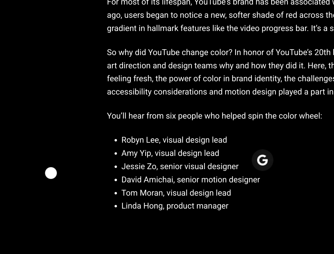
> You’ll hear from six people who helped spin the color wheel:
Maybe I'm being a bit mean to UI/UX in general, but does it really take 6 people to decide a slightly different shade of red ?
I do appreciate good UI and UX but sometimes it does seem some of them are just trying to justify spending so much time and money on these (to me at least) banal things..
The page's background turns to fairly unpleasant pink once you scroll past the middle point. Is that the norm for design.google blog posts or is it some kind of subtle messaging about the new gradient?
Also the replacement of the mouse cursor with that negative-color circle is visually interesting, but it suffers a lot from input lag which gets on my nerves.
Also, For Anyone's Info, black-on-red is impossible to read on monochrome displays. As with e-ink. Lesson learned as an anti-copy tactic for uni note-taking services, back in the day.
(Possibly not YouTube's core demographic, but a blog post shouldn't do that.)
Am I right that this article nowhere compares against the current red or even has anything with the current red in it, anywhere?
Is that a policy choice there? They don't want to.. not be future looking or something? I don't really get why. It made the article frustrating to read
I suspect it's because they don't want you to focus on the past, only the present. Or maybe it's because it would either highlight how irrelevant the change is, or how annoying the new one is.
sorry to contact you this way, but you mentioned frida and android emulator to use gmx freephone some time ago, could provide more details to this. Many thanks.
Glad you figured it out! Keep in mind it now has an extra clause that you need to open the GMX Mail app on 10 days every month after a year, not sure how/if they enforce it. Also, don't forget the disable the Datenautomatik in the portal.
I self-host invidious but in the last few months it has been struggling (slow buffering, often doesn't load saying media not recognized, etc, which I understand is YT being actively hostile). Any better options, or am I "holding it wrong"?
YouTube has been really cracking down on alt clients and YouTube downloaders lately I think.
I don’t even use one, and I see “you must log in to view this video” on videos shockingly frequently if I’m not logged in. Not even age restricted videos, they give that on any video at random now.
I wouldn’t be surprised if soon it will require an account to watch at all, and they will just get to ban any accounts that use Adblock or download anything.
YouTube currently bans every IP address with a lot of guest traffic. They have also banned all datacenter IP ranges.
Sometimes a "poToken" (a magic string that's used to 'validate' a client to prove that it's an official client) can be used to bypass this, but most of the time it's easier to just sign in with a Google account (which is also dangerous because YouTube has been banning accounts with unusual activity since last year[0])
Nowadays, most third party clients either use a browser/WebView to generate a poToken[1], or directly require a user to enter it for downloading[2]
I feel like the parent commenters issue is related to this, and it looks like there's an ongoing PR to implement support for it[3] (Invidious already had supported poTokens, hovewer their implementation were setting a single token in the config, and AFAIK that method doesn't work anymore)
Messing with the cursor like that feels so amazingly invasive and it makes using the page significantly more difficult. Is the point on the round cursor in the upper left? middle? who knows!
Before they worry about color, they should worry about typographic principles. The rag on the headings and line length on paragraphs screams "we haven't done this before." Haunting that this is the work of six people (all being paid extraordinarily well, I'd imagine).
I don't mind continuous redesigns or small tweaks. I like it when products and apps I use subtly but constantly change. Form and function are one, it's not form over function if it's done well.
But for YouTube I wish they realized that the majority of the design visitors experience is in the user created content. And they should start policing it. A good first step would be to stop having user selected thumbnails. Video titles should be under the thumbnail, not word-art added on by the creator. Then the video thumbnail itself should be just be a calm still image representation of the video. A video having a thumbnail with a person having an extreme facial expression overlaid with enormous neon text should just be throttled to get 0 views by hiding it from view.
Depends on how many people just refuse to ever click such a video on principle, or never start a youtube subscription so long as the thumbnails are like that. All you need to wait for is for that group to be bigger than the group of people who mindlessly click the sensational ones. I'm holding my breath until it happens.
Make it windows 95 grey for all I care, just , for the love of whatever is sacred, improve the DOM to make it run smooth...
I'm sure it is done to discourage you from using a browser and prefer their stupid app.
3 times the page just scrolled to the top. Doesn’t seem like the UX team at google really knows anything about user experience but gradient colors keeps things fresh!
A lot of people suggesting paying for Premium. Value for money arguments aside, I see a huge problem here: sharing even more data (personal financial information) with Google.
I, personally, have zero trust in Google. That’s a company that went from “Don’t be evil” to “Be as evil as needed as long as it’s profitable.”
> Linda: We want YouTube to be a welcoming space for our broad user base regardless of demographic, so we stayed away from colors that felt domineering, cold, or corporate.
She's making hundreds of thousands of dollars, while most intelligent, honest, hard working people will never have any chance of owning a home or starting a family. That's all I could think of when reading this.
When I was in college just a decade ago, my rather old computer science professor had an entire bookshelf of books: A reference library. Half of this reference library was books on UI design and UX best practices and how to make human friendly and human-centric interfaces.
This hard-won knowledge was the result of decades of observation by groups like the entire armed forces of the US on how to make systems that a 20 year old non-expert in a stressful situation can reliably use. It was the result of sticking people in front of computers and watching them make mistakes and figuring out what they intended to do and happen, so we could understand how people interpret an interface, and we used this research to make interfaces more discoverable and human-friendly. It lead to things like https://en.wikipedia.org/wiki/Fitts%27s_law . All this work was used heavily for example in Windows 95 to make an interface that grandma would be able to use. This research is why my mother was able to eagerly utilize computers for her work with minimal training.
But fuck all that I guess. Why base UI and UX on empirical study when you can just make bad faith A/B testing prove whatever you want and just make a red more magenta because your company makes a billion dollars per employee and has a captured market and hasn't had to actually build anything useful in decades.
Amazing. Yet another overly specialized mobile website. Can't read the article because every few seconds it just scrolls back to the top.
I miss the days of html and little js.
CssZenGarden always had it right. That's where I learned early modern css during that transition from web1 to 2.
Whatever it's a new thing from Google that will make it more difficult to use whatever their product is.
Just disregard that millions of people know how to use things as-is, but to justify their jobs people need to change things that are working ok, instead of trying to do minor changes to improve the experience for the people on the edge.
Apparently it takes time to change a color, because in Germany we still have the old red. Bonus: There's already Telekom, which bases its entire Magenta brand about... the color Magenta.
I just added this to my userstyle CSS for YouTube:
  /* Remove pink tint from end of progress bar */
  .ytp-play-progress.ytp-swatch-background-color,
  .style-scope.ytd-thumbnail-overlay-resume-playback-renderer,
  .ytp-scrubber-button.ytp-swatch-background-color {
      background: var(--yt-spec-static-brand-red) !important;
  }
This is a manifestation of Google drowning in excess headcount and unable to innovate because of endless fake make-work nonsense, where a team of highly compensated designers make the site less usable (gradient on the progress bar? Really?) and make changes for the sake of change, just to make it look like they are doing something.
People do love trumping up what they have done. Developers feeling their project was absolutely essential when it might be more about NIH. But are any categories of people more used to trumping up their pointless work so high that any reasonable person would be too shameful to attach their name to the narrative? I guess PR people and politicians can compete with them or even take the first two places.
This doesn't take away from what wondrous thing a designer can achieve. It's an enormously difficult thing to design something that's functional and pleasing and in some cases provide a mood (calm, fast, serious). This sort of bullshit from what I imagine uber expensive designs rebranding major corporations simply highlights the value and rarity of a good designer.
I'm curious were they ever serious about their craft? Or the pursuit of promotion and glory took away their original ethos or they drunk the cool aid so much that they actually believe what they are saying?
Well I just want to say thanks to Robyn, Amy, Jessie, Linda, David, and Tom for these changes. In retrospect they probably played a big part in keeping me on YouTube watching videos. Money well spent!
That song is directly inspired by the Pepsi nonsense; the lyrics and backing video [1] have some direct quotes. Definitely the first thing that comes to mind each time a multi-billion company decides to change their logo and nobody likes it.
"Redesign Your Logo" was actually directly inspired by this exact brand redesign document, so your instinct is well-founded! Here's a transcript of the official Spirit Phone commentary track where Neil mentions it:
I feel the same way when my AWS console asked me to take survey on the EC2 console. I replied that I don't know which version I was meant to comment on since it changes every other week, and that I hope someone gets there performance bonus. My favorite question was "it feels modern". Like just leave the damn thing alone. Rather than worrying about useless small tweaks like a gradient, make sure the core features of the product work.
A whole lot of nooks and crannies of the AWS console are missing major convenience UI features, and usually when a console is redesigned it solves some reasonably major pain points.
there's a chasm of difference between fixing something that's broken and redesigning. the vast majority of people will not recognize a slight shift in hue of YT Red or YT Magenta gradient, and of those that do most won't care or have their lives made better or have an improved world from it.
After reading this, I feel like Arthur Dent having an unshakable sense of the color magenta level of snark.
What’s frustrating about tech industry is that they are probably getting paid multiple hundred thousands of dollars for this. Meanwhile I know of engineers at Google who are being managed out for “performance reasons” after being gaslighted into working 60+ hour work weeks.
Ultimately, average engineers are not a valuable resource they can be replaced within hours.
Even a few actual good design talents is going to have a much bigger impact on product success than an entire room of average engineers who’s skill tops out at react spaghetti.
I often think about how much more cost effective some companies' products would be if they would decide their product is "done" and that they accepted moving on into a cash cow type of phase.
There are major websites and web-based products like Craigslist, Wikipedia, and Steam that are handling insane Internet traffic with comparatively tiny levels of staffing when compared to YouTube or other giants.
I think those companies have accepted that there is no rush to make major innovations or changes and that hiring a large army of talent is far less cost effective than having teams that are small enough for everyone to know each other.
> There are major websites and web-based products like Craigslist, Wikipedia, and Steam that are handling insane Internet traffic with comparatively tiny levels of staffing
Hacker News. (Not "planet scale", but very impressive traffic/staffing ratio.)
There's a lot that goes that you don't notice, or that you easily forget about when you make a comment like this.
The introduction of a gradient and accent actually enables and makes it more natural to use more eye-catching effects on the platform. For example, when a YTer says "subscribe", a rainbow (IIRC) animation plays on the subscribe button. When you like or subscribe, an animation plays that now has more color to it. These animations feel satisfying and I dare say have measurable impact.
At the same time, the changes are so subtle that users hardly notice a change that they will have difficulty getting used to, and also already present components do not look out of place if they don't get refreshed.
That is what an experienced design team is paid to do. Complaining about seeing no drastic change here is like complaining about engineers making no user-facing effect when they refactor the underlying systems in preparation for future developments.
> We change the product constantly — we’re talking over 1,700 updates per year!
Good job, the new red is a huge improvement.
Meanwhile the YouTube comment sections are still getting pummeled by bots, trying to scam viewers with fake crypto offerings (90%+ involving an "Elon Musk giveaway") or writing entire threads praising the great investment returns from a genius trader named "Mr Definitely A. RealName" who operates only on WhatsApp.
Take a look at the comments under this video for example, all the references to AMZ6OP are for a scam crypto token that they pretend is being launched by Amazon: https://www.youtube.com/watch?v=JRd_wNHJG4o.
I'm having doubts even reposting this link… please do not believe for a second that any of these claims are real.
I guess changing red to red-ish magenta was apparently more important than addressing the widespread issues that have been plaguing YouTube for years.
>I guess changing red to red-ish magenta was apparently more important than addressing the widespread issues that have been plaguing YouTube for years.
I have a suspicion that the color and design folks are not the same people in charge of comment section spam/bots.
Google laid off over 1000 people (100 in YT) last year. So at some point they did make a conscious decision that the 6 people making the red slightly more purple were more important than 1000 other roles.
Apparently most were working on content creator relations, a lack of which is probably #1 in "widespread issues that have been plaguing YouTube for years" if you surveyed the people who make platform what it is. You also can't convince me 0 out of 1000 google employees are capable of taking on a spam prevention role. On a long enough time scale headcount is fungible.
>You also can't convince me 0 out of 1000 google employees are capable of taking on a spam prevention role.
Similarly, you can't convince me that laying off 6 people would make any difference (let alone solve) any of the spam, bot, or content creator relations issues. So I guess we're at an impasse.
It's somehow substantially less surprising to me that a video deep dive on cryptocurrency has these comments. Youtube should address it, but to a degree it's very much expected/comes with the territory.
I don't follow cryptocurrency on YouTube (and in fact I made sure to "not interested" the link you posted, no offense). Anyway, I don't follow crypto and as such haven't had the issue you described.
YouTube comments have been and always will be a cesspool. You should consider yourself luck that they actually improved quite a lot (at least in terms of toxicity and "stupidity") when the thumbs down button was nerfed.
I agree. The subscription model is actually pretty decent at allowing you to find stuff from the creators you care about without having a ton of algorithmic "for you" content shoved in your face.
Yes, obviously YouTube does still wield enormous power over what shows up on the home page and in the "watch next" queue, but it's still overall far less invasive than the tiktok/reels/shorts model, and gives me way less cause for anxiety about the political motivations of whoever is pulling the strings on that algorithm behind the scenes.
Non-sequitur aside, what specifically do you want to post on YouTube that's not allowed? To me it seems like you have to go pretty far off the rails before they'll step in.
The down votes are kind of telling. There exists no censorship and anybody who says anything to the contrary has to be censored? If people don't like the answer, they should probably not ask the question.
Now you know why everybody loves the great leader. Because they make sure that the people who don't love him shut up.
I was born in a place where everybody agrees with everybody else on every issue, because if you don't agree in every detail you are shunned and shamed as a heretic or suspected enemy spy. Then you cannot have open discussion of anything except of discussing how much you hate people who don't think like you.
I quite agree with the YouTube policy with respect to health. Where it comes to health, I don't think that the layperson without the equipment and education to provide an opinion based in evidence should have a voice.
I will agree with you that the ban on RT comes selectively. The cited reason is that RT trivialized the Ukraine invasion, but the same criticism can be levied against the many news outlets that trivialize the Gaza genocide.
- When I search for recent news e.g. "australian medical staff jewish" (current topic), all the results are left leaning responses. I would mostly prefer to see the original video without commentary and uncut, and also would like to see more right wing responses. (A lot of issues over the years that were right leaning would just surface late night comedians mocking the right wings perspective on such issues)
- Looking up medical or scientific claims that are "indisputable" e.g. climate change, covid. I was curious to see Kari Mullis speak about his claims around hiv/aids correlation but only one or two videos exist, I had to go to the alt-youtubes to find speeches and lectures he did.
For the first example: that’s not censorship? It’s just a bad algorithm. Also, I don’t even know what “left-leaning” means in this context; the top result is from the Australian national broadcaster, and seems pretty straightforward. No one thinks nurses murdering Israelis is a good thing.
For the second example: Mullis is literally insane, and you can still find his opinions on YouTube, as you yourself found. Did you try uploading those lectures you found yourself? I’ll bet money that they won’t be take down (except maybe for copyright).
To be a little less charitable: this is a persecution fantasy. The right wing is not being silenced by YouTube.
Youtube is probably the most reasonable of the social media websites now. Well it was until Twitter was fixed by Mr Musk, anyway.
People have been allowed to post crazy nonsense on YouTube for many years. For a short period they censored quite heavily (2020-2023ish) but theyve backed off. It has never been as bad as Twitter or Facebook were where milquetoast 2008 Obama would have been banned ten times over.
The ad was (not so obviously) AI generated; both an AI clone of his voice and an AI-generated face-swap/ lip replacement.
This seemed pretty surprising because it was fairly convincing. He looks like he is saying the dialog of the ad.
It's surprising because there's no way the creator of the ad got Hanks' approval to use his likeness; meanwhile Youtube is profiting by selling the ad. Seems illegal, yet i'm forced to watch the garbage.
The ad in general is part of a similar trend I've been seeing of these AI generated voices speaking fast about prostates or large eggplants (if you know what I mean) used with influencers' or podcasters' likenesses. I would never click on the garbage, and it's probably a scam anyway.
I just scratch my head wondering if this massive company realizes the garbage they are forcing into our lives.