I also built a wall (with literal wallpaper even!) in order to create the cover for a genealogy book that I created.
I knew what a wanted — an old fashioned looking wall with old-timey pictures of my relatives hanging on the wall. I also wanted a mantel with more photos standing on it that would run along near the bottom of the book cover.
I tried initially creating the cover in a paint program — layering elements together (wallpaper, photo frames, photos), adding drop shadows, but it wasn't coming together.
So I went to Lowe's and bought a 4' x 8' sheet of 2" insulating foam or some such, bought what looked like the oldest-fashioned wall paper, a gallon of paint, etc. In the end I messed up the lighting, but I suppose that is something I am still learning in photography. But I still liked the result.
My home studio doesn't have plain, unobstructed walls for some simple shots, and while a paper roll backdrop is a good substitute, sometimes you want a wall, or a corner, or you just want to use wallpaper.
So I built a massive construction with doubled-up cardboard sheet, girders made with pallet corners, these gigantic split pin things and hot glue, and then I spray-mounted wallpaper on it.
I also did it at the wrong time of year, when the air was still too damp and the heating needed to be on, so it didn't last an enormously long time before things rippled, because it turns out cardboard has some quite organic behaviours in moist air.
So it was almost a failure. But I'd absolutely do it again, replacing the cardboard with foamcore or thicker insulating board.
It was a really fascinating, liberating process to take that much control over the process, and I've been doing similar since, assembling my own photographic tools to a level that looks a bit like obsession.
I think maybe many software developers here don't understand the parallels between doing this sort of thing and assembling your "stack" for a few applications.
A true photographer's "tools" barely even start with the camera. There's a whole array of tools beyond that, beyond peripherals, that extend into the scene or into methodology.
I've been spending a lot of time on photography (though mostly w/ film cameras) during recent years, and only recently realized this is actually photographed. (It took long because I'm a long-time Linux user, so I barely seen the image.)
Many people say this would've been easier with VFX, but I disagree. The image has highly convincing details that would take a long time even for highly talented VFX artists to nail. Instead, with a camera, you can let the world do the work for you. The studio setup is also very simple (cardboard + acrylic panel + projector + fog) and easy to experiment with. I'm pretty sure photography was the right tool for the project.
I think if you handed this image to a VFX artist and said “make this,” they could do it. They probably could have done it back in 2015, too.
But the team making this image didn’t have it in advance. They just had some ideas they wanted to try out.
The story of how it was made is not just the story of the techniques they used, but also how they applied and adjusted those techniques to try things and see how it looked.
This image was “made” in that people built the stuff that was photographed, but it was also kind of “discovered” in that they tried a bunch of things until they discovered what they liked.
That’s possible in VFX too, but the process is different and too many iterations can quickly erase any cost advantage. This is one reason animated movies are disciplined about locking the script early in production. You can’t cost-effectively improv your way through an animated movie the way a director and actors can with a camera and a set.
I agree with all of this -- particularly the exploration and discovery aspects.
But a side note on this:
> You can’t cost-effectively improv your way through an animated movie the way a director and actors can with a camera and a set.
The Jim Henson Company is working on exactly the technology that supports this, actually -- the business of live puppetry capture as distinct from, say, motion capture.
This kit is expensive/bespoke but I don't know that it's _that_ expensive, set against how much money goes into making movies with large-scale bluescreen work these days. And it's wholly amenable to improv.
And now we are completely drowning in VTubers, who use software like Live2d that analyzes a webcam image and uses it to control the motions of a pre-made 2D character. I've only ever seen it done to spice up the video of people streaming video games but I'm sure there's someone doing no-budget cartoons with it. There's also Adobe Character Animator, which has been used for various TV stuff like a live performance of Homer Simpson or a few low-budget shows.
And then there's VRChat; a few thousand dollars of head-mounted display/facial capture/body trackers and you can get realtime full-body tracking. There's probably someone fucking around with making movies this way too.
At this point I'm pretty sure that you could get most of the functionality of that hand-tooled puppetry gizmo by just taking a sock and gluing a couple of ping-pong balls onto it and tweaking some tracking software.
Spaghetti Sorting is just one of the Analog Gadgets called out in Dewdney's "The Armchair Universe" (originally in his Computer Recreations column in "Scientific American"). There are many other cool ones (beginning on page 28):
>> contact-and-removal operation takes constant time, the worst-case time complexity of the algorithm is O(n).
How is the contact-and-removal operation constant time? How can that assumption ever be true? If you use a parallel processor like human vision or human feel (ie. which pressure nerve activates on the hand) it may appear constant, but if you use a computer it would be n right (as you would need to check n slots). Wouldn't either defy O(n)?
The analog algorithm described is not described for digital computer. It’s an amusing theoretical thought experiment and not a recipe for actual fast sorting. It’s O(n) when you use your hand for contact and removal. I don’t know if it’s possible to implement spaghetti sort on a computer, maybe not, but I guess if it were possible, it would probably at least require n processors to sort n elements. Maybe the nearest analogy on digital computers is radix sort.
Depends on the mathematical framework you're working with.... there's a genre in theoretical compsci that deals with parallel algorithms, and as a toy example, I remember an O(1) sorting algo (given O(n^2) processors). This example is more fun than anything, but ofc in general you're free what constraints you subject your statements to.
You can simplify the "human hand" to a rigid metal sheet that comes down from the top and stops on the highest object. Still constant time, but no "parallel processing" needed.
The point is that reality itself is highly parallel
I wonder if the removal operation is not actually O(sqrt(n)). Depending on the way we structure thought experiment of course. But as the pile of spaghetti gets bigger, the act of picking the largest one is constrained by:
1. how fast your hand can reach for the next spaghetti piece - on average proportional to the radius of the pile of spaghetti, which is proportional to sqrt(n).
2. to actually notice the biggest piece, you need to again wait for a time proportional to sqrt(n) - light propagation is not instant.
So if we start thinking about this algorithm more like a computer scientist would (how fast it is as n grows to the infinity) it doesn't seem to be O(n) IMO.
Of course, all computation is just setting up some physical stuff in such a way that, after the laws of physics play themselves out for a while, that physical stuff will be in a new state, and you'll be able to interpret your desired result from that new state.
Which details are you thinking of? I was under the impression that with ray tracing, physically based materials, and fluid dynamics our computers wouldn't be hard-pressed to realistically render a static scene with light (of varying coherence and other properties) going through a piece of plastic and hitting swirling fog.
The parameters of the scene need to be set up, yes, but then it would be just as easy to generate a few thousand frames from it. Also it's easier to version control for experimentation.
Specular reflections and diffuse media (fog) makes for massive render times though, in my experience.
I did something similarish with water a long time ago, using a spectral renderer, finding spectral data for ocean water absorption and reflection, realistic spectral sun/sky model, and a physically-based ocean wave simulator to create the surface.
The underwater "caustic god rays" looked very nice and realistic, and setting it all up was easy once I had found the data. But it took ages to get rid of the noise.
That’s a reasonable guess if you don’t follow graphics developments, but the tech for producing realism hasn’t changed that much in the last 10 years, most of the realism developments have been incremental. The main thing that’s happened in CG in the last 10 years is speed and scale improvements. There were great fake-or-real CG photo contests in 2015 and earlier where some of the CG was photoreal enough to trick most people. The Windows wallpaper definitely could have been 100% there 10 years ago, for a skilled CG artist who knew what they wanted. The reasons for doing it practical don’t necessarily hinge on whether it was possible to do it in CG, there are good reasons to do it physically anyway.
The Stranger Things intro scene is CGI. Artists were consulted who originally created similar titles in the 80s with practical effects to see how they could do it too. The old-school artists said to just do it in CGI because that’s what they would have done.
I recall Amazon’s Lord of the Rings title sequence [1] received some criticism for looking fake, even though they filmed it practically [2]. I’d guess it was due to folks assuming title sequences are CGI, combined with the fact that few people really know what poured liquid metal is supposed to look like.
There's a similar problem with gunshots and explosions - we want what movies have given us which is not what they actually act/sound like - so much so that live recordings of actual gunfire/explosions is often deemed "fake".
Yes. But why would you do all these computer-ish things to provide a backdrop for a computer? Where is the creativity in that? Where is the attitude, the whimsy, the irony, the juxtaposition?
Considering how much of current technology stems from geeks just proving that their crazy idea could work and looking for money for it afterwards, the disrespect here for another geek's craft and intuitions is wild.
I would have used VFX for this as I'm pretty sure it would have been more cost effective to achieve a similar result. Most people, like me, probably just assumed this was VFX anyway. But I'm glad Microsoft didn't though, as this is a fascinating story and case study.
the ironic thing is they have all those photos of real life places they use for wallpaper those are all photshopped to an insane degree to remove the ugly trees and clouds and other natural formations and make the colors extremely different
Honestly it’s way more satisfying to work analog. Experiencing the colors in “real life” spatially. Also, collaborating with others and being able to share the process in a studio rather than on a screen is an amazing experience.
Another thing is the fog rising up to create diffusion on the light. Even the best VFX in the world will only ever be an approximation to the real thing.
Nah that's post hoc rationalization. The amount of busy-work that went into it is ridiculous. Just because a colossal amount of effort was poured in this wallpaper doesn't mean that they used the right tool for the job or that the output was better because of it.
You're thinking like an engineer, and speak as if there is a right amount of time to spend on artistic endeavours; if you cross this threshold for you it is a "ridiculous and colossal amount of effort".
Budget aside, art isn't constrained or criticized by how much effort the artist put in.
All that matters is the result. A wallpaper or any other artistic creation isn't less beautiful or evocative because the artist spent thousands of hours on it.
Even without getting into semantics about "what is art", the reality is that this is promotional material for advertising. This wasn't commissioned by a rich patron to put up on exhibition for MoMA.
This isn't to take away from the artists skill, effort, creativity etc. but the context of this is inherently a business and economic decision. There's no artistic impetus, no political/social/cultural message.
It's a computer wallpaper that monopolistic megacorp funded to show off how wealthy it is. It's a very typical "look at how much money we spent" exercise to showcase success or whatever.
> Even without getting into semantics about "what is art"
They say, before making comments about what they think is art :-)
> There's no artistic impetus, no political/social/cultural message.
There is, as you state in your next couple of sentences:
> … monopolistic megacorp funded to show off … typical "look at how much money we spent" exercise to showcase
You can, probably rightly, call it a crappy impetus. But that was impetus for the exercise and could be called the artistic impetus. Even if you disagree strongly on that particular point, it is definitely a message.
To be slightly more fair, that wallpaper is a major part of the initial impression people have of the OS version, much like XP's Telly Tubby Hill did. The XP image was trying to convey “friendly, welcoming”, the Win10 one tries to convey something more like “dynamic, technically competent, flashy”. While it may not be an expression of someone's inner feelings or a societal property or anything like that, some art is more about directing your impression of something than it is about expressing someone else's and that is what this image was for and what it does.
> Even without getting into semantics about "what is art", the reality is that this is promotional material for advertising. This wasn't commissioned by a rich patron to put up on exhibition for MoMA.
99.9999% of all art is not commissioned by a rich patron to put up on exhibition for MoMa. It's just something that artists do.
IT geeks are all for imposing their own creative restrictions on their work -- using Haskell when the competition is using PHP, developing their own distributed network persistence layer on top of SQLite when there are products out there that already exist but they just don't like for pseudospiritual reasons.
But artists who just make pictures are expected to be cost-effective and not to put any value on their artisanship?
You know, it's art even if it has no ambitions to be exhibited at the MoMA.
> It's a computer wallpaper that monopolistic megacorp funded to show off how wealthy it is.
Groan. It's not possible to have a serious discussions with someone starting from such a cynical position. After all, what is even the point of creating anything? We're all going to turn to dust and be forgotten forevermore.
The point is it's poorly done by the standard you'd expect from top level no-expense-spared commercial graphic design. And that reflects poorly on the company and the product.
The Win XP field was the opposite. It was organic, calming, and oddly fascinating because you couldn't tell if it was a plain photo or an edit or... what. And it had an unexpected reference to the Windows branding in the composition.
Win 10 was more like meaningless window-shaped visual noise.
Again, it does not matter, and it is entirely subjective, if art is poorly done or not. It does not matter if it doesn't calm you. It does not matter if it reflects poorly on Microsoft. Why do you care so much?
Like it or not, art exists in a vacuum. It does not need to justify its existence. That's the very definition of art.
It's a ridiculous and colossal amount of effort from (I think...) 34 people for something that looks like it was knocked together in a garage.
The proportions and composition are weird, messy, and obviously asymmetric in both axes. Both the horizontals and verticals are slightly off, which makes it feel unsettled.
It seems quite clumsily edited, with a blotchy cut-off at the left that feels claustrophobic and doesn't seem to be there for a good aesthetic reason.
IMO it would have been stronger and more powerful rotated left through 90 degrees so the light was shining down.
"All that matters is the result. A wallpaper or any other artistic creation isn't less beautiful or evocative because the artist spent thousands of hours on it."
Disagree, HEAVILY, a ton of the biggest marvels in the world are so because of how much work was put into them.
I always assumed it was CG because there are aspects that look unrealistic to me, in particular the bloom along the edges is too bright compared to the illumination of the rest of the panes and the light beams coming from the on the corners looked artificial. Turns out it looks this way because they projected brighter light on the edges and corners. Neat.
When I saw this headline I mixed up windows versions and thought it was going to be about the Windows 11 Bloom backgrounds, which I always assumed were made with physical materials, but it seems like I am wrong about that one too, hah!
Agreed. As a tech artist, I'm 100% positive I could get a bang-on reproduction using Arnold or some other really solid photorealistic rendering engine, but it would probably take longer than using real cameras, practical props, and doing a bit of massaging in post. The modeling, color, camera angle/focus length/etc. are all really easy. Tweaking the subtleties in the light, glass shaders, fog, etc to get them good would take quite some time. It would only make sense if it needed to be animated or you needed a bunch of versions with modifications. Definitely a 'use the right tool for the job' kind of thing.
> Unfortunately, due to the nature of volumetric rendering, I was unable to economically render the final animation at a high resolution with enough samples. So I had to resort to denoising, which sadly degraded the image quality and made it a bit flickery.
> Perhaps, with enough computing power, I'll be able to return to this project in the future and provide a cleaner final render.
Not that I'm saying the video doesn't show some skill, but creating a fresh image from scratch is quite a different task from recreating an existing one directly from a reference.
It doesn't look as good and Blender/3d modeling software in general have come a long way in the last 9 years or so (Windows 10 came out in 2015)
Sure it could can/could be done but it would take a lot of time to get as good a result. Probably easier to just photograph it for real and photoshop a little bit.
Despite having seen this image thousands of times, I never considered it might have originated from practical effects, even if it was composited. Very cool.
The composite sounds like no picnic, either:
>With over 3,000 photos captured from the shoot, the initial stage of the composite was an exercise in patience as Munko diligently went through all of the assets and picked the best ones suited for the final image. He then dusted off his old 40 year-old designer fingers and brought them into Photoshop where he tirelessly combined exposures at a blistering 9k resolution.
He first build up the base image, which was obviously the foundation for the hero still, flushing out the core logo design with a variety of laser-infused illuminations.. These core layers were varied, ranging from minimal rim-lighting to a multitude of laser lines fanning through the central portions of the logo, lighting up the volumetric haze in a variety of artful ways. Compositing all these layers together was an extremely iterative process and was done in collaboration with Daddy Bear Art Director Ryan Vulk and Creative Director Christopher Ashworth, the two senior Directors on the Windows Brand Team.
Once the lovelies at the Windows team and up the ladder at Microsoft were happy with the aesthetics of the logo foundation, Munko then composited in the environmental passes, which consisted of separately shot layers of smoke and haze to create a very moody palette and accentuated the qualities of the practical approach.
The final touches were the lens flares, which were again shot as separate passes but were flaring the lens with a light source positioned in the same place as the laser projector, so the flares lined up perfectly with all the other passes. The final grade was applied to bring everything into the signature ‘Microsoft Blue’ palette, but still leaving a tonal range that kept everyone happy. The final 9k file was then sent to the magicians at XYZ Creative Production Agency, who specialize in high-end photo retouching and did the final optimizations on the hero image.
This is basically how product photography works if you’re on a budget. You keep the camera fixed in place but adjust the lighting between shots. Then, in post, choose your favorite components of each image and composite them together in Photoshop. I like watching a YouTube channel called “workphlo” that does this. The core process is the same for all of the items, but it’s quite enjoyable to see him vary the techniques.
Compositing like this is a nearly inevitable part of almost all product photography, I think? Anything that has motion will lean towards compositing for all the surrounding elements. Except those incredible people who built motion rigs for burger drop ads.
Capture One (the kinda sorta still industry standard tethering/photography capture software in the marketing industry, for all the high-end kit) has a really nice tool to help with previsualising compositing live.
Agreed. My thought on this enabling a "budget" option is that you can get the look of an expensive, multi-light studio with just a single speedlight and a lot of compositing.
> With Bliss, Microsoft went a step further than merely licensing it: they bought the full rights to the image meaning no company would ever be able to license the photo from Corbis again, as the image was often used as part of XP's marketing and the Luna theme is modelled around its color scheme. It was purchased for an undisclosed amount of money in the low six figures; O'Rear cannot reveal the exact amount without violating a non disclosure agreement. He did not receive the full cost as Corbis handled the sale. As a result of its Microsoft acquisition, it was permanently removed from Corbis' website and has never been available on Getty Images or other sites that Corbis cross-licensed photos to. The vertical shot was also included in the acquisition, as O'Rear cannot release it due to his agreement with Microsoft.
I mean, that's not surprising at all that they would want to own the image. It would be ridiculous if that was also being used to advertise vaping or Bitcoin or something.
Also interesting: Brian Eno on his work composing one of the Windows startup sounds:
> Q: How did you come to compose "The Microsoft Sound"?
> A: The idea came up at the time when I was completely bereft of ideas. I'd been working on my own music for a while and was quite lost, actually. And I really appreciated someone coming along and saying, "Here's a specific problem -- solve it."
> The thing from the agency said, "We want a piece of music that is inspiring, universal, blah- blah, da-da-da, optimistic, futuristic, sentimental, emotional," this whole list of adjectives, and then at the bottom it said "and it must be 3 1/4 seconds long."
This bit has always stuck in my head. Makes his longnow foundation work make more sense. Always find it wild that microsoft takes the time and spends the money on such tiny details in their products.
That Microsoft Natural Elite on the left side of the image is still the only keyboard I use, or will use. I have a stack of four backups in the closet.
As already mentioned it was the install setup, and it's my favorite Windows background to date as well. It's actually a 2 bit image with all blue and black, with dithering. It's very comforting in my opinion.
(Disclaimer: no special insights into what Microsoft was doing at the time; I merely lived in the same era.)
I'd call it an artifact of only having 16 colours to work with when SETUP boots. Obviously, most machines at the time had more to work with than that, but VGA - which is to say, 16 colors at 640x480 - was the baseline. And remember that Windows 95 could be installed from _floppies_; looking fancy is good, but you don't want to gratuitously use disk space. No multiple versions of the same image for you!
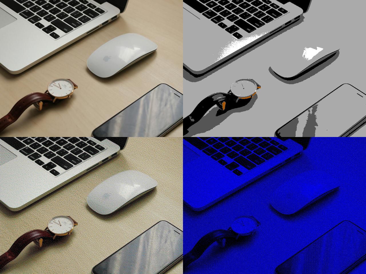
Let's take this fancy "Mac with some other random shit on a desk" image from Unsplash:
(I know, the images are small on a modern display! Each square is full-size, because we're VGA.)
Top left is the original, obviously. Top right is what happens if you just reduce it to 16 colours; it looks like nothing in particular, and it weighs in at 153K (exported in a modern graphics editor), or more than a tenth of a 3.5" floppy disk. Bottom left is what happens if you do it with dithering; you can make it look like you have more colours than you actually do, but it also weighs 153K.
And bottom right is SETUP.BMP. It only uses _two_ colours from the palette ("0, 0, 255" blue and black). That's 1-bit colour which means my SETUP.BMP when exported to an actual BMP only takes up 38.5 kilobytes.
So the answer to your question, I suppose, is "use as few colours as possible and don't waste disk space" or "dithering" or "the 90s", but often the technical limitations of a period plus time become an aesthetic.
If you refer to the color and not the composition, it's called halftone. Unlike analog halftones, you calculate where to place the dots in a way that minimizes visual error, called dithering.
Something I find deeply funny about this is the amount of work invested here just to have the default background quality setting in Windows 10 still be < 100%.
In Windows when you set a wallpaper it (sometimes) silently transcodes the one you selected into a new, smaller version. It doesn't always, there's a heuristic, but it's assumed it happens to prevent people from selecting a 1TB terapixel photo and have it destroy the machine.
Anyway, since it transcodes the WP into a JPEG, it has the ability to select a compression ratio. That ratio is pretty famously < 100% and as a result there's some degenerate cases where a wallpaper that looks good when viewed in the filesystem looks terrible when set to the background.
I've seen machines which needed to swap to show the desktop, because the wallpaper was a high/true-colour BMP and it was like half the memory the machine had!
Right, I feel like between that and seeing it a lot over remote desktop I've never really appreciated the quality of the original. I always liked the wallpaper set from the windows 9x era because they were designed to look good in low quality 256-color modes.
Microsoft got Windows where it is by having no sense of self-respect and willing to play the B2B race to the bottom. And it remains dominant thanks to decades' worth of legacy software that needs to continue running.
So that's cheapness and momentum.
If Windows was ever a beautiful product, it certainly isn't now. It would never become popular today in its current shape and principles.
Anyone can say that about any product. That doesn't make it true. Windows is a successful product that satisfies a need that people and businesses have. You can't fake dollar bills.
>Microsoft got Windows where it is by having no sense of self-respect and willing to play the B2B race to the bottom. And it remains dominant thanks to decades' worth of legacy software that needs to continue running.
>So that's cheapness and momentum.
>If Windows was ever a beautiful product, it certainly isn't now. It would never become popular today in its current shape and principles.
I'd rather sell a hundred million copies than convince some randos on the internet that my software is "beautiful".
The original Windows 10 wallpaper. In a later release, it was replaced by a brighter and cleaner version that was drawn on a computer. I personally prefer the later revision.
According to the wiki, it was not drawn on a computer, but created again in the same way as the first. I personally prefer the darker original, but most Windows users use light mode. It's cool that it has 25 people listed in the credits for what seems like a such a simple image.
> GMUNK was also involved in this version, and stated that it was created under the same methodology as the previous version.
If you have a chance and are interested in the subject, I highly recommend the Musée Cinéma & Miniature in Lyon, France: <https://www.museeminiatureetcinema.fr/>.
A lot of the promotional material highlights the sets, costumes and props from films on display, and they are certainly interesting, but far more interesting to me are the two floors of cinematic miniatures--diorama after diorama of physically-built miniature sets used as "virtual backgrounds" before they were mostly generated using CGI art (which I do appreciate). They are remarkable and remarkably interesting as pieces of art as well as cinema history. This story reminded me of this--sometimes the effect you want needs a tactile realism that is hard to replicate digitally, and is rarely as neat and toy-like.
> Our approach involved a live-action shoot using different variables and customizations.
What does "live-action shoot" mean in this statement? Wouldn't this just be "still photography"? When I think of live action, I think of people or at least ... action?
This is so over-engineered, it tells you that when you have billions, you do the most whacky things. A 5-minute VFX job will yield the same results. But no, there's so much f*k you money, they had to do this.
Traditionally, one of Microsoft's weaknesses was how crappy it looked against Apple. Maybe they are trying to say "we care a lot about making this look good".
I think this is actually an interesting question. I think I've been leaving on the default desktop on any computer I use, for over a decade now. It's not just that, it's every kind of setting. I just don't futz around with things that don't actively get in the way of my work anymore. I used to love to tweak everything, to try to pour my personality into a sweet computer setup, but after using computers for fifteen years or so, I just lost interest in that.
I've settled on a slightly custom setup based on Plasma and i3wm. It involves a single systemd unit running in user space. I get batteries included desktop environment and a tiling window manager I can tolerate. I also set up zsh+powerlevel10k. In all it takes me about 20 minutes to configure.
I don't know if there's a name for this genre of photography (it's not exactly
"abstract" since clearly things are being represented), but another example is the cover of Modest Mouse's Good News for People Who Love Bad News [0], which looks like a digital drawing or composite but was physically built and photographed by bandleader Isaac Brock.
We must not forget the legal side of this. Microsoft knows everything about intellectual property rights. If I were going to design a logo to be displayed literally billions of times across every screen running the windows OS I would make very sure it was beyond any conceivable infringement allegation. A generated smoke image might be up for some allegation of copying, that the generated smoke or some other aspect was "created" by the software. A physical photo shoot means zero possibility of any outsider having any contribution in the final image.
There are ways to make a dark background that looks inviting, but this is not it. And it has enough bright highlights to make it uncomfortable when you actually like to have a dark screen in a dark environment, so it’s also not a particularly good dark-mode background.
I remember the good old days when I would spend so much time choosing the right wallpapers for my PC and phone. Nowadays, the wallpaper is completely hidden from me because I am constantly switching between apps on macOS thanks to my Raycast custom keyboard shortcuts and I never see whatever picture I set...
It's a weird feeling. Kinda like letting go of the desktop-oriented computer in favor of window-manager-oriented. There's beauty in the former, and simplicity and elegance in the latter.
I used (like many many many) to do this. And one day I thought to myself.. hey.. that greenish background color of Win NT was cool (R0, G128, B128), wasn't it?
And then the Windows 2000 blue.. oh how beautiful.. (R60, G110, B166).
And later in life i switched to total black with dark mode for all my devices (and my eyes thanked me for it :)
Yeah when I read things like this, I always sit in awed wonder for a moment, trying to figure out where these people are totally full of crap, or whether they really think about things this way, and are just very different than me.
The alternative versions of this wallpaper are extremely pretty. I think it's awesome that they've been made available like this, I just wish they were available at a higher resolution. Would love to use one of the red or purple ones on my 4K display.
The very first thing I did when installing Windows 10 was changing the desktop image. It amazes me how many resources companies put into stuff that users don't give a peanut.
To me as a photographer and as computer vision expert, this sounds wayyyyyy over-engineered and -produced. I get that there's a big vision (and budget) involved, but c'mon!
Yup... but, if everyone thinks it's a rendering, and you could have saved tons of money by actually rendering it instead of doing what these guys did, it's still a waste of money if you ask me...
That can be said for many other artistic creations. But if you ask me, the fact that it was so elaborate adds something to it. The end result might be the same but the intentions and the process to get there matter.
Also, waste of money. We’re talking Microsoft. It’s not like those money we’re going to be spent on charity. They paid some creative people to do creative work. We should appreciate that.
But it has the air of the banal. For something supposedly so creative it seems to totally lack....creativity. I suppose 100% in keeping with a tech company's vision for what a computer desktop should look like.
(That commercial literally had Honda execs complimenting the team on the quality of their CGI when they first saw it. Needless to say they were blown away when they found out it was real.)
That awesome! The funniest part is the end though, where the car is revealed and it's boring and kind of ugly. The commercial is way too good for that car :)
Sometimes these things land and sometimes they don’t. XP’s grassy hill seems to have been universally loved but could easily have been seen as lazy.
Granted, MS used to actually take theming seriously. XP had an excellent marketing campaign that tied in with the visual scheme of the product. Even the OS sounds tied in with the choice of music for their commercials, “Ray of Light” by Madonna.
Now we just get the wallpaper and there’s no concerted effort to make a theme of joy or accessibility or creativity or anything.
It was lazy in the sense that photo had not been taken specifically for XP. It was a pro photographer seeing a nice thing to take a picture of with not specific project in mind, snapping it, then having it sold through a stock photo agency.
Gmunk was working on visual graphics for the web back in late 90s / early 2000s with Vir2L.
If they wanted to, they could have easily banged out half a dozen wallpapers in an afternoon using Maya or whatever, but they chose the physical route.
Yea, I appreciate their dedication but the end-product doesn't equal the effort when Jane in XBox 3d effects department probably could have done this during her lunch break.
For one still sure but they have made lots of movies from that set that were used for promotion. At some point this is a lot easier to get so much much material and quick variations.
It's a really cool project, but the video presentation was just horrible to watch. All I really wanted was to see the fixture in plain form, but they tease you the whole time.
* Blasting loud music
* Saturated with bragging, useless testimonials
* Blurring-in was more common than actually seeing the work
* Cutting away from the work to a human too quickly
Maybe I'm coming off as miserable, but this video was totally unsatisfying to watch.
When I was young we had a PC running Windows 3.1.1 (not the first computer I remember using, but the first one whose OS I remember the name of), and I recall it having this neat feature where you could draw an image in a tiny box and it would tile it across the screen as background image.
It probably wouldn't work so well for a "4k" monitor, but I thought it neat at the time.
Reminds me of someone once asking me how I got the hand-drawn pencil look to the type on an article in the typography magazine I published about the T-26 type foundry.
I drew it by hand with a pencil and scanned it.
I had another article headline where I commissioned an artist to carve the headline in stone and had it photographed for the printer.
Yeah I know, besides my keyboard has no physcial end/home key. But if websites do stuff like this, I usually hit Ctrl+w because my time is to precious to fight bad UIs.
It still doesn't measure up to xp's rolling hills or just about any macos default wallpaper. Nature is really pretty and hard to compete against. Small things like this say a lot about the overall product design philosophy in my opinion.
Brilliant! Just today, I was listening to a panel of world class artists being asked (now trite) questions on AI taking over their jobs and they concluded something like:
"For mediocrity, turn to AI. If you want masters, call us".
Seeing that they put that much attention to detail into a wallpaper, it seems petty to get hung up on the fact that their software is a shit show. So it's all forgiven.
I certainly can appreciate the artistry in building it and also I'm happy that the artists found joy in making it, but I can't help but wonder why MS bothered.
As impressive as this looks (and is), the effort strikes me as monumentally oversized. This particular picture, with its straight lines and everything artificial, could have just as well come out of a renderer. For substantially less cost, the result would have been the same.
Doesn't mean you don't need to have the creative vision first. But executing it with a camera and a light/laser/fog set and all the effort that went into it, seriously, just take a talented vfx artist and you get the same result.
It's different with nature photography and especially with humans. But there was nothing natural with this image.
That's like saying why should anyone at all make music, art, hire actors, etc., when A.I. will be able to do all of these tasks identically over the next couple years (partially already).
The human element is important. Because we're humans.
The final image is shaped by a variety of people observing live changes to the scene and giving inputs. You can't iterate as quickly when you're interrupted constantly by the artist having to modify the scene and then render it. I'm sure you would have made a nice looking image using a digital scene, but I don't think you can duplicate the experience. It would not have been the same creative atmosphere.
I'm pretty sure it'd be far faster for a team of people to view various options on a screen while an artist moved virtual lights around and played with colors and lens flair effects in a computer than it would be to wait around while people set up and move around various lasers and projectors and smoke machines between attempts and then looked at a screen to see how the camera picked it up.
But that's exactly what's interesting with this! Everything can't just be viewed through the lens of costs, the effort to make something unnatural like this in real life is part of the art itself.
If you're just looking at the end result, yeah, same result could've been achieved with VFX with a lot less costs, but it also wouldn't have as much value.
This rather speaks against Microsoft than for them. There was zero sense in creating a physical installation to capture it. The result feels digital and should have been digital. This speaks of Microsoft's poor planning and bad execution of plans and ideas.
This is such an ignorant take. The default wallpaper is seen by millions if not billions of people. Many never change it. It's an important part of the branding. The total cost of the shoot, including equipment, salaries, the studio, etc. is NOTHING to Microsoft and its marketing budget. It's not like they had to prioritize this over anything else, they are printing money left and right, they are a trillion dollar company and the default wallpaper is a key aspect of how people see their core product, Windows. It would be disastrous of them to ship with a sub-par wallpaper and in what world would the money "saved" would make a difference to "build a better product"?
Does Microsoft have plenty of money to do anything? Sure. Does the trillion dollar company spend an appropriate effort on the product itself? Certainly not!
The issue is this: From Windows 10 and up, almost every interaction with the UI is a little bit broken, and I could fill pages just describing things that used to work just right in Windows 7 and earlier. It appears the Windows UI is now designed and approved by the visuals only. And now we learn about a disproportionate effort to create a visual.
So it's easy to see how a comment that points out this discrepancy, resonates with everyone who is halfway through their thousand daily cuts of UI punishment.
And yet the best wallpaper they ever used was a lucky fluke by the photographer, who was driving through Sonoma after a rainstorm, in a year where they had to burn the vines off a hillside due to blight infection.
I don't know about you, but more often than not I have maximized windows covering the background image. The thing which reminds me I'm using Windows is the start button. Not to mention.. everything else.
I hate myself for saying it, but this feels like an artistic variation on "we spent 500 hours manually perfecting React button animations" or "I built a Lisp so we can have more interesting configuration files for our ... todo list app".
Bah. You're right. I'm being obtuse and need more coffee. Nerding out on things is fun, my whole life is based on it. I guess I feel some rivalry with the artistic world. Maybe it's jealousy.
It's kind of sad how often the best way for artists to get paid and have their work seen is by creating corporate advertising. At least in this case it's just a pretty logo and not a direct lie or manipulation.
Two main reasons to make it this way is to also generate movies for possible ads etc. And creative process - you get a lot more happy accidents and variety doing it this way over “draw anything” in photoshop which can be pretty daunting.
I don't know. I think a nice wallpaper can cheer up the day and make a system more lovely. Seems relevant when it reaches so many people.
However, I have never really liked this wallpaper (the few times I have seen it as a non-Windows user). The random desertscapes and dynamic wallpapers in macOS are really much more appealing.
I personally find this visual quite cold and soulless, compared to previous Windows wallpapers, mostly XP's of course.
For me this also coincided with Windows becoming completely useless and my moving to a Mac.
There was definitely a kind of warm, optimistic vibe that came with the Windows XP wallpaper. The whole UI language of the OS was similar too, with bubbly blues and greens everywhere. I suppose it captured a kind of positive cultural attitude towards computing.
I think it was aimed at making the OS look less threatening and complicated to a new user. Then again, people did complain about it being a "Fisher-Price UI", so maybe this overwhelmingly positive perception is a result of people spending so much time with the OS and getting used to the way things were.
I do recall the Fisher-Price complaints. As I recall it mostly came from the Linux (or Linux-inclined) crowd. I never really understood the complaints, though it was common enough that I must have just been missing something. But really, I don't get whats wrong with a functional UI that's also friendly and inviting.
Just today I was thinking about XP and the phrase "Fisher-Price" came to mind. I liked XP's UI, even as whimsical and toy-like (and easy to make fun of) as it was. I'd prefer if computers and OSes retained the whimsy and character of that late-90's-early-2000's era of Win XP and the colourful iMacs, etc.
Windows 10 with WSL, Power Toys and many other things sold me on windows for development.
I still use a MacBook on the move, but if I work from home I would never swap to OSX.
Way too many things annoy me: the filesystem, the file explorer, poor windows and multi monitor handling (to this date OSX sucks with 3 monitors and switches the output randomly when coming back from sleep/rebooting), the consistent issues with unlocking cameras/microphones, somewhat questionable support of non-Apple accessories (Bluetooth headset is an example), Docker support and there's some more.
Same feeling from me. Windows 11 could be the perfect OS if they dropped the anti-user features and pestering, and make new features like Copilot and AI stuff opt-in instead of being forced down your throat by major updates.
Basically have Windows behave like Linux, where you get the bare minimum and the letting you choose what to add on top.
> OSX sucks with 3 monitors and switches the output randomly when coming back from sleep/rebooting
This drives me nuts with my Mac at my workplace. It's mostly an awesome workhorse, but when I switched to Mac I was flabbergasted that this can be an issue.
The window-management I find also rather awful. When I asked the Mac-nerds I knew they all had their custom setup that includes some third-party-tooling, the built-in mission-control or whatever they call it didn't exactly receive favorable remarks...
> I personally find this visual quite cold and soulless, compared to previous Windows wallpapers, mostly XP's of course. For me this also coincided with Windows becoming completely useless and my moving to a Mac.
Honestly, I kind of feel that's the contemporary style. My employer recently moved to a new office building, and feel exactly that way every time I have to go there.
It doesn't help that it's 100% hoteled seating, so there's no "lived in" vibe to counter the sterility.
Start menu in W10 is terrible. Especially since they had wonderful menu in developer builds which I was using as my daily driver. But in the end they replaced it with this monstrosity.
I had no Windows edition since 98, which I didn't need to alter right after a fresh installation because of Microsoft bullshits. At least, it doesn't take a full day anymore to install and configure a fresh Windows.
Windows is really awful, and Macs are super limited in hardware. (It might work if you only do web dev)
Fedora is literally better than both. People are just so used to repeating the linux prayer of 'debian/ubuntu/mint', that most people don't know: Debian is an outdated/old distro with limited features and lots of bugs.
Fedora is up-to-date, loaded with codecs and drivers, works with Nvidia, and has a 10/10 pro-consumer experience.
No ads, no harassment, smooth, fast, everything just works.
Fedora favors shifting the technological overton window over shipping working software. I first tried Fedora out on the initial release which switched on Wayland by default -- this was in like 2017, or around there. I installed it, booted to the login screen, and then logging in went to a black screen which booted me back to login. I was on an Nvidia card which was unsupported and I had no idea what Wayland was, so I ended up uninstalling it in favor of Linux Mint.
It's not like they weren't aware this wouldn't work for the majority of the desktop marketshare. They didn't try to mitigate this by detecting your card and defaulting to x11. They did not apparently care. Evidently causing friction and getting the ecosystem to switch was more important to them then my machine working with their software.
I'm sure Fedora is great, but I think it's poor form to recommend it to people new to Linux.
I don’t want to be a fanboy but the wallpaper is so soulless and industrial. I like how Apple always tries to bring nature to computing with wallpapers and screensavers.
Apple has sterile attempts to pretend they're not sterile.
And that's fine. That's all it has to be. Something aesthetically appealing and universally brandsafe. But it's not not-soulless.
Have you ever read a F500 companies press release about a (re)branding or new logo or something? Where they retell the story the branding consultants told the executive suite about what the new image means and the vibe it embodies? But the end result is just bland nothingness that doesn't standout from the pack at all?
That's the energy in every Apple attempt to show personality. Hypercalculated and ultimately meaningless.
Yeah I do kind of love the current dynamic "different every time" Mac OS wallpaper / splash screen. It's corporate Apple but still great, and infinitely better than MS's Borg-like contentless flatness.
The Windows login screen has been showing dynamic landscape photos for a loooong time. Of course, the part where you accidentally click on one of the search labels (?) and it opens Bing in Edge (previously IE), which is one of the three hundred ways you can accidentally open Edge/Bing in Windows, is not cool at all.
> I don’t want to be a fanboy but the wallpaper is so soulless and industrial. I like how Apple always tries to bring nature to computing with wallpapers and screensavers.
To each their own. I personally have more than enough nature around me; I prefer it to not also invade my computer.
> Why do this when you can get an identical picture from photoshop?
It gives it character and helps ensure you'll get good artists to work on it. Though now I wish they'd made that clear by making the intermediate shots desktop defaults.
I knew what a wanted — an old fashioned looking wall with old-timey pictures of my relatives hanging on the wall. I also wanted a mantel with more photos standing on it that would run along near the bottom of the book cover.
I tried initially creating the cover in a paint program — layering elements together (wallpaper, photo frames, photos), adding drop shadows, but it wasn't coming together.
So I went to Lowe's and bought a 4' x 8' sheet of 2" insulating foam or some such, bought what looked like the oldest-fashioned wall paper, a gallon of paint, etc. In the end I messed up the lighting, but I suppose that is something I am still learning in photography. But I still liked the result.
https://imgur.com/a/12VN4sI