(Disclaimer: no special insights into what Microsoft was doing at the time; I merely lived in the same era.)
I'd call it an artifact of only having 16 colours to work with when SETUP boots. Obviously, most machines at the time had more to work with than that, but VGA - which is to say, 16 colors at 640x480 - was the baseline. And remember that Windows 95 could be installed from _floppies_; looking fancy is good, but you don't want to gratuitously use disk space. No multiple versions of the same image for you!
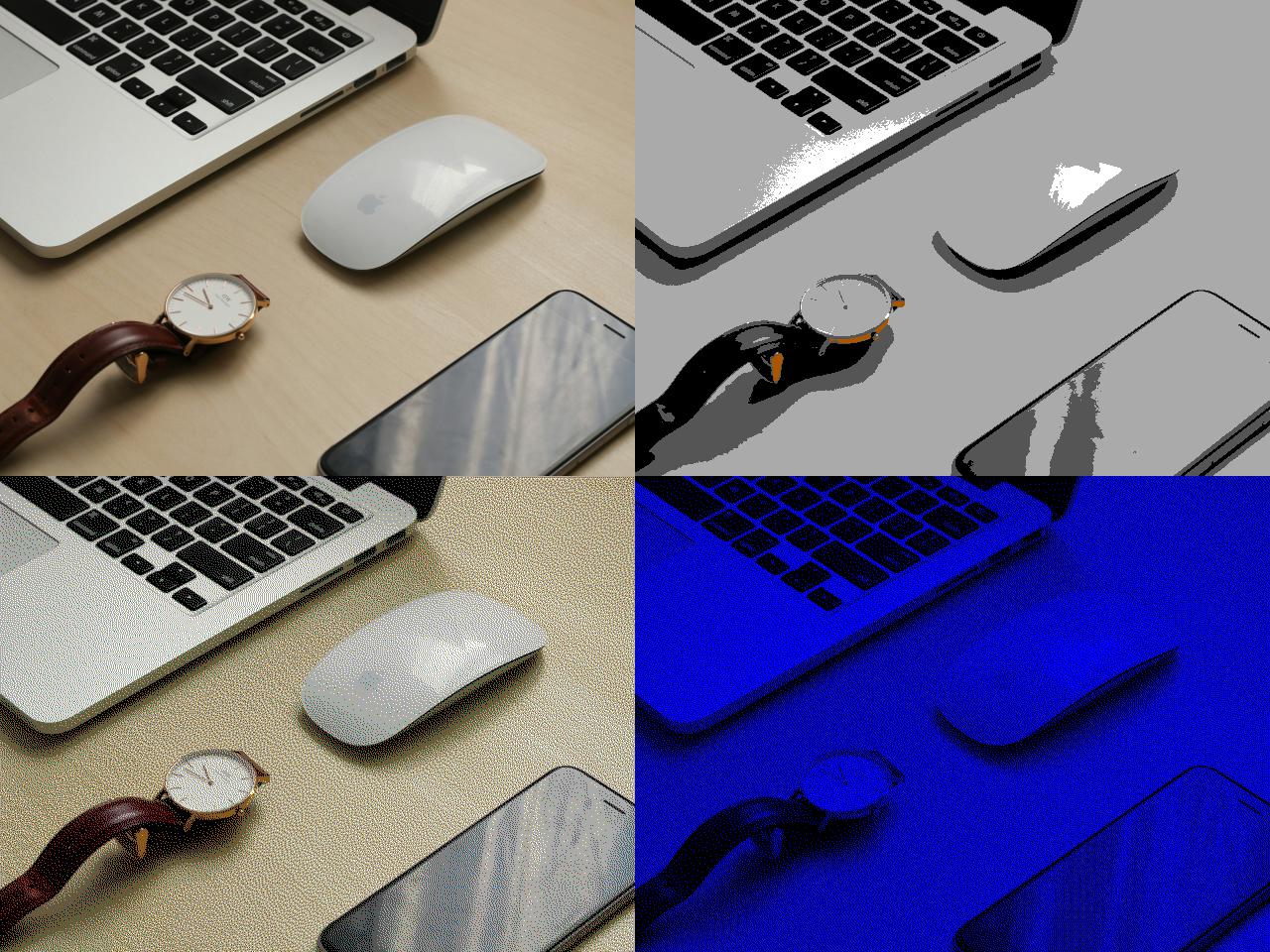
Let's take this fancy "Mac with some other random shit on a desk" image from Unsplash:
(I know, the images are small on a modern display! Each square is full-size, because we're VGA.)
Top left is the original, obviously. Top right is what happens if you just reduce it to 16 colours; it looks like nothing in particular, and it weighs in at 153K (exported in a modern graphics editor), or more than a tenth of a 3.5" floppy disk. Bottom left is what happens if you do it with dithering; you can make it look like you have more colours than you actually do, but it also weighs 153K.
And bottom right is SETUP.BMP. It only uses _two_ colours from the palette ("0, 0, 255" blue and black). That's 1-bit colour which means my SETUP.BMP when exported to an actual BMP only takes up 38.5 kilobytes.
So the answer to your question, I suppose, is "use as few colours as possible and don't waste disk space" or "dithering" or "the 90s", but often the technical limitations of a period plus time become an aesthetic.
If you refer to the color and not the composition, it's called halftone. Unlike analog halftones, you calculate where to place the dots in a way that minimizes visual error, called dithering.