You wouldn’t want a mandatory text field to insert a random string when you clear it (or have a random string as its initial value), just to maintain the invariant that it must not be blank.
In a similar vein, a set of radio buttons can be initially unselected, in order to force a user selection, even though only selected states are valid states.
The convention on desktop and mobile is not to have a submission at all. If you click one of these "mercury" buttons, you can always have up-to-date state.
Forms and submissions are mostly a web convention. I too think that's more natural, but there are a lot of existing contexts like settings where the expectation is that making the selection doesn't require an explicit "save" step.
That's a bad excuse. There are plenty of widgets that need to deal with illegal states in an auto-saving form.
For example, every text input that expects a numeric value needs to allow an empty string.
If you don't want to deal with validation logic in your app, you could just disable the last checkbox.
Also in practice this state does not happen in “apps”. Before the user reaches the screen, you must have set a default. If you have default, then “deselect all” will eventually revert to that default.
> The “one of [sic] more” component is exactly a list of checkboxes followed by a “confirm selection” button that warns you when nothing is selected.
> The constraints is enforce [sic] at the time of submission.
Perhaps it would be better to have all items selected initially. The user deselects those that they do not want. If they try to deselect everything then they get a warning popup at that point.
No. The GP is no different from a mandatory field. You can have a default value set, but then that should be a value that makes a good default for every user.
Multi-select or not, for inputs like language or region selection, there can be 200+ options. I think that’s why some form designers try to make a “best guess” at moving common options to the top. This frequently leads to annoyances like scrolling to the bottom only to say “where’s United Kingdom?”
This doesn't have anything to do with the context of this thread, but it's possible to have the same option at the top and also at its sorted position.
100% agree this is solvable with words and conventional form fields. But also - it’s usually bad idea to disable a form submit button. It deprives the system an opportunity to tell the user what they need to do (i.e. if it’s disabled you can’t show an error message) and for the same reason it’s bad for accessibility.
This doesnt really apply to the language selection, which is somewhat ironic. You can tell the users what they need to do, but... which language do you use to tell them to?
This control does not allow you to uncheck first and check another one afterwards. Its logic is not self-evident that undermines trust from get-go.
There is a principle "let user click" formulated by Ilya Birman, which means "let user enter whatever data they want and then deal with it separately". E.g. i'd like to be able to uncheck any checkbox before selecting a different one. Or clear the text to paste some other text. If there is a hardcoded logic that prohibits any of these intermediate states, people would be constantly frustrated.
Food delivery apps say "select one or more options" and let you uncheck anything with a separate validation. These guys literally make money by optimizing for happiness — their job is the best UX scientific experiment out there.
I’ll give it to Tog, the UI is creative, and it communicates its intention without words, but it’s awful to use. It feels like fighting the computer to choose a selection even after you learn the trick.
In particular it's "noncommutative" - I want to check English before I uncheck French.
I tend to agree with other commenters here that it's better to just make a checkbox list and require one to be selected. Or in cases like language, maybe have a primary radio (mandatory) and a secondary checkbox (optional) section, where you need to select a language for the app to show you thinks in but can indicate interest in other languages' content.
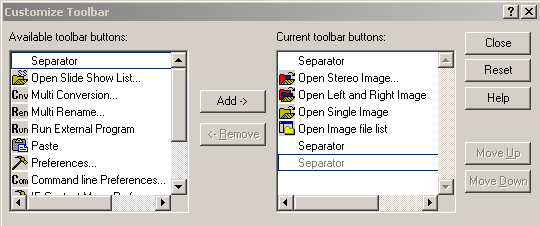
Another option, depending on context, is to have two panes with Add/Remove buttons like [0], where you can disable the Remove button when there is only one element, and provide some helpful text or tooltip.
iOS has tables. A table is a single column of complex cells that usually fills the screen. Cells can be divided into sections or not divided. The Settings app is almost entirely tables; so is a Twitter app, so was the iPod. Table cells can have a checkmark accessory—just a glyph, not surrounded by any shape—that is either exclusive to one among many rows or not exclusive. Originally, a single or multiple selection field would push another screen with a table whose cells would provide the behavior you want. Tapping anywhere in a cell selects it, displays the checkmark, and if desired removes it from other cells. The user pops the screen when done.
This is all the same as what you find in the macOS Menu Bar—items may be grouped between dividers, some items may disclose another column of options, some may have a persistent selection state, the selection states of nearby items may be mutual or individual. macOS menus also never had checkboxes or radio buttons but can have either kind of selection indicated by a checkmark. Table screens are menus.
iOS also decorates arbitrary objects like photos with a checkmark in similar situations—put the Photos app into selection mode for example. There is no checkbox control to aim for. You hit the entire object and it performs the appropriate selection behavior, which results in a checkmark being displayed or hidden.
I believe the reason iOS has an object decoration instead of either checkboxes or radio buttons is that fingers are blunt and users enjoy big tap targets. Trying to poke at a small circle or box to the left of some accompanying text kinda sucks. The whole of the text could be an active touch area but a user wouldn't know that from looking at it.
Have a look at switches for comparison—they're big, they can be tapped or dragged, they play haptics. But the text beside them does not activate them because it doesn't look like a thing you can handle, not like the switch itself, not like the checkmark-gaining photo or a mail message table cell.
I think the reason this question is still asked is that the HIG doesn't address expectations about a missing control. To my knowledge Apple has never in this era explained their design reasoning, maybe because intuitive UI has historically been their competitive advantage. So we identify patterns largely from repeated anecdotal use and make educated guesses about the reasoning. In the end it means that long-time users of iPhone are at times more aware of UI norms than career designers who aren't particularly iPhone specialists. And sometimes, despite knowing better, we design and build custom radio buttons because a stakeholder couldn't be convinced.
This is confusing and annoying UX. If you try to uncheck the final option, it instead runs away from you. If you don't know what's going in you may even try to chase it!
It's more verbose, and the semantics are slightly different, but to capture this pattern you could have one radio selector for "primary language" and then checkboxes for "additional languages". Often I see this as a dropdown for language, with a "+" below it for "add additional language" that then exposes a second dropdown for another language and so on.
I don't think we have any real-life controls that we interact with that have this behavior so it's not easy to see a clear affordance.
It depends on the interaction type -- if this is a customer signup page or something, that is a very frustrating interaction. "But I don't want English, why can't I unclick it" is very annoying. For persistent interactions with a system this is probably fine.
Strictly superior here is the default in the article -- allow them to unselect, but disable the "continue" button.
I explored an adjacent topic - a UI component that seamlessly transitions from a nullable boolean to a multi select. I wrote a short blog post[1] and there is a page with this UI component in action[2].
It was a fun experiment and I liked the result. Still, I wouldn't do this outside of a hobby project (at least not without a very good reason and a lot of resources).
When you have one or more UI requirement often you usually also care about the priority of selections. Certainly language selection without priority is unusual.
It exists, but it's a UX nightmare. Especially on desktop the user won't know how to select multiple options unless there's a text instruction like "Hold down the Ctrl (windows) or Command (Mac) button to select multiple options.".
Much clearer than something completely new that nobody would know about, imo, would be radio buttons; then once you select one the others or they all turn square (and either way you can't untick the last one).
Disabling the "accept" button and having that message seems far superior. With this, when you are trying to unselect something you don't want, you get an annoying popup that you may or may not read. It's such a minority case -- most users will intuit that they need to select something and will uncheck "English" and check "Espanol" and continue on with their lives never knowing how dangerously close they came to violating the semantics of the input.
As much as possible you should stay out of the users way and let them decide how to interact.
If you watch the video, it feels a lot like whac-a-mole. Just bad UX.
From my experience, every time you feel the need to do something "auto-magic" in code, don't. The user will not know what is happening or why. It's easy for developers to understand this but what I've found is that managers will be the ones insisting on this kind of crap. I guess it's something they can use in meetings to gaslight the customer and hide their failures.
imagine scenario, you have to pick your timezone.
we have a lot of timezones and initially selected one is on the other side of the world.
you want to deselect the one you see and then scroll to the other end of the lost to select the one you want, but this way you cannot. you have to scroll to other end, select your preferred one and then scroll back to deselect default.
to be fair, this design is interesting and refreshing, but I feel it only works well for short lists where you can always see all options at the same time
The “one of more” component is exactly a list of checkboxes followed by a “confirm selection” button that warns you when nothing is selected.
The constraints is enforce at the time of submission.
Even in real life, when talking to a human who wants one or more words to continue, you won’t be able to continue without giving one or more words.