It's disingenuous to say that Disney invented these "colors", or that they're "colors" at all. The article is even explicit that they are many different shades, that vary according to surroundings.
More accurately this is a color design strategy to use muddy greens to blend/hide equipment/fences/buildings, and sky blues to make buildings seem shorter and less obtrusive.
You can see stuff painted dark green in any state park, so I doubt Disney "invented" that strategy. The sky blue technique is interesting, though -- this is the first time I've heard of or seen something like that.
The constant witch hunt here in the comments is so much more annoying than headlines that just try to sound colorful and fail to convey the full nuance of their story in twelve words. I'm smart too, I know colors aren't invented, I'll decide what I think of the headline without warnings.
Not really; it’s all I could actually think reading the article (before I saw the comments) when it said “a darker Go Away Green” and talked about transitioning between different shades of the blue. It’s just not a color at all, but a family of colors used for a specific purpose. Still interesting but not like I came in expecting.
What did I come in expecting? A specific shade that was A/B and panel tested and perhaps shown in eye-tracking studies to minimize the attention drawn to objects painted in that particular shade. A family of colors makes more sense (because there isn’t any one right answer for all scenes), but it’s still not an “invented color” - and notice that I’m not quibbling about the “invented” bit by saying it’s been used before or it was always there but they just discovered/names it.
I think it might be important not to assume that everyone thoughtfully scrutinizes the details in publications.
But this touches on something I now notice daily on HN and elsewhere that “smart” people congregate: a dangerously weak empathy for what’s actually “typical.”
But what you're replying to isn't talking about whether colours are "invented," just whether Disney did it. It also discusses the article, with its full nuance, not just the headline.
So what exactly are comments for, if discussing aspects of the submission are off-limits?
And to be fair, in context it's not unreasonable to read "invented colors" as "they came up with a novel application for specific colors". Or more simply, they "invented a user for these colors".
While colors are not "invented", there use and application is material/situationally dependent. Vantablack is absolutely an invented "color" since it's use requires both the color and material application. Disney's painting of these buildings with a specific color, finish, and properties is not much different.
Hmmm. I thought "color" is the mix of the frequencies of the light being reflected and/or emitted. I wouldn't call other things that affect the appearance "color" at all.
For instance, you can have a flat blue and a glossy blue that are the exact same color.
While I think you're technically correct, my practical opinion is the two are essentially inseparable. Physical properties greatly affect how a color is perceived.
The thing you are complaining about is exactly why I like coming here. I want to hear about why the pithy headline and subsequent text is slightly wrong/incorrect. If you don't want to hear opinions about the article in question, why not just read the article and avoid the discussion?
> What’s important to know here is that Go Away Green can be a few different shades to match the surrounding foliage or trees.
The two main examples of this green are not just different shades, they are very different hues. It seems like the headline is maybe more that Disney strategically uses context-appropriate colors to camouflage certain park elements, and guide the visitors' eyes to what they want them to see. Not that there are two magic colors that they invented that do this in every case.
People throw around the word invented a little too easily. Disney formulated a lot of paints to match specific needs, including to distract and draw attention.
This is hardly an invention, even if the formulas are a trade secret. We use different colors in everyday activities... Red anyone?
It's interesting that "go away green" is so close to "industrial" or "factory" green, the standard shade used from the 1920s to around the 1980s to paint industrial equipment.
Especially because, in the industrial context, you actually want to see the equipment! (But then, in an industrial context, everything around the equipment is white or silver or black, rather than natural colors, so a drab green does stand out.)
AFAICT from some research, the use of that shade of green to paint industrial equipment, itself originated as a private-sector cargo-culting of what was originally an accident of history in public-sector use: a lot of drab green camouflage(!) epoxy paint was left over from World War I, and worked perfectly well as an industrial one-coat anti-corrosion sealant over bare steel; and large public-works industrial machines like the insides of power plants don't need to be any particular color, but do need to be corrosion-proofed; so the specifiers of these plants went with what was available. (In other words, industrial machines are painted, literally, "armored-vehicle green." Same paint, at least originally.)
If states hadn't had that volume of green paint laying around, I'm guessing they would have just used the cheapest anti-corrosion paint they could lay their hands on... which would very likely have led to industrial equipment painted red-barn red. Farmers paint that color because it's the cheapest anti-corrosion paint to buy, in turn because it's the cheapest anti-corrosion paint to produce, in turn because the red is literally just "iron, powdered, and left out in the sun to rust." (Thus the name of the paint brand Rust-o-leum!)
The problem with red anti-corrosion paint is that it makes it harder to spot actual corrosion when it happens. As one instance I'm tangentially aware of, I learned that US laws require bridges (unless otherwise grandfathered under historic paint colors) to be regularly repainted in bright colors closer to whites/yellows/blues/greens so that any red or dark corrosion patterns or even just badly aged/weathered paint become easier to spot from a distance.
That's the first I'd heard that Rust-oleum was named for one of its original pigments rather than its rust-protection capabilities. I can't find anything to substantiate your story, but I did learn that the inventor pursued fish-based primers after observing that fish oil prevented the spread of rust on fishing vessels.
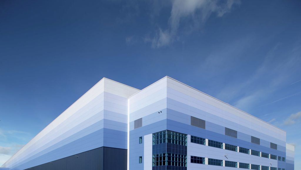
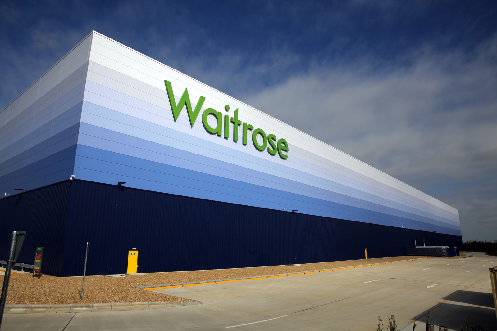
Thank you! I had shared a photo I had seen of an Amazon warehouse painted this way, but couldn't find the source of it. In this picture specifically, the warehouses in the rear perfectly blend into the sky to the point where my brain thinks the horizontal stripes are JPEG artifacts in the photo.
I suspect there are quite a lot of warehouses in this style, I've seen them in a few places, although the only one I can remember off the top of my head is alongside the A1 around the Midlands somewhere.
Knowing this use of color, it is very interesting to visit the California park. You can see the construction and such, but you really do have to focus on it to see it. The strategy they employ works very well, and IMO, should be used elsewhere to make our visual landscape less cluttered and more visually pleasing.
Similar in function to "Dulles Gray" which is used extensively at Dulles airport so other buildings/structures do not distract from the famous Eero Saarinen designed main terminal. Employees there humorously call it "Dull-Ass Gray"
So according to this article, Disney basically "invented" camouflage? Ok, painting buildings they want to not stand out in actual camouflage patterns would probably look too "military", so they just use contiguous vegetation-green and sky-blue areas, but it's still camouflage...
This was really interesting, thank you. I found myself playing "would i really ignore this color or would i ignore any color given the contrasting castles etc that are drawing your attention" in all the pictures
This article feels like a sort of corollary to Parkinson’s Law of Triviality (https://en.m.wikipedia.org/wiki/Law_of_triviality). There’s so much work that goes into designing, implementing, evolving, operating a mega entertainment complex like Disney World, and what do we get excited to read about? Two shades of color used to paint things.
theres a state ntl guard building where i used to live, on a busy thoroughfare, sandwiched in between a busy shopping plaza and a bowling alley/sports center. id pass it every day. the building is painted a muddy green, and is only accented with a muddy maroon - corners, lettering, awning etc.
i remarked earlier living there on how ugly those colors were. few army vehicles, hummers strewn about. did not look like a happening or exciting place. ugly colors.
it wouldnt be until much later passing through i thought about the color scheme.
and it clicked - i never paid real attention to the place. at all. plaza, sports center. it was invisible! the ugly green and maroon combo - like freddie kreugers sweater - made you not want to look at it, or hurt your eyes trying to process information - on purpose.
now i look for people who paint their houses in those colors, and i understand.
about the part of matching the color of the sky - i find across the country the blue color of the sky varies. im sure the lighter blue sky of florida differs from the darker, almost greyer blue above nevada (the blue on their license plates)
That unnoticed green was a Bell Labs invention, developed for Bell System outside plant boxes. Look at the next ground-level communications infrastructure box you see. It will usually be close to that green. The original design also had some strips of fake wood pattern, but that was dropped later. A Bell System ad once mentioned this.
In my area most of these boxes have been painted artistically, and often very attractively, I suppose to prevent graffiti. It's always nice to see one I haven't noticed before.
Same here, along with other utility boxes. They used to do this with fire hydrants as well, but the fire department complained so they stopped. The artistic paintings on the hydrants were interfering with the existing paint color codes the fire department uses to indicate various aspects of that particular hydrant.
In most languages the colors are defined as the language progress
The order: 'black', 'white', 'red', 'green', 'yellow', 'blue', 'brown', 'orange', 'pink', 'purple', and 'grey'.
One of the reasons League of Legends is so addictive is the entire time, you're looking at a calming lush green colourscape, similar to green colours shown in this article.
.jpg)
More accurately this is a color design strategy to use muddy greens to blend/hide equipment/fences/buildings, and sky blues to make buildings seem shorter and less obtrusive.
You can see stuff painted dark green in any state park, so I doubt Disney "invented" that strategy. The sky blue technique is interesting, though -- this is the first time I've heard of or seen something like that.