About 7 years ago, the brooklyn brewsers, a beer brewing club, got the tour of the brooklyn brewery. On that tour, the brewmaster, Garrett Oliver, told the story of how Glaser designed the logo for the brewery. He said he drew the bold B [1] and the founders were not that impressed. The story went that Milton said with some confidence, essentially "sleep on it, let it grow on you" and so it did. And more HN related, I recall that he took a small share of the company as payment so he really had some confidence in the logo which has become among the most iconic logos in the beer industry.
It was a wonderful story, and something I will always remember about the man.
The Brooklyn Brewery logo looks like genuine new old stock graphic design. It looks like it was done in the 50s and sat on a shelf, rather than emulating the style of the old regional breweries. It’s a true work of art. Glaser was a master of the fundamentals of graphic design. He understood weight and form in ways that have largely been forgotten and I fear that we have now lost the last of the breed.
i took a tour a couple years ago. they said they basically gave him free beer for life. every year one of his assistants comes in a van and they load it up with their beer.
He spoke at my university and said something that stuck with me, “never ask a question to show that you know something, but always ask in earnest and be vulnerable to the fact that you don’t know something.”
A little aside--I have a colleague who will ask a question, and then they ask another one, at which point you realize they already have an answer. HA! Just tell me the idea. Don't manipulate like a child. Magic spell to make their conclusions inevitable, because you answered two leading questions.
And when I don't ask questions, but assume the other parties already knows what I know, I get problems. So... I have to find a way to ascertain that other parties know what I know (more or less) - without sounding like I'm asking a question to show what I know.
Whilst contracting with a London digital agency in the mid '00s, I overheard a design conversation which stuck with me (in a bad way). One designer commented something like "Good design stays in place; bad design goes everywhere", citing Glaser's logo as an example of "bad design". I felt they were wrong, at the time, and the experience has actually helped me understand design and art better since (I'm a programmer, not a designer). It's very rare to create something so meaningful and recognisable, replicable, with "seams" you can easily unstitch to recycle the image whilst keeping a visual and semantic link to its source. Amazing.
EDIT: gave up trying to use the right heart character.
EDIT: better grammar.
Sad to hear of his passing - Glaser was prolific. I used to work fairly regularly with a company (Masque Sound) that provided audio equipment for Broadway shows. Milton arranged a beautiful illustration for their 75th anniversary. I still have a shirt with that drawing on it - it's a cherished possession.
Unicode also have hearts that aren’t colored pictures (which gets filtered out if you try to write them on HN apparently)
But then again, some people get a black line. I guess we can let others get a colored emoji.
It’s actually down to what Unicode you use. We ran into this on Standard Ebooks tooling for return-to-text arrows in the endnotes, and the solution is to add a U+FE0E character after the emoji to indicate a textual rendering is preferred. More info at https://mts.io/2015/04/21/unicode-symbol-render-text-emoji/
If you’re on an OS that lets you manage the fonts yourself you can use GNU Unifont. It has monochrome bitmaps for all of the enoji and fits much better with the rest of the text.
I see you chose to use the “BLACK HEART SUIT” symbol (2665); the semantics is heart as in on a playing card, accompanied by the associated symbols. Would not the “BLACK HEART” symbol (1F5A4) be more suitable, as it has no “playing card” semantics?
I tried that one, but it stands out even more garishly. The one that's up there is already too bold relative to the surrounding text—not the most competent tribute to a master designer, but at least our, uh, heart is in the right place.
Only for the OP and you? What about others who have tried putting it in this thread multiple times with edits and see their love disappear, literally. :p
I didn't think of that. Actually it's easy enough to turn off for a while, but these comments have passed the editing window. If you or anyone wants to add a heart, email hn@ycombinator.com and we'll reopen your comment for editing so you can.
I'm curious why so many people say it like this, even out loud. I also hear it with other objects of love, like "I heart pizza", or "I heart walks in the park".
"I heart something" is so awkward it's like you have to deliberately ignore the obvious reading ("I love") and choose "I heart", maybe to be playful. Meanwhile, "I love something" is as old as English. I saw the logo when I was a child and immediately read it as "I love New York".
If it sounds like I'm criticizing you, it's more that I am deeply curious! I feel in the minority, because I hear people pronounce it "heart" more often than "love".
I think “heart” has a slightly different meaning. I can’t really explain it, but when people say “heart” the also tilt their head or do the heart symbol with their hands. Just a little different.
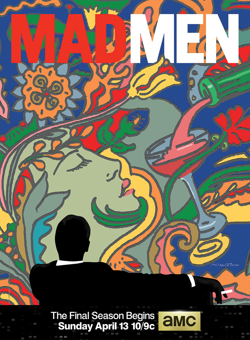
Milton Glaser is probably the most well known graphic designer in history because of his I (Heart) NY work, but he has so many outstanding pieces of graphic design work.
It always amazes me how incredibly timeless are his logos. You could launch any brand with that logo tomorrow and it wouldn’t look out of place.
He was a fantastic writer and artist across so many mediums. I recommend his book “Drawing is Thinking” which captures his work and insights quite thoroughly.
Glancing the frontpage and seeing a bright red heart in the corner of my eye my first thought was: How did click-bait like this make the frontpage.
After reading the full title I have to say, this is the most appropriate use of a non-baseplane unicode character - or whatever characters like this are called - I can imagine.
”In fact, the only thing Mr. Glaser regrets is that, after the terrorist attack of Sept. 11, 2001, he designed a “I NY More Than Ever” logo as a patriotic symbol.
The Pataki administration threatened to (but did not) sue him for trademark infringement. “The stupidity!” Mr. Glaser sputtered. “It saddened me.””
> Fundamentally I teach because it makes me feel good.
> Its helped me certainly clarify my own objectives. There is nothing more exciting than seeing someone whose life has been affected by, in a positive way, by something you’ve said. There is nothing more exciting to see somebody change from a, a sort of condition of inertness or inattentiveness into a mind that beings to inquire about meaning. I think if you don’t do something to project into the future that way, the possibility for total self-absorption and narcissism becomes very much greater.
…
> My idea about graphic designers and social commentary is that that is part of the practice. I’ve always believed that because you have access to people’s minds and you communicate to people, that there is a corresponding responsibility, the responsibility of being a good citizen, and also recognizing that if you have the ability to transfer ideas from one point to another, that those should be ideas that cause no harm.
The man was a legend. I’ll miss his wit and charm. I remember him most for his bold Tommy Hilfiger billboard that made the company practically overnight.
George Lois played a very major part in the creation of modern advertising creativity evolution and vitality in the 60's, and is an art director rather than a graphic designer.
Glaser came out of the same explosion of NY commercial creativity in the 60's and has a certain style that has endured and is successfully timeless, which is quite uncommon in the design world where styles go in and out of fashion.
I don't know whether Glaser's work could fall into the tail end of mid-century modern, but I love both that and his prime years of work. This page is a great example of the graphic design for The Incredibles which draws on the heyday of Los Angeles and New York (in my mind): http://joshholtsclaw.com/blog/2018/3/5/the-graphic-art-of-in...
If anyone else has similar pages they like and would share, I'd love to see more!
One of my favorite work of his was a poster[1] he did for a Darfur antiwar campaign, I still remember seeing this on streets in NYC. Super powerful and timeless image.
I love “I love NY” (can’t seem to type the heart character and not have it removed by HN). When I see a similar line with some other city’s name, I feel like it’s just a copy where someone couldn’t add something on their own.
The number of souvenirs and clothing sold with this should probably be in hundreds of millions, at the very least.
Well... maybe not here in Asia. The only time they will be introduced to western historical figures is in their design history class, of which there are likely to be no more that two. They would certainly never hear it at high school.
Also, wherever they come from, young people nowadays tend to jump straight into Pinterest, Deviant Art etc. These collections are not curated, and are, to them, little more that images without context. They may have seen MG's work in this manner, but would be unlikely to know his name.
This is very different to when I was at school. Browsing a library is a very different experience to browsing the web.
It was a wonderful story, and something I will always remember about the man.
[1] https://web.archive.org/web/20111004163949/http://miltonglas...