"As if all that wasn’t enough, there’s also the matter of tabs. Tabs are a couple of decades old now, and, like much of the rest of the desktop and web environment, they were initially thought up in an age where the predominant computer displays were close to square with a 4:3 aspect ratio."
Tabs are at least three decades old now, and they weren't originally restricted to just one edge of the window:
>The WordVision DOS word processor for the IBM PC in 1982 was perhaps the first commercially available product with a tabbed interface. PC Magazine in 1994 wrote that it "has served as a free R&D department for the software business—its bones picked over for a decade by programmers looking for so-called new ideas". The NeWS version of UniPress's Gosling Emacs text editor was another early product, with multiple tabbed windows in 1988. It was used to develop an authoring tool for the Ben Shneiderman's HyperTIES browser (the NeWS workstation version of The Interactive Encyclopedia System), in 1988. HyperTIES also supported pie menus for managing windows and browsing hypermedia documents with PostScript applets. Don Hopkins developed and released several versions of tabbed window frames for the NeWS window system as free software, which the window manager applied to all NeWS applications, and enabled users to drag the tabs around to any edge of the window.
Notice the layout of the overlapping Emacs windows with tabs sticking out of their right edge: since text is much wider than it is tall, you can stack up a lot more tabbed windows with tabs on their left or right side, and still read their labels.
>HCIL Demo - HyperTIES Authoring with UniPress Emacs on NeWS:
>Demo of UniPress Emacs based HyperTIES authoring tool, by Don Hopkins, at the University of Maryland Human Computer Interaction Lab.
Notice how you can drag the tabs of these NeWS windows to any edge or proportion of the height or width, and use the tab as a proxy for the window by popping up a window management pie menu on it, even if the rest of the window is covered:
>Demo of the Pie Menu Tab Window Manager for The NeWS Toolkit 2.0. Developed and demonstrated by Don Hopkins.
Notice how the tabbed windows can be stuck on the visual PostScript stack like a short order chef's "spike". The tabs enable "direct stack manipulation": and they are constrained (by "snap dragging") to slide up and down on the stack (rearranging the order of the items on the PostScript stack), and can be pulled far enough away that they "pop" off the stack, or dragged back onto the stack so they snap into place, and you can directly drop them into any depth of the stack.
>Demo of the NeWS PSIBER Space Deck. Research performed under the direction of Mark Weiser and Ben Shneiderman. Developed and documented thanks to the support of John Gilmore and Julia Menapace. Developed and demonstrated by Don Hopkins.
Described in "The Shape of PSIBER Space: PostScript Interactive Bug Eradication Routines".
>The Shape of PSIBER Space - October 1989.
PostScript Interactive Bug Eradication Routines.
>There is a text window onto a NeWS process, a PostScript interpreter with which you can interact (as with an "executive"). PostScript is a stack based language, so the window has a spike sticking up out of it, representing the process's operand stack. Objects on the process's stack are displayed in windows with their tabs pinned on the spike. (See figure 1) You can feed PostScript expressions to the interpreter by typing them with the keyboard, or pointing and clicking at them with the mouse, and the stack display will be dynamically updated to show the results.
>Objects on the PSIBER Space Deck appear in overlapping windows, with labeled tabs sticking out of them. Each object has a label, denoting its type and value, i.e. "integer 42". Each window tab shows the type of the object directly contained in the window. Objects nested within other objects have their type displayed to the left of their value. The labels of executable objects are displayed in italics. [...]
>Tab Windows
>The objects on the deck are displayed in windows with labeled tabs sticking out of them, showing the data type of the object. You can move an object around by grabbing its tab with the mouse and dragging it. You can perform direct stack manipulation, pushing it onto stack by dragging its tab onto the spike, and changing its place on the stack by dragging it up and down the spike. It implements a mutant form of "Snap-dragging", that constrains non-vertical movement when an object is snapped onto the stack, but allows you to pop it off by pulling it far enough away or lifting it off the top. [Bier, Snap-dragging] The menu that pops up over the tab lets you do things to the whole window, like changing view characteristics, moving the tab around, repainting or recomputing the layout, and printing the view.
>Designing to Facilitate Browsing: A Look Back at the Hyperties Workstation Browser.
By Ben Shneiderman, Catherine Plaisant, Rodrigo Botafogo, Don Hopkins, William Weiland.
>Since storyboards are text files, they can be created and edited in any text editor as well as be manipulated by UNIX facilities (spelling checkers, sort, grep, etc...). On our SUN version Unipress Emacs provides a multiple windows, menus and programming environment to author a database. Graphics tools are launched from Emacs to create or edit the graphic components and target tools are available to mark the shape of each selectable graphic element. The authoring tool checks the links and verifies the syntax of the article markup. It also allows the author to preview the database by easily following links from Emacs buffer to buffer. Author and browser can also be run concurrently for final editing. [...]
>The more recent NeWS version of Hyperties on the SUN workstation uses two large windows that partition the screen vertically. Each window can have links and users can decide whether to put the destination article on top of the current window or on the other window. The pie menus made it rapid and easy to permit such a selection. When users click on a selectable target a pie menu appears (Figure 1) and allows users to specify in which window the destination article should be displayed (practically users merely click then move the mouse in direction of the desire window) . This strategy is easy to explain to visitors and satisfying to use. An early pilot test with four subjects was run, but the appeal of this strategy is very strong and we have not conducted more rigorous usability tests.
>In the author tool, we employ a more elaborate window strategy to manage the 15-25 articles that an author may want to keep close at hand. We assume that authors on the SUN/Hyperties will be quite knowledgeable in UNIX and Emacs and therefore would be eager to have a richer set of window management features, even if the perceptual, cognitive, and motor load were greater. Tab windows have their title bars extending to the right of the window, instead of at the top. When even 15 or 20 windows are open, the tabs may still all be visible for reference or selection, even thought the contents of the windows are obscured. This is a convenient strategy for many authoring tasks, and it may be effective in other applications as well.
Unfortunately most of today's "cargo cult" imitative user interface designs have all "standardized" on the idea that the menu bars all belong at the top of the screen and nowhere else, menus items should layout vertically downward and no other directions, tabs should be rigidly attacked to the top edge and no other edge, and the user can't move them around. But there's no reason it has to be that way.
The big problem I have started seeing is web design assuming you always browse using a maximized window. Combine this with a prevalent market of wide screens and most sites won’t look right without at least 1200px. So once you put anything like a toolbar or inspector on this side, you have a problem.
Designers of many sites I have to use daily seem to assume I’d never want to see two windows at once, let alone rearrange my UI or use non-widescreen devices. The responsive sites can be even worse too since they’ll snap into a mobile layout at anything less than 1000px wide or so and then increase all of the margins and icon sizes for touch accuracy purposes. It looks extremely silly and wastes even more space than these layers of toolbars hanging around the edge of a browser.
Not only that, but many websites tend to have very large left and right margins. One would expect that by reducing the width of the browser window the margins would be adjusted but instead the website either "won't fit" in the resized window requiring you to scroll horizontally or will reduce the width of the central column.
That's people doing margins wrong. They see a CSS property called 'margin' and go for that, which ends up only working well for displays and window sizes comparable to their own. What they should be using 'margin' for is to specify the minimum outer padding and combine it with 'max-width' to allow the browser to apply flexible margins appropriate for whatever window size the reader actually has.
Another problem is the default styles for Bootstrap (which is very convenient for those of us who aren't graphic designers). If you resize or snap your windows to be half-width, they'll be relegated to the mobile styles. Bootstrap does this when the view width is at 960px or less which is exactly half of a 1080 screen (1920px). So even if your windows had no borders, you'll still end up with the mobile styles.
Oh is that why mobile design seems to have taken over so much! I keep running into sites with uselessly gigantic fonts and big square buttons, and I assumed it was either laziness and an assumption that everyone is browsing on a phone, or just another inexplicable designer fad. Do people really just not use portrait-mode windows?
We ended up building our own framework to solve for that with a simple tank confit if we need to change the breakpoints. Bootstrap was just too big yet too limiting for all of our client work. We don’t force the mobile menu either.
> The big problem I have started seeing is web design assuming you always browse using a maximized window.
That's been a problem for roughly twenty years now. Way back in the 1990s (on a 4:3 CRT, natch) I started out with half the screen dedicated to my browser and the other half left free for other things (back in those days it was normal to have many windows open at once on a Mac screen — weird how we have so many more pixels now, but typically just have one thing on the screen at a time!).
Eventually I had to stop doing that, because so many sites assumed that I'd have the browser opened full-screen. At the time, I believed that to have originally been a Windows-ism, but I don't know anymore if that was really the case.
Even though I love my tiling WM, I do kinda miss the days when I'd have multiple windows open. Now, I have a second, portrait-mode, monitory — but I only have code on it, and leave my browser on the landscape-mode screen.
I'd actually argue that Windows handles "not maximizing things" better than Mac from a usability perspective.
Sure, the visual treatment of maximized windows felt "more natural" on Windows, but the Mac's #$@&! global menu bar often made moving between multiple non-maximized apps more annoying (especially on a large display).
Indeed. I have global menu on KDE with a multimotor setup. Nearly enforces to use a "click to focus" policy, as if you have a "follow the mouse" focus policy, is pretty annoying. Doing weird mouse moventa to avoid the focus being stoked, isn't fun. Also, I enabled having the app menu on the windows border icon (you can have both options enabled). I find it very usable and I'm begin to use it more that the global menu bar.
It's funny too because these days in Windows it's so easy to tile to halves or quadrants (the semi-maximized "snap" states and their mouse and keyboard shortcuts), yet macOS seems to have regressed to mostly encouraging only full screen/maximized apps (with most tiling options disappeared from system menus and now seemingly relegated to third party tools) and so many web developers seem to be on macOS these days.
A 4.8 inch Galaxy S for example is 720x1280 or 1280x720. iPhone 6 1334 x 750 or 750 x 1334.
Really, a small resolution laptop is vastly less common than mobile on most websites. Looking ugly but working for group A is much better than not working for larger group B.
I don't think you understand how browsers on mobile report resolutions. Those HiDPI devices report widths and heights as the actual widths and heights divided by the device pixel ratio.
Screens are visual, and human vision is biased to search lateral space over vertical space.
This is due to the nature of humans' visuospatial limitations. We're largely 2d animals in our movement: front/back & left/right, not so much up down. This is different from animals like birds and fish who constantly have to navigate all 3 dimensions to catch prey and avoid death.
We aren't ignorant of vertical space, but horizontal space is much more well attended to by the human brain, spatially and visually. (Video game designers encounter this problem in getting players to look up.)
Vertical screens for the masses started with mobile, because constraints of the hand matter more than the biases of vision in that case.
Of course as desktop screens become giant, lateral vs vertical space becomes a less important distinction, but understanding why "widescreen" came about over "square" is important. Of course, this all varies by task, but I imagine this is a big reason why 16:9 came about.
When reading text, I believe the opposite to be true. It's why newspapers use relatively narrow columns of text despite having a lot of width to work with. It's much easier to keep my place and process information if I don't have to move my eyes much horizontally.
When it comes to scanning for unexpected information, you may be right. A high aspect ratio might be better suited for gaming, at least with games where a significant element is scanning the screen for information and responding to it quickly.
One more data point to throw in is that according to Wikipedia, the human field of view is approximately 1.5:1. That suggests to me that 1.5:1 is a good aspect ratio for a general-purpose display. https://en.wikipedia.org/wiki/Human_eye#Field_of_view
The problem with both yours and the parent's assertion is context. Newspapers are easy to move so the portion you're reading is in your field of view. Your monitor isn't and it's used for much more than just reading static text. 1.5:1 may be a good reading aspect ratio, but if you need multiple things with that aspect ratio open and on the screen at the same time then you need a wider screen.
edit: I just realized a 3:2 screen is basically two 1.5:1 "areas". There are some laptops that have a 3:2 screen mentioned in other places in this thread.
I do wish I had a better way of splitting content into readable newspaper style columns, though. Modern web design is pretty antagonistic toward this end. There was a MacOS app that used to do this[0], but it hasn't been updated in years and there isn't an alternative for windows.
3:2 is one 1.5:1 area. It's two 1.5:2, or 3:4 areas.
I don't find 3:2 to be an especially good aspect ratio for fullscreen text. It's still either too wide or too short, but 3:4 is pretty good, so two columns on 3:2 is two pretty good text areas on a 12-15" diagonal screen. It's also one pretty good text area and some UI, ads, etc... on either side.
I should note that physical size is a major constraint here. On a laptop, I want a column of text to be about 4-6" (10-15cm) wide. A desktop screen that's usually farther away can be a bit wider, maybe 8-10" (20-25cm). Having those columns be very tall is fine. I've been using a 24" 9:16 display for having documentation up while coding lately.
(Though best supported by Firefox and Edge, with interesting bugs in Chrome and Safari I've seen.)
With one major flaw in that -ms-scroll-translation still hasn't made it out of being just an IE 10 suggestion (that Edge still supports and no one else) and into the specs and is a pain to polyfill, but a relatively key ergonomic need: https://msdn.microsoft.com/en-us/library/hh973361(v=vs.85).a...
Windows 8 tried to encourage horizontal scrolling, multi-column design in applications and websites, so Microsoft put some good work into the ergonomics of it, and I appreciated they tried and am still somewhat sad they failed.
(I'm proud that my blog uses a multi-column layout for text at wide widths, but given it is my blog I can do weird design craziness like that that amuses/interests me and not worry about confusing potential visitors.)
I wondered if I was ignorant of any engineering constraints. Good to know. However, my comment was meant to be more about screens in general, so it includes why TVs are wide in the first place.
Well, I really like being able to put a code editor on the left and then a browser, terminal, document, LaTeX output on the right of the screen without them becoming too constrained horizontally. But probably this is a very particular use case?
If you take the same width of screen, e.g. 1920 pixels and make it taller, say, 1440 pixels, then you have the same horizontal space and all of those windows are taller with more content in them!
Plus potentially a bigger keyboard with more rows. If Apple had done that with the new MBPs they could have had room for both full-size function keys and the Touchbar. C'est la vie.
Edit: after posting I realized something was missing. I meant had they done this and increased the diagonal to say, 17 or more inches.
Meanwhile the site has a fixed header taking away vertical space, like many others. Maybe interface design should accomodate the fact that every single desktop user uses a widescreen display and start putting navigation on the side.
Vertical tabs and taskbars can also be done in most browsers and OSes. There would probably be a lot of friction if vendors made that the default, but it's still easier than replacing every monitor in existence.
Yes, the ability to "tweet" and "share". Neither of which I ever do so it's just a bunch of wasted space.
My favorite is the headers that mess up scrolling with the space key -- scroll down then immediately scroll up because the header is covering part of the content.
And don't even get me started on sites (looking at you Medium) that have both headers and footers...
I find 4:3 too square for both tablets and laptops as it seriously detracts from watching widescreen video content such as nearly all newer movies and TV shows, but 16:9 does have seem a bit too wide compared to height, especially on tablets when you try to use it in portrait mode and it seems ridiculously tall. I've found 16:10 to be a better than 16:9, and while I haven't had a 3:2 laptop, the 3:2 Nook HD+ from a few years back is probably my favorite table screen(shame about the rest of the tablet) in that it didn't compromise movies too much, but wasn't awkward in portrait.
Uh, yes that was indeed the point of my comment, thank you for restating that. If video was the only important thing, 16:9 across the board would be important. But going the other way to 4:3 is a vast over correction as it would make the screen nearly useless for video.
Maybe not all laptops should be 4:3, but that doesn't mean none should be.
Many of us never use our laptops (especially employer-owned ones) for full-screen video, or have no objection to the letterboxing and slightly smaller video size when we do.
"Nearly useless" seems like a ridiculous exaggeration to me. I have an iPad (4:3) used for little other than video, and love it.
I don't find it to detract seriously; it just reduces the display area. Since a laptop is fairly close to my eyes, and easy to move closer, I don't consider this a big problem.
I have to say, I really miss the 4:3 ratio on tablets, as I do most of my reading there. I've been trying to read now via landscape orientation and scrolling down the page.
It works (kinda) but I miss having the whole page at a view...
The article didn't mention why 16:9 screens are chosen over 16:10 screens. You have to make 5% less pixels (screen area) which is a direct cost saving. You can still market your screen at 13" but make it for less money. The more vendors that go for this cost saving approach, the more you gain from economies of scale which drives down the cost further (or drives up the cost of 16:10). Since people look at screen diagonal over screen area, they are usually none the wiser.
It’s amazing how much more useful hardware could be if software were properly designed and flexible.
I don’t know why screens still care about optimizing video...I can’t remember the last time I watched something full screen when there’s picture-in-picture. As with other software, I want to do multiple things and not necessarily just sit and watch something.
For decades software has had a weird laziness when it comes to making things simply resizable. Ever seen a program pop up a list of 1000 choices that only shows about 4 of them, truncating half the names, with a useless miniature scrollbar and no ability to resize, on a gigantic screen?
The day I got the iPad 1, it was the coolest thing ever. It took just weeks for that to be gradually ruined by ridiculous decisions made in software (web sites that could no longer be pinch-zoomed trying to “help” me with a “mobile-optimized” interface, apps lazily zooming up from phone sizes and making terrible use of space, etc.). To this day I would never opt into a “pro” version of that experience; I simply can’t stand software that constantly wants to tell me how much space I have been rationed for each thing.
I find if I don't fullscreen my video and disable auxiliary monitors then I won't end up even watching the video at all in which case I may as well turn it off.
The original Surface RT had a horrible aspect ratio. The actual screen is about 9.5" x 5.25", so it is almost double as wide as it is tall, in the normal orientation. It's really too narrow to be comfortable for reading in the portrait orientation. As a tablet, it just doesn't really work.
If you grew up in North America, the 4:3 ratio probably feels the most natural because it's closest to the standard 8.5"x11" Letter paper size that almost every sheet of paper you've dealt with in school is.
Outside of gaming and videos I pretty much never full screen anything. Just put two windows side by side and 16:9 (and wider) starts to make a lot more sense.
Do others do this? I've always found the right side to be the better alternative since the bottom and right sides would be the natural "ends" of the screen.
I do this - and yes, always showing. Makes for better ergonomics when you can aim your mouse trajectory at exactly where you need to be instead of mousing over, waiting for the dock to appear, and then mousing to the specific icon you want.
I often drag items to the dock to open them in an application other than the default (only the finder let's you select what app to open a file in without doing that).
I also have an issue where if I've got multiple windows from a single app open in different virtual desktops, the only way to get to the other windows from the app is to click the dock icon - it can't be done via keyboard as far as I can tell. (And yes, it's infuriating.)
Yes, always showing, due to decades of Microsoft bugs with their toolbar which would inevitably get stuck showing but masking the underlying window or stuck hidden.
I mean that you need something more than 100px wide. So it cuts into the page space more aggressively. It’s a good use of space but unfortunately most designs do not account for this very well in my experience.
Windows 95-style taskbar, sure, but since Vista switched to the default of grouping icons with rich hover, the Windows taskbar has only gotten better at being on the short axis.
(Though I've been keeping my main taskbar on the right hand side since XP and that was perfectly reasonable then even. These days, I tend to sandwich my Windows taskbars these days with it on the left on the left monitor and on the right on the right monitor.)
Good point. I tend to use folders so on a bar they’d be a menu that would hide and then show. But for things like reading lists where I want something linear and present, the sidebar is nice.
> Lateral space is simply not as valuable as vertical space in desktop apps or on the web.
This is not the fault of the hardware, it's the fault of the software. I want more screen space, and I'm not asking for a square laptop and I'm not wanting my screen any taller than it is.
Browsers should optimize for vertical space and let you reuse your horizontal space. Tree-style or vertical tabs are perfect for this. But for some reason, all browser vendors follow each other, don't build alternative options (or count on the community to do it if they even allow that), and presume they have got it right with tabs on the top. It's like browsers have become so hard to build and maintain by the big four that having more than one way to view things is disallowed or relegated to extensions. I've said it before, I want my browser like my IDE. I want to move and dock windows in a MDI, and I want to move around the web like a power user. Yet we're all subject to the lowest common denominator of users because, I suppose, maintaining more than one UI paradigm is too difficult and they've all settled on the best apparently.
> Tree-style or vertical tabs are perfect for this. But for some reason, all browser vendors follow each other, don't build alternative options (or count on the community to do it if they even allow that)
Vivaldi has in the options (without any 3rd party add-on) a possibility to put your tab bar either on top, left, right, or bottom.
Right, several non-major browsers do this with major browser's rendering engines (I wrote one: https://cretz.github.io/doogie/). I am criticizing the big four browser vendors specifically as opposed to the community.
Nobody is asking for rotated text. There are many applications that have mini dockable assistant windows on either side of the main document window. Our file system browsers list items vertically, so can our browsers. Hell, most do with bookmarks, just not active tabs. It's more a problem of group think and the trend towards reduced customization that causes this, not language direction.
Or in some common cases it fails to inform the design of tab bars and other user interfaces, since you can stack many more tabs along the left and right edges than along the top or bottom edges, and you can allocate enough room to distinguish their labels.
It sucks that "standard" tabs are always along the top edge: you can only fit a few of them, and their labels are clipped so you can't distinguish them, and you can't do anything about that. You should be able to move them to any edge and adjust them according to the task, tab count, label size, screen dimensions, and personal preferences.
Ideally, users should be able to choose which edge and how far along each edge to place the tab, adjust the tab's size and rotate its orientation, iconify and expand windows to and from their tabs, and easily group windows together by their tabs in rows or columns as desired (including docking inside other windows, or nesting tabs in 2D tree outlines using different edges and orientations at each level).
"Direct Manipulation" PostScript stack editing with tabbed windows:
Vertically organized tabs use more pixels, but in addition to demanding less valuable real estate (when in fullscreen at least), also let you have more tabs open at once without scrolling the tab bar.
My favorite laptop that I've ever owned was an unusual 21:9 ultrabook about 5 years ago [0]. The author does acknowledge in the second to last paragraph that ultra widescreen can be helpful, and boy was it. I could fit my terminal side by side with my text editor split into two 80-char tabs, or fit my terminal, text editor, and chrome all together. It was the closest thing to having dual monitors on a laptop without having too strange or annoying of a shape.
Sidebars! If you take a day to get used to the using a sidebar for browser tabs, you'll never go back. I prefer Tree-Style Tabs on Firefox, but it's far from the only option.
Then again... even with that, I guess I agree with the OP. Even after turning on the sidebar, there's more horizontal space than I need. And I love screen real estate.
I long ago got used to black bars, and don't watch that much video on my laptop anyway. Usually when I do, I'm connected to an external monitor.
Toshiba released a real widescreen laptop a few years back. The 845W. 21:9, 1792x768 pixels. It was neat, Staples or OfficeMax (I can't remember) blew them out for $499, but I ended up returning it because 768 pixels is just not enough room to get anything done. Besides, it had all the issues of a typical Windows laptop of the time, battery life wasn't very good, touchpad was terrible, etc.
Sony also tried this with the VAIO P, in a smaller format with a 1600x768 screen.
Why do people say 16:10 when they could say 8:5? (Or worse, 19.5:9 over 39:18?) this one of those human things? Do you just really like numbers close to 9?
Generally speaking (from a math education perspective), people are bad at denominators. If you really want to compare ratios, and have established in the writing decimals in the numerator to afford that (TFA used 19.5:9 to describe an iphone which is what started my rant) then you should use 14.4:9 instead of 16:10.
People see the latter and think it is quite similar to 16:9 because the 16s are the same, and don't realize that this is not true. 16:10 is actually closer in form factor to 3:2 than 16:9.
But as a neighbor reply pointed out, it would probably be best to normalize to one. Do you want a 1.5 aspect ratio (3:2) or a 1.77 (16:9) one? Much easier to compare single numbers with each other.
I don't think 1.77 would make more intuitive sense to the average consumer of this type of product than 16:9, for the same reason that you don't typically write "add one unit of flour and 1.33 units of sugar" in a recipe.
Particularly for screens, which most people think of in terms of two dimensional surfaces, using simple fractions seems more obvious, and for ratios like 4:3 and 16:9, numbers are particularly useless because they can't be used to exactly describe the relationship.
This kind of debate has been going on forever and it will continue as formats for random purposes are invented at random times in history. There is no next better aspect ratio or pixel density that we should move to so we do our best. If we suddenly switch who is to say the next big unknown thing suddenly makes 14:10 the best ratio for the next 10 years?
Funny you should say 14:10, that's almost the aspect ratio used in Europe for paper sizes. It's based on the square root of 2 so that cutting a sheet in half results in two new sheets with the same aspect ratio.
In fairness, the article was not arguing that some particular aspect ratio (e.g., 3:2) was _optimal_. It's main point was that 16:9 is not optimal, especially on small laptop screens, and that something wider would work better.
Aspect ratios are one thing but a number of tasks are just better in portrait. For that purpose I have a desktop monitor stand that rotates 90 degrees.
Trickier on a laptop but can't someone design a 'convertible' with a rotate-able kickstand, so that a detachable typecover snaps into place regardless of whether the screen is in landscape or portrait?
>> Aspect ratios are one thing but a number of tasks are just better in portrait.
Aspect ratios and orientation are moot if you have more real estate and pixels.
If you were to have something like a 55" curved 8K monitor and good eyesight (or glasses), aspect ratio would be less important to you, since that screen would cover most of your field of view while still providing you with high pixel density.
At least, some one that noticed that vertical space on screens is important!
For many years (since I grab my first 16:9 screen), I used and suggested to others to put the taskbar on a lateral. Because It allow to display more text! You have a more wide screen and you can afford to lose a few of horizontal space better that losing a few of vertical space.
Maybe it's just me, but I don't like glossy computer screens either... I'd rather use matte. It seems like matte screens make a bit of a comeback but it was hard to find one years ago.
I once heard a rumor that they were doing widescreens because they were cheaper to manufacture... not sure how true that is...
I disagree with the premise of the article that you only use one application at time on a laptop. I almost always use a split screen setup where I have my notes on the right side and another application on the left. In my view, wider is better.
Regarding the idea that "human vision is biased to search lateral space over vertical space", what has influenced us to have writing systems that are almost universally horizontal?
I can only think of Japanese that may be written vertically.
My taste is generally for more squarish screens, but it must be said: the image at the beginning of TFA supports the point less than it shows the goofiness of Verge's design.
I hear writers with this complaint alot, too. But I've never understood it. Sure, if you've only got the one file, there's black/white space on either side of the column (if you're fullscreened and in full-on anti-distraction mode), but it's just never bothered me like it does everyone else. However, I find it's great to be able to split emacs vertically and have notes/documentation/outlines on the left and the actual document on the right and both hold an 80+ character line with my preferred font. And I wouldn't go back unless I had to.
I don't know why this article is only about laptops. It's difficult to buy a square desktop monitor these days too. I've been complaining about it for years. Widescreen is a terrible shape for code. I don't need more horizontal space, I need more lines. What am I going to use horizontal space for? People say turn the monitor vertical but that's horrible too. The screen is designed to be viewed at a certain angle for a start. 4:3 is perfect for me to be able to have two columns of code filling the entire screen.
I beg to differ. I have a UWQHD and love it for code. I can have 2 sets of code side by side (or a terminal) AND docs AND the website I'm working on, all visible without moving windows. Possibly also messaging apps.
I cannot fathom how someone wouldn't be able to appreciate working on a UWQHD monitor.
I have a 27" Apple monitor at work and it comfortably supports 3-4 columns of text in Sublime. I'd much rather be able to have an extra column available rather than an extra 100 lines in a 1-2 column layout.
Do you (or does anyone) know if Textmate has a feature to automatically wrap text from one column to another? I've looked for one and not found it. I know emacs will, albeit with typical difficulty, but I just can't go that far.
Definitely this. I get a nice 4 column layout that works great considering my code is generally 80 chars wide. I wish my monitor where actually 2:35:1 CinemaScope.
Widescreen was great for having multiple pages/windows open until the recent trend of apps going from having multiple windows to one window (ushered on by Windows (people people have been fullscreening since day one), webapps (where windowing isn't well-supported) and mobile/tablet-centric design).
I really despise how the Xcode team thinks that iTunes was a good inspiration for a UI.
Oh god all these bad memories coming back. I remember sticking with MoviePlayer 2.5 for many many years. And to think I even stuck with QuickTime Player 7 pretty much until this year because that was still better than the new version.
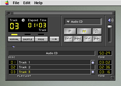
What is it about media player software in particular where everyone from the beginning had to have weird skeuomorphic UIs? Even the early examples I can think of (AppleCD Player, Creative's Windows 3.1 stuff, Winamp) all had to have non-native UIs. Preferably with a fake segmented VFD/LED display https://panic.com/extras/audionstory/popup-images/popup-appl...http://i.imgur.com/27tgh8S.png
I have two 27" Apple monitors, one in portrait and one in landscape orientation. The portrait orientation monitor I use for code. They look identical, there is no degradation (that I can see) from looking at the monitor rotated 90°.
If anyone is interested, I use the VESA mount conversion kit from Apple and have the monitors mounted on the Amazon Basics monitor arms, which I highly recommend.
I like portrait mode too, so much in fact that I've got 2 x Dell 27" U2715H monitors (2560x1440 eIPS) set up that way.
I've been using this setup for about 18 months now, and I really rate it. 1440x2560 is a very usable resolution. Very few problems with websites (I had regular minor issues when I had a 1200x1920 screen); tons of lines of code on screen; plenty wide enough for 2 side-by-side columns; I don't find it a problem to use 3 side-by-side columns (77 columns apiece) in Emacs with a small font; small desk footprint.
Full-height windows are sometimes a bit much, but for the main display I've found having one window or panel that's 2/3 the height and one that's 1/3 the height works very well. The 1/3 height area is still 1440x850 or so - plenty for a terminal, Emacs window, debugger output, that kind of thing.
As a bonus, 1/3 of the screen is a bit taller than 16:9, so good for videos, and 2/3 of the screen is about the right proportions for A4 PDFs. Considering it's just the not-very-good 16:9 turned on its side, I've found 9:16 to work remarkably well...
(With the proviso that the pixel count is almost certainly relevant, and I very likely would not feel as positive about 1080x1920...)
Everyone on the teams at my last 3 jobs has preferred a single large 4k display to alternatives. The ability to have 3-4 columns of code, as well as more lines of code per column, has been invaluable for productivity.
It is very often that I find myself debugging or reading code for the first time and need to dive into several layers of code. Having it all side by side helps tremendously.
The other nice thing about a single, large monitor is that it maps to the same workflow / muscle memory you'd use on your laptop.
Switching between a laptop and multi-monitor setup was a bit comical for me despite trying it for a month. Even something as simple as alt-tab focusing a window that's not on the expected screen would slow me down.
It wasn't for me. And my productivity improved once I moved back to a single 26in monitor.
Around my office, we have two common setups. A large 30" display (16:10), or a super-wide curved display.
The super-wide is way too short, vertically, that I have no interest in using one.
I actually have two of those 30" displays on my desk. My approach is do to most of my work on the primary, and to shove some chat windows, log windows, etc, to the secondary. So I'm really using all of one display, and maybe half of the other.
(Of course once displays get this big, the other half of the secondary display is too far from my field of view anyways.)
I have one and I think it's great. I actually prefer splitting a 16x10 monitor into two halves, but the perfectly square monitor is great for diagnostics/monitoring where I can split it into four equally sized quadrants and see four things at once...
I second this. I have this EIZO square monitor and it is a joy to work in. Just think of "wide" screens as actually being "short" screens, and you can see why you'd feel cramped and constricted when using one, like living in a house with 7-foot ceilings.
Are you using an IDE that has sidebars or other elements on the screen than code?
In my setup with Emacs, a 1600x1200 screen and 12px monospaced font, I have two 86 character wide windows side by side. To add another column without changing something else, I would need a 2400px wide screen.
I wouldn't object to a large 2:1 aspect screen on my desktop, but it makes for an unwieldy shape for a laptop.
The “certain angle” applies mostly to TN monitors. VA monitors are much better at this, and IPS monitors can be viewed from almost any angly (the specs say 178° or something like that). IPS monitors are often more expensive, but I’m willing to pay.
You still run into problems with the pixel structure. The RGB components are lined up horizontally, and they become vertical when turned 90 degrees. Any tech that takes advantage of the layout, such as Microsoft's Cleartype, will fail miserably on a rotated display. I suppose that's why Apple thought it was so important to go to high DPI displays on the iPhone and iPad.
The trade-off is that now we have more vertical pixels than ever before (4k monitors). It just comes with extra bonus pixels on the sides too. What I do is have a code window on one side, and a documentation window on the other.
Yeah, now. Thanks to Apple's start of the high DPI push and 4k/5k displays.
For a long time, we suffered from what I'll call "The Great Laptop Display Regression of 2008". For many years, you simply could NOT buy a non-Apple laptop with more than 1080 pixels in the vertical direction. It didn't matter how big of a screen you got, and it didn't matter how much you were willing to pay for it. No one dared even give you the option.
I still have what I believe is one of the last great laptops with a 1920x1200 display. It's a 15 inch Core 2 Duo 2.66Ghz Dell with gigabit Ethernet from around 2008-2009. It's not my primary driver. It's used as a Plex Server running Windows 10.
I'll occasionally use it for browsing when I am working from home using my work laptop on the VPN.
I usually have a two monitor setup, but my next personal computer will be a 27 inch 5K iMac. I want to be able to use one monitor with an IDE on one half and the browser on the other half.
Any modern (ie IPS) screen has a viewing angle wide enough for vertical to look perfectly fine. Wide screen plus a tiling window manager will change your life. Going back to the days of 4:3 sounds awful.
My issue with a laptop is that for the screen to have a wider aspect ratio, the whole computer has to be bigger, or the screen has to be shorter. With a desktop, it's much easier to have multiple displays or very large displays and the aspect ratio is less important.
Every time I consider upgrading my home desktop monitor, I consider how difficult and/or expensive it will be to replicate its 16:10 aspect ratio. That immediately cures me of the upgrade fever.
For me, desktop 21:9 displays have been a good substitute -- divide the screen down the middle and it's comparable in feel to having side-by-side 4:3 displays.
I have one on my house computer. Really nice, but I found that for doing productive stuff, having two screens (16:9 + 4:3 or 16:9 + 16:9) it's better. Yes, you can use the 21:9 as virtually two 4:3 screens, but it's the same. They way that you have tendency to place and snap windows isn't the same that when you have a true multi monitor setup.
My desktop runs a pair of stacked 21:9 displays just fine ;-)
I'm in the camp that finds 16:9 / 16:10 to be the wrong ratio for... everything. Maybe a giant high-DPI display would make it better. For now, having four windows arranged as though they were maximized on a 2x2 grid of 4:3-ish displays perfect suits how I like to work.
What a moronic article. More space is always better. On Windows/Linux just chuck the taskbar on the left/right of the screen and enjoy the extra visible space.
The shit some people complain about , unbelieavable......
It's not more space. My 4:3 monitor has a resolution of 1600x1200. That's 180 lines of pixels more than a 1080p screen which is about 13 lines of text.
>> It's not more space. My 4:3 monitor has a resolution of 1600x1200. That's 180 lines of pixels more than a 1080p screen which is about 13 lines of text.
And it's 320 less lines horizontally.
What matters to you may not matter to the next person, because their use case is different from yours.
No matter what laptop (and monitor) manufacturers do with respect to aspect ratio, they're never going to please everyone with their design decision.
Which is why we started by widening that to 1920x1200 (16:10). Which I think many of us were perfectly happy with. You didn't lose any vertical pixels, but gained horizontal pixels.
Then all PC laptop manufacturers seemingly conspired to deny us the option to purchase anything, at any price point, with >1080 vertical pixels. (Thankfully Apple didn't follow this trend at the time.)
Of course now with all the 4k/5k/high-DPI stuff we might finally be moving past that, but I haven't gone PC laptop shopping in a long time.
Why do they have to choose only one? Just offer options for people who don't want widescreen.
This is hacker news. Surely here we can complain that they're not made for programming. I also do a lot of writing and extra width is utterly useless for that.
>> Why do they have to choose only one? Just offer options for people who don't want widescreen.
Isn't the answer kinda simple? If Apple were to decide to offer non-widescreen laptops and they sold like hotcakes, everyone would follow suit. For better or worse, Apple sets the trends on laptop form factors.
> Those are oddly low resolutions for 2018, but: if it's the same height, just wider, then great.
Not odd at all. '1080p' is probably the most common resolution on laptops sold today. They really fleeced us with the 'HD' marketing; laptop displays today are often lower res than they were ten years ago!
Tabs are at least three decades old now, and they weren't originally restricted to just one edge of the window:
>Tab (GUI):
https://en.wikipedia.org/wiki/Tab_(GUI)
>The WordVision DOS word processor for the IBM PC in 1982 was perhaps the first commercially available product with a tabbed interface. PC Magazine in 1994 wrote that it "has served as a free R&D department for the software business—its bones picked over for a decade by programmers looking for so-called new ideas". The NeWS version of UniPress's Gosling Emacs text editor was another early product, with multiple tabbed windows in 1988. It was used to develop an authoring tool for the Ben Shneiderman's HyperTIES browser (the NeWS workstation version of The Interactive Encyclopedia System), in 1988. HyperTIES also supported pie menus for managing windows and browsing hypermedia documents with PostScript applets. Don Hopkins developed and released several versions of tabbed window frames for the NeWS window system as free software, which the window manager applied to all NeWS applications, and enabled users to drag the tabs around to any edge of the window.
Notice the layout of the overlapping Emacs windows with tabs sticking out of their right edge: since text is much wider than it is tall, you can stack up a lot more tabbed windows with tabs on their left or right side, and still read their labels.
>HCIL Demo - HyperTIES Authoring with UniPress Emacs on NeWS:
https://www.youtube.com/watch?v=hhmU2B79EDU
>Demo of UniPress Emacs based HyperTIES authoring tool, by Don Hopkins, at the University of Maryland Human Computer Interaction Lab.
Notice how you can drag the tabs of these NeWS windows to any edge or proportion of the height or width, and use the tab as a proxy for the window by popping up a window management pie menu on it, even if the rest of the window is covered:
>NeWS Tab Window Demo:
https://www.youtube.com/watch?v=tMcmQk-q0k4
>Demo of the Pie Menu Tab Window Manager for The NeWS Toolkit 2.0. Developed and demonstrated by Don Hopkins.
Notice how the tabbed windows can be stuck on the visual PostScript stack like a short order chef's "spike". The tabs enable "direct stack manipulation": and they are constrained (by "snap dragging") to slide up and down on the stack (rearranging the order of the items on the PostScript stack), and can be pulled far enough away that they "pop" off the stack, or dragged back onto the stack so they snap into place, and you can directly drop them into any depth of the stack.
>PSIBER Space Deck Demo:
https://www.youtube.com/watch?v=iuC_DDgQmsM
>Demo of the NeWS PSIBER Space Deck. Research performed under the direction of Mark Weiser and Ben Shneiderman. Developed and documented thanks to the support of John Gilmore and Julia Menapace. Developed and demonstrated by Don Hopkins. Described in "The Shape of PSIBER Space: PostScript Interactive Bug Eradication Routines".
>The Shape of PSIBER Space - October 1989. PostScript Interactive Bug Eradication Routines.
http://www.donhopkins.com/drupal/node/97
>There is a text window onto a NeWS process, a PostScript interpreter with which you can interact (as with an "executive"). PostScript is a stack based language, so the window has a spike sticking up out of it, representing the process's operand stack. Objects on the process's stack are displayed in windows with their tabs pinned on the spike. (See figure 1) You can feed PostScript expressions to the interpreter by typing them with the keyboard, or pointing and clicking at them with the mouse, and the stack display will be dynamically updated to show the results.
>Objects on the PSIBER Space Deck appear in overlapping windows, with labeled tabs sticking out of them. Each object has a label, denoting its type and value, i.e. "integer 42". Each window tab shows the type of the object directly contained in the window. Objects nested within other objects have their type displayed to the left of their value. The labels of executable objects are displayed in italics. [...]
>Tab Windows
>The objects on the deck are displayed in windows with labeled tabs sticking out of them, showing the data type of the object. You can move an object around by grabbing its tab with the mouse and dragging it. You can perform direct stack manipulation, pushing it onto stack by dragging its tab onto the spike, and changing its place on the stack by dragging it up and down the spike. It implements a mutant form of "Snap-dragging", that constrains non-vertical movement when an object is snapped onto the stack, but allows you to pop it off by pulling it far enough away or lifting it off the top. [Bier, Snap-dragging] The menu that pops up over the tab lets you do things to the whole window, like changing view characteristics, moving the tab around, repainting or recomputing the layout, and printing the view.
>Designing to Facilitate Browsing: A Look Back at the Hyperties Workstation Browser. By Ben Shneiderman, Catherine Plaisant, Rodrigo Botafogo, Don Hopkins, William Weiland.
http://www.donhopkins.com/drupal/node/102
>Since storyboards are text files, they can be created and edited in any text editor as well as be manipulated by UNIX facilities (spelling checkers, sort, grep, etc...). On our SUN version Unipress Emacs provides a multiple windows, menus and programming environment to author a database. Graphics tools are launched from Emacs to create or edit the graphic components and target tools are available to mark the shape of each selectable graphic element. The authoring tool checks the links and verifies the syntax of the article markup. It also allows the author to preview the database by easily following links from Emacs buffer to buffer. Author and browser can also be run concurrently for final editing. [...]
>The more recent NeWS version of Hyperties on the SUN workstation uses two large windows that partition the screen vertically. Each window can have links and users can decide whether to put the destination article on top of the current window or on the other window. The pie menus made it rapid and easy to permit such a selection. When users click on a selectable target a pie menu appears (Figure 1) and allows users to specify in which window the destination article should be displayed (practically users merely click then move the mouse in direction of the desire window) . This strategy is easy to explain to visitors and satisfying to use. An early pilot test with four subjects was run, but the appeal of this strategy is very strong and we have not conducted more rigorous usability tests.
>In the author tool, we employ a more elaborate window strategy to manage the 15-25 articles that an author may want to keep close at hand. We assume that authors on the SUN/Hyperties will be quite knowledgeable in UNIX and Emacs and therefore would be eager to have a richer set of window management features, even if the perceptual, cognitive, and motor load were greater. Tab windows have their title bars extending to the right of the window, instead of at the top. When even 15 or 20 windows are open, the tabs may still all be visible for reference or selection, even thought the contents of the windows are obscured. This is a convenient strategy for many authoring tasks, and it may be effective in other applications as well.
https://upload.wikimedia.org/wikipedia/en/2/29/HyperTIESAuth...
Unfortunately most of today's "cargo cult" imitative user interface designs have all "standardized" on the idea that the menu bars all belong at the top of the screen and nowhere else, menus items should layout vertically downward and no other directions, tabs should be rigidly attacked to the top edge and no other edge, and the user can't move them around. But there's no reason it has to be that way.