I feel like this is a joke but if you're interested in the "Coming Soon" schedule, it's actually just commented out in the source. (edit: just noticed it's a design conference. Has to be a joke, edit2: Sessions 2,3,4 are all the same so obviously not finalized!)
    Session One

    9:00 - 10:45AM
        Evan Sharp, Pinterest, in conversation with Brad Wieners, Bloomberg Businessweek
        Alon Cohen & Adi Tatarko, Houzz, in conversation with Emma Rosenblum, Bloomberg Pursuits

    Break

    10:45 - 11:00AM

    Session Two

    11:00 - 1:00PM
        Matias Duarte, Android, in conversation with Joshua Topolsky, Bloomberg Business
        Michael Bierut, Pentagram
        Tim Brown, IDEO, & Roger Martin, Martin Prosperity Institute, in conversation with Josh Tyrangiel, Bloomberg Businessweek
        Susan Kare, Susan Kare Design
        Marco Tempest, Technoillusionist

    Lunch

    1:00 - 2:00PM

    Session Three

    2:00 - 4:15PM
        Matias Duarte, Android, in conversation with Joshua Topolsky, Bloomberg Business
        Michael Bierut, Pentagram
        Tim Brown, IDEO, & Roger Martin, Martin Prosperity Institute, in conversation with Josh Tyrangiel, Bloomberg Businessweek
        Susan Kare, Susan Kare Design
        Marco Tempest, Technoillusionist

    Break

    4:15 - 4:30PM

    Session Four

    4:30 - 6:00PM
        Matias Duarte, Android, in conversation with Joshua Topolsky, Bloomberg Business
        Michael Bierut, Pentagram
        Tim Brown, IDEO, & Roger Martin, Martin Prosperity Institute, in conversation with Josh Tyrangiel, Bloomberg Businessweek
        Susan Kare, Susan Kare Design
        Marco Tempest, Technoillusionist
Jumping in here as someone who has been designing for the web and other medium since 1994 I think what drew the OP to that question is lack of historical context. This site is great. It's clearly 100% deliberate, tongue-in-cheek, like randlet said here as well. Scrolling headers, blink tags, superfluous animation is what dominated the web like drop shadows / leather & satin / "flat" / etc. later, as we found we could use it — then jodi, nn, and other text-only web artists incorporated into their work. This is a nod to both sides.
I'm not so sure it's tongue in cheek anymore. The problem with post-modernist design is that eventually it just becomes codified cool.
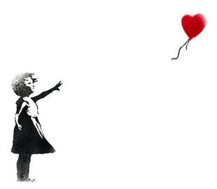
Look at the Terry Richardson shots for American Apparel, the works of Banksy, or Miley Cyrus's outfits -- the original intention was to produce camp, but to young people, without context, they just look cool.
The designers get to feel like they're doing something high-art, because there is intended irony behind their work, but the masses are just experiencing it like any other loud obnoxious art -- it still drowns out anything of subtlety.
This is a fun conversation and I feel I may be too ignorant on the topic to hold any informed stance. But my feeling is the problematic issue has a lot less to do with the producers and a lot more with the consumers. As in, you're right — the intention may be there, but the result is misguided since the audience can't appreciate it. Well, I appreciated it at least.
(Banksy's original intent was not to produce camp — read his pamphlets and manifestos from the early 00s. Highly socio-political, black mirror stuff.)
There is art that revels in loudness, and art that embraces subtlety. They can coexist. A Palahniuk novel does not negate an Ishiguro. The world is too big and audiences too fragmented for any one thing to dominate.
The world of music shows that inexperienced audiences will flock to loud novelty over quiet depth and substance every time.
The decline and death of classical music illustrates as much. The barrier to entry for the subtle works of the old masters is too high in the face of easily accessible garbage.
Or look to fine art, where people are more aware of Jeff Koons' balloon animals than they are Bouguereau's The First Mourning or the sculpture of Daumier.
Really appreciate your writing this. While I agree 100% that those realities are unfortunate, I think it's a related but somewhat tangential issue bordering on threadjack due to loud vs quiet, classical vs "garbage", etc. Those are subjective. What you're getting at is the current unquestioned appeal of the shiny and new. Reminds me of a quote I mention often, heard when mentoring a junior designer a few years ago. He said, "yeah I've got a book on typography, but, you know, it's from the 90s."
Bloomberg has a lot of fascinating web design. Their homepage has been walked down from the height of its punk-rock-ness, but I've always appreciated how bright and lively their site is, especially for an incredibly boring business/finance website.
Did I really just read "Did we reached" as a viable English construction? Ow. Easy fix if you can be bothered.
Regarding the question, no, I think that embodies everything wrong with the abilities of web design. Throwing a layer of Helvetica and various typeface sizes is not pleasant. What gives with the Mickey Mouse hand cursor? I get it has five fingers, but that's a glove suitable for a body that's been floating in a river for the past two weeks. And, if anybody else managed to dig deep enough into this LARGE PRINT EDITION WEBSITE and get to some of the speakers' photos, and mouse over, they wiggle and twitch and zoom in and out in some kind of digital seizure.
If you're going with coolness factor, I can honestly say some Pitchfork and Vice and other multimedia layouts have been quite impressive. There's a reason Medium is catching on so well. Clean, image featuring narrative in a not-too-cluttered-but-still-link-tastic format is highly readable and allows the subject matter to be the focus[0]
Everybody has different opinions and cultural influences, sure. Same goes for food. Or musical scales. I suppose that can make it more difficult for consistent standards and expectations on a global platform like the webs.
Title reminded me of "Cool Site of the Day". Surprised to see it's still going strong, 21 years later. Extra points for using a perl script via CGI. Now that's cool.
It's a bit disappointing to see how many websites no longer exist. Would be cool to see a mashup of Cool Site and The Internet Archive.
Think of it like architecture: you create a design that works, people copy it, it becomes standard, then boring, then people make baroque experiments, and then finally it goes retro. Rinse and repeat until a new technology replaces the old (steel over brick/concrete).
Web (and mobile) design is now stuck on the hamster wheel. Until we have nanomachines swimming through our veins, all we can do is reinvent what we have to make it fit the fashion of the day.
I'd argue the same goes for tech startups' business models, not just their websites. Snapchat didn't introduce any new technology, it just changed how we use what we have. That's why you see so many Uber/Airbnb clones: tech has hit a ceiling, for the time being.
I think in the next 5 years there will be a contraction in Silicon Valley, and a cynical cultural backlash as people see more and more that all this new tech isn't making life all that much better than years previous, but instead it just serves to make a few people very rich and the rest more rushed than ever.
- No hidden white text that needs to be highlighted to find the super secret link to the super secret webpage
Otherwise, bravo to the design team. They've developed a unique style (anti-style?) for Bloomberg pieces that many are now trying and failing to emulate. Good to see web design satirizing itself and staying fresh.
I'm using Firefox and there are actually many usability issues, which I only noticed when I opened the same page in Chrome. The bigDot's are too large and cover some of the text. The venue map doesn't show up on Firefox at all. Circles next to About/Speakers/Schedule/Location overlap each other. And so on.
Some talented artists getting away with amazing stuff over there, like how the 'what is code' article logs an ascii art "smash the patriarchy" tweety bird into the console. i love it.
If authors are reading- The 6 in BWDESIGN2016 wraps at smaller browser widths.
I'm noticing two emerging interesting trends on the web design/development front nowadays where people embracing and exploring international typographic style motifs mixed with minimalism on one hand and on the other hand, people dabbling with a revival of the ill-fated Flash websites in the early 2000s but this time around built solely on web technologies.
Nothing against those two specific trends and going experimental away from the bland and boring corporate and "professional" look dominating today's market but I must say that the Flash and extreme artsy minimalism are a step backwards and not a best fit for this specific medium and use cases.
The most interesting trends in web design I've seen lately aren't aesthetic - they're features engineered into sites that work and feel like native apps.
The pedant, polemicist, anal retentive in me would argue that losing just two letters is more economical than scraping a whole word and then inserting a new one in its place but that's just me and my multiple personalities.
That's not "atrocious css", that's minified CSS. They're running their backend code through a resource compression system like JAWR to conserve bandwidth. Who cares if the CSS that's presented to you isn't pretty, it's a declarative language anyway.
It's likely that's a remnant from Normalize.css (where each hack is assigned a number and an explanation) that didn't get removed when uglifying the CSS.
It's just minified. The CSS itself isn't terrible besides a couple overly verbose things, but nothing's atrocious. I think the /* 1 */ comment might reveal an issue with the CSS minifier they're using. That's normalize.css, all the other comments are removed besides the one inside a selector.