I mean, different people prefer different things, but there are plenty of high end watches that's square/rectangle, even though circular ones are more common.
When it comes to watch design, circle != automatically good looking, in my personal opinion, the Moto 360 is very cool for being circular, but the casing itself looks like one of those $100 dirt cheap Movado-lookalikes that you can get from an outlet mall.
Those are all renders of AppleWatch (the initial Moto 360 renders were equally fantastical). Are there bystander photos of the working AppleWatch models that look as beautiful as the renders? I'm interested in the cheaper plastic model in particular as that's likely the one I'm getting — and the price makes it a fairer comparison to the Moto 360
I actually like some square and rectangle watch designs, but in this case I dislike the particular overall shape of the Apple Watch.
It has something to do with the combination of the thickness, and the specific rounding of the corners and sides, that I find off-putting aesthetically.
I want to wear a watch, not a gadget. So I want the technology to be submissive to the watch. When you look at what is on my wrist, I want you to see a watch, not an iPhone mini-mini posing as a watch. We're still a decade away from this being possible.
The best thing about Apple selling this watch now is that it puts them on track to make one half as thick a few years later that really will be aesthetically competitive. Within the decade, smartwatches will undoubtedly be thinner than mechanical watches, but they've gotta start somewhere.
Though I do have to admit that going into this thing, my guess was that they'd be using a new color e-ink display to save battery life, not a "raise your arm to turn it on" sensor.
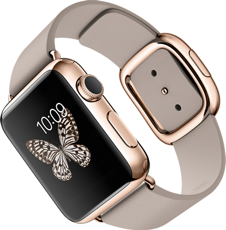
To be completely honest, I think it's hands down the best looking smartwatch.
The Moto 360 is the only competitor in looks, and it does indeed look great in renders. The problem is that it actually looks horrible (IMHO) in person. It's huge -- really massive. Nobody with a small wrist can wear a Moto 360 without looking a bit dorky. The strap attaches to the watchface at the very bottom as well, and it's a very thick watch, so the thickness is just emphasized in a very bad way. It's a bug chunk of metal sitting on your wrist on an inelegant way.
I think it's time to get over the fact that it's not round. 99.99999% of the LCD screens in the world are rectangular.
Apple is trying to reinvent the watch, not the LCD. The Apple Watch is capable of so much more than a mechanical watch. Why would they needlessly adopt the limitations that would come with a round face?
It really is an ugly square brick, regardless of how nice the bands are.
For a company that wanted you to think difference, which I interpret to mean "don't be a square", all this squareness and market conformity is really disappointing.