Whenever I see warped maps like this, I intuitively compare it to the standard map. Which, if you think about it, is a ridiculous comparison since one is based on population and the other is based on land mass.
That would be because Africa isn't a country. Look in the bottom center of the visualization: MAR, NGA, EGY, ZAF and a number of smaller countries between them - that's Africa.
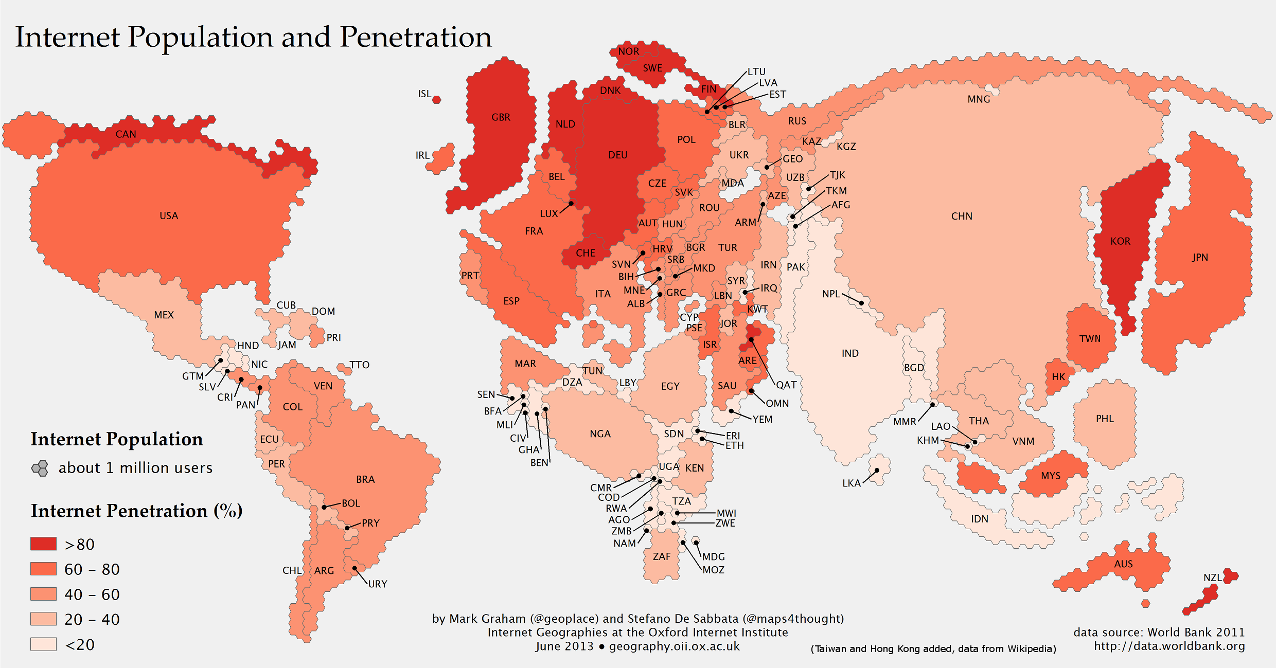
Since I still think it's an interesting to have it for comparison, I added it along with Hong Kong, taking my data from Wikipedia (respectively 17 and 5 million users, and 76% and 72% penetration):
http://ssz.fr/brdl/internet-pop-hk-tw.png (I'm no graphic artist and just fiddled a bit with Gimp to get something that looks acceptable - obviously the whole map would need to be redrawn to better take geography into account).
The two places do make up a sizable part of Internet population in east Asia, and make it look less like a region with only two isolated developped countries.
Yes. The data source for the map is the World Bank. The World Bank does not recognize Taiwan as a sovereign nation and refers to them as Chinese Taipei, as does the IMF.
http://cdn.theatlantic.com/newsroom/img/posts/population.png