designer here. by symbol-heavy languages i mean languages like Perl and Haskell which make heavy use of symbols (sigils in Perl and operators in Haskell). Myna was designed after my frustration with other monospace fonts combined with my (self-imposed) inability to use ligatures.
I think it might be useful to put some screenshots of other fonts on your page, to show what symbol or alignment problems yours corrects. Because I've studied a lot of typeface design, and I can't really figure out what you're doing, what pain points you're trying to address.
Because when you say "and $, @, % seem ever mismatched?", I don't have the slightest idea what you're talking about. I certainly am curious though, since you went to all the work of building a new typeface!
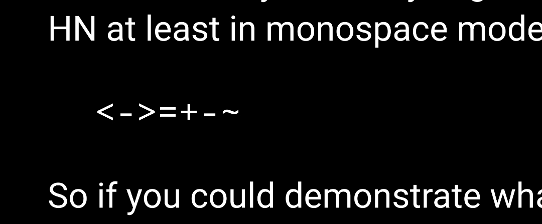
And when you talk about fixing alignment, like all of these seem correctly vertically aligned with each other here on HN at least in monospace mode:
<->=+-~
So if you could demonstrate what it is fixing with reference to the most common monospace system/coding fonts, I think that would help a ton.
thanks for the suggestion. i'd think about adding screenshots of other fonts.
about the alignment, i think the README might give an impression that it's solely about vertical alignment, but it's more about uniform flow of characters along with some resemblance with an actual symbol (which we can not have in ASCII).
for example, take the `<-` combination. i think you're correctly pointing out that in most fonts they are indeed vertical-aligned properly. but there are other details (horizontal alignment, angle between strokes, weights, etc) which i found missing. in most monospace fonts, these less-than and more-than signs are not designed with the view that their most common usage is indeed not checking for inequality but for bitwise operators and struct pointer dereferencing (C), function declaration and monadic/applicative/functorial programming (Haskell), shell redirection (bash), function composition (OCaml, Elixir), tags (HTML), and countless others. if you think about it that way, it makes sense to not make the angle between strokes too small. many monospace fonts do it because they respect classical typographic conventions regarding space and design. the same goes for the designs for backquote, tilde, comma, colon. in most monospace fonts, backquote is so small it's barely visible and tilde looks too much like the hyphen, etc.
Myna is my attempt to break some of these conventions to make things look a little bit even for programmers.
i know the title can be a bit misleading but Myna is primarily ASCII.
languages which insist on using full Unicode like APL and Agda have bigger problems (availability of uniform glyphs and inconsistency with monospace design) on their plates. which imo is one reason why full Unicode editing hasn't really caught up.
Myna doesn't use any ligatures though. it would run on almost all terminals and editors.
Yeah, I realize that I was wrong about ligatures afterwards. The two plusses next to each other looked as if they are a single combined glyph, but they are in fact separate. I think this is the effect you were trying to reach, and it looks very slick.
J mostly looks good but [) looks almost like a fancy capital D which can be distracting and =# run together at smaller font sizes which is a little weird. Those are the only things that jump out at me but I did not look hard, overall I would say it is one of the better fonts I have tried for J.
The big problem that I am having with this font is that its narrowness makes it difficult to find a fallback font for APL/BQN that plays well.
Myna's predecessor was a customised version of Source Code Pro. but i've changed a lot of glyphs by borrowing designs and modifying glyphs. so, it may not look like it at all now.
My own font took on the blockyness of the IBM 3270 terminals. Now it has a ton of glyphs those terminals never had, but I tried to remain faithful to its original design principles.
i've not been faithful to the original design of Source Code Pro or even Fira Mono or Ubuntu Mono (from which i also derived a lot) but do try to stick to a simple geometrical ideal with only a few exceptions.