Personal favorite, visualizing used disk space in order to find large directories that can be deleted. I use QDirStat on Linux and WizTree on Windows.
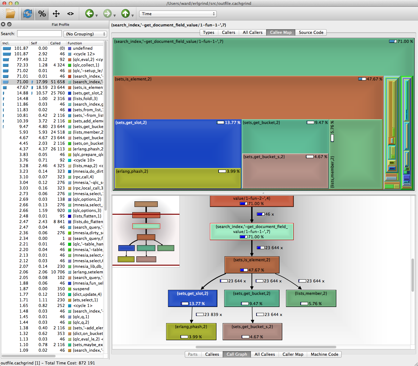
Showing CPU performance of an application is a pretty neat use case of one type of treemaps too, typically called flamegraphs too, but in reality I think they're just up-side down treemaps :)
yeah i have a deep infatuation with it too. i like disk inventory x and the visualization really works for me. i wanted to visualize my financial accounts and how much each one had etc (rather than seeing it in numbers) so i built a script to generate files in bytes representing the amount of money in each account and then build a temporary directory and then load it in disk inventory x. really interesting.
i ended up building my own library in react to render various things like what i spend my time in throughout the day (using rescuetime api) to gain better insights into my day. really neat stuff!
I did something similar a little bit more directly in my finance visualization app. (It's written in F# and there was a .NET Treemap control I could easily use. At the moment it mostly relies on Mint [Intuit] CSV exports, but the benefit to that is that I could treemap based on the Mint categorization tree.)
> The x-axis spans the sample population. It does not show the passing of time from left to right, as most graphs do. The left to right ordering has no meaning (it's sorted alphabetically to maximize frame merging).
Showing CPU performance of an application is a pretty neat use case of one type of treemaps too, typically called flamegraphs too, but in reality I think they're just up-side down treemaps :)