People don't like Apple, Google, etc. because they have cool, meaningful logos. I don't even know if the apple has a significant meaning beyond a fruit, and if it did it wouldn't make me want Apple products more than I do now.
This reminds me of when Pepsi paid several million dollars for a new logo, and this 27 page marketing doc leaked explaining how their new logo takes into account everything from the Mona Lisa to gravitational fields:
I think companies that are falling behind seem to be grasping at the straw. Someone suggested "well we seem to be losing market share, it is probably because we have an outdated logo, let's fix that"
HP is a big enough company that they will be able to take this and make it recognizable. As with any brand, it will take a lot of time, but I'm interested to see how this works for them.
It's likely the most abstract and simple logo I've seen a company of this size try using, so I admire this move on their part because it's risky and interesting. I do question the 13° thing, though. It may be crossing the line of simplicity and non-description if they intend to move on to just a forward-slash in a decade. I don't know if such a simple shape can do the job of a logo.
edit: Regardless, almost any logo can be a good logo if it's stamped on good products.
> HP is a big enough company that they will be able to take this and make it recognizable
If they have to do it, it's already a failure. Unless you are very familiar with their current logo, the odds of you guessing what the new one is are vanishingly small. They'd have to spend a ton of money to maintain its recognizability.
That's not true, no logo is recognizable when it's first designed. The whole point is you build an association to your company by putting it on your products, and ads (which will probably be crucial in this transition). If you start seeing this logo and hearing the letters "HP" along with it you'll start to recognize it really quick.
They'd have to spend a ton of money to maintain its recognizability.
Like I said, the way you maintain a logo's recognizability is by simply using it. What I meant to say is if they use a specific design aesthetic/context, through repetition the logo will become recognizable. HP is a big company and their usage of it will be heavy enough to make that happen. It just might be more challenging since they're pushing the limits of abstraction in logo design, which is what I find interesting.
> no logo is recognizable when it's first designed
I am surrounded by logos anyone with even the most a tenuous grasp of written language would be able to interpret correctly in less than 5 seconds. IBM, Dell, Microsoft, Philips, HP (the current one), iG (the company I work for). The ones that would require more work would be the Microsoft flag, Apple's bitten apple (which is obviously an apple) and Ubuntu's circle of friends. I understand your point of continuously using the logo in order to build context, but this one is not like Cisco's bridge - it's a very generic set of four parallel lines. When someone tells you it's HP's logo, you say "ah! of course!" but, until then, people will scratch their heads for a while.
Maybe you're right, but to be fair those names you mentioned all use logotypes and this design is bordering on just a logo- it's much less of a logotype.
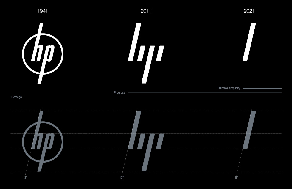
"The defining signature of the system is the 13° angle. 13° represents HP’s spirit as a company, driven forward by ingenuity and optimism about the future and a belief in human progress."
This reads to a non-designer like myself as pure BS, written merely to justify the likely exhorbitant cost of their work. All that seems missing is a few "paradigms" and "outside the boxes".
Could an experienced logo designer weigh in a let us "pure techies" know if this kind of stuff passes muster with you? Does a 13* angle really convey that much more than a 14* could?
For what it's worth, the new logo looks terrible. The old one had a classic tech look like IBM's.
The original logo from the 1940s is 13°, which is why it's not 12° or 14°.
Companies strive for the pure distillation of their brand. Over time, the identity of successful brands become simpler and simpler because the simpler it is, the easier and quicker it is to identify from afar. What's better than the Nike swoosh with the Nike text on top? Just the swoosh by itself because people know what the swoosh is without you telling them. Starbucks also recently simplified their logo. They dropped the text and emphasised the siren. I wouldn't be surprised if in the future, the Starbucks logo is nothing but a green circle.
Coca-Cola is a master at this. You don't need the cursive white text to know that a red can is probably Coca-Cola. They effectively own the red can. With the new Diet Coke branding, they're trying to do the same for a silver can.
The experiment is trying to establish something similar for HP. When you redesign something, you have to carry over something from previous designs--otherwise it's not something familiar but completely foreign. The agency that did this redesign decided to focus on the angle of the italicised text hoping that HP can eventually "own" anything that is slanted 13°
As a design student I can guarantee the 13° stuff is presentation BS. It's an attempt to make the HP board-members feel as if they really got their money's worth, like it's been meticulously designed and perfected to the degree.
I wish they had just referred to it as an italic, because that's what it is. But that wouldn't fly.
When you look at it, you see the 'h' and the 'p', but when you just glance at it, it's nothing. The effect is kinda neat, but I'm tempted to say that 'clever' is not what a logo should be (and I think clever here is being generous).
edit: at least not this kinda of clever, where the whole thing is hidden.
A little bit too simple for me. I guess it supposed to look cool and sleek, but I don't know, something is odd about just 4 lines. What do you guys think?
So you're the new CEO at HP, and you look out across the landscape. You see many problems. Lots of things need deliberate attention with a mindful approach to creating solutions that can be put in motion today and followed through for years to come....
And you come to the conclusion that what the company really needs is a corporate identity refresh.
Je ne sais quoi - An intangible quality that makes something distinctive or attractive.
I can say, with a high level of confidence, that the intangible quality that produces je ne said quoi surrounding brands like Apple. The current HP logo is sufficiently "designy" to surpass the general public's expectations.
This reminds me of when Pepsi paid several million dollars for a new logo, and this 27 page marketing doc leaked explaining how their new logo takes into account everything from the Mona Lisa to gravitational fields:
http://code.google.com/p/daxp/downloads/detail?name=pepsi%20...
I wonder if the Pepsi execs are still looking at this doc and wondering why they are second to Coke and Diet Coke?