Their new design was just yet another example of how the currently in vogue "minimalism everywhere" design aesthetic sucks. The Tropicana case study is such a great example because the effects were so drastic, but only really because there were easily substituted goods - consumers basically thought the carton was just "generic store brand OJ".
My guess is that other recent brand redesigns to this boring, same, sans-serif minimalist aesthetic (recent HN article, https://news.ycombinator.com/item?id=32040506) are just as bad, but with "stickier" products (people aren't likely to leave Google or Facebook just because the typography is shittier) the downside is less noticeable.
On that subject, https://www.underconsideration.com/brandnew/ tracks the desecration of all these once colorful, beautiful, expressive logos into this new bland style that's in vogue.
Saying that this guy's designs were terrible therefore all modern design is terrible is like saying all children's TV presenters are pedophiles (apologies I know that's an extreme analogy).
The truth is that the guy behind this design agency is not a good designer at all and his career seems to have been driven by confidence, greed and the incompetence of his clients. It's a sample of one. He's the Jimmy Saville of bad design
Which is why I linked the related recent HN post about tons of different brands, across tech and fashion, that wiped out any trace of their individuality for bold, sans-serif logos.
I agree, I think this designer is just a particularly shitty designer, but he's a shitty designer that's just copying the broader trend of minimalist design laziness. I think the last section in that linked HN article (https://velvetshark.com/articles/why-do-brands-change-their-...) perfectly points out what went wrong in the Tropicana redesign as well:
> There’s nothing bad in wanting your logo to look simpler, better, mobile-ready, or universal enough to appeal to the broadest possible audience.
> But don't throw the baby out with the bathwater.
> Shoot for simplicity and legibility, but keep your distinguishing features. Don’t throw away what the brand has been working on for decades.
> Otherwise, you may end up in a situation where you could slap any logo on any product and hardly anyone would notice a difference:
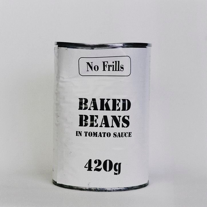
My guess is that other recent brand redesigns to this boring, same, sans-serif minimalist aesthetic (recent HN article, https://news.ycombinator.com/item?id=32040506) are just as bad, but with "stickier" products (people aren't likely to leave Google or Facebook just because the typography is shittier) the downside is less noticeable.