Eh, the Borland Grahics Interface (BGI) style TUIs were kind of awful. I hated the Borland Turbo C IDE in no small part because of that style TUI. It just wasted so much precious character space on TUI frames and other decorations.
More of my fond TUI memories from that era were the bespoke ones in the demo/art/music/bbs scenes. Those in many cases were still character based but seemed to make better use of the screen space and at least more aesthetically pleasing character sets.
Scream Tracker / Impulse Tracker comes to mind as one example:
For anyone searching for the Borland style text interface, it was actually called TurboVision, not BGI (which was a generic graphics library). TurboVision (and many GUIs of the time) largely followed the Common User Interface (CUI) spec by IBM for its interactions in text mode.
It is fair to say there was a lot of screen space devoted to borders and such, especially in 80x25 mode, but that helped make everything super clear and usable.
I remember that I loved the Turbo Vision TUI's so much that I dreamed to have a copy of it as a kid. My family wasn't very well off, but I got Borland C++ 2.0 for Christmas. The compiler came with BGI graphics but they were NOT text mode. The library was also awfully slow (drawing a picture by repeatedly calling drawPixel() took minutes)
I don't remember the price of Turbo Vision, but I remember it was obscenely expensive in my third-world eyes. It was sold separately until it was finally bundled with BC++ 3.1 (1992).
Altought I liked Borland IDE's, did't liked their UIs neither. For me the best text UI's ever created were Symantec's, which used some custom icons (ie arrows, buttons), and nicer tech colors:
The DOSSHELL included in MS-DOS itself also used some custom graphics, but that was totally optional. The interface was still based around the usual hardware text mode.
You might have disliked them but they were far from awful. They were some of the cleanest TUIs ever designed.
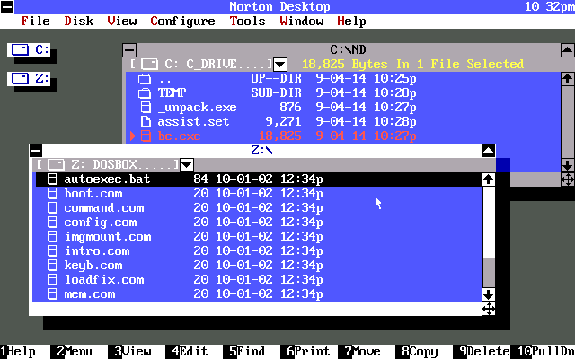
The other screenshot you shared isn’t a TUI by the way. It’s a GUI. It just happens it runs atop of DOS (much like early versions of Windows did). So it’s not really comparable to TurboVision.
Regarding TurboVision, I suspect you might be in the minority with your dislike for them too. Which I guess just goes to prove that everyone will have different preferences and thus you can’t please everyone all of the time.
It has bevels made up of 3 colours, so I can’t see how it’s pure text mode. It’s certainly text heavy so they could have drawn the GUI int a frame buffer and then just used text mode for screen updates. But that’s a little disingenuous from being a TUI.
You guys are still missing my point that it’s not a TUI because non-text elements have been drawn to the frame buffer. This is actually a lot easier to do in DOS than it is in UNIX too by virtue of the fact that DOSs text mode isn’t a pseudo-teletype. In fact this is a trick I used to do all the time when writing software back in the 80s: draw a UI then fallback to printing characters for UI updates.
For that tracker to be a proper TUI it would have to use text characters for all of the UI elements, bevels included. You simply couldn’t do those 3-tone bevels with any alt character sets, let alone an 8-bit one from the era of DOS.
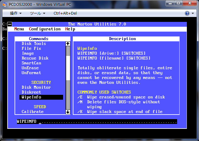
What frame buffer? There is no frame buffer. It runs in text mode, thus it's a TUI. Would you consider Norton's text-mode interfaces not TUIs because they would redefine some characters for window chrome and a mouse pointer?
Are you sure? It seems to me that they were probably replacing some text characters with their own sprites instead. They could still be text characters, just redefined for their purposes.
I remember back then my editor of choice in DOS was QEdit. I think it used up less space with its menus, although it's funny to think I enjoy using vim today whereas back then in my youth it may have been too much for me.
I do miss the simple UI offered by some BBSes (as well as their message editors, like in Renegade BBS). A lot of that is just nostalgia, of course.
Compared with modern UIs where you don't know where an UI element begins or ends or with gray font on gray background (or like this text field on my phone where the cursor does not advances when i press space) those UIs were a blessing.
Impulse Tracker, which was intended as an advanced Screamtracker clone also features character map graphics to show sample data. It was kind of mind-blowing back in the day to have a text-mode DOS tool with pseudo graphics.
Totally! However, even with the proper fonts (that also have to be aspect ratio corrected, the usual VGA text mode did not have square pixels), I struggle to recreate this to the point that it's really recognizable.
CRTs with that text mode (and including scanlines, but not only that) just seem very hard to reproduce on modern displays.
The fact that your photo does evoke the same feeling while I'm seeing it on a modern 5k display shows that it's possible, but the amount of tricks needed might be so much that it becomes whimsical somehow (or at least in contrast to just changing the font)...
I once wrote a web front-end for a DOS-era web application that was used at over 2,000 locations by hundreds of thousands of people. It was virtually identical to the original layout and functionality, but it had basic-yet-functional HTML look to it. Think Google search.
On the 1st of April it would instead switch to a "DOS skin" using the fixedsys font and the original colour theme and box-drawing character layout. Virtually identical to the original, except that some things were centred and you could scroll with a mouse.
I wonder if it would be possible to extend a terminal multiplexer to the point of providing such an intuitive interface to existing TUI software on modern *ix systems. I'm sure the effort would be quite non-trivial, but it would help a number of workflows. Adding support for the additional features that are found in these TUI environments (consider e.g. menubars) could then be done via custom terminal extensions.
Check out the VTM project[1]! It feels like that's the direction they're heading. No direct affiliation; they've filed some bugs on Windows Terminal, however. :)
Well, that's a terminal multiplexer but not very TUI like. I don't think it would be directly usable over a low-bandwidth SSH connection, which is the kind of use case people often have in mind for TUI's.
Oh, great! Happy to help. I've been using it for years now -- it's becoming a faithful friend, to the bafflement of my colleagues who are mostly Vi(m) or Emacs fans.
The one thing it doesn't do for me is pick up Git commit templates, so for that I have to have my default set to `mc`. I don't know why that one thing doesn't function.
I liked Turbo Vision but I thought Microsoft’s text UI (the one used in products like QuickC, QBasic etc — not sure what it’s called) was actually cleaner and more aesthetically pleasing.
Never tried that, however. Ncurses is what is used under Linux and other UNIX like systems to draw terminal based GUIs, and allows some pretty good graphics.
I absolutely do. I'm 100% aware that it's the nostalgia talking, but I don't care, I unapologetically love them.
For context, the first computer we got at home was a PC at some point in '94 or '95. We had MS-DOS 6.22 and Windows 3.11. Some years later we moved into Windows 95. While I didn't really use these kind of GUIs (DOSShell and so on) as often as I would like, I always thought they were very pleasant to use. There is something about that DOS font that makes me happy each time I see it, and there is a certain feeling of being a stereotypical movie-style hacker when you use these instead of modern, actually graphical UIs. And yes, the reminiscence of simpler times with simple software, way before the surveillance capitalism and the brutal omnipresence of ads, is easy to appreciate.
The nice thing is that early versions of Windows supported these GUIs as well. So, a few years later, during my degree in Computer Engineering, I learned some x86 assembly (using Turbo Assembler as a compiler); this was during the early 00s, and we still used EDIT.com as the main text editor, although there were some others available. I loved it since the first day, both in concept (super low level programming with direct access to the hardware, managing interruptions and so on) and in execution (everything was in that text mode I loved, since modern Windows and their restrictions didn't play nicely with such low-level programming). I learned a lot from Ralf Brown's Interrup.lst, and wrote a few simple GUIs of my own, using box drawing characters and all that. Aside from those I wrote for academic work, I mostly spent a lot of time creating a silly GUI that allowed you to modify the look of the console. There were a few resolutions available, from 40x25 to 132x60, and you could change the colours of the text, the background and the border (yes, there is a border, which you can set to a different colour than the background. And my program could get 2^18=262144 colours available, not just 16! Although 16 was the max simultaneous on-screen limit IIRC), plus the font (I was able to add an edition screen where you could see the aspect of all 256 characters, yet I could use box drawing and so on for the interface in this screen. Did you know that DOS allowed two different sets of characters in screen at the same time?). There were some other additions like pixel-level scroll as opposed to the usual line-level scroll, and background "music" using the PC speaker. It didn't have any practical purpose aside from these silly customisations (which, in the case of Windows, went away when you closed the windows, and some times, also when you moved from full screen to a window), but man, did I have fun coding it. It's still one of my best memories of programming, nearly 15 years later.
Then, in 2009, my last Windows 98-capable computer stopped working, and current hardware only supported Windows XP and newer, so all of this fun basically stopped being possible (especially considering that basically all state of the art hardware was already 64 bits, and 16-bit applications like EDIT.com weren't supported any more). With emulators it's not the same, because I know I'm not really accessing the low-level hardware registers. By that time I already had a job and there was less time for this kind of hobbies, so I eventually stopped. Currently my recreational programming is mostly oriented towards math (Project Euler and so on), which is very different, but I still remember those days very fondly. I still have all that code somewhere.
Yeah, it's all nostalgia, but that doesn't mean it doesn't hit hard.
OH GOD NO. Man, I hated all that stuff at the time. If you're stuck in text mode, just be text. Don't try to mimic a GUI; it just looks weird and generally works poorly.
A web site that imposed this sort of interface would be a site I visited ONCE.
I suggest that you need to look at the historical context of it.
When DOS was the uncontested king of business computing, user interfaces were all over the place. Every app had its own UI, its own keystrokes, its own everything.
To steal some text I wrote for Wikipedia:
In WordPerfect, the command to open a file was F7, 3.
In Lotus 1-2-3, a file was opened with / (to open the menus), F (for File), R (for Retrieve).
In Microsoft Word, a file was opened with Esc (to open the menus), T (for Transfer), L (for Load).
It was a mess and a significant effort to learn multiple apps.
Then classic MacOS and MS Windows started to introduce the idea of uniform UIs, where programs had the same menu bar with the same core menus with the same commands on them, opened and navigated with the same keystrokes.
It made life so much easier. A lot of apps came across, even big-name ones -- for instance MS Word (v5.0, proprietary 2-line menus at the bottom of the screen; v5.5, CUA menu bar); WordPerfect (added CUA menus in v5); Borland Quattro; etc.
And if you have a standard menu bar, then you more or less need to have dialog boxes as part of the UI.
Once you go that far, you may as well apply it to multiple documents support and so on.
And so you end up with a familiar, more-or-less harmonious UI across different apps from different vendors, and for the first time it became possible to operate a program you'd never seen before first time.
This was a huge win for usability, accessibility, and it saved time, effort and stress for millions of people.
It was a triumph. That UI persists today in most modern FOSS apps and desktops, except for intentional rebels like GNOME 3, who want to make us all use phones with big screens.
If I am going to use a text editor, say, in the shell sometimes, then YES I want it to use the same UI I have in my GUI session, with the same keystrokes and menu options. Life is much to short to learn some crappy half-assed UI from the 1970s because a bunch of old dudes with beards have loved it ever since.
I'm 51. I lived the era you're describing, so yeah, I understand the historical context quite well.
But you're crossing the streams a little here.
Yes, it was a net win for the shift to GUIs to include a shift to very, very consistent interfaces.
HOWEVER, it doesn't follow that goofy, hamfisted attempts to mimic those interfaces in text mode was a good idea. If you want that, just go use Windows (or the Mac).
Word for DOS 5.0 was a fantastic program that I could move around in VERY VERY VERY quickly. It was powerful, stable, and extremely usable once you learned its interface.
Word 5.5 for DOS ripped out the ESC menus for a crappy text-mode UI, and basically killed the product. (For my part, I immediately uninstalled it and reinstalled 5.0 so I could get work done.)
But I _strongly_ disagree. In fact I think I could reasonably say that I couldn't disagree more.
I thought it was a huge win when DOS and console-mode apps adopted the general Windows-like UI.
I worked in support back then. I had to learn many dozens of apps to support them.
For instance...
In word processors, on DOS alone I worked with MS Word, WordPerfect, DisplayWrite, MultiMate, WordStar (classic, 1512 (i.e. Express), & 2000 — all different), Samna Executive, PC-Write, VolksWriter, XyWrite, Protext, PFS:Write, and also LocoScript (from the Amstrad PCW, later on DOS). Probably others.
Spreadsheets: Lotus 1-2-3, Lotus Symphony, AsEasyAs, SuperCalc, Quattro, MS Multiplan. Probably more.
I had to learn all of them, all separately, either at least the basics (I think Samna is the only one that defeated me there), or in multiple cases, pretty much inside-out.
I mean, as an example, I didn't consider myself a guru, but I interviewed for https://www.newtonim.com/ in about 1992 and I got a record-best score (about 98%) in their test of my WordPerfect and 1-2-3 skills. Neither was even my favourite program of its type!
It was a massive pain.
I mean, yes, you're right, some of them were highly efficient interfaces. I didn't hate 1-2-3 or MS Word for their idiosyncratic 2-line menus. You had to memorize them to be fast and efficient, but it wasn't that hard and once you had, it was as you say very quick.
Unlike, say, WordPerfect with its wretched Ctrl-F3, Alt-F6, Shift-F2, Alt-Shift-F8 workflow. Horrible and basically impossible to discover. If you didn't have that little cardboard keyboard template, you were doomed.
But I didn't have the luxury of picking 1 app of each type and using only those. At work I used PCs with PC DOS, at home I used CP/M and Locoscript, later Acorn RISC OS, later still OS/2 2. I did charts and DTP on classic MacOS.
All totally different, and my job meant knowing _all_ of the leading contenders in all categories.
Sure it was possible to write attractive, efficient, DOS menuing systems. Novell's DOS menuing system on Netware clients and on the server itself was fast, easy, efficient, and attractive.
So was 3Com 3+Share -- probably last seen by most people in the config tool for the classic 3C509 NIC.
But they were totally different from one another.
So if you only used MS Word, good for you. I envy you the simplicity that may have lent.
But for those of us who changed apps considerably more than every day -- more like ever hour of every day -- no, the profusion of DOS UIs was a complete pain in the neck and made my job 10× more difficult.
So when they all went away, replaced by a text-only version of the Windows/CUA guidelines, I celebrated. It made my life so very much easier.
Which is why now, 3 decades later, I absolutely refuse to learn the horrid 1970s BS UIs of Emacs or Vim. I don't care how powerful they are. I'm not interested. I gave that rubbish up in about 1990-1991 and for me all those proprietary UIs died once the next-gen ones came along.
You're still litigating the idea of interface standardization, which isn't the thing I was saying was a terrible idea.
Your background is not normal. Most people doing actual work in that era used the word processor they had, not seven word processors.
In a limited environment -- text mode -- efficiency and speed > cuddly GUIs. If you wanted the common interface, install Windows; don't fuck up the existing interfaces of tools people were VERY VERY good at to graft some horribly ugly faux-GUI on them.
>I absolutely refuse to learn the horrid 1970s BS UIs of Emacs or Vim
Given the longevity and popularity of these tools, coupled with their broad availability on so many platforms, this sentence reads more like "I'm proudly ignorant!" than anything else.
Believe me, tech support is actual work. Without it, all those writers and accountants wouldn't get much done.
The CUA interface is perfectly efficient and works very well. It doesn't need a mouse, although you can use one if it's there.
As I said: I was a skilled user of a bunch of the leading pre-CUA DOS apps, and I can navigate a CUA interface using hotkeys very quickly and efficiently without a pointing device. Occasionally, over the years, astounded onlookers have asked how it's possible that I can operate Windows so quickly. The answer is that I don't use the mouse much, and the reason is that in my first job, my employers didn't own a PC mouse. They sold Macs; if you wanted to do graphical pointy-clicky stuff, you bought a Mac.
I decided that Windows looked like it was useful and could be big one day, so I installed Windows 2.01 and learned to use it... without a mouse. The same keystrokes mostly still work today, from obvious ones like Ctrl+S to save, Ctrl+X/C/V for Cut/Copy/Paste, to less-known ones like Ctrl-W for Close Window and Alt-F4 for Close Program. Alt-Space for the window control menu, then X to maXimise, etc.
It's a common but spurious argument to claim that because one knows one particular program well and can operate it very quickly, that this fact in some way indicates that the program's UI is particularly efficient or well-designed or something. It isn't. It just means that that individual knows it well.
The basic concepts of the desktop GUI were nicknamed WIMP: Windows, Icons, Menus, Pointer. Well, each of those works fine in isolation. Icons are a useful abstraction all on their own; for instance, iOS and Android make very extensive use of the "I" part without the "W," "M" or "P".
By the same token, the W and M parts -- windows and menus -- work very well without a GUI. It's very handy that the same keystrokes that let me drive Geany or Mousepad or Notepad also work fine in Tilde or MS-DOS Edit.
They're no less efficient. Ctrl+S Ctrl-W to Save then Close is just as quick as ^KS ^KD, or !wq, or C-s C-x, or Shift+F3, Ctrl+F4.
But what's a huge boon to my or anyone's efficiency is that once I've learned Ctrl+S, say, it works in thousands of programs on multiple OSes. C-s C-x or Shift-F3 don't work in anything except the one particular app they were designed for.
I used poor wording. Support is definitely work. I just mean that MOST people doing day-to-day work USING tools (vs supporting them) only deal with one at a time.
A UI's utility isn't determined by whether or not it's shared with other tools. It's determined by *how well users can get work done with it* which is why a host of non-CUA interfaces persist today.
Text-mode CUA was and remains horribly ugly and clunky. If you want that, go use a GUI.
What I am saying is that in this case, I put it to you that this is more than simply a matter of opinion and personal preference.
There are demonstrable, measurable advantages to this approach. Knowledgeable users can work on unfamiliar programs immediately by using standard keystrokes and via prior knowledge of how the menus will work.
Unskilled users, so long as the machine has a mouse configured, can simply use the console/terminal app in the same way as they're used to, by point-and-click.
I get that you hate it. What I am trying to tell you is that I _really_ like it. It is a _strong_ preference of mine, I find it asthetically pleasing as well as convenient, and I hate and refuse to fight with non-compliant apps that don't use it. Including _both_ of the xNix world's favourite editors, Vim and Emacs -- I hate both -- *and* all the alternatives people recommend: Joe, Pico, Nano, etc.
I get that you have a preference. That is your choice. But you are trying to make out that it's a universal truth, that your opinion is an objective fact, and it's not.
Whether you, or anyone, likes it is neither here nor there. It helps. It works. It's useful. It makes life easier.
And if the price of that is that some people's aesthetic sensibilities are offended, well... sorry dude, tough.
Lmao I like how saying "no" got you downvoted. Express an opinion about a purely subjective thing that others don't like and you get downvoted. Come on HN, you can do better.
https://img.itch.zone/aW1hZ2UvMTIyODU3OC83MTY0MTEyLnBuZw==/o...
They have such a cozy feel, reminds me of simpler times.
It would be cool if there were a CSS framework where you could make webpages like that.