There's certainly an amateurish charm to old video game ads. Today, everything is pretty slick and there's a general base understanding of how to write copy and how to make ads look polished (probably thanks to the internet), but back then it was really a free for all.
Everything used to be less slick. Even huge store chains and brands look amateurish by modern standards, from as recently as the 90s. Some of it's explainable by changing fashion making those things look worse, but most of it's just that less was designed, and expectations for how (say) a Wal-Mart's exterior (and interior, for that matter) would look didn't include the whole building being "on brand", to pick one example.
I think graphic design becoming much faster and cheaper, and elaborate custom-designed and custom-printed/manufactured signage, wraps, et c., becoming far cheaper to make, is part of the cause.
I also suspect much of this is a very visible case of Graeber's "Bullshit Jobs", specifically of the "zero-sum competition" variety—which makes sense, given the relation of this to marketing and ad-spending. I don't think Target having the entire facade of its buildings designed & built to be "on brand" does very much good of any kind, per se, nor do brand-driven price tag or end-cap sign designs and such, and the (apparently) increasing tendency to tear down rather than repurpose—I assume because making the old building fit your design system would cost about as much as building new, anyway, and if you build new you also get... a new building—sure seems socially harmful. However, they feel they have to, so they don't look shabby next to all their competitors.
On the subject of changing tastes, I suspect that in 10 years anything in a corporate Memphis style [1] is going to look horribly amateurist and outdated. This shows up a lot more in landing pages and tutorials than ads, but I'm sure there are similar artifacts in ads these days.
That link is a wild ride. I expected a design blog. Instead I got a communist indictment of startup culture through the lens of the commodification of illustration.
I miss hand-lettered signs with misspellings and punctuation errors in carry out places. Now even the smallest mom and pop has professionally lettered signs and menus.
The UK is having gas shortages and I saw a article where one of the gas stations was pictured and they had a glossy, perfectly on brand sign explaining the situation. I was thinking that a couple of decades ago it would've been crazy to get those printed and distributed to stores in less than a week.
Maybe I've just become jaded by it all, but those older ads also felt steeped in a different kind of consumerism, angled at a different kind of consumer. Still interesting to read, but I don't find them any less passe just because they're a few decades removed from your Sears catalogue.
Yeah, you've got a point. They're still ads at the end of the day. A lot of the design language is also very much a product of the time. Very type-heavy (I'm reminded of the magazine Ray Gun) and a lot of "attitude".
Growing up playing video games in the '80s and '90s, I always thought the companies making games were massive. As an adult, I've gone to several retro gaming conventions and seen game creators from back then talk about their experiences. It really surprised me the first time I learned that often those games were often coded by 1 or 2 people. So yeah, those companies behind the ads were tiny by today's standards.
The teams were much smaller than Young me realized as well. The mini interview about the launch of the Nintendo Entertainment System after the video game crash was pretty interesting.
> In my job I work with professional programmers working on
personal computers. I have met hundreds of such
programmers and have developed a good feeling
for their characteristics as a group. I can say with
sad certainty that the average programmer is not
sharp enough to write good wargame programs.
Very few programmers in this business are bright
enough to handle the task. Most programmers
work in BASIC, a language for beginners. Even
among programmers producing commercial
software for personal computers, fluency in
assembly language (the most powerful language)
is rare. It is impossible to fully realize the power of
a personal computer without using assembly
language.
To the folks that were around - was that statement true at the time, in a reasonable/charitable interpretation? Or is it just a early form of gatekeeping that got written down?
You were all but guaranteed a BASIC in most late 70s/early 80s home computers. It was frequently optimized for development cost and ROM size-- so "it fits into 4k or 8k" was more important than performance or quality of life features. The canonical example of this problem was Commodore's 2.0 BASIC-- incapable of accessing almost all of the machine's graphics and sound capacities without resorting to peeks and pokes. Even if you could fight through that, it wasn't going to be possible to maintain smooth animations or do cycle-precise operations.
The other available option was assembly. Most platforms had some assembler/monitor package available for fairly cheap, or even built into ROM.
The solutuons you'd expect to fill the gaps simply weren't there. You didn't see too many compiled languages (which could close the performance gap) likely because compilers of the time were typically expensive and commercial, and often required fairly big hardware (disc drives and more memory) to run on. If you had a VIC-20 or ZX80, there was barely room for any nontrivial code, let alone a compiler to toss around intermediary state.
FORTH was a valid alternative to BASIC on the 8-bit machines (it could easily have better code density than naïve raw asm) and some commercial software used it.
I have a vivid memory of an ad for, I want to say a joystick, from when "force feedback" concept was quite new, it's stuck with me since the mid-nineties perhaps?
It was a picture of someone putting a fork into a toaster with the caption "there's an easier way to get force feedback...". I want to say it was for something in the Microsoft Sidewinder range, but I can't find it! It's stayed with me though as I thought it was both clever and terrifying!
That's one thing I miss about that era. Every year your mind would be blown as the seemingly impossible was rendered in real time on your computer. Each year was a massive leap in capabilities.
These days there's still a lot of boundaries being broken but it feels less pronounced than it did in the 80s and 90s. The difference between HD and 4k is pretty small from a reasonable viewing distance vs the difference from SD to HD. Never mind the jump from 8 bit colour pallets to 16 bit colours, CGA to VGA, or even the first time I hooked up a colour monitor to my Amstrad after using a literal green screen for years.
> Every year your mind would be blown as the seemingly impossible was rendered in real time on your computer. Each year was a massive leap in capabilities.
I remember seeing a blurb in a magazine for Morrowind (two years before it came out) with a picture of a dark elf's face and thinking that there was no way I would ever own a computer capable of rendering that.
To be totally honest I struggle to tell the difference graphically between PS3, PS4 and PS5 games as an example. I'm an older gamer and I tend to play retro games so I know I'm showing my ignorance here. But to me graphical advancements have been in the "diminishing returns" phase for a good while.
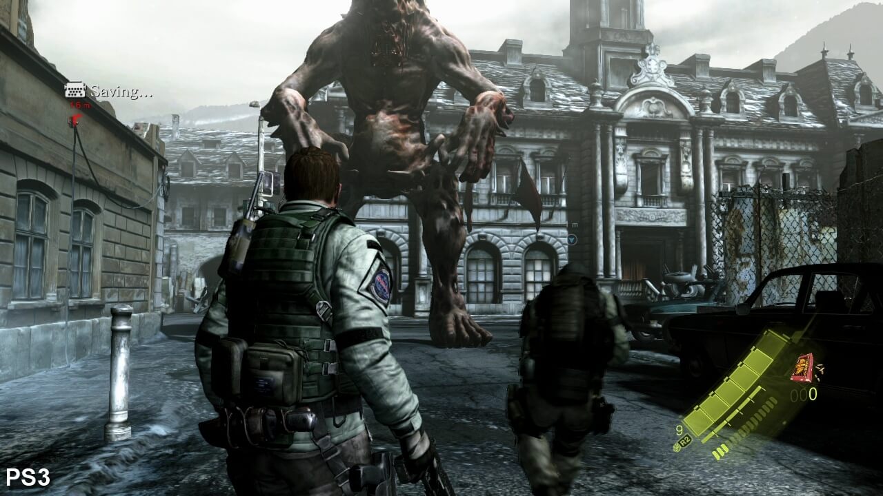
You probably wouldn't say that if you actually looked at a PS3 game vs. a PS5 game. The difference in texture qualities tend to be immense. Older games will have textures that looks like starchy blobs of the right color scheme. Newer games will have detailed textures that have depth to them.
Here's resident evil 8 (I think on Xbox?). Even on the other end of the room you can see details in the wood paneling. The lighting feels more realistic. The reflections off of the floor varying by material and angle are particularly nice looking. The chandelier looks very intricate whereas in an older game it probably would have been comprised of 2D slices or something.
You're right, I agree with that. I think if I were to look at games side by side I'd notice the difference. I guess I more mean when playing a game, I rarely notice the added fidelity. Where as older generations, like Saturn -> Dreamcast or PS1 -> PS2 the jump was plain as day.
As a kid I went from NES to N64, not knowing there was a generation in between. That was pretty cool. I think there have still been a handful of "wow" moments in graphics for me still in recent years. It's not so much things looking more detailed, but things looking more alive and fluid. Hair is looking really cool in games these days. Wet things look really wet. Real time global illumination strategies look damn cool, and imo, more impressive in non realistic environments. But I think in general the biggest improvements in graphical immersion yet to come will be less in terms of graphical improvements and more in environmental physics and small details that "happen" when previously they would not have happened.
A lot of high end tech is becoming more accessible, and I think because of this, will also become more modular. I'm excited for it.
> I think there have still been a handful of "wow" moments in graphics for me still in recent years.
I'm not saying it isn't happening. I just think it's less dramatic. The examples you've given are all significant in adding to the realism of a game but it still doesn't have the same impact that previous leaps in tech did. eg no kid chats to his mates in the playground about how much more real someone hair looks in a game.
It’s possible you grew up. I literally couldn’t tell you a difference between the last two generations of PlayStation and Xbox except that one is made by Sony and one is made by Microsoft, but both consoles have their fan communities.
It's not an age thing. It's about graphical updates becoming an advancement with diminishing returns given we only have a limited visual acuity to begin with.
This is why engines have to work on smarter lighting effects, more realistic physics of water, hair, etc to step things up (or pivot to entirely new technology platforms like VR or AR). But the thing with more realistic physics is that they're not always really obvious. That's in part because there's a law of diminishing returns there too where previous generations of game engines would get progressively better at simulating these effects. So unless you're really looking out for the differences, a lot of the improvements will be easily overlooked (though I'm sure they're at least picked up at an unconscious level).
But when you go from monochrome to 4 colours. Or 4 to 16 colours to 256 or several million, that difference is very noticeable because the limitations were very noticeable too. And those were the changes that happened to gaming during the 80s and 90s.
> I literally couldn’t tell you a difference between the last two generations of PlayStation and Xbox
Exactly.
> but both consoles have their fan communities.
Of course they do. You'll find fan bases around most things. That doesn't prove anything other than humans being largely pack animals and habitual.
It was one of the only ways to find new stuff! Getting a new game magazine with a demo CD was was a very cool treat. I remember there was a TV show I’d watch that would promote new games too. Otherwise the only way to know what games existed was to go to the store and look at the pictures on the giant cardboard boxes they packaged floppy disks in (and later CDs).
I distinctly remember doing that for Quake. Going into the store and getting the demo hard disk to take home and install on DOS. That started years of FPS playing…
I actually get more enjoyment these days reading about games than playing them. Or at least I spend more time reading about them than playing them. For instance, reading an issue of Retro Gamer magazine is highly pleasurable. Picking up a retro game that I didn't actually play as a kid is usually less so.
Apparently every single one of them had to have an edgy snappy tagline, preferably in quotes.
Gotta say though, seeing quasi-cubist art, for ‘Hyperblade’, is a bit of a pleasant surprise. Even if it's quite in vein of business magazine illustrations from the 90s to this day.
One of the fun things about reading 90s and 00s comic books is seeing the full color full page video game ads for whatever system was current at the time.