The post notes that adults "fucking hated" the ladder E. Does anyone else find it creepy, or just me? I can't explain exactly why.
As the alphabet develops in the replies, it loses some of the creepiness and gains something else. Not friendliness exactly, but.... not sure. Something.
I think the first ladder E is creepy partly because it's unexpected, and is placed among normal letters. It's a cuckoo, an interloper, alien.
Others have pointed out similarities with some machine learning outputs. I was reminded of the spooky, spidery lettering from fashion GANs, e.g. check out what happens to the text "bisou" and "100% love machine" in [0] taken from [1].
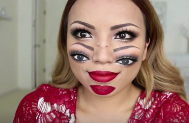
Yeh, for me, it's the eye strain from my eyes trying to "focus" on an image that's already focussed (and impossible to resolve the way my brain thinks it should be). This is similar to the Buscemi-with-four-eyes picture[1] - it tricks your eyes into continually changing focal distance in an attempt bring the picture into focus. It is physically straining your eye muscles.
Oh, now I know why I hate that ladder E: your sight tells you it's an E, but it has a bit more up, so it analyses it, and it's still an E, and the process repeats until your sight tells you that can't possibly be an E anymore.
My guess is that the creepiness comes from the fractal-like nature of these letters -- taking the thing that makes the letter unique and overiterating it. Since nature constructs itself in fractal geometry, the letters are stuck in a half-baked transition from symbolic to organic, and our expectations are left bouncing between the two.
If you could put the word "caterpillar" in a cocoon and hatch a real butterfly from it, these letters are what it would look like if someone cut the cocoon open too early.
This was my thought as well. I experience pretty pronounced trypophobia and didn’t find this unsettling, but people experience it in many different ways.
I think it has something to do with uncanny valley. Just like how distorted human faces look unsettling, this is the same mechanism.
The letters are deeply rooted in our interpretation of the world, so when those symbols are distorted, it is a distortion of the whole world itself. I bet it's mostly only native users of the alphabet who are affected like this. Someone who uses it as a second language, e.g. a japanese person, probably doesn't get the same feeling
»Cancer« was my instant association seeing ladder E.
IDK if it caused prior knowledge that there will be something "unsettling" I got from HN title ("Unsettling capital letters"; impossible to rule out now). I'm pretty sure it induced similarly disturbing feelings I got when I saw photos of bones affected by cancer for the first time. (Do not search for them, or be warned; I normally have no problems with such imagery, but this particular views haunts me to this days and I'd better like to have never seen them.)
> this particular views haunts me to this days and I'd better like to have never seen them
According to sleep research, you have to dream of those to lessen the emotional load associated with them, so go and have a couple of bone cancer nightmares.
My son has an e in his name. He often added extra crossbars when signing in to class last year when he was in kindergarten. I don't know if he still does it in first grade since parents don't enter the school building with Coronavirus. In any event, I always found the E charming.
Frank Lloyd Wright's lettering (apropos since we live a couple miles from his home/studio in Oak Park), incidentally often doubled or tripled the crossbars on A and H (but not, I would note, E). Being in FLW territory, we see a lot of the Eaglefeather typeface based on his lettering [0] but I doubt that my son was inspired by that (but then again, since he was three, he has declared his intention to become and architect).
I find it incredibly fascinating how readable the end results are. They’re so wrong, so fun and attention-grabbing, and somehow it makes sense.
I’d really like to understand better how it is that we can decipher language so well. At least, it seems like we’re good at it. Why can I read that font or that calligraphy? It’s almost an abomination, haha. Yet my brain troops on, parsing and processing, turning those squiggles back into what it knows.
Truly fascinating stuff. I also enjoy the back story here. Exploring written language as a kid was a lot of fun. I settled on a strange way of writing, not much unlike the runes on the inside of the ring in the LOTR movies, and it was entirely arbitrary and almost an artistic decision. Totally impractical. I still write like that to this day.
> Aoccdrnig to a rscheearch at Cmabrigde Uinervtisy, it deosn’t mttaer in waht oredr the ltteers in a wrod are, the olny iprmoetnt tihng is taht the frist and lsat ltteer be at the rghit pclae. The rset can be a toatl mses and you can sitll raed it wouthit porbelm. Tihs is bcuseae the huamn mnid deos not raed ervey lteter by istlef, but the wrod as a wlohe.
I think that paragraph oversimplifies. (For example, splitting up the gh in "rghit" or the tt in "ltteers" would make them much harder to scan.) But clearly what it's getting at is true, that there are certain details of words and letters that we tend to focus on, and we can ignore quite a lot of noise as long as those details are in place.
Most likely but doesn't that prove the point that reading is ultimately heavily context based and provided enough context you can distort the letters themselves to some absurd lengths and still preserve meaning?
Sure, writing has very low entropy, but the claim that you can easily tell what a word is as long as you preserve the first and last letters seems false.
Longer words seem to work OK if you add another constraint: keep all letters with ascenders and descenders in roughly the same relative order, eg, Cmbadigre Uisrevitny. Also, it works much better in a whole paragraph.
Something I just noticed about that text is that "important" is spelled wrong - there is an E and no A. Searching for the first line shows me some results that have it wrong and some that have the A in there, I wonder how that came to be.
Aindroccg to a rccrsheeah at Ciardgbme Uistvinery, it d'nseot metatr in waht oedrr the leretts in a wrod are, the olny ioatnprmt tnihg is taht the frsit and lsat ltteer be at the rghit pclae. The rset can be a ttaol mses and you can slitl raed it wouitht pberlom. Tihs is bscueae the hamun mnid deos not raed eervy lteetr by ieltsf, but the wrod as a wolhe.
Can we calculate how many bits of entropy we are saving in this compressed form? There seems to be (n-2)! ways of writing a word in a different way that is still readable.
I guess that could be a form of lossy text compression - where the end result is not completely right (the letters not being completely in the right order) but it's good enough to be able to read the text.
Information density of English text is 1ish bit per letter. There was some research about it, and also it's the compression rate you get from state-of-the-art algorithms.
I have to subvocalize to read the quote, which I don't normally do. But once I do it's easy to read. I wonder what that says about language processing.
I too was surprised by how readable it was. I'd skipped to the examples at the end without reading the original alphabetical list and was still able to read them.
I found myself identifying the letters by focusing on the four corners / extremities of the letters.
Part of the reason is, we don't actually parse letters individually, but the patterns of words/letter-groups, sentences and general grammar.
Another responder mentioned the infamous Cambridge study. My Layman's take would be that the patterns are recognizable enough that the pattern-matching portion of verbal cognition can still associate them properly without conscious thought. And any "misses" are filled in or trained by contextual clues.
Watch cracking the mayan code (pretty sure that was what it was called). Spoiler alert. Turns out mayan letters are kinda like this. Lots of freedom as long as the basic shape is there. Lots of artistic freedom.
Douglas Hofstadter spent some time interested in letterforms and asking questions like "what variations are still recognizable as an 'A'?" He wrote two essays that ended up in his Metamagical Themas book, Variations on a Theme as the Crux of Creativity and Metafont, Metamathematics, and Metaphysics. Very interesting reading if you are interested in type and lettering. The second one involves the Metafont program that Donald Knuth wrote (in part) to create his Computer Modern font (used in TeX).
Meet 'multi-ocular o'. This is the fever-dream of some 15th-century Russian scribe. He was writing about 'many-eyed seraphim', and decided that no ordinary O could do justice to them. Somehow, his doodle found its way into unicode.
For the more sedate eye-lovers, there is also Ꙩ (monocular o), and Ꙫ (binocular o)
It's horrible but effective. It doesn't really work as a normal size letter though. Perhaps someone could add a note to font designers in the Unicode spec: "This glyph is intended to be three times larger than a regular O."
The main thing we learned from this is that this a terrible problem to use machine learning for. These are far better, and readable. The algos couldn't even figure out that letters are a bunch of straight lines and neat curves.
I had a similar thought. It's amazing what you can do with machine learning, but this example shows that you can't just throw machine learning at a problem and expect good results.
And it shows that, at least for now, machine learning isn't going to make humans obsolete.
It showed that machine learning is useless if the input format doesn't match the problem. The result would probably be better if the problem was approached more on a vector graphics-based level rather than throwing a bunch of pixel clusters at the program and expecting it to figure out the underlying shapes by itself.
I mean, children in school don't learn to write by copying printed letters out of a book either, instead they're shown the individual strokes and their direction step by step.
Incidentally, to update my comment there, I asked someone who had a font GAN and he mentioned he'd already found uppercase/lowercase latent directions which can automatically "more-uppercase" letters. It's not that this is a 'terrible problem' - it's borderline trivial. (I've seen highschoolers do much more impressive GAN things.) He just didn't do it even remotely right, is all.
He put in way more work than would've been necessary to get StyleGAN or CLIP to do a vastly better job, is my point, because he used totally the wrong tools and approach. (And he could put in vastly more work, and it still wouldn't work that way either; the level of effort one would or would not spend on a SIGBOVIK paper is just irrelevant when his approach is doomed from the beginning.)
When I saw this thread I went looking for the link, couldn't find it. Felt sad. Came to read comments. Saw others have posted it and now I feel content again.
If all research papers were written in this style, I'd read a lot more of them.
> I trained the network using a home-grown (why??) GPUbased package that I wrote for Red i removal with artificial
retina networks [16]—an example of “lowercase i artificial intelligence”—and have improved as I repurposed it for
other projects, such as Color- and piece-blind chess [17]. It is “tried and true” in the sense that “every time I tried
using it, I truly wanted to throw my computer out the window, and retire to a hermitage in the glade whenceforth I
shall nevermore be haunted by a model which has overnight become a sea of infs and NaNs.”
Reminds me of the characters Raava and Vaatu from Nickelodeon's Legend of Korra. I love how crisp and sharp the lines are, and the amount of detail is spectacular!
Miscounting fs when "of" is present is actually a fairly well known psychological effect (see e.g. https://sharpbrains.com/blog/2006/09/10/brain-exercise-brain...). It's because the sound of the letter is different, and that makes me think deaf people will be more likely to count correctly.
I still prefer "The five boxing wizards jump quickly".
Back in the 90s when I published a typography magazine I remember one of the Adobe people (David Lemon, iirc) really loved this one. And of course the longer but no less delightful, "Pack my box with five dozen liquor jugs."
I love this, but I find the K both in the original font and in the final version to be a bit unsatisfying (and the X to a lesser extent), because all the other letters are repeating existing letter features but K just adds in this extra stuff to be obscure. I think a stronger candidate on that one would be a vertical bar on the left and then some diagonal crosshatching (in the V/W family) derived from the two legs of the K. Possibly K and X would have identical or near-identical cross-hatching patterns except the K would have the vertical bar on the left.
K (as well as X and V) is supposed to be a fractal, so the pattern isn't just arbitrary. X and V are too dense in my opinion and could use a lower branching factor, maybe base 2 for consistency. K is better in this regard, but they didn't recurse correctly which makes it less satisfying.
Playing with letterforms is such a fun part of childhood. I hope that kind of pen and paper play never goes away entirely, even as we push our children to use “devices” more and more at school.
This also reminds me of another form of the lesser/greater/greatest joke: Wowoman Pokemon:
I recently decided to get a Note again for the S-Pen experience, but I keep seeing the ReMarkable mentioned and I'm considering it, but I can't really justify it since I don't actually write that much, I just like the idea of having "electronic paper". What would you say about the device?
It's not a general purpose device - which is OK with me - no need to be distracted by games or web browsing.
If you don't care about linux or privacy, the kindle is way cheaper, and most any tablet with apps has more general utility.
I mainly wanted an ebook reader with a big e-ink screen.
What I found was more than I expected -- you can scribble or highlight your PDF files. The paper/writing part is pretty fun. Write in the margins. I've found myself drawing/sketching for no reason.
Another motivation was openness. You are not forced to use their cloud service or run an app.
In fact, they provide the root password and you can ssh into it. Out-of-the-box you are into-the-box.
It's linux-based, and people have written modifications for it.
Curiosity rather than nit-pick: calligraphically or cursively? Or itallically? :)
I've deliberately modified my handwriting a few times in my life, like many people. In my teens it was an expression of character. Later in life, I did a master's degree that required many written exams over several years, and I found i was getting hand pain and cramping from writing so much for so long, over 2 hours for example. After some Googling, I turned to itallic writing (I'm right handed), where all strokes are of the form //////. It made a huge difference and I stuck with it.
I have to do something different, maybe press harder because some of my strokes are almost invisibly thin. Same problem with pencil. I do like a fat magic marker, and mechanical pencil is fine.
Thinking about it, in the past decade or two, I haven't ever written much more than my signature. Maybe in the future writing will only be done for pleasure, like listening to vinyl.
I did this as well when I was little, and I distinctly remember thinking that if one rung on an E was good, more must be better. My kindergarten signature is still faintly legible on my library card, and contains a four-runged E (I was very proud of making it fit in the small space provided).
I don't remember for sure, but I think I thought of it as an EEEEEEEE.
My brain must be broken, because I don't find anything unsettling about them at all. My brain simply classifies them as artistic pictograms that are representative of the respective letters. Similar to the overly fancy first letter of a medieval illuminated manuscript.
I love this post and how it shows that playful exploration can produce interesting results (and learning along the way).
I've often felt that getting learners to ask "What if" rather than "Why" leads to a much more fun and fulfilling experience while covering the same content.
I had no trouble scrolling, but the "get the app" overlay seemed to break the "go back" function of my browser. If this is a dark pattern to get me to engage with the site it has backfired and convinced me to avoid it at all costs. A horrific (cool) font for horrific (not cool) webdesign.
I'm trying to imagine being actually mad about typography and just chuckling to myself. Try expanding your interests, and consider that others might simply be interested in stuff you don't care about for a minute
Get off my lawn, I guess? Rather than just denouncing it, maybe you could share why you don’t like it, and what you think should be showing up instead.
That breaks the site guideline against insinuations of astroturfing, shillage, brigading, foreign infiltration, etc., without evidence. Please don't do that again.
We have that rule because internet users are overwhelmingly too lax about posting such claims, which are almost all based on imagination. That's poisonous for discourse here. Real astroturfing is a different story, of course, which is why the guidelines ask you to email us at hn@ycombinator.com if you think you might be seeing that. The point is that there needs to be some data or evidence—some shred of something objective—to go on. That rules out 99.9% of these cheap internet swipes.
Fonts and typography are very often a side interest of hackers. They're certainly one of mine. There's just this weird realization that squiggles on paper or a screen translate so easily into meaning in our head; in fact, the creation of writing might be seen as some kind of hack of our brains. Also, there is a lot of technology and technique in how letters are designed and laid out on a page, all of which tickles my intellectual curiosity.
Okay, this page is mostly just a bit of fun. But there's seriousness behind it.
I was delighted to see this on the front page. Letter forms fascinate me and I enjoy playful explorations of the topic. They sit neatly between formal and informal systems and shed light on human cognition.
I'm very glad you're not the gatekeeper of what's here and what isn't.
Nobody is saying that. HN content typically caters to a prticular kind of geeky intellectual curiosity - that I think often has broader interests than you're giving it credit for.
As someone else pointed out this post would fit nicely into Douglas Hoftadter's Metamagical Themas - a book with impeccable geek credentials.
As the alphabet develops in the replies, it loses some of the creepiness and gains something else. Not friendliness exactly, but.... not sure. Something.
I think the first ladder E is creepy partly because it's unexpected, and is placed among normal letters. It's a cuckoo, an interloper, alien.
Others have pointed out similarities with some machine learning outputs. I was reminded of the spooky, spidery lettering from fashion GANs, e.g. check out what happens to the text "bisou" and "100% love machine" in [0] taken from [1].
[0] https://images.deepai.org/converted-papers/2007.10947/figure...
[1] https://deepai.org/publication/garment-design-with-generativ...