Windows 95 is probably the oldest OS easily usable by young people. It's fascinating because:
- It has established strong foundations about Windows UI. The Menu/Toolbar couple, scrollbars with a relative size, 3D buttons, start menu, toolbar...
- The gap between Windows 3.1 (1992) and Windows 95 is insane.
- It was beautifully coherent. Today, Windows 10 seems like a mess with different UI pieces from different universes: Modern UI, Windows Vista/7 era utilities, Windows XP/2003 config things and some older gems. Fun thing: open a Word document from a pendrive and unplug the pendrive, MS Word will show an error box from Win95 era, asking to insert the floppy in the drive.
- When booting a VM or an old computer with classic Windows I feel "at home". Our first family computer when I was a child was a Pentium II / Windows 98. I have strong reflexes with this kind of UI and I'm faster with classic window and menus compared to my phone or a tablet with modern touch interface.
I do not really understand how Microsoft could drop the ball that low on Windows 10 usability. It feels like a cramp to make something different but without any foundational insights how it could be better than past iterations on the UI nor with the budget and man power actually needed to pull the project together. Putting all other things aside, the "Windows shell" today is so much inferior to even latest GNOME and KDE iterations.
On the other hand, what's changed massively is how easily Windows 10 can be used as a power user, single-user desktop computer from the shell through powershell. I do not even have to rely on bad or outdated click UIs --- although my employer recently sent me to a AWS course where the task was to configure a Windows Server based AD controller, and the experience involved admin GUIs from my worst nightmares --- to do things like checking the current IP addresses, configuring and overriding DNS servers, or definining/scheduling custom background services anymore.
While other parts and usage paradigms of the Windows computer are experiencing a boost and are being "supported" right now, esp. when it comes to developer tools and developer workflows, package management (winget...) --- thank you Microsoft for that vision ---, the "classic way of using Windows" and the use of good UI to make the OS accessible to users of all PC user skill levels is being neglected to such a degree it's not even funny.
Windows is, unfortunately, just following the general trend of letting brain-dead "UX designers" make everything look like a website on a fucking iPhone. More wasted screen real estate, fewer features, slower to load, and built-in adtech.
It is our fault as an industry that this has happened and we are reaping what we've sewn.
I lol'd at your comment. Poor UX designers. In an age of gentleness, I wish I could barge into their houses and rearrange all their furniture, toss the contents of their refrigerators into the bathtub, and spraypaint their bedrooms a cheap pink color. Because that's what they do to my computer interfaces at random intervals, and I have no power over it anymore.
I think what it really is is that the power user is no longer the target audience. It’s the 18 year old who wants a new flashy thing every few versions. Regular users think the same is boring and old, so the need to “change things up” is higher than ever.
Look at iOS (and to a lesser extent Android) for instance. It has had I believe 3 or 4 major UI looks in its 13 year life.
I have owned an original iPhone and an iPhone 12 mini. In between I used Android through 4 phones. I did not find it difficult at all to move back to iOS.
I'm in a similar situation and the only thing I'm really annoyed with so far is the lack of a universal back button that's well placed for me to reach one handed. Some apps support swipe to go back, but not all do, and it's not consistent which apps / screens in an app will let me do that gesture. And the reachability gesture of swiping down on that little pill shape at the bottom of the screen is awful. More often than not I 'tap' whatever is behind it.
I still remember the first day I used Windows 10 and tried to make a desktop shortcut. I opened the Start menu, began typing the name... and then dragging a program off the search result list didn't work. I right clicked, expecting to get the option to "send to desktop(create shortcut)" and that was gone too. I found I had to add it to the Start menu, drag it from there onto the desktop, and then delete it from the Start menu. The feeling of dread that settled onto my stomach at that moment has never been matched by any other computer event in my life.
Had this exact experience and had to google a solution.. Why they didn’t use the same control element for an item found with the search versus in the start menu is mind boggling.
The same attitude extends everywhere else in the operating system. In any other version of Windows if you drag a folder onto the taskbar you get a labeled icon that opens that folder when you click it. In Windows 10 it just adds to the list of possible folders when you open the file manager shortcut. You can create a shortcut to a folder by adding an Explorer argument to a folder shortcut but it still won't have a label when you put it on the taskbar.
I'm not sure what you mean about the behavior of dragging a folder onto the taskbar. If I do that on Windows 7, it adds the folder to Explorer's jumplist.
In Windows 7 it's called the Favorites toolbar. You add it to the taskbar and create a section you can put folder links in, with or without labels. Windows 10's version is called Links and it's utterly crippled in comparison. You can't put it on the left side of your other taskbar shortcuts and you can't remove the massive "Links" label that wastes space and does nothing.
Those are bad events that happen once and then are over and you pick up the pieces. Windows 10 is like learning you have a terminal illness. It's a few small inconveniences now but you know it's just going to get worse and worse and worse.
Microsoft didn't just drop the ball on the general design. Individual features have fallen behind. The calculator in Windows 7 was great, you could type sums and edit your history to quickly make changes to calculations. Windows 10, history is just for looking at.
I don't think I've seen a single person in any office using the calc on windows- anyone who needs to do simple calculations more than once a day has a physical calc on their desk- so much better and easier to use.
That's the point. No one uses it because it sucks.
Meanwhile, my linux box has a dedicated macro to opening and closing SpeedCrunch, I also have br from the command line. Along with a numberpad input, there is literally no difference here from a desk calculator (which I still have, of course)
Install that giant monster just as a calculator? This does not make sense. There are free calculators for windows with very nice functionality and no bloat.
The system I'm typing on runs Windows Server 2019, which has the Windows 7-era calculator and very little ability to use UWP apps, and I still do my math with Speedcrunch, Desmos, or an emulated TI-84 Plus CE via CEmu.
The Windows 7 calculator is a solid basic calculator, but I think most power users in that time used third-party options or something like a spreadsheet. Microsoft clearly thinks of the calculator as a demo application for UWP and XAML, as evidenced by them open-sourcing it, sort of like how Apple treats TextEdit like a Cocoa text rendering demo. If you want a serious calculator or a serious text editor, you're better off looking outside these bundled tools.
The one I run into the most is the new modern settings-interface which looks nice but is bloated and contains 1/10 the features of the control panel categories I'm actually trying to get to.
In my experience, pretty much every single Windows emcumbered IT department I came across lately [1] switch off Powershell on their servers "for security". Every single setup involves circle clicking your way through >20 year old windows UIs. There's absolute no change if everyone involved has their foot firmly on the brake. Powershell and WSL are nice, but if pretty much every corp puts a lid on them, you're still stuck in yesterday's Windows hell.
[1] Assessing our software deployments at customer sites
i think they tried to create a common UI experience with windows 10 mobile; they even had the concept of 'universal apps' that could run as is on both the desktop and windows phone; They really tried to make it on the phone, but it didn't work out. Now the desktop is stuck with the result, as they decided to change priorities to the cloud, and windows 10 turned into the 'last good version'.
I recently ran Mac OS 9 on an emulator, out of curiosity, after having been using modern macOS/OS X/whatever you call it for the last 10 years. Now, to set the context, I'm Russian, and back when classic Mac OS was current, Apple computers were generally stuff of legends. "Insanely expensive beautifully made things, very good with colors and fonts, that professional designers sometimes use and most people can't afford". Macs only started gaining popularity around the very end of 00s — probably not least because of the Intel transition and the ability to try out the OS as hackintosh.
Anyway. It was interesting to see how it evolved. There definitely are familiar elements and patterns, but it's... different. There's no dock. You can't minimize windows. The menu bar is there, but the item with the current app name is to the right and it's an app switcher; what is now in that item, is under File, so you do File -> Quit. There are no status/tray icons in the menu bar, they're instead in a separate bar at the bottom left. There are desktop shortcuts to programs, something that feels Windows-only to me because no one does that in the modern macOS. Files don't have extensions, but instead rely heavily on extended attributes in the file system to remember what type the file is and what program it opens in. There's some third-party software installed with the system, and craploads more bundled on the installation CD for you to install manually. Inclusion of third-party software with the OS felt very un-Apple to me. And, the most perplexing thing, there's no support for scroll wheel and right mouse button! I understand that Macs of the time came with single-button mice, but c'mon.
I’d encourage you to also take a look at one of the very early versions of Mac OS, up to System 4 or so, from before they added multitasking. IMO, it was better designed—masterfully well designed, really—and a lot of the UI decisions make more sense.
MacOS classic had some nice UX touches that modern MacOS lacks though. For example having the close button on the opposite side of the window, so there's no questioning you meant to close the window. Same with the trash can being in the corner of the screen, if you dragged something there, there really was nothing else that could have been your target.
Apple really thought about those things a lot back then. In some ways, modern MacOS is a step backwards on details like this.
I did the same thing recently too and felt elated. I ran System 7.5.5 and Mac OS 9. The simple fact that a drive with System 7 installed is completely empty, save for the System folder, made me see my macOS drive structure in a whole new way. Mac OS 9 is clearly made by people who were also working on OS X at the time, and it includes a ton of little hints of it which kind of hide the simple zen of System 7.
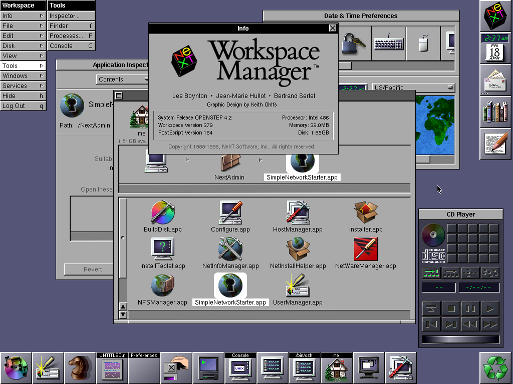
A lot of the UI is pulled out of NeXTStep. That's where the dock comes from. That's where Finder's column view comes from. The early Mac OS X's were even more like NeXTStep but users revolted a little and they nudged it more towards classic Mac OS.
Yeah, the UI/UX arguably evolved more from Next than OS9. Jobs wasn't going to embrace the UX of the company that stagnated with him gone for a decade. Even at launch of OSX the old Carbon based applications felt behind the times compared to the rest of the OS.
You say the gap between Win3.1 and Win95 is insane. I don't agree with that. Before I was able to run Win95 I used Calmira with Windows 3.11 - it provided a nice Wind95 like taskbar. There was also win32s to run most 32bit applications. Yes the multitasking was better on Win95, in Win3.11 I had to wait until a floppy disk was formatted before I could do something else.
I totally agree I feel at home with the 98 classic and XP classic UI's. It's a pitty I can't run modern browsers and java on XP, otherwise I'd be tempted to use it. There are some themes for Linux though, perhaps the Xplorer2 runs under wine. I could use ReactOS as well.
I recently revived an old laptop that was sold for scrap, it was fully working... just missing a power adapter.
Dos 6.22 and Win3.11.
Much more usable than I remembered. Was kinda sorta able to get online with a PCMCIA Ethernet card.
Aside from the whole, well... lack of HTTPS support in any browser you could possibly use on that OS. Also in Win95. And Win98. But regardless...
The UI was very straightforward even then. Open folder. Click icon to run app. It wasn't hard to use. Like you say, the bigger issue was the amount of power we had under the hood. Task switching wasn't perfect but it didn't exactly hurt us then, either.
I realised that for as long as I have had a Windows system (all the way up through to my Win10 box though I now prefer xUbuntu)... I always did something that is kind of a holdover from my days of using Win3.0... Instead of using the start menu, I put shortcuts to all of my mostl commonly used apps in a folder called 'Proggy Bin' on the desktop so I can alt-tab to it when I needed to instead of dragging my mouse to the corner. So, in some ways, the old Win3.x UI was more productive in my workflow.
> Aside from the whole, well... lack of HTTPS support in any browser you could possibly use on that OS. Also in Win95. And Win98. But regardless...
Use a proxy running on your LAN.
The proxy connects to the site over modern HTTPS (i.e. TLS 1.2 or whatever) and you connect to the proxy over plain HTTP, or whatever old version of HTTPS your client supports (NT4 sp6 with IE6 supports TLS1.0 or SSL3, as the latest, dunno about win 98), if you make sure to trust its cert.
XP and previous versions were susceptible to root kits. Once you had one the the OS was toast. Removing them and mitigating the impact used to be a prolific business. At the end it was so bad that companies were forced to migrate to Windows 7. Windows 7 introduced a protection feature that somewhat randomized the once predictable memory locations of the kernel drivers. Root kits disappeared as a common occurrence. XP in the hands of a lay user will be trashed almost immediately if exposed to the internet.
Calmira was amazing! It, along with Win32s and the 16-bit version of Internet Explorer, brought a lot of second-hand 386's with 4 Mb RAM into the modern world, by providing working Internet access and32-bit app support and a modern UI.
Ah that takes me back, I remember having a computer magazine at the time when Windows 95 was in development (and was just known as Chicago) which came with a bunch of software on the free disk/CD which "emulated" the Win95 look and feel on Win 3.11. Was pretty fun at the time. I guess Calmira might have been one of them!
Yes, at one time it was renamed into Calmira. I think it was written in Delphi, but I'm not sure - it now has LFN support. The nice thing is it can run on a 386 with 4M.. which can easily be emulated on for example DosBox or Qemu. You perhaps could virtualize the whole thing in javascript and run it in a browser like here:
https://archive.org/details/win3_stockhttp://www.calmira.net/
i don't know if you have any particular objections to using Windows 10 as your main operating system, but there's a pretty cool tweak called SimpleClassicTheme which can get you a surprisingly long way in replicating the classic Windows aesthetic in modern Windows:
I've always felt Windows 2000 was the pinnacle (or perhaps XP with the classic theme turned on). So consistent and clean. The emphasis back then was a computer is a tool you use, not something that needs to be "pretty".
Windows 2000 was such a surprise. The "look" was not vastly improved from 98se, but for a power user it was clearly a better OS. Everyone I met who had tried Windows 2000 a similar reaction - this is really good stuff.
I feel like Win 2k was "underappreciated" because of that surprise, but also to the point of the author. The visual design was not a huge improvement over previous editions. I'm sure it didn't "feel" like an upgrade.
I felt like for 2000 they took the 98 look and just nicely honed it. Things like the gradient in the title bar of windows, or switching from the default aqua of 98 to the nice blue of 2000. Little things that pushed this overall look and feel to a nice sheen.
I do remember back in the day the name was confusing, up till that point all DOS based Windows had a year name, and all NT based windows were, well, called NT :) I remember people being surprised to find out 2000 was an NT based Windows.
Well, it was the first Windows based on the NT kernel that found its way to consumers' computers. Well, at least the computers of enthusiasts and power users – as far as Microsoft was concerned, the 2000 was still meant for workstations and servers and did not have a "Home" edition. For home use there was the much-maligned Windows ME which ended up being the last non-NT, not-memory-protected, still-sorta-just-a-fancy-shell-over-DOS Windows that Microsoft released. Only with XP did Microsoft completely unify their "home" and "professional" lines.
I completely agree. Windows 2000 (classic theme in XP and later) was the best Windows has ever looked. The foundation was already fantastic and it had extensive customization options.
I still long for the Rainy Day theme. I wish Windows 10 would allow us to use the classic shell.
I want to go to the alternate timeline where a major distro actually picked up the GNUstep ball and ran with it, and built out a full desktop based around WindowMaker. It's still faster and more fun than most modern desktops.
What is so special about NeXTSTEP and WindowMaker? I see it often brought up and I actually used WindowMaker briefly at some point in the past, but I don't "get it". Could someone explain?
I remember seeing the early peeks at Windows NT in Byte magazine. Jaw dropped. Reading about features had me drooling over the future. It was similar to Win 3.1 at the time but with a much more serious look. As a pre-teen I was obsessed with the asthetic and the idea of having a multi-user security model and built in networking. This was during a time when you had to buy expensive products like Lantastic (hardware and software) to have a network in your small business.
Agree with the state of UX and UI’s these days. Younger developers are missing out on the UI design standards which worked very well and were introduced back in the late 90’s with Win95 as well as Windows Forms (in Visual Studio). There used to be a Microsoft UI best-practices/standards document which most developers actually followed, resulting in predictable interfaces which did not force users to have to guess their way around (to be fair Apple did a better job maintaining their UI standards I think).
No matter the framework flavor of the day, web technologies make for sub-standard user interfaces.
Win95 was a big step from Windows 3.1x. Being a Microsoft Windows support tech at the time, supporting both the older Windows 3.1x and new Windows 95, it made for many lengthy support calls. It definitely took a while for the new look & feel to catch on.
I fired up my Windows 3.11 recently- one thing I had forgotten about is that there is no right-click to get to icon properties, instead there is only Alt-Enter.
I always install Classic start on all my systems no matter if its just testing for 5minutes, or anybody's computer to make life easier for me and them.
the partition manager on windows 10 is even more unchanged from the 95/98 days than the example given in the article. it seems to literally still be the exact same interface
That's a holdout from the configuration UI style introduced in Windows 2000, not 95/98 (unless it was already there in NT 4, or unless we aren't talking about the same thing are all)
2000 reigns as the pinnacle of Windows UI consistency in my perception, but that particular management UI style was a first hint at future deviations, it was an outlier even then (I think it's because it's a family of UI built to interact with a separate system service, potentially remote?)
You are right, it's been 25 years and what we have today is nowhere near better. Windows 95 was consistent, there were very few UI surprises compared to almost every single version that followed after it. Frankly I don't even know how people learn how to use computers nowadays, if someone like me, who used computers for most of their lives+ use them professionally for living, struggle on daily basis.
> It has established strong foundations about Windows UI. The Menu/Toolbar couple, scrollbars with a relative size, 3D buttons, start menu, toolbar...
Or maybe windows just never progressed. If you see how much linux desktops changed over this period. Windows today just looks like a fancy clone of 95, always has.
Which is as it should be. Backward compatibility and 'stability' (maybe familiarity/recognizability would be better words) are far more important than random changes/experiments that are the core features of Linux desktops.
So not replacing the win95 menus but just adding more and more on top speaks for stability? Familarity is more relavant than a work focused workflow? I dont really get that sentiment, how many win95 programms do actually still work without issues?
> Windows 95 is probably the oldest OS easily usable by young people.
I grew up in DOS days, and a lot of kids back then were using it just fine. You learned some dual pane commander, how to navigate/copy dirs/files around on floppies, a:, c:, what files are runnable and you could run and share games and programs.
It was not that incoherent either. Norton/Volkov/M602 commander was the main interface, had popup menus for most functions (so everything was quite discoverable), and the rest was just about running random executables you got from someone on a floppy. There was barely any multitasking. At most you got to run some resident programs (mouse driver or various cheats for games :)). It was conceptually simpler than what you get these days.
And having a file manager as a primary interface kind of invited you to explore what's on your computer.
People who still like to use two pane file managers probably come from those days. :)
Yes, I understood that. I just assume that young people today are no different from young people 25 years ago, other than maybe having the (dis)advantage of preexisting knowledge of today's computing. Which may be the parent's point, I guess?
Yes, I interpreted that to be the point, considering a lot of the UI elements of Windows today first debuted with 95. It's a lot more difficult to convince young users to spend time to learn a console environment when a "modern" GUI is already available -- kids in early 90s did not have that choice.
FWIW, my first ever computer had Win95 installed, so I grew up believing that the start menu was always a given, and I thought DOS was just part of the computer start-up procedure.
> I grew up in DOS days, and a lot of kids back then were using it just fine.
My first PC when I was a kid came with Win95, but all the good games were still on DOS. Some games like Ultima VII had their own extended memory system and was a pain to get working right, especially on a newer PC running Win95. It took a lot of trial and error to get the right boot disk/config.sys to get the game to work. It was like a game in itself. Needless to say, I got DOS-savvy pretty quickly since playing cool games was my motivation.
Not really. While Linux DEs had open in place, Windows would keep opening new Windows when clicking a folder. Until the UI crashed. I believe the NT line had open in-place.
That's besides the point though. The same list of actions would randomly BSOD in one case and not the other. Windows 95 was not coherent it was chaotic.
You only had 4 hours left on the 0day FtP WaReZ site? Tough luck. Deadline at work? Too bad. With Win95 randomly crashing and corrupting files whether you'd get there or not depended on Russian roulette kind of luck.
Folders opening "in place" was a deliberate design choice called spatial file management or so [1]. It has its downsides and IIRC I wasn't a huge fan, but I wouldn't call it incoherent.
I don't think anybody misses Windows 95 in terms of technological quality, but there was actual deliberate and well-researched design behind its UI.
- It has established strong foundations about Windows UI. The Menu/Toolbar couple, scrollbars with a relative size, 3D buttons, start menu, toolbar...
- The gap between Windows 3.1 (1992) and Windows 95 is insane.
- It was beautifully coherent. Today, Windows 10 seems like a mess with different UI pieces from different universes: Modern UI, Windows Vista/7 era utilities, Windows XP/2003 config things and some older gems. Fun thing: open a Word document from a pendrive and unplug the pendrive, MS Word will show an error box from Win95 era, asking to insert the floppy in the drive.
- When booting a VM or an old computer with classic Windows I feel "at home". Our first family computer when I was a child was a Pentium II / Windows 98. I have strong reflexes with this kind of UI and I'm faster with classic window and menus compared to my phone or a tablet with modern touch interface.