Isn't it obvious that it's faster to find the mute button on a TV remote control with 5 buttons than on a remote control with 50 buttons? I experienced that just yesterday.
Agreed if muting the TV along with 4 other things was the only thing we do with the TV! Having a numpad to explicitly punch in the channel number, dedicated prev/next, input selection, volume and a bunch of other buttons doesn't hurt. If you compare 5 buttons vs 50 buttons to find something - what about the counter argument as follows: If you need to do 50 things but only having 5 buttons to do it? Wouldn't it get frustrating? Having to dig into menus over and over and over hundreds of times a day? What about doing this for 5 years everyday? It gets tiring, right? I would take 50 buttons any day over 5 buttons, without a doubt.
I think it made me think about an important point - frequency of use. It has to be taken into account.
OK, so we agree that it's easier to find the mute button on a remote with 5 buttons than on a remote with 50 buttons, at the cost of the other operations becoming harder.
I'm fine with some operations being harder. For example, my remote has a dedicated button for entering the size of your room, which adjusts acoustics. How often am I supposed to change that, really? But it still made it harder for me to mute a blaring ad.
Applied to a car, it means that operations performed while driving should have physical buttons placed front and center, while other operations should be hidden away in order to make the former easier to find.
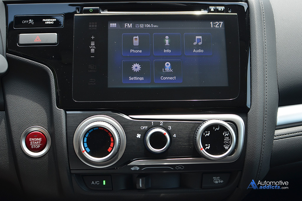
I can control the airflow without looking because it's the only knob of that size on the entire dashboard. Before looking at the picture above, I couldn't tell you where the emergency lights button was because I use it so rarely, but every time I needed to use it in a pinch I was able to find it almost instantly because it's basically the only button on the entire dash.
Replacing the touchscreen with a bunch of physical buttons that I never use while driving would be massively detrimental IMO.
(Note: the driver has dedicated volume buttons on the steering wheel, which is why there's no volume knob; the touch slider is for passenger use.)
I think I mostly agree with you but then I have a mental block when "hiding stuff that's not needed".
How about just leave them there, and the most important buttons and controls in a dedicated area at the top of the remote? Perhaps in a red blaring border box?
I think this is a layout problem, no need to hide stuff.
A quick look at the screenshots will give you an idea of the sheer number of settings. Can you fathom the sheer size, and awful daily usability, of a TV remote that would expose physical controls for all these settings?
Cars are becoming this way too. One example is ambient lighting customization in newer luxury cars.
You can't have physical buttons for all this stuff. It just doesn't scale.
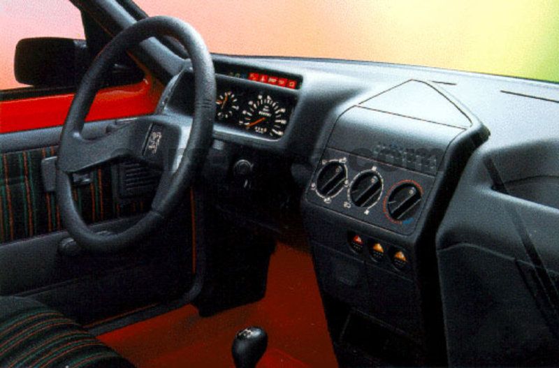
Edit: I feel we were stuck for a decade in this worst-of-both-worlds situation where the number of features were exploding but could still be crammed into a 50-button TV remote or car dashboard [1]. Now that features have grown even beyond that, manufacturers are forced to move less-frequently used features into an alternate interaction mechanism. For cars, that's often a touchscreen; for TVs, that can be a remote that doubles as a pointer, allowing to control a TV like a mouse controls a computer. Thanks to that, my current car that I linked earlier [2] looks much closer to the very simple and usable car I drove as a teenager [3], both of which are IMO much more usable for an untrained user than [1]. This doesn't mean I think the Mercedes dashboard is bad; it's an AMG car, so targeted to enthusiasts who may appreciate having a physical button for traction control. But I don't think it would make sense to expose this button in an entry-level commuter car like mine.
I think you're right. I am thinking of old TVs which I remember using a single remote with all functions in it. Moreover, I was responding to the specific argument about 5 vs 50 buttons to do 5 vs 50 things.
> You can't have physical buttons for all this stuff. It just doesn't scale.
Definitely. Like in the F-15 video, the controls near the elbows were rarely used (essentially "hiding" them out of sight). So may be a good compromise is pick 50 most used features, create buttons for those and then leave the rest of the 150 features in the menu system.
I haven't used a modern TV in over 10 years, I hope the remotes still have decent number of buttons.
[1] car appears to do everything right. [2] is worse because it feels like what you see is just the tip of the ice-berg. [3] had to be like that because there was nothing more to be done. It didn't need more controls.
Unrelated: A turn signal stalk is a brilliantly designed UI control. If famous designers we know - say Jony Ive - and if they don't know what a car is and you ask them to design a dashboard, not in a million chance that they would come up with a dangling stick behind the steering wheel that translates LEFT/RIGHT signal > DOWN/UP stalk movement > ANTI-CLOCKWISE/CLOCKWISE steering movement. It is totally genius and not obvious at all unless you've seen a steering wheel and a turn signal stalk before.
The original patent [1] actually separated the signal switch (ie the bit that the driver moved) and the release that was a magnetic link that was powered via a ring on the steering column.
So originally, the UX wasn't UP/DOWN = RIGHT/LEFT (which btw is reversed on RHD cars). There was a V shaped set of contacts with an arm that pointed to the right or the left and was held there by magnets until you turned the steering wheel.
So it's more likely that someone worked out that mounting the switch on the steering column would save circuitry and expense than it was a UX/UI design decision.
> both of which are IMO much more usable for an untrained user
That's the key though: almost everything in life except random websites is operated by users with various degree of training - either through frequency (TV remote) or explicit lessons (cars, planes). If you have to use a tool more than a few times, this minimalist trend is making the experience worse.
Experienced photographers seem to agree with you; I certainly do. The one obvious, visible thing that differentiates expensive cameras preferred by professionals from consumer models is that the former have a greater number of dedicated, physical controls. It’s much better to just move your thumb, rather than take your eye from the viewfinder to look at a screen and dig through a menu!
Physical buttons are expensive to make. A touch screen is a single UI element and can be changed/fixed by software. Physical buttons require individual design, additional hardware, wiring, power, assembly, failure, repairs...
And related: touchscreen, purely-software UIs can be developed in parallel with the rest of the device, possibly by a different team or a subcontractor, which saves further manufacturing costs.
> Isn't it obvious that it's faster to find the mute button on a TV remote control with 5 buttons than on a remote control with 50 buttons? I experienced that just yesterday.
It would also be easier to type vowels on a 5 key keyboard with only vowel keys, but then you'd be limited to only typing vowels.
I have one of those awful ~10 button remotes, and it takes about 10 key presses to "add a show to my list" on Amazon, because the remote hides the "green" button behind a soft menu. It was also definitely not "easier" to find that button the first time.
Degrading functionality to make certain functions "easier" or "more obvious" is a bad trade-off far more often than many UX designers seem to assume.
In an interface you're intimately familiar with (like your TV remote, your car, or a plane if you're a pilot), you should spend zero time finding things, because you already internalized where everything is. Low information density interfaces prevent gaining familiarity and remembering where things are.