A weird thing about some early discrete arcade games is that they generated 3x5 pixel digits without a ROM. They used a 7448 seven-segment decoder -- you know, like those cool LCD/LED clock radios. A BCD counter drives the 7448, then it feeds into a couple of multiplexers and a handful of gates, which generates the video signal.
I gotta think there's a better way, but I'm not inclined to second-guess these designers.
It certainly tested the physical limits of my aging eyes. The version on the poorly-calibrated display was a good bit easier to read than that on the well-calibrated display.
I'm glad you pointed this out, I was ready to write this off as an illusion that just doesn't work for me. Provided your render scale is 100%, it's a very cool trick. Naturally easier to see on a lower DPI screen too.
Great article. As an aside: I found the bit buffer function a little hard to read. I suspect that's because I haven't done a lot of work where I've needed to manipulate bits in a procedural way. Can anyone recommend any resources / exercises for me to get better at this?
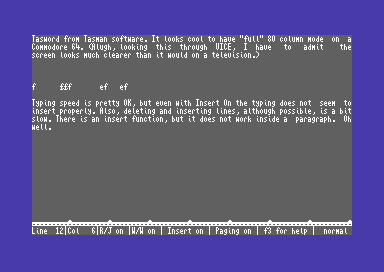
Not so amazing for those who, tired of the 40-column limit of their Commodore-64 or similar machine, took to such tricks to get up to 80 columns of text on screen (e.g. SpeedScript did this [1] as did TASword [2]). Was it easy to read? No, it wasn't. It was hardly readable to be honest but it did make it possible to get a full line of text on the screen.
Meanwhile, those of us still slumming it on our TI-99/4As were stuck with a word processor that didn't even try. Not only was TI-Write stuck in 40- (or perhaps 32-) column mode, but they didn't even bother changing the TI's default font, which mapped lowercase code points to small-cap glyphs, making text look nasty, hard to read, and nothing like printed output.
The dedication and achievements of the Commodore community never cease to amaze me.
Yes, but on a machine that primitive, loading a font takes a significant percentage of the entire computer's resources.
Each character required 8 bytes to define its bitmap. If all you want to do is define only the 52 uppercase and lowercase letters (which was allowed), that's still over 400 bytes. The entire computer only had 16,384 bytes of RAM, and not all of that was available to the user.
Also, there is the small matter of how you're going to load it. The obvious answer is to write a BASIC program to issue the font commands, and store the BASIC program to cassette tape.
Then every time you turn on the computer, you have to make sure the cassette is loaded into the tape drive, make sure it is rewound to the correct spot, type the command to begin reading a program, press play on the cassette deck, wait what might literally be a minute for it to read, stop the cassette, run the program, then delete the program from memory. This whole process is likely to take five minutes.
So you end up asking yourself, can I stand to just look at these ugly characters? And the answer is basically yes.
EDIT: I should add, the word processor was probably on a ROM cartridge. presumably they could have included a font on that cartridge and loaded it without all this tedium if they wanted a font to be available just for that application. So maybe not as bad as I am portraying it.
On the TI-99/4A, if you redefined characters using BASIC, you can only expect such redefinitions to last as long as your BASIC session. Booting into another program (especially on cartridge, as I believe TI Writer was) required a system reset.
Tasword didn't do sub-pixel tricks, did it? Certainly didn't on the Spectrum to get 64 columns on a 32 column display - they just drew the letters themselves instead of using system output. I'd imagine the C64 version was exactly the same?
No, in the age of CRT monitors it did not make sense to mess with subpixels as those do not have a fixed relationship between actual display RGB-triplets and the displayed bitmap. Apart from that the C64 could only display 16 colours which is not enough to play those tricks.
I typed quite a few papers in Screenwriter II on my Apple II, with its 70 column text (hi-res graphics was only 280x192) and its floppy-disk based virtual memory.
As did I on SpeedScript and TASword, that is until I bought a broken Amiga 500, fixed it by replacing a single capacitor, modified a CGA monitor (i.e. RGBi, 16-color digital) by adding a preamp so it acted like an analog RGB monitor and used that: true 80-column text. A bit later I added a PC clone to the mix which had a Hercules-clone multi-everything adapter ("Diamond Brand something-or-other" bought on the cheap at a trade show) which I found out could do a bit more than it said on the label when I managed to get the 6845 to display interlaced graphics (50 lines of text, 720*700 graphics, It even worked in AutoCAD...), swapped the motherboard for a broken-and-repaired AT-clone board, etc.
very nice article, love the background info on what's being done. been looking at implementing a simple font renderer for some bare metal software and something like this would be awesome to try and save some resources!
I gotta think there's a better way, but I'm not inclined to second-guess these designers.