According to Jobs, he's the only reason computers have typography whatsoever:
> Reed College at that time offered perhaps the best calligraphy instruction in the country. Throughout the campus every poster, every label on every drawer was beautifully hand-calligraphed. Because I had dropped out and didn't have to take the normal classes, I decided to take a calligraphy class to learn how to do this. I learned about serif and sans-serif typefaces, about varying the amount of space between different letter combinations, about what makes great typography great. It was beautiful, historical, artistically subtle in a way that science can't capture, and I found it fascinating.
> None of this had even a hope of any practical application in my life. But ten years later when we were designing the first Macintosh computer, it all came back to me, and we designed it all into the Mac. It was the first computer with beautiful typography. If I had never dropped in on that single course in college, the Mac would have never had multiple typefaces or proportionally spaced fonts, and since Windows just copied the Mac, it's likely that no personal computer would have them.
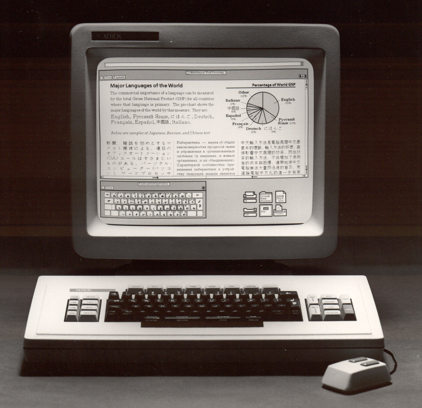
Apparently the Xerox Star had basic desktop publishing with a variety of typefaces in 1981, so Jobs's calligraphy course may not have been the history-changing event he makes it out to be. "Beautiful" is, of course, subjective.
I wonder if you've noticed but the rendered text on websites viewed from a mac is very different from the same on windows. On windows the fonts aren't as smooth as on the mac.
I always dread viewing the windows version of websites I develop after I did them on my mac. They make a good looking website into a crappy looking one because its headings, its text becomes more pixelated.
The good thing is... (There's always a good thing). Now I know how much typography matters in making things look good.
> Reed College at that time offered perhaps the best calligraphy instruction in the country. Throughout the campus every poster, every label on every drawer was beautifully hand-calligraphed. Because I had dropped out and didn't have to take the normal classes, I decided to take a calligraphy class to learn how to do this. I learned about serif and sans-serif typefaces, about varying the amount of space between different letter combinations, about what makes great typography great. It was beautiful, historical, artistically subtle in a way that science can't capture, and I found it fascinating.
> None of this had even a hope of any practical application in my life. But ten years later when we were designing the first Macintosh computer, it all came back to me, and we designed it all into the Mac. It was the first computer with beautiful typography. If I had never dropped in on that single course in college, the Mac would have never had multiple typefaces or proportionally spaced fonts, and since Windows just copied the Mac, it's likely that no personal computer would have them.
Quoted from http://www.freerepublic.com/focus/chat/1422863/posts