It is honestly one of my favorite documents. With the thought put behind it, it is of no surprise the game was such a well crafted masterpiece.
Most software work tends to move away from this kind of ... I don't want to say documentation, we have better documentation tools than ever, more-so a level of writing in general that is more 'human', be it written documents at length or well commented code.
I recall a Warcraft III one I once saw, that went into technical details on the tooling/scripting packaged with the game. That was another great document too, but I don't have it :)
I got to ogle a game design doc for a Sonic the Hedgehog game that was never produced. And yeah its very similar, except it had way more visual layout. Absolutely everything sonic could do was amazingly visualised and described.
Wow I had no idea you could actually “downgrade” things to be compatible with S1. (My units all came with the later app that force updated itself, but appear to be compatible with S1). They had given me the idea the device firmware was ratcheting forward, so once upgraded no way back.
Did this change during all the noise? (Entirely possible I was oblivious)
The Alan Dye era at Apple has been the worst for me. Basic UX concepts like Fitts Law are ignored for the sake of "simplification". Finder notifications with tiny click targets that only appear on hover are something that wouldn't have stayed around for multiple OS revisions. Discoverability is lacking everywhere.
Having close buttons on the left side and the right side of tabs depending on state (like the number of tabs in Safari) is something that following the Human Interface Guidelines wouldn't have allowed.
I love innovation and trying new things – but the styling improvements shouldn't ignore the basics. There will always be new users who need to see what is possible in order to navigate.
The Finder titlebar now is in a massive font and truncates at the END of the file path and ellipses the text at the END. It should be at the beginning or middle.
Eg. in directory /Users/rich/Library/Developer/CoreSimulator/Caches/dyld/21G115/com.apple.CoreSimulator.SimRuntime.iOS-13-2.17B102 I have no idea what path I am in because it truncates it to /Users/rich/Library/Developer/CoreSimu... and when I click on the title bar it shows the path as /Users/rich/Library/Developer/CoreSimulator/Caches/dyld/21G115/co... so I still have no idea what directory I am in.
Oh yeah, I had to use a brand new MacBook for work stuff, and I was literally yelling at the Desktop Picture settings (for example). Buttons that are just a floating text label? I didn't even realize it was a button until I randomly guessed it _might_ be, secretly hoping it wasn't because it didn't look like a clickable element whatsoever... spoiler alert: it was a button. Like, come ON. It's 2022, stuff like "a button should look like a button" was something Apple themselves standardized on like, 30 years ago?
It's so glaring. What are these buttons in the FaceTime dropdown at the top right of this[0] screenshot? Why are there four different shades of buttons? Again, why don't they look like buttons? The flatness reduces meaning - maybe they're just status indicators? Actually, looking at the screenshot I'm not even sure they are buttons now?!
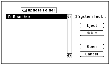
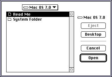
I miss Apple's confidence in their OS design. System 6 - Mac OS 8 (maybe even 9) are so similar in design, like all they really did for 7 and 8 was add a bit of shading/depth. Seriously, here's a screenshot of System 4 "Open File" dialog vs. Mac OS 9's "Open File" dialog:
This is why I like Monoprice, they have a limited selection of high-quality products at reasonable prices.
I just wish they would make an AV receiver – that seems like a space where they could bring the price down but still have good room correction and Atmos. The Monolith is a good start, but something for the average consumer is what I'm thinking of.
[first] "This report, by its very length, defends itself against the risk of being read." -Winston Churchill
[last] "To protect this document, please restrict your fallen tears of joy to this box. Thank you!"
reply