I personally think it looks nice and welcome the update. I haven't really been using Firefox all that much mainly due to how busy the interface is, so maybe leaning it out will make me a regular user again.
> I haven't really been using Firefox all that much mainly due to how busy the interface is
Firefox UI is as busy as you make it[1]. It's very customizable without much effort. Not that it couldn't use a refresh but I quite like it the way it is.
EDIT: The commenters below get it right. Tree Style Tab[2] add-on is responsible for the tabs and you can remove the clutter by right-clicking the refresh button for example, choosing "customize..." from the context menu and just dragging all the unused stuff away into the box (a window that will appear). Toolbars can be hidden from View → Toolbars. Enabling integration with Ubuntu also thins it a bit.
Oh snap, now that's a UI overhaul. How's that tab interface working out?
At a glance I can imagine how much more effective it is at displaying a large number of tabs in the same window.
In fact, I'm finding it quite brilliant. The web at large takes advantage of vertical scrolling, so why shouldn't browsers? All of my bookmarks are already arranged in vertical lists.
Even when faced with the input procedure of navigating my cursor to a browser tab, vertically stacked tabs have a clear advantage (for trackpad/thinkpad nipple users like myself):
To move my cursor up and down (again, with a trackpad) all I have to do is bend a finger at the knuckle. When moving the cursor a substantial distance left or right, I torque my whole wrist slightly or reposition it entirely.
Maybe that's splitting hairs... I'm rather starry-eyed at the moment seeing your Firefox interface. Perhaps I'm missing some disadvantages?
I've been using it for years, I can't see myself go back to tabs on top. That's why I can't switch to chrome.
Tabs on the left (or right) is how it is supposed to be ! Websites nowadays have a lot of horizontal space because of our new big wide screens. We don't have 4/3 anymore and all the websites were conceived for that kind of resolution (800600 or 1024768).
Also it's more practical because you can open so many tabs at the same time, you can use nesting etc...
I really don't understand why it's still not the default, or at least a native option of the browser.
Agreed, I would never consider using another browser unless they had vertical tabs. My Firefox typically crashes once per day but treestyle tabs make it worth it.
Once a day? Any idea why? For a while, mine was due to memory issues but they did some seriously awesome work fixing it somewhere in the high teen updates, ever since then it's been solid.
Drag and drop sometimes stops working and you lose the ability to move those tabs around (change their order). Some pages will be too wide, at least on a small screen like mine, forcing you to scroll horizontally. Also, after every (major) update you need to (re)move the new buttons.
But those are all very minor. Otherwise, it's smooth sailing.
2. We always had those kind of "busy" UI since IE, Netscape, Opera and Firefox.
3. Chrome comes around, makes a very simplistic UI and now many people assume that it's the only way.
IMO Chrome is just too simplistic, It's beautiful yes but is it efficient? For example, the first thing I do when I install Firefox on a machine is to display the menu bar. And I think it's a shame there is no more status bar as well.
This is one of the most shameful things to have happened to Firefox. The status bar is core functionality. It should be included by default, and it should be enabled by default.
Now, if they really felt the need to play design games with the UI, they could have at least disabled the status bar by default, and allowed it to be quickly re-enabled (like can be done for the menus).
Forcing users to go through the hassle of installing an extension just to get back core functionality is truly unjustifiable and very shameful.
I think that for almost all Internet Explorer and Safari users the UI is as busy as their developers make it.
I expect the average user of Chrome and Firefox to be able and willing to at least get to the "View" menu (or similar) and configure the interface as he/she sees fit.
if you enjoy vimperator I suspect you'll appreciate the tree style tabs mentioned above.. also if you `:set tabnumbers` you can easily switch between numbered tabs, which can be very useful
Why does it seem like everyone is moving to those curved tabs? They've always seemed like a waste of space and the overlapping bits make for an inconsistent tab UI.
The old one is showing 13 tabs, the new one is showing 12 tabs and the edge of the 13th one. However, the new one is way less cluttered and easy to read IMO.
The inconsistency is based around a scenario like this.
Open 4 tabs. click tab 1 and then tab 3. What order do you display the tabs in? Does tab 1 overlay tab 2? If closing tabs don't to the last open tab this now means that the visual stack is not accurate to how the program operates.
I understand the depth but there are better ways to show it that don't take up as much space nor have to deal with issues like visually showing the tab's z-order
Chrome stacks away from the currently focused tab. If tab 6 of 10 is focused, 6 will be in front of 7, which is in front of 8, and so on; similarly 6 is in front of 5 which is in front 4, and so on. There is a subtle visual lead to the focused tab. If you then select tab 2 for example, tabs 3 to 6 will be restacked for consistency.
I loathe that behaviour, it was one of the things that bugged me about Chrome. If I close a tab, I want the focus to go back to the previously viewed tab, not the previous tab in the z-stack.
> I haven't really been using Firefox all that much mainly due to how busy the interface is, so maybe leaning it out will make me a regular user again.
Those mockups are busier than the current interface, at least for OSX. The new OSX UI gains some vertical space in exchange for losing horizontal and making the UI more cluttered.
EDIT: Actually it only gains about 4 pixels of vertical space despite all the downsides, including the loss of the title.
Those tabs look nice when you have 3 or 4 of them.
But I have 26, and it won't look so good then. (I tweaked my chrome to shrink the minimum tab size, so I can get lots of them without having to scroll the tab bar.)
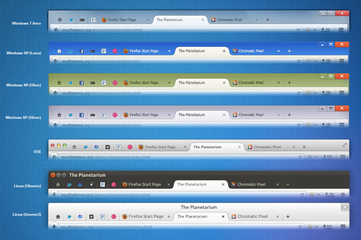
I love firefox and use it daily on all platforms. What bothers me a bit (just a bit) about the design is that only on linux the menu bar row sticks out [1], while on Windows or Mac they were able to collapse it or hide it quite well. I suppose this is due to the GUI implementation constraints on the platform, but it is still very noticable when I switch from my mac to ubuntu.
I'm not on ubuntu right now, but this should be done by an ubuntu specific extension that places the menu bar in the global menu bar area that unity creates in essentially the same place it is on a mac. Should be installed by default on untuntu+unity, perhaps you disabled it?
I would guess that it's possible that the way X works prevents this from happening. At least, easily.
I use an offbeat windowing manager (WM) (aka, the client to Xorg that actually draws the base-level windows for the GUI). The WM gets to present titlebar as it pleases, and given how my WM works, there's 0 chance that Firefox would be able to draw it's own stuff up in there.
Given that, perhaps some WMs can allow the client window to draw up there and some can not. I get the impression that, at a minimum, the titlebar is not guaranteed to be fair game.
It's as B-Com said. The window manager. I used to use Emerald. There was no way you could consistently draw in the titlebar across all the themes available for it.
That's called client side window drawing and GTK has it. Needed for Wayland. Maybe good to investigate a little bit before saying things that aren't true.
Not in GTK2 which Firefox uses. It doesn't use GTK3 yet. Qt port of Firefox already exists anyway, but Mozilla didn't find much interest to support it.
Also, I'm not sure how Wayland is going to solve that, since Wayland protocol doesn't mandate for the window manager to use client side decorations. May be you are talking about Weston (which is a reference compositor of the Wayland project). But in practice each major DE will probably create their own compositors which won't necessarily use client side decorations.
Is a title bar really necessary, though? The vast majority of the time, the exact same sentence is repeated again in the page as a h1. More prominently. With better styling. When I have the browser open, the favicon and the few characters on the tab are usually enough to figure out what the page is, and when it's minimized, the text shows up in the taskbar and alt+tab... I'm curious, what's missing?
It's often repeated again in the page as a H1, but that's only visible if you're scrolled to the top of the page. If you're part-way down a long HN discussion and want to quickly double-check what the topic was again, where do you look?
How does having the page title in the title bar help with that, though? It only shows the full title of the currently selected tab, but can't you usually tell which tab that is from its content?
No, not if they're all the same website. Take 3 comment pages on hacker news, for example, you'd have to look around the page for context to know which was which if you had several open at once.
Use a tab manager add on like Tab Mix Plus. It is the first thing I install on any new installation of FF. You can rename tabs or set a minimum width to see more of the title.
When the solution to a problem that nearly every user will have is, "Use an add-on", then that's clearly a time when the design/dev team should go back and re-think their implementation. I can see the phone calls now, "Yes, mom - you need to go install an add-on. What's an add-on? Well, maybe they call it an extension - depends which screen you're on. What's an extension?" Ugh - awful idea.
And then you end up with the old Netscape Communicator suite, until someone wants a "fast" minimal browser, maybe by moving some of the features out of the main browser into extensions....
recently sites seem to be inverting the useful info to the beginning of the title, but this is still a problem. Especially considering that even when you only have a few tabs, the space given for the title is way too small (at least in Chrome, firefox is better about it)
Why do you have to "figure it out" when it can easily just be made clear. This is one of the reasons why I am very sceptical of the Chrome trend towards absolute minimalism.
I find myself installing addons to cut or move parts of the UI back to where it was when I was used to it. Starting with the location bar ending with status bars. Additional fumbling around in the config became the normal thing to do after an major update...
I know it's nice if your are the developer and you can force stuff on your users because most of them can't do anything about it and will accept it in the end but remember one thing: you will cross a border for another part of your custormers and then somebody will come up with something new just because you forced us and then you'll lose customers.
The reason why X Windows was so much more popular than Mac OS X or MS Windows was because it was so configurable, right?
As a matter of good design, configuration options should be used very sparingly. Yes they diversify the UX, but they also diversify the UX! Some decisions just have to be "made," like losing the title bar.
> you will cross a border for another part of your customers and then somebody will come up with something new just because you forced us and then you'll lose customers.
If the overall design is good, the customers loss are negligible vs. the customers gained. No one bothers chasing the miniscule emacs market.
It's more of a case of good defaults vs bad defaults. When 90% of your customers will never know how to change the defaults (or never like your system enough in the first place to bother) then being served up something weird by default doesn't help your popularity.
I think that is why Firefox is ditching the title bar. It just seems weird now (but I've been using Chrome for way too long).
But configurability is not on many consumer wish lists. Ya, power users love to have it there way, but most consumers just want a good experience out of the box.
I went away from software because of that for so many times. I can't remember the names of the software of companies anymore. I'm pretty sure they are not there anymore.
Sure YOU say the decision to make something go MUST be done. You don't even bring a reason for it here. I don't see it. Why does it HAVE to be made? Is the title bar going to be forbidden or something? Is it banned in some countries? I don't understand. I don't understand even more why I shouldn't have the CHOICE to make such irrelevant decision by myself. Why not? Give me at least one real reason...
Most of the time (like here) I have the feeling we are in some kind of Fashion Show. Some design guru decides: this will be like that now. All the big fashin designers jump on the train. But the fact remains that people on the street won't dress like that...and sure you push it here and there through the discounters and you may reach a mass where it becomes a thing. But initaly nobody wanted that. It may be even a worse kind of clothing. It may be a shoe that hurts your leg muscels in the end but nobody is interested in that because it is Fashion.
I see it the same way here. Don't take me wrong. I appriciate changes that are useful. I appriciate it even more if there are options but I don't see any reason to force Fashion moves on me in software.
A word on Win8? Nah I guess you already know ;)
@X Windows: are you kidding me? Do you want to start a discussion about marketing methods now and then? I guess you've just missed the point on that one. I can sell you the most ugly crap software if I have the money or the right marketing strategy but it has nothing to do with the topic.
I find I sometimes need to right click my title bar on Linux, to do things like move my window to another workspace. And other window functions, I have to have it on with Chrome.
I'd actually rather there was a simple meta key in each application, that you could use to just show you the vital data about a page. Meta data in webpages can be human readable - title, author, summary etc. How about an overlay? And how about have this for every app? Looking at an image - activate meta key, to see copyright info etc, listening to a tune, activate meta key to see tag info etc. Far better than hiding it under some menu item and distant properties tab.
Opera has an info bar, but it's not that user friendly.
That doesn't particulary address whether the title is necessary, it's great for window management, using windows instead of tabs. But you'll need a good window manager. I'd rather windows than tabs - though I fear that Opera introduced tabs as they were cheap windows more than anything else.
Your absolutely correct in my mind. I get more from the favicon then anything else, and since moving to Linux and losing the title bar I have not found myself missing it or lost.
That's one of the things I despise about Chrome... plus the fact that it doesn't have a title bar at all. They taking exactly the things that make Chrome less usable to me and putting them in Firefox. /sigh
What are you missing on your Mac? It has the system title bar, the system-provided x, -, and + buttons, and (on my Mountain Lion, at least), the system-provided full-screen button in the top-right. What more could there be?
A full height title bar with the title of the current tab in it that I can use to drag the window around. Having to precisely aim my mouse pointer in order to drag my window is extremely annoying.
If Chrome was full of tabs, the ~20px area to drag the window around is arguably a bit small, but it'd look ridiculous if there was a huge margin above the tabs.
If you get tab happy, tabs are really difficult to navigate in Firefox without and extension, and I've tried most of the popular tab extensions - and have yet to find anything I like (that works without some bug).
Chrome and Opera squeeze the tabs, but list them all, whereas Firefox forces a scroll after so many, which feels horrible. Also Opera has let's you list and switch open tabs with CTRL+TAB, or lets you reposition your tabs.
Really though managing tabs should be left to the window manager. Otherwise you just get inconsistant behaviour between applications.
> Chrome and Opera squeeze the tabs, but list them all, whereas Firefox forces a scroll after so many, which feels horrible. Also Opera has let's you list and switch open tabs with CTRL+TAB, or lets you reposition your tabs.
It makes Firefox have the Chrome behavior of making tabs shrink infinitely. All it does it tweak one minor setting in the UI, so it's pretty bulletproof.
Ah, but unlike Chrome, in Firefox, you can configure your client to look exactly like it did before. I know this is extra work for you (and me), but I guess it might work better for the vast majority of users.
The new ui update has the specific goal of reducing configurability, so new users dont get "confused".
Such changes include the inability to edit any of the UI except a row of buttons on the top left, shockingly just like chrome!. I'm sure these changes will help focus their design vision, or something.
So in short, no, you wont be able to configure your client to look exactly like it did before.
Just as in Sublime Text (and even with a proper titlebar), I really dislike those Chrome-y tabs. They take too much real estate for my taste.
Lion scrollbars finally landed on Aurora and I was hoping to move back to Firefox again when it would land in Beta. The move towards consistency with the platform was very welcome around Fx4. Now, striving for uniformity, they make it feel foreign again.
Here's the agenda: Firefox as a brand has to grow and make a show of itself. Indeed the Chromification goes much deeper than simply tab looks: as the OS is relegated to a platform/hypervisor, the browser becomes an OS in itself, so that Firefox OS makes sense for people. They're moving to make phones, which will soon call for services (unless they plan to rely solely on third parties such as WhatsApp). Mozilla's product may increasingly end up looking like yet another vertically integrated software platform.
I'd like Firefox to give me back the ability to choose "full screen" and have it make the web page itself fill the screen from corner to corner, with no "chrome" (no title bar, no tabs, no menu bar, no URL bar, etc.)
It used to be possible to use Firefox on Mac OS X to do a presentation with HTML and have the web page, and only the web page, fill the whole screen. (It was an option in the "View" menu.) That feature disappeared several versions ago, and now if you want to use it, you have to switch to Chrome.
I have the Full Screen option in the latest version, on Ubuntu and I don't remember a time when it wasn't there. It's still in the "View" menu. I just press F11, the default shortcut.
Furthermore, Firefox implements the HTML5 Fullscreen API, which gives the ability to websites themselves to request the full-screen mode, with a dialog pop-up that allows you to either deny, or to temporarily or permanently give this privilege to a website: https://developer.mozilla.org/en-US/docs/Web/Guide/DOM/Using...
So basically your full-screen HTML presentation can load in full-screen mode by itself, without the user having to make an explicit View action for it.
I find it hard to believe that you don't have it. If it's true, maybe it's a problem on OS X that will likely get fixed.
The fullscreen API works fine. A website can display itself without any other clutter on the screen (with user permission). Unfortunately, it is no longer possible for a user on Mac OS X to cause the switch to fullscreen. The view menu (Firefox 21.0, for example, on OS X) still offers an "Enter Full Screen" menu item. Unfortunately, all it does is hide some of the chrome (it hides the menu bar and the title bar), leaving other bars (tabs, URL) still cluttering the screen.
It has been this way for a couple of years, if I recall correctly, and it is only a "feature" on OS X. Nothing is being done to change it, AFAIK.
I just tried this on Nightly and the chrome that's left behind (tabs + URL) slide up and out of the way within half a second of entering full screen mode, leaving nothing but the webpage on the screen. Are you sure that this isn't happening for you?
Yes, I'm quite sure. On OS X, I can get real full screen with Chrome, and I can get it with Firefox if the website itself initiates it. But the "full screen" in the View menu removes half of the chrome and leaves the other half. Useless.
It turns out I'm not the only one complaining. It has been a known issue since at least early 2012. Apparently, some of us think full screen should mean FULL screen. Nobody at Mozilla is working on it:
https://bugzilla.mozilla.org/show_bug.cgi?id=740148
You might need to enable the "hide toolbar" option, which can be accessed by right clicking the toolbar in the right place while in full screen. I'm unsure if this option is available on OSX.
In addition I'm running the Tree Style Tabs addon, which moves all tabs to the left. While I look at a full screen Firefox I can move the mouse to the left side of the screen and the list of tabs will show up -> There's no way to get better screen estate usage, imo.
People are always complaining about existing features being lost.
"I am not using firefox again until they reinstate the back button!"
I see this kind of stuff on reddit and slashdot all the time. Is it some sort of FUD campaign against Firefox?
Click view > Enter Fullscreen
You can also use F11, unless you set OSX to high-jack that button. You can also use the fullscreen button in the top right corner on lion versions of OSX.
The page title hasn't been shown on the window chrome for some time on Windows. I don't remember when it changed, but Firefox's UI hasn't changed for a little while.
The window titlebar doesn't make sense in every application. In this case, the title is already displayed on the tab. Showing it in two areas that are very close to each other is just redundant.
On Windows Vista, 7, and 8, explorer does not have a titlebar since the location breadcrumb trail makes more sense. On OS X, iTunes and the App Store also do not have titlebars, favoring other ways to show information that makes more sense in the context of the app.
Tabs are a bit too small to display much useful info though. A page yes, but which song is playing - already too wide. It would be a major improvement if tabs became about twice as wide by default, only shrinking on demand (like they already do).
> the rest of the new UI is fine.
The seemingly inexorable chrome-ification is just wrong.
I didn't see it in the linked article, but what happens when I do Alt-V, z, r in the new UI (to pick one at random) to reset the zoom level? Will the rest of my memorized shortcuts cease working?
Now if only they would copy the separate master process (Heck, put all the renderers in one process, I don't care) so I can move tabs around without waiting five seconds per tab.
Hi I'm Firefox and I'm trying to be just like Chrome. Maybe if I try hard enough I will eventually be indistinguishable from Chrome and then I can just give up and let Google push me out of the browser scene entirely.
Except they can't seem to emulate Chrome where it counts: The snappy page loads and heavy heavy caching. Regardless of benchmarks, Chrome is noticeably faster loading existing and new pages for me. Everyone else I know has the same perception.
I agree, this is one of the most absurd things about Mozilla's actions over the past few years.
Time and time again they've gone out of their way to bring the worst of the Chrome experience to Firefox. Much of this revolves around the awful UI changes starting with Firefox 4 that have made it harder and far less efficient to use. It's pretty sad that we now have to manually enable the menu bar, and install extensions to get a status bar, for instance.
Yet at the same time, they just haven't managed to implement any of the truly beneficial things that Chrome offers. Like you mention, Chrome clearly does perform significantly better than Firefox. While the Firefox supporters like to trumpet how Firefox is "comparable to Chrome" in the arewefastyet.com micro-benchmarks, this just isn't observed under real usage patterns.
If the users are going to get the Chrome experience while using Firefox, but not Chrome's better performance, then what's the point of using Firefox these days? They might as well just use Chrome, and at least get some decent performance along with the rather bad UI.
>Chrome clearly does perform significantly better than Firefox. While the Firefox supporters like to trumpet how Firefox is "comparable to Chrome" in the arewefastyet.com micro-benchmarks, this just isn't observed under real usage patterns.
Not under my usage patterns. I rarely have fewer than 30 or so tabs open, and Chrome is simply useless for this.
Concur. I had to switch away from Chrome because of its heavy heavy use of cache that slows the entire browser down when you have several dozen tabs open.
And jwz gets proven right again [0]. I don't use Firefox as my day-to-day browser but every time I drop into it, I find that I have no idea where anything is. Hopefully they'll stick with the new changes (which do seem to be mostly cosmetic, instead of location).
Firefox may be changing things, but comparing it to Safari must be sort of a joke. Just my opinion, of course, but I never found myself as lost in FF as the article describes. Conversely, every time I'm stuck with Safari I am frustrated beyond any hope of redemption by all the tiny things that are weird. It's nice to have things consistent, but to me, in Safari things just don't make any sense.
(Since I'll probably be asked to qualify that, my go to example - The address and search bar. Basic search is confusing already, but typing ahead in the address bar is as if the advances of the past ten years of browser technology never happened.)
They've had this planned out for a long time now. Thunderbird received this UI refresh in August last year(the change log said it was to "match the new Firefox UI"), so I wonder why they delayed adding this to FF for so long.
Personally, I much prefer the current UI. It's very concise, no space wasted with curves, perfect for people like me who tend to have 10 tabs open at once. I would rather they update the current style with a few of the nice hover effects and bolder colours, rather than change the shape of tabs and the menu location.
The curves are only on the current tab according to the mockups, the rest are still square.
Here's a comparison using the latest UX Nightly branch with two windows at the same width that have enough tabs to switch to "scrolling tab mode" (notice the arrows on either side):
The new one shows 12 tabs and the edge of the 13th, the new one shows 13 tabs, the last one being cut off a tiny bit. The new one looks cleaner to me what with the lack of extra noise with the boxes around the tabs.
(Of course the rest of your comment may still be valid, but the curves/wasted space in the tab bar in general doesn't hold up IMO.)
I'm actually kind of sad they're moving away from "square" tabs, as that was one of the design choices they've made that I always really liked. I'm hoping they'll provide an option in the new release, or at least that there will be an add-on that allows me to revert back. I'd love to be able to have my tabs in the title-bar with the current style.
It looks less awful than the current theme in Linux, thanks to the menu button (which usually occupies the position of the leftmost tab in Linux and isn't even orange) being moved to the same location as where Chrome has it. But there still seems to be a lot of wasted space in the titlebar of the Linux theme.
I remember reading that this is because certain opendesktop UI guidelines (can't remember which one) prohibit apps from encroaching on the window chrome. But Chrome doesn't care and puts tabs at the top of the chrome anyway, and this is quite useful because you can just push the mouse to the top edge of the screen to click on a tab. With a thick titlebar occupying the edge, on the other hand, you need to aim more carefully.
To be honest, I really don't care about the UI on Linux so much as the terrible lag. For whatever reason, Mozilla just can't get its shit together when it comes to fixing lag on Linux. For this reason alone, I continue to use Chrome, even though I'd love to move back to Firefox and get all the customizability that it's known for.
I'm not sure what you mean by lag, chrome has preloading, possibly that's what you're seeing (negative lag?). I use Ubuntu 12.04 and don't see any "lag". FF is snappy. I use chrome most, but mainly because I prefer it's developer tools and memory footprint, but neither of them are very economical with memory.
Can you try "resetting Firefox"? You can go to about:support in your browser and click on the Reset Firefox button. This will fix most, if not all, lag issues you are experiencing.
Whenever I download a new browser, the first thing I do is remove as much UI as possible. This saves space, removes clutter and generally makes it more robust.
No I'm referring to the app mode they're trying to get every application to use. The desktop mode is only for legacy and backwards compatibility purposes. Though they might have changed their mind on that now that Windows 8 pretty much flopped, I'm not sure.
Yet after Lion, Mountain Lion, and in a few month the new Mac OS, they still haven't implemented the native scrollbar and bounce scrolling... Mozilla is doing a lot of stuff, but I don't see any focus.
The native scrollbar style and bounce scrolling will be released with Firefox 23.
It's true that we've been behind on some of our OS X integration, but we're very hard at work fixing that situation. I hope you will like our future releases better.
If you want, you can test out Firefox 23 today by downloading Firefox Aurora, http://aurora.mozilla.org
Yeah, how dare Mozilla not instantly implement the constant stream of random UI modifications Apple makes on a whim that require every developer to overhaul their UI and potentially make the UX worse?
From my perspective, not making that nonsense priority #1 demonstrates Mozilla's focus on features that actually matter.
Also, patches welcome, write an extension, etc etc etc.
"Instantly" was true when Lion launched. It's been ages now. And the new design clearly is not "focus on features", but UX. Regarding patches, their have been patches for the scrollbar since day one. It's just Mozilla bureaucracy that makes it impossible to land.
The UI feature I will miss most is tabs-on-bottom. I have an address bar, a bookmarks bar, and a row of tabs. Quickly scanning tab titles and switching between them with the mouse is more important than knowing the current page's URL. So the tabs should be closer to "the action", the web page my eyes and mouse are interacting with (Fitt's Law).
The "Tabs on Top" menu item has been hidden since Firefox 15. The about:config pref "browser.tabs.onTop" is the only way to toggle this feature.
Well, Great, how about more snappy and perf bugs land on 25 as well. Still waiting for SuperSnappy or e10s, or the new Necko work.
Firefox is slow ( Comparatively ) , I hate opening Chrome from time to time keeps reminding me how fast Chrome is ( Although that have gotten slower in recent release ).
Edit: And God they drop the Firefox Menu Button! Do they have to copy chrome on every god damn thing? What the heck is happening with Opera and Firefox UI design team?
Actually for some reason I cant prefer all that flashing buttons at all, visually its good to have some highlight of what is/will be selected, but I cant imagine messing around with the interface if the UI is like that.
Just swipe over the menu, its simply to much contrasts and far away from being gently to the eyes. I also don't want to imagine that with a darker theme (if it cant be customized).
And again minimalistic and ribbon like menus what was the worst feature introduced in some more or less modern applications (on windows).
I want to see a menu for several reasons (perhaps a long time user habbit) but, please, dont remove that if I dont ask for that. Just noticing the min, max and closing button on the top left(?) of the main window - I really really hope that this is only for preview.
In addition, will there by any chance a way to customize the colors used for general UI elements (browser textboxes, find dialog, titlebar) besides the system one?
For example to allow the use of theme colors over the system ones. Changeable dialog colors would also be warmly welcomed.
If Firefox takes away the ability for Add Ons to create several rows of tabs, I would have lost the only reason I stay with Firefox rather than use Chrome.
I'm always afraid when such UI changes are announced for Firefox. Thing is, I love how I currently configure Firefox and I don't want to loose the ability to do it.
So wathever new defaults you choose for Firefox, please always provide a way to revert to what we prefere (even if that requires to use about:config).
Here's my current Firefox setup : http://i.imgur.com/PwiPeDM.png . I'd like to be able to keep it that way. I seriously don't care about round corners and stuff like that if that means I loose some control over how I can configure Firefox the way I like.
I wouldn't hold the release target listed on a wiki page as binding. Remain skeptical until we see some aspects of Australis actually land in Nightly (which moves to version 25 on June 24).
This new layout actually breaks the tree tabs plugin. It relies on tabs-on-the-bottom (which are then pushed to the left), and the new layout drops support for it.
Of course, the authors could figure out a new way to do it, but for now it breaks the add-on.
Firefox will be less responsive than Chrome until the Electrolysis project makes some progress. FF runs everything in a single process, so a few heavy HTMl5 pages make the whole browser unresponsive.
sooo we move the main menu around in completely NON-obvious places every year, just to piss off long time users.
I feel like a problem with UI designers is that once they made something they feel like they have to change it else they're useless. So they change stuff for the sake of it or something.
Real changes in australis:
- tabs around more round.
- main menu move from far left to far right, slightly lower, and has a new icon
arbitrary much? Save 3px?
I can tell you, all the non-techies will be lost (there's no point even arguing tat), and many of the techies will be pissed (you can argue on that, but im pretty sure it'll be a large amount)
Linux: http://people.mozilla.com/~shorlander/files/australis-design...
Windows 7: http://people.mozilla.com/~shorlander/files/australis-design...
Windows XP: http://people.mozilla.com/~shorlander/files/australis-design...
OSX: http://people.mozilla.com/~shorlander/files/australis-design...
I personally think it looks nice and welcome the update. I haven't really been using Firefox all that much mainly due to how busy the interface is, so maybe leaning it out will make me a regular user again.