Hacker News new | past | comments | ask | show | jobs | submit login
Postgres Explain Visualizer (github.com/dalibo)
309 points by vishesh92 on March 3, 2020 | hide | past | favorite | 33 comments


Is this different (in a fundamental way) from https://explain.depesz.com/ ?


I would say that for a visualization tool, the visual language is pretty fundamental. So I would say yes, https://dalibo.github.io/pev2 is much more accessible than https://explain.depesz.com/ even if it hides some details.


Eh, except this tool seems to obscure some pretty useful information. It's certainly a nicer to look at thing, but the removed information about query portion detail is pretty vital to quickly working out issues.


What are you missing? I'm not sure it removes anything, if you click on the node you get the detailed info and to me it looks complete.


Sorry - my comment was a bit poorly worded. That information is now obscured away from easy visibility being behind a click - it is still there behind the click (not entirely removed) while being removed from a surface view.


Given the input, it can't be - it's just a different visualization. Great one byt the looks of it, too!

https://explain.depesz.com/ is an awesome tool too, and I especially love the "Explaining the unexplainable" series: https://www.depesz.com/tag/unexplainable/


i was just coming into this post to link to https://explain.depesz.com/. Super useful tool.


Alternative that also works well: https://tatiyants.com/pev/#/plans


It's not so much an alternative as it's the original inspiration. That is explained here:

https://github.com/dalibo/pev2/#disclaimer

> The pev project was initialy written in early 2016 but seems to be abandonned since then. There was no activity at all for more than 3 years and counting though there are several issues open and relevant pull requests pending.


Looks like I missed that part, thanks!


Nice, but would be great if it could show it as a Gantt Chart too. The current display shows everything starting at the same time, so doesn’t estimate the total wall clock time.

Now are there similar explainers and visualizers for MySQL and Presto?


That's unfortunately impossible to know when a node starts doing some work with the information returned by EXPLAIN.


True, but showing the critical path puts a lower bound on it, and neatly shows what is serial and what may be parallel


There is MySQL Workbench, and a collection of Percona tools:

https://www.percona.com/blog/2018/03/01/visualize-this-mysql...


For mysql there is https://github.com/Preetam/explain-analyzer

haven't tried it myself.


Adding to readme an example of generated output would be nice...


Check the bottom of the README

For a complete example, see this codesandbox.

https://codesandbox.io/s/pev2-ry2dd


There's also a link to a demo at the top: https://dalibo.github.io/pev2

Pick a sample plan and submit.


Can you elaborate what "generated output" exactly mean?


screenshot of the app I imagine


That's super useful.

Related question: does anyone know of anything similar for SQLite? Best I've found is SQLite Browser, which just splits the output of EXPLAIN QUERY PLAN into a table.


I haven't seen one, but SQLite doesn't really support very complex indexes. If your database has gotten complex enough to warrant studying query plans and tuning queries, it might be time to consider switching to a more powerful RDBMS.


I have a somewhat special use case as I'm using an in-memory SQLite to drive a video game, so I do tune every query for performance.


These are great! I'm in a position where I have to teach people about query optimization often enough and using some combination of these visualizations will help get the point across in a more friendly way. So far screenshots of the explains and then walking through them have been okay but I think its more of a passive acknowledgment that explains are a thing versus actually a deep understanding. Hopefully this will help me cross the gap.


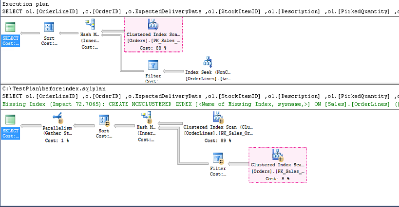
isqlw (aka SQL Query Analyzer), the client for Microsoft SQL Server 2000 had an amazing visual explain tool. To this day, that's probably my favourite ever GUI SQL client, it was just so damn responsive and well-thought-out. I never made the switch to SQL Server 2005 so never really properly tried the later Visual Studio-esque version, but it seemed slow by comparison.

Screenshots:

https://www.sqlshack.com/wp-content/uploads/2016/09/machine-...


SQL Server Management Studio still has a great GUI for query plans and the database engine reveals more than ever.

There's also Azure Data Studio for a cross-platform version: https://docs.microsoft.com/en-us/sql/azure-data-studio/what-...


looks nice!

i personally always loved pgadmin's graphical explain. i'm pretty visual and for me it is ideal to get a good first intuition on what's happening.


I'm familiar with SQL, but not Postgres. Is there a good example plan/query that I can use to test this demo?


The page has a sample button on the top right, it gives you a lot of samples to try out.


Thank you. Good work


Looks like a very good job, congratulations!


Great job, really...

In the meantime, and even with the help of vue.js, front dev. remains such a mess :(

(But what you did is just pretty cool)


Guidelines | FAQ | Lists | API | Security | Legal | Apply to YC | Contact

Search: