It's considered good writing style to write the first sentence, the second is implied.
Unless you're presenting historical facts or figures, If every sentence in an article had the author qualify himself with 'imo', 'that's why I think that', etc... it would be a pain to read, and the argument would be a lot weaker.
It's considered even better writing style to be clear with your titles.
When clicking on this, I assumed there would be either; cited facts or a general consensus from a large number of users that this font is "the best". Instead, what this is, is an opinion.
> Retina screens make subtle strokes and thinner weights look better, and M+ does that: its thin is ethereal, almost a stick font.
Opinion.
> It’s much narrower than average, so 80 characters per line can fit in less than half of my screen width - so I can use a vertical split in vim to edit two or more files at a time.
My opinion is that you might as well just use a smaller font size if this is an issue. Narrowing makes things harder to read than proportionately down-sizing - to me.
> It covers Basic Latin, Latin-1 Supplement, Latin Extended-A, Kanji and Kana: beyond that, few monospace fonts will do, though you can always fall back to Arial Unicode.
Don't most other mainstream fonts?
> It’s clear: 0 is slashed to differentiated it from O, and 1 is easy to tell apart from I, and l.
Don't most other mainstream fonts?
Edit: Just to be clear - I don't have a downer on the initiative of creating fonts (especially when they're open source and trying to make life easier for programmers), I'm just shooting the breeze over a bit of grammar. I'm sure lots of people will/do like this font. :)
You have it confused. That is when we're talking about clearly personal / subjective issues (e.g "Banana is the best ice cream flavor", "Obama is the perfect president", etc). This is not the case here.
An article saying "Medicinal drug X is better" (meant as a personal opinion) is not "good writing style". It's downright misleading.
And nobody said he has to do it for "every sentence". A clear "Here's why I think M+ is the best programming font" on the beginning would be enough.
I don't know, I strongly prefer the explicit "IMO" where correct. Most people do mix up, in their writing, statements of opinion and statements of fact. It's really annoying to leave the burden on the reader to figure out which is meant.
I don't know, I strongly prefer the explicit "IMO" where correct. IMO most people do mix up, in their writing, statements of opinion and statements of fact. IMO it's really annoying to leave the burden on the reader to figure out which is meant.
The argument would be weaker because it is weak in reality. That is why journalism digs up actual evidence beyond one person's speculation. This article is light on substance; if he'd written it as a personal opinion, it still would have stood to introduce the font. Having said that, the font looks promising, and I'll try it out.
It's good writing style in a persuasive essay, but this blog post hardly provides enough support for the first sentence to be called an essay. The only distinguishing fact about the font presented as support is that it's legible while being thin. The other distinguishing feature, narrow lines, is actually a disadvantage on lower resolution screens.
Hmmmm. When teaching basic physics, I sometimes have trouble illustrating the difference between energy and work for my students. But this solves it! Post something with a title of "The best x for programmers is y", and you can watch the expenditure of an enormous amount of energy - yet, zero work.
So I guess it looks bad on high resolution screens that aren't on apple devices? Why do people even use this term when not referencing magical apple lingo?
Because it has better branding, and fewer syllables? You didn't have any trouble understanding what was meant, and I'd guess no one else reading the article did either.
I've yet to find a font that I like more than DejaVu Sans Mono. It strikes the perfect balance between being monospaced and looking good IMO. Plus it's open source easily installable everywhere.
I've tried almost every other "programmer" font but there's always something that rubs me the wrong way. In the case of M+, it just looks thin and silly.
I looked it up in gedit, and it turns out Dejavu sans mono and Ubuntu mono are practically identical. Really minute details. I prefer Ubuntu because it's less fuzzy on my non-retina screen, though. For fun, try Tex Gyre Chorus Medium and show it to a programmer and say it's your favorite programming font.
Yeah, DejaVu Sans Mono is perfect, though sometimes I also use the new Source Code Pro and the old ProggyCleanTT (like when I'm working for several hours and my eyes need something more sharp).
I'm a professional programmer. I know quite a bit about computers. I don't claim to be the smartest guy in the room but I'm no dummy.
And I have no idea how to install a font. I download the zip and open it and there are 43 (43!) ttf files. I can install them by double clicking the file and selecting Install Font.
But then what? I now have 43 new fonts, but how do I know which one to use in my editor? Can someone explain this for a dummy?
You will probably have to set the terminal font and not Vim's.
In any case, usually when there are various ttf files for a single font, they all belong to a Font and then have variations (Medium, Medium Italic, Condensed, etc) Depending on the software, it maybe presented with 43 different fonts, or one single font, with variations (On mac, if you open Font Book, you get the font name, then you can expand to the variation, don't remember how it works on Windows)
See, that makes no sense to me. Is the font named "Source Code Pro" or "Source Code Pro for Powerline"? And if I'm using a different font, how do I know what it's name is? For example, is M+ named "M+", "M +", M+ for Powerline" or what exactly?
Yeah, I can see where one could get confused. I use a version of Source Code Pro that's been patched to work with vim-airline[0], which is why it's "for Powerline". On OS X I think you can get the font name from the "Family" column of the Fonts pane, or via Quick Look in the Finder.
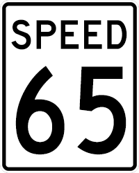
In defense of the design of this project, tall and thin is in. Oregon Speed Limit signs now use a taller and thinner font that is much easier to read at distance. Also the NHL used new fonts to number their jerseys for the Stadium Series so that the fonts could be seen at greater distances.
A little too thin for my tastes. I quite like Consolas or good old Courier New. To me the font width isn't all that important compared to the font height as I am not pressed for width but an extra couple of lines visible vertically is almost always wanted. Consolas is a nice balance at 11pt.
I just tried Consolas again, inspired by this article[1]. I like how it is short and shows a lot of vertical lines. And it looks good. But after comparing it side-by-side with Monospace (default on Linux Mint), I'm sticking with it. I just like more how it looks, it seems clearer to my eyes.[2]
I believe you're right. I could do that, since I don't live in the US. :)
Consolas was designed for ClearType, and for Windows. And I remember liking it very much on Visual Studio. But I'll just leave it be, I'm happy for now as it is.
Is there a legal/practical way to use Consolas on any OS other than Windows?
The last time I looked into using it on my Ubuntu workstation (which was admittedly a couple of years ago), it involved manually extracting the font files from the installer for MS's standalone PowerPoint viewer application, which was both clumsy and probably against the viewer application's license.
But I've gotten so used to the Deja Vu family of fonts being the default monospace font everywhere on Linux that I don't know if I could go back to using it again.
  mplus-fonts-common.noarch : Mplus, common files (documentation…)
  mplus-1c-fonts.noarch : M+ C is optimized to be proportioned and has two variations
  mplus-1m-fonts.noarch : M+ M emphasize the balance of natural letterform and high legibility
  mplus-1mn-fonts.noarch : M+ M emphasize the balance of natural letterform and high legibility
  mplus-1p-fonts.noarch : M+ P is aimed as sophisticated and relaxed design
  mplus-2c-fonts.noarch : M+ C is optimized to be proportioned and has two variations
  mplus-2m-fonts.noarch : M+ M emphasize the balance of natural letterform and high legibility
  mplus-2p-fonts.noarch : M+ P is aimed as sophisticated and relaxed design
Looks like Fedora users have a lot of choice. Which of these is the author talking about?
  mplus-1m-fonts.noarch : M+ M emphasize the balance of natural letterform and high legibility
  mplus-1mn-fonts.noarch : M+ M emphasize the balance of natural letterform and high legibility
Apologies, I am not sure which one of these you are talking about.
Maybe it's because I'm getting older, but no programming font comes close to Monaco in terms of clarity and character balance and spacing (vertically and horizontally).
Ultimately it comes down to being able to patterns quickly in the code. You can train yourself to do this with any font.
Bitstream Vera Sans Mono occupies a nice middle-ground on Linux for programming, almost like Monaco but a little clearer, if more boring. Have preferred compared to others so far.
I couldn't get Monaco, a little more eccentric but sometimes nicer to look at, to render correctly on Linux. Wierd line heights and hinting problems.
The 0 should always be slightly more oblong than the character O, even if you are using a slashing it.
Other than that, this is a decent retina font, but so are Anonymous Pro, Inconsolata-dz, Consolas, and Source Code Pro; and those all also come with options for Powerline.
I've tried different programming fonts, and finally settled on the old Source Code Pro font. I don't like overly narrow font. It's just a personal preference. There's no "best" in subjective personal taste.
I just compared Inconsolata and Consolas side by side and couldn't believe how similar they actually are. Whenever I just swap between the two, it's hard to compare, since Consolas seems to run about a point bigger looking than Inconsolata, so I have to scale it back a bit to give a real comparison.
Not surprising considering the author of Inconsolata cites Consolas as his primary inspiration, but I'd never noticed exactly how close they are. Both great monospace fonts. Very nice characters, but what really makes them stand out to me is that they both manage their kerning very well, especially around thin characters. Many other monospace fonts, including M+, end up with awkward gaps that approach a full space width and give the text a slinky-like compression/decompression effect, making reading and determining word breaks at a glance difficult.
Fonts are quite the subjective thing. M+ looks a little on the thin side to me. I greatly prefer Menlo (regular, which happens to be the default for Sublime Text on OS X) or Consolas.
I'm not sure that font choices are entirely subjective. Legibility matters, and it's not impossible that better legibility means fewer bugs and less eye/brain strain.
It would be cool if there was objective research into this. (I don't know of any, but I haven't tried searching very hard.)
I can't look at M+ without seeing M+. With other fonts - I'm old-fashioned and like Menlo, but I've tried many others - all I see is code.
Of course they aren't entirely subjective! There are objective ways that fonts can be assessed for sure. In fact, there's an entire documentary on Netflix about Helvetica (and titled the same).
M+ thin is too thin, and M+ regular too bold, for my taste. And though I do like leading, M+ has too much built in; it's easy for a user to add, but difficult to remove.
It's surprising to me with the advent of retina screens that there are so few narrow options (M+ is the only one I've seen). Aesthetics aside (although M+ is quite pleasing to the eye), I think the narrowness functionally =is= better.
However the line height is quite tall which I'm not sure is an attribute of the font or text editors. TextMate still inexplicably has terrible line height management (you have to mess around with 2 terminal command settings).
Is this a new kind of holy war? First we warred on what platform to run, then what we run on the platform, and finally how we display what we run on these platforms?
Everytime I come across these programming font articles, no one seem to mention about BPMono, which I've been using for years exclusively and loving it.
I tried it, and actually don't like the narrowness. It's less readable to me. Also, the light version isn't nearly as sharp as Source Code Pro Light. I think I will be sticking to Adobes font as my favorite...
I have spent a significant amount of time with many programming fonts. My favorite monospaced font is Menlo. That said, I'm farsighted and prefer fonts with more weight.
Seems there's a bit of a grammar issue here, I've fixed it for you:
"My favourite monospace font for programming is M+."