The 4004 could have performed much better than it did (up to 3x faster) if intel hadn't insisted on the 16 pin DIP. This limited how much data could be accessed per cycle and relied on shift registers etc to get full instructions and memory.
These die shots are all very pretty. Are people mostly interested in these just at the pure beauty of how so many circuitry can be packed into a small space and the feat of engineering, or for some other reason?
Some hobbyists use these die shots to reverse engineer older chips, bypassing the need to decap the chips themselves. The craft is explained nicely in this video https://www.youtube.com/watch?v=aHx-XUA6f9g.
Just wanted to comment on the usability of directory listings (Apache server?). No javascript bs, no UI frameworks, no SPA garbage, just good ol folder listing in HTML. Glorious, fast and shall I say, impeccable?
In 2021, this would be a "card" based page, about 6 cards visible, rounded corners, and it would have fucking infinite scroll, ofcourse with spinners to let you know its processing. God, help us.
Edit: I should clarify, I like JS for form submission and a few things. If you're building Google Docs competitor, by all means, go for SPA and big JS frameworks. That's what they're designed for.
Totally perfect apart from the fact I don’t have a fuckin clue what most of this shorthand and naming means. Sort of detail someone might include on of those silly cards or newfangled js dohicky
Eh. It’s pretty terrible on mobile, though. I can’t read or click anything without zooming and a page load for each directory resets the zoom. I would say the content isn’t really relevant for mobile users but the images themselves actually work pretty well on my device. Far better than the site itself.
It's actually pretty decent on mobile IMO. Pinch and zoom is easy to do, atleast on the iPhone. Then you just scroll naturally. The entire page doesn't move on you.
I agree with you in general, its not great on mobile, but it's not terrible. Far better than hamburger menu'ed UI that I see in the wild that seems to show 1 card at a time and hijacks the scroll mechanism.
A lot of "Not designed for mobile" fear stems from early days of smartphones in 2010-era which still lingers today. Things have changed. Screens have gotten much better in resolution, responsiveness has improved and touch experience on modern phones is exceptional.
I don't know why people are terrified of zooming. Frankly, zooming to use a desktop site is better UX than 90% of mobile sites. All you have to do is ensure your text lines aren't too long, which is good practice anyway.
Maybe it's because iOS don't have a one finger zoom gesture like Android? I wonder why Apple never added that one?
AA sibling comment mentions double tap to zoom in on a paragraph, but there's also a single finger zoom (tap and hold, then move the held finger vertically) for Maps (and by default in MapBoxGL last I checked).
Yeah it was in the first iPhone but you can't control the amount of zoom and it often guesses wrong or just doesn't work. I pretty much gave up on using it. On Android in most apps you can double tap, hold the second tap, then swipe up and down to zoom. It's a lot more natural than it sounds and it gives you precise control over both the zoom location and zoom amount.
On iOS you can try the gesture in Maps, and then wonder why they never added it to Safari.
Glad you are enjoying! I've aggregated some question responses below to try to clarify a few things.
Browsing the /map directory directly isn't intended to be informative in the way people are looking for. It's more of a file store that just happens to be browsable for advanced users. Rather this information is intended to be from the wiki which has more detail and is searchable etc. See for example: https://siliconpr0n.org/archive/doku.php?id=mcmaster:raspber...
I'm looking over people's suggestions and trying to see if there is anything I can take in to improve the site. Thanks for the feedback and feel free to reach out to me directly if you want to contribute something directly!
PS: yes I know there is some crufty stuff on there like search is doing weird stuff right now with the side bar. I upgraded the wiki software recently and haven't yet been
I couldnt agree more, I use ublock in advanced mode (even on mobile) and I was expecting to have to enable multiple scripts, which nearly always consist or analitics and ads, to be able to use this thing. Nope, all first party scripts, brilliant.
Better folder descriptions maybe but other than that perfect!
Quick question: is there a particular reason why the table and the other elements aren't centered in the browser by default? Even this site seems to do that to some degree, which improves the usability at least somewhat.
AFAIK that would require just a text-align rule for the title and margin-left: auto; and margin-right: auto; for the table, which seems a bit more readable on wide screens.
I really dislike centered websites. That means that if I change the width of the browser window, the position of the website elements changes. So when I make the window bigger for ONE annoying tab that requires more width, it changes ALL other tabs. This is horrible for my muscle memory.
Also, I arrange my windows such that overlapping windows don't hide important stuff underneath them. So I can see essential elements of a site even with chat windows on top. But if the website position changes on browser window width change, this invalidates ALL my other windows. It's simply awful.
I want degrees of freedom to be independent, otherwise they are far less useful.
People want centered websites because they are using browser windows that are far too wide, usually full screen. Just use a narrow browser window and left-aligned websites will look just fine. You'd think that with everyone having a narrow smartphone, websites would work well with narrow browser windows, but no, usually they use a different (bad!) layout on desktop browsers. I really hate this.
It's pretty good, but Apache tries to cut off long filenames and isn't Unicode-aware when it does this, so it looks untidy because names come out at apparently random lengths…
Fantastic! Thank you both. Such a high quality repo, and only 28 stars.
The viewer is really cool. I wonder if it'd be possible to modify it to display a folder of PNGs in a nice streamable way...
(It looks like it only supports slicing a single png, whereas we usually have tens of thousands of pngs. I've been thinking of ways of letting people view lots of ML images better than e.g. how tensorboard does it.)
That is a top layer shot of a flip-chip die. Every modern complex IC looks like that. Any time you see a pretty die shot with identifiable blocks of any kind of modern CPU or SoC, instead of a grid of balls, it's because someone has gone through the trouble of removing most or all of the metal layers which obscure all the circuitry. Otherwise it looks like that photo. Balls and power buses.
I've never looked at images like this before. Really cool. I don't know the nomenclature, but one question I have is, why are the points where metal contacts touch the IC so... complicated? For example:
Those are output driver transistors. There's a pull-up transistor on one side of the pad and a pull-down transistor on the other. The transistors are interdigitated to make them large so they can provide high currents.
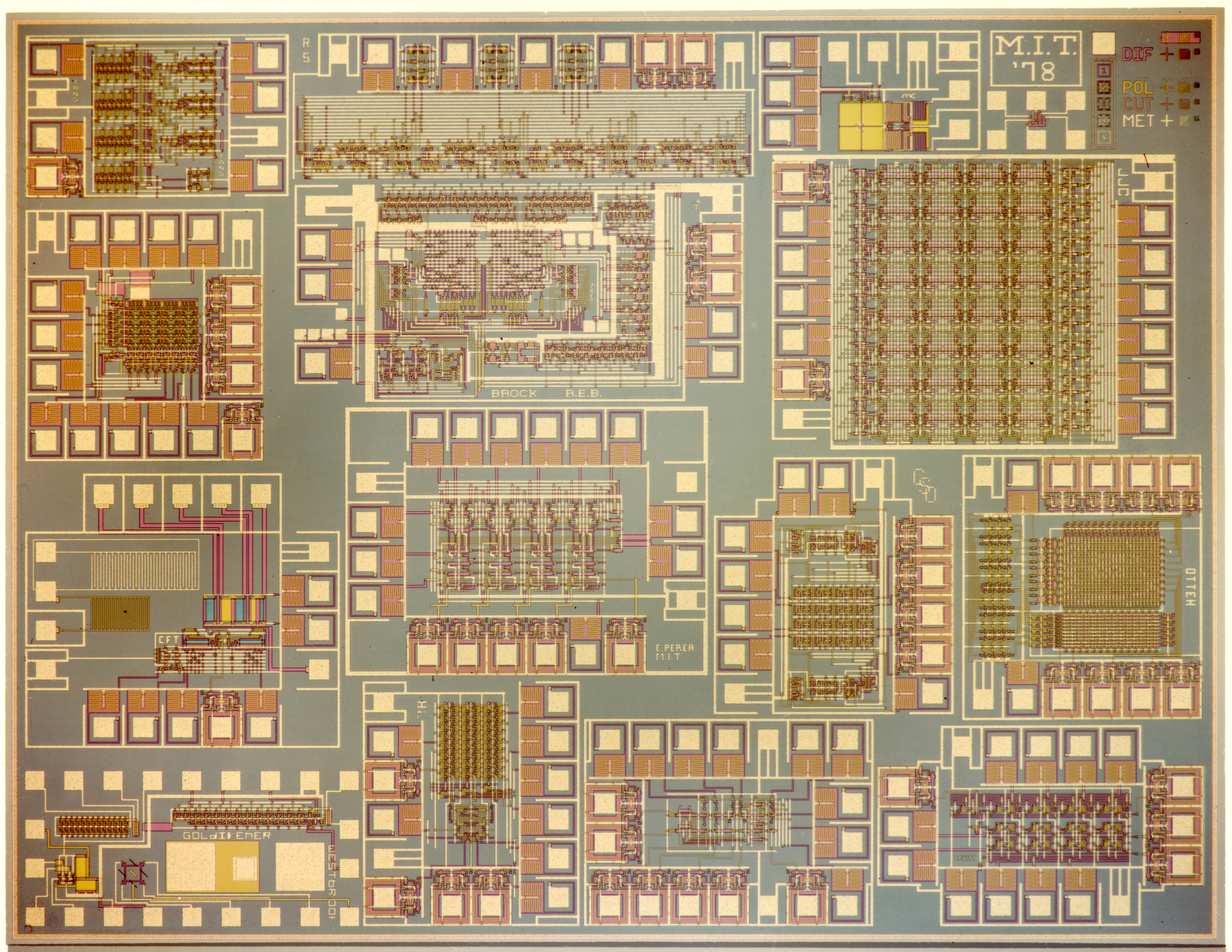
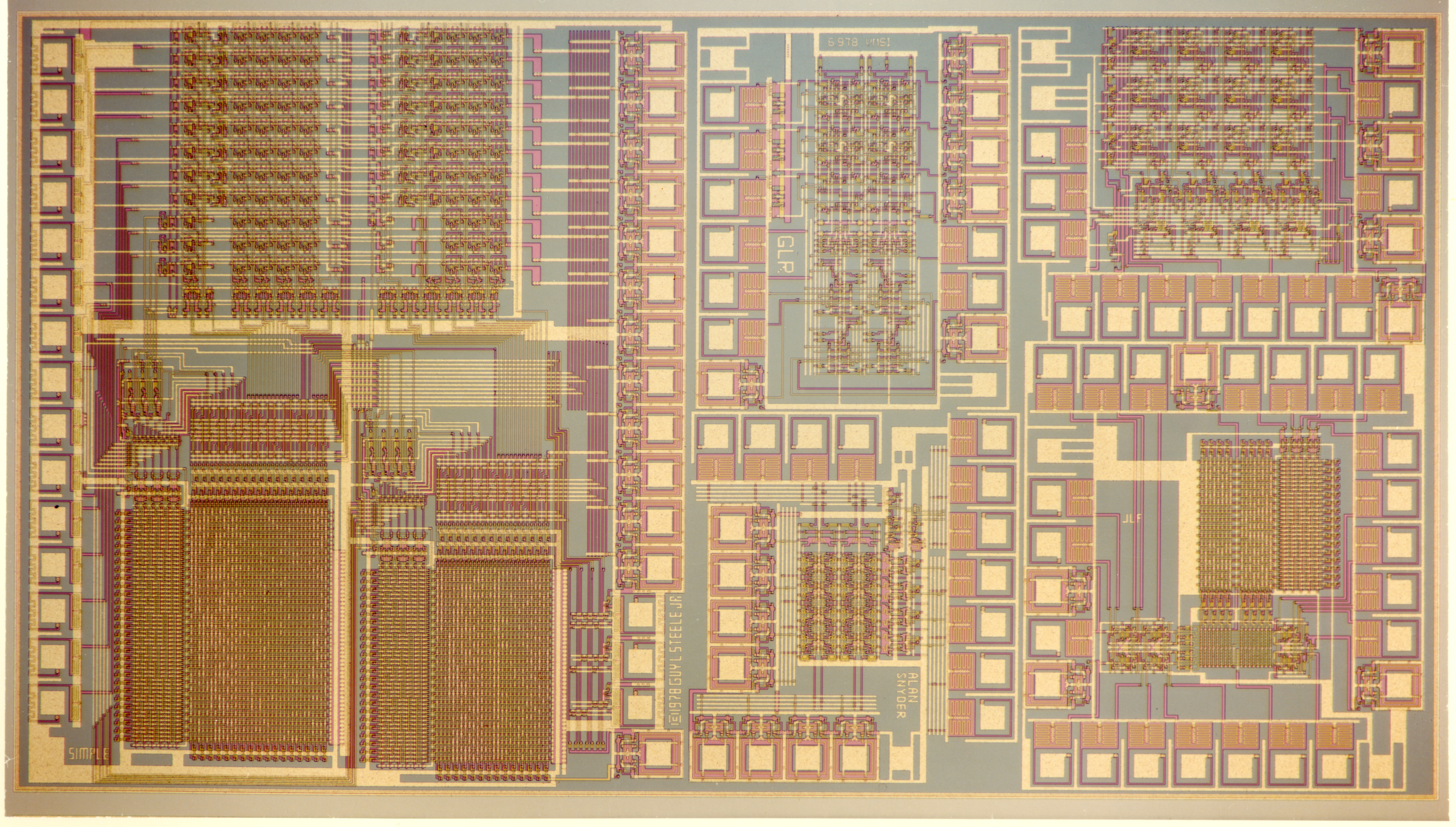
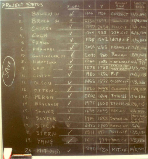
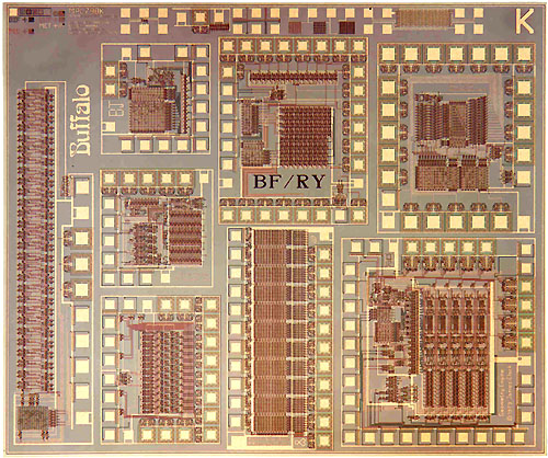
The Great Quux's Lisp Microprocessor is the big one on the left of the second image, and you can see his name "(C) 1978 GUY L STEELE JR" if you zoom in. David's project is in the lower right corner of the first image, and you can see his name "LEVITT" if you zoom way in.
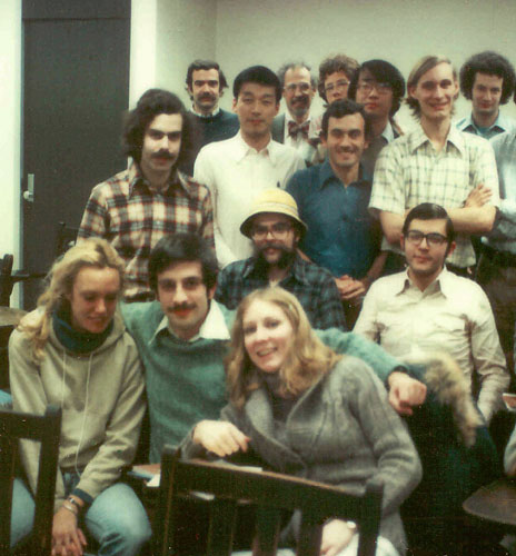
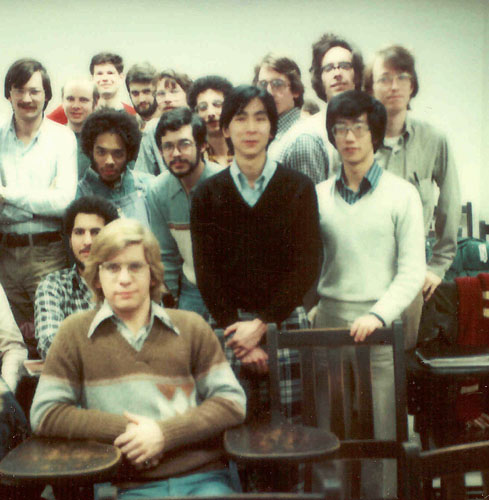
Here is a photo of a chalkboard with status of the various projects:
The final sanity check before maskmaking: A wall-sized overall check plot made at Xerox PARC from Arpanet-transmitted design files, showing the student design projects merged into multiproject chip set.
One of the wafers just off the HP fab line containing the MIT'78 VLSI design projects: Wafers were then diced into chips, and the chips packaged and wire bonded to specific projects, which were then tested back at M.I.T.
We present a design for a class of computers whose “instruction sets” are based on LISP. LISP, like traditional stored-program machine languages and unlike most high-level languages, conceptually stores programs and data in the same way and explicitly allows programs to be manipulated as data, and so is a suitable basis for a stored-program computer architecture. LISP differs from traditional machine languages in that the program/data storage is conceptually an unordered set of linked record structures of various sizes, rather than an ordered, indexable vector of integers or bit fields of fixed size. An instruction set can be designed for programs expressed as trees of record structures. A processor can interpret these program trees in a recursive fashion and provide automatic storage management for the record structures. We discuss a small-scale prototype VLSI microprocessor which has been designed and fabricated, containing a sufficiently complete instruction interpreter to execute small programs and a rudimentary storage allocator.
Here's a map of the projects on that chip, and a list of the people who made them and what they did:
Just 29 days after the design deadline time at the end of the courses, packaged custom wire-bonded chips were shipped back to all the MPC79 designers. Many of these worked as planned, and the overall activity was a great success. I'll now project photos of several interesting MPC79 projects. First is one of the multiproject chips produced by students and faculty researchers at Stanford University (Fig. 5). Among these is the first prototype of the "Geometry Engine", a high performance computer graphics image-generation system, designed by Jim Clark. That project has since evolved into a very interesting architectural exploration and development project.[9]
Figure 5. Photo of MPC79 Die-Type BK (containing projects from Stanford University):
The text itself passed through drafts, became a manuscript, went on to become a published text. Design environments evolved from primitive CIF editors and CIF plotting software on to include all sorts of advanced symbolic layout generators and analysis aids. Some new architectural paradigms have begun to similarly evolve. An example is the series of designs produced by the OM project here at Caltech. At MIT there has been the work on evolving the LISP microprocessors [3,10]. At Stanford, Jim Clark's prototype geometry engine, done as a project for MPC79, has gone on to become the basis of a very powerful graphics processing system architecture [9], involving a later iteration of his prototype plus new work by Marc Hannah on an image memory processor [20].
[...]
For example, the early circuit extractor work done by Clark Baker [16] at MIT became very widely known because Clark made access to the program available to a number of people in the network community. From Clark's viewpoint, this further tested the program and validated the concepts involved. But Clark's use of the network made many, many people aware of what the concept was about. The extractor proved so useful that knowledge about it propagated very rapidly through the community. (Another factor may have been the clever and often bizarre error-messages that Clark's program generated when it found an error in a user's design!)
9. J. Clark, "A VLSI Geometry Processor for Graphics", Computer, Vol. 13, No. 7, July, 1980.
[...]
The above is all from Lynn Conway's fascinating web site, which includes her great book "VLSI Reminiscence" available for free:
These photos look very beautiful to me, and it's interesting to scroll around the hires image of the Quux's Lisp Microprocessor while looking at the map from page 22 that I linked to above. There really isn't that much too it, so even though it's the biggest one, it really isn't all that complicated, so I'd say that "SIMPLE" graffiti is not totally inappropriate. (It's microcoded, and you can actually see the rough but semi-regular "texture" of the code!)
This paper has lots more beautiful Vintage VLSI Porn, if you're into that kind of stuff like I am:
A full color hires image of the chip including James Clark's Geometry Engine is on page 23, model "MPC79BK", upside down in the upper right corner, "Geometry Engine (C) 1979 James Clark", with a close-up "centerfold spread" on page 27.
Is the "document chip" on page 20, model "MPC79AH", a hardware implementation of Literate Programming?
If somebody catches you looking at page 27, you can quickly flip to page 20, and tell them that you only look at Vintage VLSI Porn Magazines for the articles!
There is quite literally a Playboy Bunny logo on page 21, model "MPC79B1", so who knows what else you might find in there by zooming in and scrolling around stuff like the "infamous buffalo chip"?
One interesting feature of the Lisp microprocessor is that it doesn't have an ALU. At that time an ALU was a very large part of a processor design and the idea was that Lisp didn't need it and not having one would allow the project to fit (barely) in the limited area allocated to each student.
You can define numbers from scratch in Lisp by using lists and having their length (for example) represent the number's magnitude.
If we define the empty list as ZERO, and the successor of a number N as (CONS 'S N) we can build a whole math library from there:
    (DEFINE ADD '(LAMBDA (A B)
        (COND
          ((NIL? A) B)
          ((NIL? B) A)
          (T (ADD (CONS 'S A) (CDR B)))
        )))
This site uses (1) prerendering different resolutions and (2) tiling.
(1) If you take a look under https://siliconpr0n.org/map/intel/4004/m0_200x/l1-tiles/ you'll see that the 1/ subdirectory has the most zoomed-out version of the chip image, 2/ has slightly higher-res images, and so on until 6/, which is full-resolution.
(2) Tiling means you might take a 12000x12000 (ie 144 megapixel) image, and split it into a 20x20 grid of 600x600 subimages (ie 0.36 megapixels each).
Zooming and panning can now be implemented by having your UI alter the x, y and z parameters.
I figured this out by opening the network tab (View -> Developer -> Developer Tools in Chrome) and watching the browser load files when I did things. Because all the files have simple names like "1.jpg", "2.jpg" inside a directory structure, I needed to hover over the filenames to see the full image URLs in a tooltip.
===
All of the above works with entire image files, which is good, because common file formats and APIs often won't let you do anything other than "load the entire file".
Some file formats allow you to load part of an image effectively. For instance, many PDFs will let you read page 53 by (a) reading enough of the header/index in the file (b) reading page 53, without needing pages 1-52 first. If you were writing something like a desktop image viewer you'd probably want to take advantage of this, but the details are likely to be very file-format-specific. You'd likely build on top of specialized libraries for TIFF, RAW, PDF and so on, rather than generic "load any image file" APIs.
AI generated microarchitecture could be fun, although I assume they do something similar already (What's the optimal cache parameters, number of execution pipelines etc. etc.)
The colors are real, mostly generated by thin-film interference depending on the thickness of the layers. Some people boost the saturation to make it more dramatic, but I think John's photos are natural.
Mostly yes (ex: through thin film interference as mentioned), but there may be significant color correction for things like halogen light yellow color. There are also techniques to produce colorful images such as DIC and using a confocal microscope (ex: the 4004 ones I believe are confocal)
somehow printing & printers came up in hn a couple months ago, and there were some supporters of not owning printers: just buy whatever prints you need.
maybe they're still right, but i feel like this demonstrates well why i'd want a decent slightly-wide-format cost-effective printer: a rotating selection of cpu print outs, to hang on the walls.
At ~$10 per print, I feel a little weird about spending the money, time & time again, to get photos.
But buying a $1000 Epson with an EcoTank- it comes with two free years of ink, and will be cheap to run after that- it might/might not make financial sense. 100 photos is a lot to print out. But I feel like it's something that I'd want to use, would be happy to use, am incentivized to use. Where-as I would be hestitant to keep throwing $10 after prints, that I wasn't super sure about. Buying my own printer lets me leave the scarcity model behind. It frees me from the act of deliberation. It gives me faster turn around, to experiment.
I'm not sure why people keep foisting what seems like such terrible & limiting advice on me, to not invest in ownership, not invest in myself. It's confusing. It's not backed up with arguments. This is the 3rd time I've had this exact same encounter on HN. I welcome some healthy questioning, but no one has given me any arguments, anything to go on.
I should probably start by ordering some prints. See how that goes. Sample the idea. But even throwing $60 at some prints- it feels like a lot of money, that could be better invested.
first, silicpr0n would be funnier, because it rhymes better/is more glib.
disclaimer, before heading on: i'm not sure how i feel about it to be honest. it's ok i suppose. decent. but it feels uninspired, at this point: traditional, expected.
yes, i love the site, what it does, what it shows. the name itself doesn't titilate me further, doesn't add to my enjoyment- i think. although i enjoy a little glibness, a little playfulness. it still is kind of manufactured. abandonedporn, architectureporn, cableporn, conduitporn, engineeringporn, futureporn, .... how many varieties of thing-"porn" do i need?
my core meta-analysis? i do think the whole internet is as a local maxima where attaching -pron or -porn or -pr0n to the end of any subject is how we say "pretty pictures". i get it, it gets the point, "in your dreams", but like, we're deep into Simulacra & Simulation territory, third degree: simulacra now precedes reality, the signified becomes meaningless. porn itself, real porn, is often unreal, often part simulation, but it still is second order, still signified a real. unmooring ourselves from sex, using porn to just mean, "hardly believable attractive take" on a thing, it's a direct enough disassociation, it makes sense. but it's also tiring to me, exhausting, that we have no other frames of desire or beauty we can hitch ourselves to.
i wouldn't mind finding some other ways to anchor ourselves, meaning. i want whimsy, i think there is "something" added by the playfulness, the bending of meaning. reviewing, i think i'm being kind of cantankerous in my assessment. but it does seem like we're low on good options. that this space could use some inspiration & opening.
The topic has come up a few times and I'm not opposed to changing it. If a good replacement name came up and someone helped with logos etc I'd change it
https://siliconpr0n.org/map/intel/4004/m0_200x/#x=2688&y=202...