Hi, I'm one of the people who worked on this and I wanted to provide a little background and a few clarifications.
Lightspeed is currently not a product. It's a collection of sketches and thoughts. It is also NOT the next version of Firefox. While some ideas might find their way into mainline Firefox at some point, many of the assumptions on which Lightspeed is based are the exact opposites of Firefox core values (e.g. no settings or customization in Lightspeed).
More than anything else, Lightspeed helps us think outside the box that Firefox is. It's a place where we can dare to explore more radical thoughts like not having any settings or or even menus. Having constraints like these stimulates creativity much like, for example, the character limit on tweets forces you to make your message more concise.
Ideas are worthless when they just exist in your head. Sketching out Lightspeed has helped us to make make lots of ideas more tangible, so they can be evaluated.
That being said, just reading through this thread has sparked some interesting new thoughts – we'll keep experimenting :)
Search operators are super powerful and awesome to use in google - providing a way to use those from the browser itself can help provide a distraction free environment, but also opens up new possibilities:
bm:“tag" - show list of all bookmarks with that tag
Windows tried to do that with their search (in Vista, 7, and 8). It has been a disaster. Hidden functionality is a UI and UX anti-pattern.
How do people know to type "bm:" for Bookmarks? Google? Is a Google search now part of the UI's workflow? Or will people simply stop using Bookmarks because it is so obscure (you're seeing this with mobile browsers, Bookmarks are hidden so go unutilised).
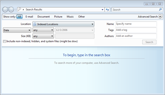
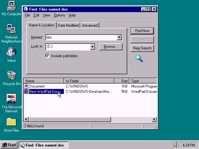
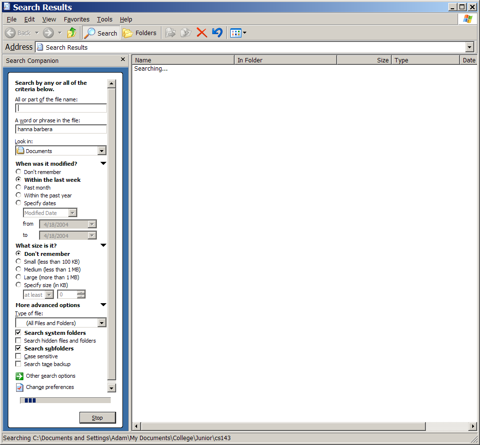
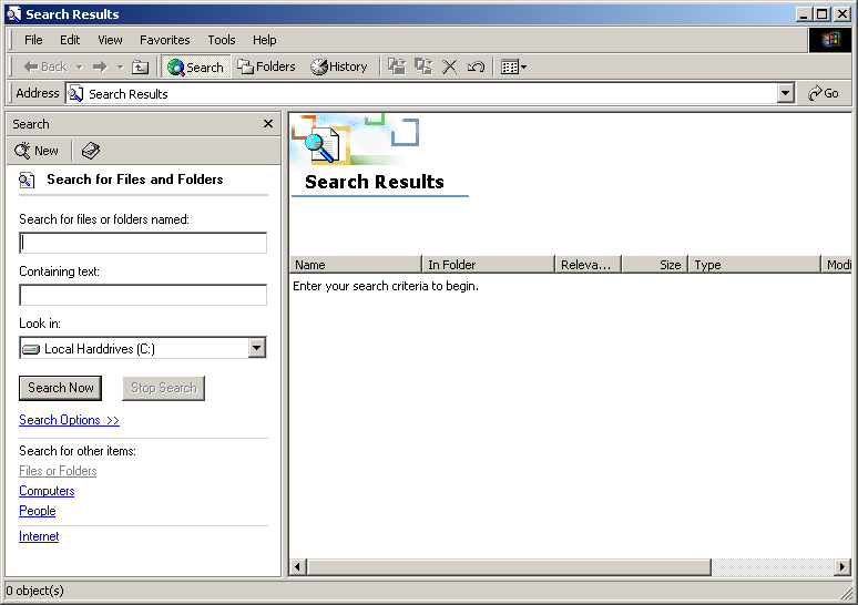
Ditto with Windows. In Windows 9x you had a nice UI for search that allowed the user to: Search file/folder names, search within (contents), and to filter by file type and file date(s). In Windows Vista+ it is now hidden strings like "filetype:" (and that is the least obscure example, try doing the between-dates thing WITHOUT googling how first). Plus now "unknown file types" cannot be search within at all (even if you alter the indexer's settings it no longer works, you have to add each file type in the registry as a "text file").
I kind of agree, though hidden powerful features aren't inherently an anti-pattern (see, e.g. keyboard shortcuts). You just need to provide affordances for everyone to be able to use an interface at some useful level.
I'm a fan of the style of gmail's advanced search (for example), which has all the various fields to fill in if you drop it down, but then when you execute the search, it converts them into the search operators, thus teaching you how to use them (if you care enough to pay attention...if not, the field boxes are still there for you to use).
The major difference was that Vista (Longhorn) originally was meant to be powered by WinFS and Vista shipped just with Windows Search (the indexing service that was also available for WinXP as "Desktop Search").
For some unknown reasons the advanced search bar is absent in Windows 7+.
That history is funny. Win95 was also supposed to ship with WinFS, but instead it got only a "you don't ask for a find-like tool anymore" search window.
I don't know if MS finished the WinFS specification already.
Based on the comments here and those that appear under the article, people in general are not at all impressed by these ideas.
I don't think the hatred is as universal as it is for, say, Australis, but it's close enough that it should be discomforting.
What is your response to this? Do you think it's right to continue work on a project that the majority of people dislike for a variety of very legitimate reasons?
"Do you think it's right to continue work on a project that the majority of people dislike for a variety of very legitimate reasons?"
Almost certainly yes. How else can you find new, previously unknown products and ideas of value? Don't you ever just brainstorm crazy ideas because you don't know where an idea will take you? You know... think different... here's to the crazy one's.
Also, "majority of people" might need to be edited to say "majority of a subset of people who are HN readers/commenters and who are so interested in browsers that they watch nearly 10 minutes of video on the topic."
"Based on the comments here and those that appear under the article, people in general are not at all impressed by these ideas."
I wouldn't say that is a fair assessment, many people took it for what it was (a UI/UX experiment), and quite a few people who did take to it badly mistakenly thought it was a Firefox design concept.
Well, to be fair, the last 2 Firefox "design concepts" got almost verbatim into the mainline despite almost unanimous complaints, and now I have 2 different plugins installed to correct the mess they created.
It's only a "mess" to some, I personally have no beef with Australis, and the beauty of Firefox is that it allows for you to customise it to work how you want (hence you were able to 'fix' it). This flexibility means there's still plenty of room for UI experimentation. Besides, this Lightspeed design is explicitly not for Firefox, the designers acknowledge part of what makes Firefox what it is is the customisability, this design is seeing what could be done with an alternative browser.
At first I thought "oh no, another distraction for Mozilla", but then I sat through the presentation and thought there was some really cool ideas (amazebar!). In fact, I think it can be simplified and paired down even more. Even better, some of the assumptions here even make the software portable (as in doesn't really need to be installed and could just run off a usb drive/out of my dropbox).
Automatically being in a private/secure mode makes lots of sense to me as well.
Some ideas I don't like:
- get rid of loved sites/bookmarks altogether. Frequent usage should just percolate autocomplete suggestions to the top. This design doesn't really need them, and tbh I've barely used bookmarks in any browser in a long time.
- too much going on in the amazebar, drop all the suggestion (which will quickly get stale, tabs, email search, etc. Just focus on most frequent sites and autocomplete, it feels like the presentation is just burying lots of the clutter that used to take up GUI space in the amazebar.
- please don't default to a "downloads" folder. I've never liked it and before I bother to change it, my downloads folder quickly turns into a "random junk I've downloaded" folder. Forcing me to put it someplace actually is simplifying my workflow. It's almost the first option I change as soon as I install a new browser.
- keep tabs more present, don't bury them in the amazebar
> Frequent usage should just percolate autocomplete suggestions to the top. This design doesn't really need them, and tbh I've barely used bookmarks in any browser in a long time.
BECAUSE address bars autocomplete sites I frequently go to, the bookmarks end up being a way to store sites that I go to /infrequently/ and use for reference or only check up on every few months.
That's the same way I use bookmarks. I won't bookmark, say, Hacker News, but I will bookmark a recipe site that I know I'll want to refer to for ideas sometime down the road.
Recipes are static text, you could just save the page (as HTML) on your device. (URLs change all the time, and website vanish) Later, the file can be found with Windows search / Spotlight.
I bookmark more dynamic pages, e.g. news articles with comments that will be around for some longer period.
That's one of my biggest use cases: bookmarking individual recipes. That's a perfect example of something I'm not going to be looking at every day but do want a list of to browse occasionally, or to find specific ones.
You may already be aware of this but a fellow HNer operates a service I use frequently for this exact use case called historio.us.
I use the chrome extension to add stuff that I might want to revisit and, when I do need to, I have historio.us as a "search engine" in the chrome omnibar.
I bookmark & tag any site that I think I will visit again.. and then search using the address bar by typing the site name or tags and the "*" character to search only bookmarks (I clear my history often and bookmark are still remembered, and I can easily make a backup of my bookmarks)
Which kind of highlights that a stripped-down "core only" browser really doesn't need it. If browsers were invented today, bookmarks would be an extension and not a core feature.
I seldom use bookmarks for browsing/reading things, but they are very useful for opening groups of related pages at once (since modern browsers can open a folder of bookmarks in one operation).
E.g., I select Bookmarks → Banking → Open in Tabs and a tab opens for each of my bank accounts and credit card accounts. (Especially handy because such sites tend to be slow.)
Autocomplete is a very useful UI for going to a single site, and I personally never use bookmarks for that, but I often use them to open collections of pages together at once.
don't worry, you'd never use this browser. The people who would barely know what a folder is. Actually that's a bit of a problem, those 'evergreen' people he talks about do NOT interact with the filesystem. So one way or another this application will have to open that folder somehow.
>keep tabs more present, don't bury them in the amazebar
This one I understand. The 'evergreens' I've met in my life don't use tabs. Some do, however, but only in a limited context.
It's tempting to think to add a feature that can be exploited for so much gain by us... but for a feature to be used, the UI must pressure the user to use it.
Current versions of Windows and OS X have a standard download folder. Following that convention makes a lot of sense for their target audience since it's what the other browsers do, in the default Explorer / Finder sidebar and avoids confusion with all of the things the average user saves to the desktop.
I agree with not defaulting to saving downloads in the "downloads" folder. Many people don't really know how to use their file manager. (For years, my mom would open Microsoft Word and organize files there.)
Why not default to saving downloads on the Desktop? Where did that file get saved? Oh, there it is!
I used to think that too. But then, why have a Downloads folder if you're not going to put Downloads in there? I agree that every once in a while you have to do some cleaning, but that's on the user.
I think you could have shortened your question to "why have a Downloads folder?"
Downloads folders are where files go to sit unused. I personally send everything to my desktop so files won't sit out of sight forever, but I think in a browser which is meant to be simple that asking where they want the file is a good choice. Why defer user action to a time where they have to do a large amount of a boring task when you can ask them to do it right there when they're most likely to know what they want to do with it?
Not understanding the file manager is exactly why not asking for a location is a good idea. You just download it, and when you want to find it later, you just search, and there it is.
What happened to just asking the user where they want to save it? To download a file I now have to download it, then open Finder, navigate to Downloads and copy the file, navigate to the folder I want to place the download, paste the file. Then navigate back to the folder and delete the file from Downloads .. because Macs don't give you a Cut option.
If I moved to a new part of the world where everybody hopped on one foot instead of walking...I'd find a way to teach them to walk though. Wouldn't you?
That sensible and effective approach has become yet another victim of the failed quest to "improve the user experience" by throwing away or changing stuff that was working perfectly fine before. The new approach is almost always far worse than whatever minor flaws might have existed with the earlier approach.
And allowing the old, working approach to be toggled back on through some preferences dialog, through about:config or through some extension doesn't justify the bad change. If anything, it's actually somewhat offensive, because it now requires users to engage in yet more fixing of things that just shouldn't be broken to begin with.
When I start using a fresh installation of Firefox, I have to spend at least a good 10 minutes installing various extensions and reconfiguring it just to get a minimally usable experience out of it. That's not acceptable, and it's not justifiable.
To me, browsers defaulting to the Downloads folder improved the user experience. You might care much about where exactly your files are going, but I generally don't. Of the two, I think "not caring much" is the default option. If you do care, right-click -> "Save link as...".
It's also incredibly arrogant to say that it's not acceptable or justifiable that Firefox does not exactly cater to what your personal opinion on "usability" is.
> When I start using a fresh installation of Firefox, I have to spend at least a good 10 minutes installing various extensions and reconfiguring it just to get a minimally usable experience out of it. That's not acceptable, and it's not justifiable.
You're assuming that this is widely applicable — very few people have spent a decade building a highly customized browsing experience and most people don't customize much at all. Ever walk around the office and notice how few people even removed Microsoft's default bookmarks from the toolbar so they spend all day staring at links to a service which they don't use?
I would also note that the history of computing is littered with loaded descriptions of things which were reflexively described as a "bad change" and a complete non-issue a year later. Mouse wheels, tabbed browsing, fonts and later CSS, JavaScript, all got the kind of grumbling you made above from a few people. Sometimes it's worth asking whether you really benefit from the old way or are just reacting to something being different.
I think your understanding of the history of computing is flawed.
As somebody who lived through the events you mentioned as an adult working in industry, I can assure you that the sentiment you believe was felt was actually not felt.
Mouse wheels were seen as a very good thing when they first came on the scene. They gave the power of the three-buttoned mouse, but also made scrolling much simpler.
The same goes for tabbed browsing. It was one of the best features of Opera for a long time. Everyone I showed it to at the time thought it was very useful. And it was one of the best features of Firefox, too, when it was still Phoenix.
And the same goes for fonts, and CSS (although to a lesser extent). Their benefits were obvious from the beginning, and I don't remember them facing really any resistance.
Contrary to popular belief today, JavaScript was not seen as good when it was first released, and it should not be considered good today. In the mid-1990s it was generally seen as a rather bad and limited language. That's why it didn't see much use until the mid-2000s. The first generation of developers who experienced it found it inferior to existing technologies and generally refused to use it. Even today, it's still a very flawed language (the problems with it are well know; I'm not going to regurgitate them here).
The problem with Firefox lately isn't that there has been chance. Of course change can be good. In the case of Firefox, though, the change has been utterly horrible, and caused far more problems than it brings in benefits, for a huge number of people. This is reflected very well in Firefox's ever-dropping market share.
> As somebody who lived through the events you mentioned as an adult working in industry, I can assure you that the sentiment you believe was felt was actually not felt.
My comment was based on my experience as someone who also lived through that period as an adult working in the industry.
> Mouse wheels were seen as a very good thing when they first came on the scene. They gave the power of the three-buttoned mouse, but also made scrolling much simpler.
That's easy to assume now but at the time there were people who complained that they required more precision to use, were inconsistently supported by existing software, etc. I remember people complaining that clicking the wheel was less reliable than using a proper third-button — no doubt true for the people who did a lot of pasting in X11 but that number was an increasingly miniscule fraction of the computing world and no doubt most of them adjusted after they stopped grumbling.
> The same goes for tabbed browsing. It was one of the best features of Opera for a long time. Everyone I showed it to at the time thought it was very useful.
… and yet other people complained that it was confusing to have tabs when you also had windows, duplicated with the OS window management, made it easy to accidentally forget you already had something open, etc. I'm sure all of those people use tabs now without even thinking about it but that doesn't mean that they didn't grumble first and learn how to use them second.
> And the same goes for fonts, and CSS (although to a lesser extent). Their benefits were obvious from the beginning, and I don't remember them facing really any resistance.
Outside of your corner of the web, there were impassioned rants about how the font tag overrode the user's font selection – that was one of the early selling points for CSS! Some people complained about CSS because it was harder to use than the font tag while others complained that it made pages slow or required downloading more data, etc. Some people complained about both because they made it easy to make pages which were hard to read on the wrong browser, operating system, or if you had a very small or very large display, or were color blind or visually impaired.
> Contrary to popular belief today, JavaScript was not seen as good when it was first released, and it should not be considered good today. In the mid-1990s it was generally seen as a rather bad and limited language.
I started writing JavaScript back when it was called LiveScript (oh, those heady days of downloading Netscape 2 betas when their FTP server wasn't overwhelmed). Then, as now, people complained about JavaScript being bloated or slow and there's a long tradition continuing down to your comment of complaining about the technical merits of the language. This wasn't wrong – even Brendan Eich is apologetic about most of it – and yet here we are in a world where the one language you can assume will be taught in 10 years is JavaScript because a billion people interact with JavaScript programs constantly.
Again, I'm not saying that the complaints are entirely without merit – only that there's a long tradition of people who overestimated either how serious a problem was, the degree to which their reaction was representative of the general computing public, or both. I remember plenty of advocacy that pages should work without JavaScript – and personally engaged in a fair amount – but much of the web today assumes JavaScript without any of the predicted disasters.
> The problem with Firefox lately isn't that there has been chance. Of course change can be good. In the case of Firefox, though, the change has been utterly horrible, and caused far more problems than it brings in benefits, for a huge number of people. This is reflected very well in Firefox's ever-dropping market share.
As they say, citation needed. That trend started well before the new UI and appears to have rather a lot more to do with Google's successful promotion of Chrome. Even in technical forums, there will be a ton of messages but they always seem to be posted by a small percentage of highly vocal users who assume everyone who isn't commenting agrees with them.
When I start using a fresh installation of firefox I don't need to do anything to get my normal use experience back because I already restored my profile folder before opening Firefox for the first time.
I've seen users right click on a link, click "Save as...", navigate to a specific folder, open Windows Explorer, and promptly forget where they put the file.
But the whole point is that this browser isn't meant for technical people. It's not meant for the kind of people that feel the need for a different `Downloads` folder.
Most of the comments against it here are in this same line. If the concept of NoScript even vaguely makes sense to you, or you've even heard the words "window manager" together, you're probably not the target audience.
I'll admit that most of these things (especially no settings) would make it a no-go for me, but I can definitely think of some relatives that I would love to stick on it and then not have to worry about them again.
I'd think /tmp by default would make sense, effectively your downloaded files would live inside Firefox itself, ready for you to drag/save them out. It's in line with where modern computing is going, making the filesystem less relevant by the day.
Not if there's any chance that tmp would get automatically cleared out, ever. I've seen people intentionally, cluelessly save work in temporary directories and then get upset when it was nuked at a later date.
We are working on something similar at StartHQ (https://starthq.com) and keeping the search results page simple and uncluttered has been a challenge.
We ended up including more images and less text for certain types of results like contacts, for example. Check out the screenshot below if you don't have time sign up:
I don't really see the advantage of displaying images. In your screenshot, we see five typical examples: the black head, the poster in the wall, the unknown face, the baby, and the picture with too many effects. How are these pictures better than printing five names?
You're right, one still needs to include the name on top of the image - that's something I'm working on atm.
We did have just text before and images stick out better, making it much easier and faster to determine which is the right result to click. Text is also quite easy to scan in one direction (top to bottom for search results), but having to scan horizontally as well is difficult. With images it's much easier, letting us include more results in the same space.
> - get rid of loved sites/bookmarks altogether. Frequent usage should just percolate autocomplete suggestions to the top. This design doesn't really need them, and tbh I've barely used bookmarks in any browser in a long time.
Opera tried getting rid of bookmarks with Opium, and very much was forced to go back after the initial release.
Users, in both cases. (I've not been privy to the data in a long time and never for Opium, but I suspect the uninstallation surveys showed it quite clearly from what was said.) The original decision to drop it was based on telemetry showing the majority of users never touching bookmarks.
> What could have been done differently in the implementation to have resulted in a different outcome.
From what I saw, the public feedback was mostly pertaining to infrequently accessed sites — which is the one case where $YourFavouriteMagicAddressBar doesn't work well. One could certainly experiment with allowing users to in some way tag or add descriptive text to URLs which showed up in the magic-address-bar, but that may well just not work sufficiently.
> The original decision to drop it was based on telemetry showing the majority of users never touching bookmarks.
Advanced users often deactivate telemetry (for privacy reasons). So you the telemetry statistics cover the normal users. For example: Microsoft made the same mistake and trusted their telemetry statistics too much. That's why they made (in retrospect) stupid and rather unpopular decisions in their recent products.
The problem I have with Firefox is that it just doesn't really innovate. We've had some small UI changes. But there's legacy cruft still in there that isn't addressed.
Like the bookmarks and history manager. There isn't anything particularly wrong with these data-table windows, but I don't really enjoy using them either. In some ways I think they should be at the heart of the browser.
I think a lot of people use tabs because bookmark management is so crap.
The only bit I resonated with was the similar sites suggestions. But you'd need a setting to setup suggestion services. There's a privacy concern with that.
Other helper features:
Pagination buttons were built into Opera driven off the rel=prev and rel=next, link elements. Navigation could further be ripped out the page window into a browser control. Searching sites and pages could be friendlier. Better form helpers needed. A good feed reader would be good. Tools to help read web content more simply (readability style) would be nice. Plus I like personalising the look and feel of my web browser ever so slightly, and even Firefox doesn't do that particularly well (it ignores some of my desktop theming).
So I think Firefox should really be thinking how to answer the question: 'How can we make it easier for users to consume web content?'. This has to go beyond the rendering engine. So actually a fatter featureful browser I think would be better - but with some very intuitive and simple controls.
> Like the bookmarks and history manager. There isn't anything particularly wrong with these data-table windows, but I don't really enjoy using them either.
And here I was thinking every browser should have such powerful tools instead of optimized-for-grandma windows.
There's nothing wrong with optimising for Grandma. The key is to make the most useful features easy to get at, and the more powerful ones discoverable.
The bookmark/history manager could be better. It has no autocomplete/awesomeness in the search. It's actually quite an awkward UI.
It's not keyboard friendly. And their are odd inconsistancies. Should the default behaviour of clicking on a link open it in new tab?
Recent bookmarks and most visited are nice smart bookmark folder, these are useful but hard to reach in that tool. Some bookmark management feels a little like a black box.
At least you can tag bookmarks. Scrolling through a massive list of tags isn't much fun.
> Like the bookmarks and history manager. There isn't anything particularly wrong with these data-table windows, but I don't really enjoy using them either. In some ways I think they should be at the heart of the browser.
But they are at the heart of the browser. The Awesome Bar use words and tags of your bookmarks to propose you the right url after typing some character in the url bar. In the standard usage you do not need to open the bookmark manager (which is ugly, you're right) to use the bookmarks. It's automatic. You need to open the bookmark manager only if you want to know what you looked at at a certain date or do some housekeeping.
Well kind of. I bookmark sites and then bring them back up by focusing on the location bar (CTRL+L), then typing * (to search bookmarks), and typing a few characters to get me to sites that I visit frequently. Which is fine if you use the keyboard and know what you are looking for, and already know that shortcut.
I was surprised to see this rise on the front page. Am I the only one who didn't get excited at all by this?
When I see a post titled "a browser experiment" from mozilla.org I tend to think I'm going to get more than some wireframes and talk about "busybees". It will be an experiment once some (any) of it has been built.
In any case from what I did see in the video I would say:
1) Bookmarks are broken, but removing them is probably the wrong approach. Tagged searchable bookmarks would be more useful - they don't need a bar in the ui, but make them full-text searchable and put them at the top of auto-complete options.
2) Tabs are an ingrained key-part of how people interact with browsers. They need to be (obvious) in the ui and easy to use. Do not go the mobile route if that is the plan. Tabs on mobile are the way they are because of constraints of the form - not because it is good ui.
There are quite a few other suggestions I would take issue with but I realise I am not the target market. E.g. I don't want or need huge tiles of sites I love - I can enter their url and autocomplete. If its a site I frequent it should be at the top of the list - navigating to it is not a problem that needs solving with more ui.
To nitpick, in the suggested experiment - bookmarks aren't removed. Although I guess you could compare the solution to "completely remove" them since they work a lot different, I guess you wouldn't "Love"-click something to read later or go back to, but their main site (Like NYT.com, BigBank.com etc). They'd be integrated into the ""amazebar"", but they'd still be there.
As has been mentioned in other threads to this discussions, tabs aren't all that important for the thought of userbase. They are people who sometimes uses tabs or never uses tabs.
Also, I, as a "Wizard/Enthusiast" user - got somewhat excited by the suggested experiment and think it kind of make sense. I wouldn't prefer using this myself, but I can certainly see benefits to a significant user share.
I understood that was the thinking re: tabs, I just think it's wrong. I can't think of anyone I know who doesn't use tabs, including my parents. In fact anecdotally I would say that the considered user base might use (or abuse) tabs more than most. They are the people who have 40 tab sessions that they never close.
As for bookmarks that is exactly my point. To "love" something is closer to marking as a favourite than as a bookmark. Bookmarks are things you want to go back to at a later date, favourites are things you go to a lot.
I think the idea that they should experiment is a good one and the idea that they might start to is exciting. They should make a dozen experimental UIs to try things. This video however doesn't do much for me - if they had a basic build to showcase it would be different, but I don't see much point in publishing a 10 minute presentation about some wireframes.
When was the last time you tried Firefox? Its performance has improved a lot lately. Many people find that it is as good or better than Chrome in that regard, though it depends on the particular workload.
If you do try switching back, please use the "Reset Firefox" feature if you have an old profile hanging around. This resets the profile, while preserving your history, bookmarks, passwords, etc., and it can fix lots of weird problems that older profiles tend to suffer from. https://support.mozilla.org/en-US/kb/reset-firefox-easily-fi... has more details.
-Tabs are important to almost all web users these days. Maybe you could hide them and display them on hover but I don't think you should ever move them an extra click away.
-Not a huge fan of the click-to-play feature. Maybe it would work if you could whitelist plugins rather than websites, I guess you lose most of your security benefits by doing this though.
I think he actually raises a good point at the end though, he wouldn't use this for work but may use it elsewhere. That's great, but typical web users only want to use one browser, they get familiar with the interface and stick to that everywhere they go. If people use a certain browser at work chances are they use the same one at home, and I don't think this is powerful for many people to use at work.
> Tabs are important to almost all web users these days
Tabs would be a useless feature, if the window manager did a better job at what they should do. In a "tabbing" wm like the one BeOS has you are much better served by one-page-one-window application.
With a bit of cooperation from the window manager you can get rid of tabs. I did it few years ago and my browsing behavior and habits have changed for the better.
The way we browse the Web is fundamentally different from the way regular applications are used: we explore several paths at the same time, branch, backtrack, revisit, keep things open as reminders... Tabs make this navigation visible and enable the conscious building of a trail, which can be a very useful aid when browsing and when trying to make sense of the collected information.
Tree-style tabs (Firefox extension) are an even better solution: each new page becomes the root of a "tree", and the tabs that are opened from it become "branches". There is also a very interesting contrast between following a link (so the previous page is available on the Back button, and therefore either accessed right away or soon forgotten) versus opening it in a new tab (so the parent remains visible as a remainder of an interesting place or a branching point in the navigation).
Since we don't use desktop applications this way, I don't really see why we should modify our existing desktop window managers to accommodate this style of navigation. If anything, we could think of doing it the other way around and fitting desktop applications into a browser-like navigation structure like the one described above.
>Tree-style tabs (Firefox extension) are an even better solution: each new page becomes the root of a "tree", and the tabs that are opened from it become "branches". There is also a very interesting contrast between following a link (so the previous page is available on the Back button, and therefore either accessed right away or soon forgotten) versus opening it in a new tab (so the parent remains visible as a remainder of an interesting place or a branching point in the navigation).
I can't even operate without tree-style tabs anymore. They make it really easy to organize my thoughts, activities, and the current state of any investigation that I'm on.
They tend to start with a search, then all interesting links opened as leaves, then pruning happens, then finding the most comprehensive leaf and promoting it first leaf, then deleting the (search) root to make the most general leaf the new root.
Some leaves then end up becoming branches as I move leaves beneath them, and I may find old tabs or trees than may get moved into this tree. The final leaves usually end up being the most concrete pages - manual pages, product listings, specific vendor options, etc.
I keep these open until whatever I was working on or investigating is complete, or if other things get in the way, I can archive them by bookmarking the entire tree and giving it an appropriate folder name.
I get the suggestion that window managers could handle this, but I don't know of any window managers that handle tree-style tabs and bookmarks like that, and anything else at this point feels like a step back.
> The way we browse the Web is fundamentally different from the way regular applications are used: we explore several paths at the same time, branch, backtrack, revisit, keep things open as reminders...
I disagree: if I could I would do all these things also in desktop applications. Web makes it easy to do, but that does not mean that we do not have the same needs in other applications.
I explore several paths also in my email application: indeed I open messages and thread in separate windows, now that Thunderbird allows me.
I branch and backtrack my terminal: I often open a new windows just to run a command and see its output, then I close it and go back to the original window. If my window manager could track that and visualize it for longer-lived shells it would be great.
I keep many applications application open as remander, yet I would like to close them if I knew that there were a simple way to recall them, or if the system would remind me about them.
I would love to bookmark application statuses and store them.
All these needs are present in the web and would be nice to have in desktop applications. My point is that tabs are not required to support these needs, a good windowing manager and some synergy with apps is all is needed.
I agreedly disagree. Windows managers are apparently not interested enough or advanced enough to do this, but having branchable/rewindable/taggable history is something most Window manager don't do.
Hyperlinks on the other hand are easily tracked, moved, rewind, etc.
Exactly, this is window managment territory. I think that tabs came about with Opera because they were essentially cheap windows, and as window management has been so dire on most mainstream OSs, tabs were really welcome. But at the end of the day, I think tabs like ephemeral/temporary bookmarks - and it's the bookmark part of the browser that sucks.
> I think tabs like ephemeral/temporary bookmarks - and it's the bookmark part of the browser that sucks.
For Lightspeed's target audience, merging the UI for tabs and bookmarks might make sense. The user's mental model for both is "that website I was looking at earlier", where earlier might be a long time ago (a bookmark) or recently (a tab).
I really hope this isn't going to become a standard thing. There are still plenty of people like me who are stuck with something like satellite internet, which forces us to micromanage our data usage. I can't afford to just have things auto-updating whenever they want.
I too micromanage my data and pay for overages. Firefox updates, assuming you don't skip them, are actually quite reasonably sized, averaging about 10MB a month for me over the last few of years, both major version revs and minor security updates combined. I consider my online security worth those 10MB because I've never been able to manage my bandwidth to the kind of precision where 10MB one way or the other would have made a meaningful distance in my bill.
> IIRC Firefox ESRs (extended support releases) do not update automatically. Or they update automatically but only to other infrequent ESRs.
I'm pretty sure you can disable automatic updates in any version of Firefox.
In the ESR editions, you certainly can disable them. It's an essential feature -- imagine being the manager of 20,000 desktops when they all auto-update at once, consuming all the bandwidth, simultaneously stopping the work of every employee in the enterprise, creating hundreds or more support calls, and breaking the corporate intranet.
And yes, ESR editions update only to other ESR editions.
> It has its upsides as well, you generally only need to target the latest stable version of Chrome.
That is an upside for developers; for users, there is an additional cost to using your website (i.e., updating Chrome, which they do seem to make as easy as possible).
I don't see any such suggestion. The fact is that updates fix many known flaws -- flaws that are or will be exploited after an update is released and the details of the flaws are fully disclosed (to the world, including the bad guys) so not taking an update is the same as being zero day'd by the software providing the update. It's not a good idea to avoid taking fixes for known and already or soon to be exploited flaws because the update may or may not have introduced new as yet unknown flaws.
I love the fact that there are no settings because of one advantage it offers (it has disadvantages too, like any trade-off).
Namely, that you can always be sure of what settings you've changed. The answer will always be none, since there are no settings.
Removing settings altogether is not the only way to achieve that; for example see how Sublime Text does its settings, you have a very easy to read explicit list of all settings you've changed. So resetting to default or undoing a bad chance is as easy as removing unwanted entries from that Preferences.sublime-settings file.
Having less choices is nice for when you don't want to change anything, since you know your settings are optimal defaults and you don't need to spend time on making sure that they are. If you use 100 apps and each offers 100 choices, that's 10000 settings to ensure are optimal. If you don't, they likely won't be.
99% of software pushes towards more choices, more settings, more customizability, which adds to cognitive overhead of using said software if you care about having optimal settings, so I'm glad to see an experiment that boldly pushes in the opposite direction.
I felt my hackles rising throughout the video, then I realised I'm not the target audience - I'd loathe most of these ideas to make it into a general-purpose browser (though I can't see FF's separate search box surviving much longer, sadly).
Still, 'no settings'? How do you do 'no settings' and also do "with your permission, we'll search your email"? Ultimately I don't really understand the difference between a "no settings" browser, and a browser where you just don't bother to change the settings.
They should remove all the crap that is non-essential. For example, social and other things. Firefox size has nearly doubled in size between version 15 and 31. Also, I don't think that security would be good. I run noscript and similar. Notice how around slide 33 they said 3rd party cookies would be cleared? 3rd parties should not be allowed. Also, what if my trusted sites does not match their trusted list? Also, what if I don't want certain plugins to be enabled. Sounds less secure to me.
This is a great concept. Getting rid of settings, add-ons and plugins for people that "just want their browser to work" is a good thing, especially when this is paired with good privacy defaults.
However, I see the auto suggestion features of the Awesome Bar at odds with the goal of protecting the user's privacy. This essentially means that all search terms that you enter into the search field will be sent to to all web services that were integrated by Mozilla, including Google, Yahoo, Microsoft, Bing, Wikipedia, Amazon etc.
Just imagine using the Awesome Bar to search your inbox for a (business) "proposal". Then, a little while later, your partner uses your laptop for online shopping and Amazon helpfully reminds him or her that you recently searched for "proposal". Depending on your relationship status, this could become very interesting...
I'm surprised "private & secure" only goes as far as deleting the browser history and cookies every once in a while.
Shouldn't a privacy-by-default experience get rid of many of the information leaks currently inherent in the web browsing experience? Shouldn't it disable the http referer header and third-party requests to tracking sites? Shouldn't it sandbox flash so that it respects the browser's proxy settings and doesn't persist its own cookie-like objects?
Just hardwiring the current porn window behavior into the whole browser seems to create more problems than it solves privacy issues. (Makes search through weighted entries in the browser history impossible, which has 99% replaced bookmarks for me; makes restarting the browser a lot bigger of a deal, especially if it also disables opening recently closed tabs).
Disappointed that there isn't any innovation wrt tabs; they aren't mentioned at all.
I understand Lightspeed aims to be minimalistic, but many of these defaults are just illogical. Default click-to-play at the moment already ruins many audio sites where the flash applet is hidden, and turns others into a game of Where's Waldo.
Completely dropping extensions is antithetical to the central idea as well. Ideally, the browser would be barebones and fast (what Firefox once was) and any features would be an addon. Otherwise, you get sucked into the mentality of "if only there was this one feature".
All in all, there seem to be several inconsistencies in the central idea, but it could definitely turn out to be an interesting idea.
The browser could just bundle the functionality from popular add-ons like download YouTube videos. On Firefox's add-ons website, six of the top 20 add-ons are video downloaders! :)
That's the catch. I believe YouTube's terms and conditions don't allow you to download videos ( not sure ). If FF bundles such an addon, they could get into trouble ( again not sure, jus speculating ).
I'd be very happy with all animation/audio being click to play. I'd like to nominate a video player to play videos. Currently I can't play Youtube videos in Firefox, so I have to open Chrome for the task. I'd prefer to just switch to an app that played video, and did that one thing well, with controls that I'm comfortable and familiar with. Rather than a g'zillion bad implementations.
Tabs are accessed through the URL popup overlay. I agree that it's difficult to imagine browsing without them, but I manage well enough on phones without them.
On an Android tablet I have, tab switching under Chrome can be done with a thumb gesture. Tab switching under Opera for me is a fiddle and an annoyance. And that's on a larger device than a phone.
I wonder if this could be made into a modification of Firefox, such that a user could choose the "simple" version when installing for the first time. If you wanted to switch between browser modes, just visit "about:config" and flip the switch to have the full experience of Firefox. Not to say that Lightspeed would be bad as a standalone browser, but the install base and the code base already exist for Firefox.
Given your target demographic, I wouldn't willingly install this for a family member, as there is no ad block.
Without being able to protect my family from scams/manipulation/malware, this is a non-starter. I'd have to alter the hosts file. I'd need to install something that updates it. Erk, and then some sites would just break permanently with no recourse.
I would say the answer would be to add filtering as part of the interface. "Hey, lightspeed filters websites so you can read them easier, is the site misbehaving, try turning me off!" Or something.
That said, even if everyone was fine with the UI proposed, there is no way the idea would be implemented. Regardless of how much of a benefit it is to the consumer.
Having an intelligent non https submission warning could be good... You could go so far as to flat out refuse to send a cc number in the clear.
The degree of dependence on the search engine is troubling, would be interesting to see how much could be handled by a local mini index without involving a 3rd party.
Also think browser history could be a lot more useful if it were organized better. For example, maybe grouping pages by the search terms that led to them... Also would be nice to have a quick way to get a detailed history on any given site, along with the pages led in and followed out.
The main way I still use bookmarks is for organizing reference material, I think this could be automated partially as well.
I had similar concerns about the dependence on a search engine, but then I realized this could be the perfect "killer app" for a meta-search engine aggregator, one that thought of SERPs like zero-trust inputs to be mined for data. (and, similarly, not personalizing, aggregation by some "mixer" intermediary, and other privacy optimizations become much more feasible)
This seems like it needs to be the end result of search, Google or no Google, but a privacy-conscious organization like putting this tech so front and center could definitely be a foot in the door to making this a reality.
I had a flashback to the days of web portals. This isn't necessarily a bad thing, I like that they're trying something because complacency is never a good thing. You have to try things to see if they work.
I think the biggest allure of this is that there are people with simple needs that want their technology to "just work" as they said. I also agree with owlish's comment in that there are some quirks that need rapid alleviation that aren't being addressed like click-to-play and dropping extensions doesn't seem like a good way to approach this.
I applaud the experimentation so long as the end results are choices we can make for ourselves.
>I applaud the experimentation so long as the end results are choices we can make for ourselves.
I don't understand why Mozilla works like this, but they won't be. They'll be pushed into an update with an option to turn them off, after 3 or 4 releases the old behavior will be pushed into the about:config, and 3 or 4 releases after that, it will be removed completely.
* Adjust search results based on your own clickthrough rates. If you bounce out of a site a few times (hello, quora) then it grays out or falls off. Sites you go to and stay on become more prominent.
* Kill downloads. I know this won't be popular, but the ability to download a thing isn't necessary for everyday use. There would be a heightened awareness for the user if they had to switch browsers to download something.
* No cross-site loading of any kind; all source material MUST come from the domain you are on. This would seriously break some sites but it would close large gaps in security and tracking.
> No cross-site loading of any kind; all source material MUST come from the domain you are on. This would seriously break some sites but it would close large gaps in security and tracking.
This would probably break almost everything. Who doesn't use some sort of a CDN nowadays?
A better alternative would be to promote the use of Content-Security-Policy, perhaps by requiring it be used in order to load source material from an alternate domain.
I wonder if natural language processing could remove the need for a dedicated settings page. For example, just type "Change search engine" or "use this page as my homepage" or "search my bookmarks for obama" and the amazebar shows the appropriate widget or result.
In fact, I think that Siri-fication could be a huge step for a vast number of applications. I develop an accounting app and it would be a huge benefit to my users to be able to just type, "pay invoice 364" or "print a statement for John Smith" or "add my logo to documents"
My first thought: "Well, this is just the new Spotlight isn't it? Why do we need another Spotlight?"
My second, more intelligent thought: "Oh, most people don't have Macs." I think there's some pretty great ideas here, and since my gut tells me 95% of computer time is spent in a browser, it makes sense for it to be extremely intelligent about inferring what you want.
I like the idea, although really this is very similar to Chrome (and other browsers) where you just never open the settings tab. Except for the search bar, this is just one of today's browsers with tweaked defaults.
I really don't see the disadvantage, minus the small developer overhead, of having all the choices they have made here configurable.
The one thing I find very weird is how this guy designing this and other people are saying "Well, I can't use this for work of course because I have hundreds of tabs open." Wouldn't make so much sense to try and solve that problem in particular? It seems like everyone does this, but it seems worthwhile to ask why everyone does this.
Do you have a tab open because you don't want to lose unsaved data? Do you want a tab open because it is faster switching to that tab than reloading the page? There must be some reason and I believe it can be integrated into a much simpler navigation than looking at hundreds 16 pixel icons squeezed side by side horizontally.
> I believe it can be integrated into a much simpler navigation than looking at hundreds 16 pixel icons squeezed side by side horizontally.
Try one of the vertical tab bar extensions (i.e., the tabs are stacked on top of each other in a sidebar) such as Tree Style Tabs. It displays many more tabs (mine displays ~40 before it overflows) and you always can see their titles.
Hi there,
adding to the discussion a little late, but grateful for your comments on this one.
We at the small Munich-based start-up cliqz are heading in a kind of similar direction - please have a look at
https://addons.mozilla.org/de/firefox/addon/cliqz-beta/
German-heavy at the moment, but going international soon, hopefully by the end of August.
Please let me know your thoughts - we would be happy to take your suggestions and together with you make it more "amazing"!
Thank you!
Richard
(richard@cliqz.com)
Something about the "there are no settings to adjust" makes me want to fork Firefox and only apply security updates from the version before this new UI gets out of beta.
And tabs a click away? That's a nightmare.
Mixing what I type with search results, history and suggestions? Hello Chrome lookalike. I thought the separate search bar and awesomebar was one of the killer features for Firefox. Once that's gone, odds are I'll be switching browser.
Like with Firefox 4, it seems they are trying to redesign the browser like Chrome and doing it badly. Last time they did that I switched to Chrome for a few years before going back to open source (Firefox). Here we go again.
But this Lightspeed experiment is at first, just an experiment. Moreover, it is heavily implied it is not going to be the new Firefox. He also suggests that the idea is targeted at more simple Internet users. As in, not us.
It may just be a thought experiment at this point, but I think it's pretty clear now that all of the major browsers are unfortunately headed in this direction.
This rush to target "more simple Internet users" hasn't gone well for Mozilla and Firefox so far. All they've managed to do is create a dumbed-down UI that's harder and less efficient to use, and this has alienated a lot of Firefox's existing users. This is a big part of why we keep seeing Firefox's share of the market sliding lower and lower.
Users can forgive Chrome for its bad UI experience because it offers quite good performance and resource usage. Firefox, unfortunately, does not offer that (I know, I know, Mozilla has benchmark results that will show the opposite, but these aren't indicative of actual user experiences). When faced with two browsers offering basically the same flawed UI, then users will use the one that offers the best runtime performance and the lowest resource usage.
Going forward with this sort of a design, or even continuing down the existing path that Mozilla has been taking, ultimately won't be successful. Users have very obviously been rejecting Firefox because it now no longer offers a usable UI, nor does it offer acceptable performance and resource usage.
>When faced with two browsers offering basically the same flawed UI, then users will use the one that offers the best runtime performance and the lowest resource usage.
I don't think that Chrome wins decisively on resource usage. It cheats a lot, and if you use your browser in uncommon ways, it degenerates.
I think that Chrome will win over Firefox's 'be like Chrome' strategy because people like leaders rather than followers, and would rather have Chrome-like features now on Chrome rather than waiting a year for Firefox to copy them, slightly differently.
The concern here is that this sort of dumbed-down UI is going to lead to there being less of users like us in the future, since by removing options and choice, it makes it easier to use, but also reduces the incentive to find out more about how things work. The browser turning into something like a TV, for consuming content and nothing more.
When 6 months down the line your car's manufacturer decides your car isn't supported any more and wants you to change to their new model that only comes in automatic transmission, has a spike instead of a driver's seat, doesn't allow you to go above 15mph, and transmits your GPS location in realtime to the police, then yes, it makes sense.
Perhaps I wasn't clear. I meant something like not buying the new car but getting the spare (security) parts from the new car and incorporating it into the old one. Or in the case of switching to Chrome, it would simply be switching to a different manufacturer once the old model is not secure anymore.
Try Pale Moon. Firefox with a sane UI and without the latest bloat and privacy violations, with the security patches and performance enhancements ported over.
Okay, let me go over the things I don't like about this concept.
1. Everything is hidden by default. No signifies. That looks less confusing... until you want to find something or something changes and you don't even notice until it's not "there" anymore. It's not clear what will happen when you interact with the UI.
2. Everything is mushed together. I type something and zillion things pop up on the scree. How am I supposed to know what are they and where they come from?
3. No settings in this context sounds like no choice. I don't want every download go to Downloads folder, because it will become a bloated mess in about 3 days.
.
Lightspeed could be an interesting alternative browser, if it could be made without diverting too many resources from Firefox then I'd like to see more of it. Could be a good browser to recommend to the less tech savvy.
It's interesting that his concept for inline search looks almost exactly like a current google results page. It would be very cool to have something like that available without necessarily relying on google for it.
Unfortunately, I'm not sure that a composite view like that, which queries multiple services, can be created quickly without aggregating the data before the search is performed. That's problematic if you want to avoid relying on a single search provider.
Bookmarks should be replaced by "app/website" drawer that shows up on your homescreen. They are useless when they are hidden in a separate window and you have to always remember to go to them. It is faster to search for them or have the them come up in the amazebar.
Instead if the new tab window provided a list of "installed/bookmarked/recently used" webapps/websites, then it will make the experience of bookmarking a lot more relevant.
I really like the popup from the url bar. Safari 8.0 on Yosemite already has it, but the one they show in the presentation is more interesting and useful. I already use Spotlight as the only way of accessing applications on OSX (habit most emacs users get from using smex), so I +1 a universal "Search interface"; it's much more useful/productive then moving your mouse and pointing to icons or open an application and look for stuff.
I already sort of have the amaze bar with pentadactyl and using duckduckgo bangs so... no, keep this to the buzybees and don't change firefox into this.
I would like to run this browser on an OS which is nothing but CLI. This imagined CLI based OS will come with two things only: A gigantic and thoroughly indexed PDF file containing hundreds of commands to do all kinds of things (so you would only use Ctrl+F to search what you're looking for); and a modern browser with least minimum settings.
Well, this idea came to mind as I was taking that Linux Edx MOOC course. I am not a programmer, but if I were, I would have built that kind of OS for myself. I think the GUI movement in the history of computers, has fundamentally diverted the real nature of computers. I am not a CLI-Nazi but going back to basics in a substantive way, is not a bad idea. Besides, there has been too much significance for mouse/pointing-device. Could we possibly have directly jumped from keyboard-only computing to touch screen? I see why not.
The no setting part is not really an option. No matter how simple you want to the browser to be, if you want this to be the one browser for the personal use, you need some settings.
* setting search engine - this should be dead simple to implement and totally should be customized. I don't mind using Google but some people just don't like that.
Actually I don't get why Firefox search engine customization is the way it is. If you want to SE that is not part of Firefox's bundle choices, you have to install add-on. To me, this should be simple to implement. A user click on "manage search engine preference", press "Add", gives a URL of the search engine (e.g. https://google.com) and then OK. Firefox should just take whatever user types into the search bar / address bar (this case needs to know whether the "keyword" is url or not) and just redirect user to http://mysearch-engine.com/?q= / ?query=.
I can even imagine this useful when I want firefox to do code search. Imagine instead of me going to dxr.mozilla.org to find the code I want, now I just need to set the search engine to http://dxr.mozilla.org/mozilla-central/search?= yay!
I can even write an addon that does that right now in probably 30-50 lines of JS right now.
* home page. I think many older Internet users still set a home page.
* Download folders - you still want to expose where to set it because some people prefer to set it somewhere else.
* Bookmarks - if there is no concept of bookmark, how exactly do I find the things I want quickly? Imagine I <3 a bunch of stuff today and tomorrow I want to find that one awesome blog post I want to re-read. If I can't recall the blog title or the domain, how do I do search?
What really helps users, including me, when I just want a browser.
* security, private, clear cookies - awesome, lightspeed would be super awesome on shared computers
* Big buttons. When I first install Lightspeed I should just be prompted a couple pages with big buttons and bars to set homepage / search engine preference
* When I <3 a bookmark, fade in search bar or show me a page with big list of bookmark categories.
And personally, a little cuteness like the wireframe in the demo is always welcome.
See these scratch drawing 1 and 2. I am not a designer, so pardon me. I am also trying to do a mobile experience here. In the bookmark case, you can type, you can mouse over / click and expand to see the top 5 in that category.
No matter how simple you want to the browser to be, if you want this to be the one browser for the personal use, you need some settings.
Words cannot express how much I agree with this, and the frustration of finding out that some new version has removed an option I had before. I'd like to point out that the Firefox page description is (emphasis mine):
"Firefox is created by a global non-profit dedicated to putting individuals in control online."
If they really want to go with the no settings idea, maybe Lightspeed's description should instead be "Lightspeed is created by a global non-profit dedicated to putting Mozilla in control online."
> A user click on "manage search engine preference", press "Add", gives a URL of the search engine (e.g. https://google.com) and then OK. Firefox should just take whatever user types into the search bar / address bar
That means you don't ever get suggestions or autocompletion in the search bar.
> I can even imagine this useful when I want firefox to do code search. Imagine instead of me going to dxr.mozilla.org to find the code I want, now I just need to set the search engine to http://dxr.mozilla.org/mozilla-central/search?= yay!
So you go into firefox, switch the search engine, type your query, then switch the search engine back because dxr makes no sense as a default? You know you can add keyword shortcuts to search engines and just type `dxr query` to send the query to dxr right?
Auto-suggestion: that's fine if I don't have it because when I search, I expect to see result displayed on the web page, which means I will spend most of my time on google.com rather than that looking at that tiny search bar.
> You know you can add keyword shortcuts to search engines and just type `dxr query` to send the query to dxr right?
You know why this Lightspeed idea exists? Because users don't need to consult you or a user guide to find out these fancy shortcuts. I am sorry, but true story. Actually, sample 20 Firefox developers randomly and ask them a bunch of Firefox shortcut and "hidden" features questions, I bet there is a high chance many of them can't answer or don't remember the syntax.
No. I don't want to do bookmarklet or bookmark. It's a simple feature.
My proposal is simple. Any real security risk? No. Privacy? You choose the search engine you want. Just because solution x y z exists, doesn't mean we can't make things simpler for both end users and power users.
I think the easiest way to change search engine is to expose some UI when you browse to that site. For example if you go to google.com there could be a little dingus in the address bar that you click to make that your search engine.
I'm stealing this idea from Chrome, which already does that, somehow. If you go to a webmail site, there's a thing on the right of the omnibox, just left of the star, and if you click it that place becomes your mailto: url handling site.
As for search engines, Chrome has IMHO the dead-easiest way to install these of all. You only have to have gone to the site once. After that you get tab shortcuts for searching on that engine. There is a UI, but I've never seen or used it because why would you need to?
Firefox does this already, if the web site has a <link rel="search">. Go, for example, to https://bugzilla.mozilla.org/, which I know has that, now click on the drop down to select a search engine, there's a 'Add "Bugzilla@Mozilla"' item.
Interesting, how was this done without installing addon? Is this bundled into Firefox? I also can add DDG doing this but not for some other search engines though.
I don't remember if setting search via click had ever been done, but certainly when I was a kid (10-12 years ago), I vaguely remember when I visited sites like Yahoo, there would be an underlined text that read "click here to set this to be your homepage!"
I don't remember if it was actually possible without user to confirm or not, but I supposed the security reason prevents that from happening today.
The closest thing I can see is bookmarklet which is also very dangerous.
The design choices really look interesting. But shouldn't Mozilla focus more on eliminating the ever persistent memory leak bug that has plagued it since forever? I can't even use Firefox on a netbook. I end up installing Midori.
Mozilla is comprised of a lot of different people working on a lot of different things. There are people focusing on various memory and speed issues, but they can't (and shouldn't) allocate all their resources to focusing on just a few issues.
yarou obviously didn't say that they should focus everyone only on reducing Firefox's memory usage and performance problems. I'm not sure how you mistakenly got that impression, because that's clearly not what that comments suggests.
The main issue here is that we've been hearing that these problems will be fixed, or even that they supposedly have been fixed, yet they're still present years later.
Whatever work is being done clearly isn't having much of an impact. Users are still reporting problems with Firefox's performance and memory usage, even if those within the Mozilla community wish to deny these problems exist, or claim that they'll be fixed "soon".
Users can only take so much of this. With Chrome and Firefox offering UIs that are pretty much identical these days, but Chrome offering significantly better performance and significantly lower memory usage, any reasonable user will obviously consider switching from Firefox to Chrome. Many have done so already, and many will continue to do so as time goes on.
yarou's comment is in response to a presentation about unrelated features, and his/her response suggests knowledge that Mozilla isn't focusing on memory and performance problems.
Many of the memory leaks have been fixed over the years, benchmarks suggest [Firefox can compete with Chrome in terms of speed](www.tomshardware.com/reviews/chrome-27-firefox-21-opera-next,3534-12.html), and Mozilla, realizing their UI still feels sluggish, launched a project (called Snappy) to fight this UI sluggishness.
Many improvements have been made over the years on all counts.
All complex programs written in languages like C++ have memory leaks of some kind or another. If you really want to get rid of memory leaks, having Servo mature, and hopefully building a browser out of it would be a good start.
According to mozilla, only 1% of users are technically competent and customise their browser or use advanced features. As for blocking ads, you can't - lightspeed is designed to make the browser a passive content consumption device like a TV. Welcome to the Brave New World.
I think Mozilla should focus on making Firefox fast and easy on memory usage before they start trying to "innovate" in the UI space, even if it's just conceptual.
This is assuming that everyone at Mozilla is capable of focusing on speed/memory. I'm betting there are several dedicated UI developers and designers who would not be able to meaningfully contribute to the core browser, and conceptualizing things like Lightspeed is their primary job role.
I don't know why this is getting up votes. This looks like a browser for bimbos. No, seriously. I don't want the browser telling me what sites to go to and while doing that, blocking my view when the address bar is in focus. 10 minutes (well, 6) wasted!
Lightspeed is currently not a product. It's a collection of sketches and thoughts. It is also NOT the next version of Firefox. While some ideas might find their way into mainline Firefox at some point, many of the assumptions on which Lightspeed is based are the exact opposites of Firefox core values (e.g. no settings or customization in Lightspeed).
More than anything else, Lightspeed helps us think outside the box that Firefox is. It's a place where we can dare to explore more radical thoughts like not having any settings or or even menus. Having constraints like these stimulates creativity much like, for example, the character limit on tweets forces you to make your message more concise.
Ideas are worthless when they just exist in your head. Sketching out Lightspeed has helped us to make make lots of ideas more tangible, so they can be evaluated.
That being said, just reading through this thread has sparked some interesting new thoughts – we'll keep experimenting :)