This is related to the reason I had to stop using Sparkleshare. A few years ago I thought the idea was pretty cool, so I tried it out. Then I started to get conflicts on some of my documents. A couple days later, I knew for sure that a file hadn't synced.
Upon searching for a manual sync option (that would have to be a trivial addition) I came upon this issue[1]:
"No, adding an action for this would be a hack. The whole point of SparkleShare is to sync stuff automatically.... Just because something is easy to do doesn't mean it should be added."
Oh God, this issue thread is a perfect example of the problem with UX trends that's plaguing our industry.
Its TL;DR is this: this software is magic. It syncs automagically. You, the dumb user, are not supposed to know and care when it syncs or if it succeeds (hint: it's magic, it always does), and you're especially not supposed to tell the program that it has to do a sync. If your company's firewall interferes with the magic, go talk to your company IT.
The article sums up the issue perfectly: sometimes, as a user, I know better when the program is mistaken than the program itself. I should have a way to force it to refresh its state.
It's the Windows model. Make the easy stuff super easy, and the hard stuff basically impossible. The assumption is that you'll adjust your business practices to match the software assumptions and definitely not the other way around.
Which is a little unfair to Microsoft, since they do have a fair bit of functionality only slightly hidden on Windows.
Apple is not without sin here. Spotlight is notorious for not finding files that are currently visible in a Finder window because the mdfind index didn't get updated properly. You can rebuild the mdfind index with a terminal command but that's too obscure for non-experts and it takes hours.
I think all of the Desktop environments do poor to terrible on internal search. I remember using a utility on Windows that just kept a live indexed filename database because Windows search couldn't even find filenames correctly at the time: Ah here void tools everything. Loved that util.
Gaps in the "recent files" coverage are always so noticeable over all the environments too.
Windows 7 does a terrible job of indexing your user directory. It's extremely frustrating to know the exact name of a file and yet Windows can't locate it because it is in AppData or something.
Sadly the devs, much like politicians and insurers, will look at the averages and find that we that may notice and know how to fix are swamped by the masses that will do something "weird" (or unquestionably follow some troll recommendation on a board) and then complain that the "app" is broken.
This example of a trend in current software development is extremely annoying and disturbing.
If your software is suppose to behave like magic, you had better make DAMN sure that it ALWAYS behaves like magic.
AND do it at the design stage,
AND taking account of every possible unexpected input,
AND fully verifying the code,
AND adding checks on both the client and server side,
AND adding fail-safes so that when the checks fail the software recovers properly,
AND doing this for every damn feature.
But this presumptuous twat of a developer, obviously thinks that his first-cut at some agile magic code is perfect (and for a File-Syncing app no less!?!) and it is just the users that are foolishly wanting to mess up his ever-so-cool design.
And this is just one of thousands infesting our software development world today thinking that their ability to remove controls from the user is 'cool'.
If you have this attitude, it doesn't matter if you work for Google or some no-name startup -- you should leave. Now. You should not be building anything.
You are building a tool for the user, not a piece of art to be admired in a museum. Tools have user interfaces. Just as it is your job to avoid 10000 controls/widgets/menu options, it is also your job to give users a usable amount of controls appropriate to the task, and also to provide recovery options, like refresh, and preferably some control over how those controls appear ('Clean Screen' vs 'Advanced'...).
Automatically assume anyone who uses all caps mid sentence hasnt thought through their point and is internet rambling. I stop reading everytime.
Quite sure there's a few of us, if you need to emphasise anything perhaps being more succinct is better than subscribing to this form of communication.
Thx for the tip. Sometimes a quick rant is more effective or all I've got time to post (vs a substantially edited essay).
I'm also disappointed in the formatting: I meant only the first sentence to have a mid-sentence all-caps. The list of "AND..." items was supposed to be just that, a list, each on it's own line with those as the bullet point leaders. Sadly, it refused to format as I entered it and mangled it all into one paragraph, and I didn't have time to take more than one shot at fixing/debugging it.
At least, though it was an imperfect post, there are those who liked it.
> Something I would consider is a hidden way to do this that's more convenient, like having an Alt modifier on the menu that changes "Add Remote Project..." to "Force Sync" or something like it, since obviously SparkleShare isn't perfect. Although I'm not going to write it and it would have to work on every OS which could make it a considerable task...
Then lower down another user expressed interest in dev'ving that for one of the three supported platforms:
> I suppose a hidden way is better than none. I'd be willing to contribute a patch for the Linux side of the house, if one is available for another platform for comparison.
Finally, the author mentioned at the bottom something about redoing notifications before closing the issue.
So when you wrote, "I haven't touched Sparkleshare since," did you mean since reading that single post you quoted? Or did you continue reading the rest of the posts from that same day which I quoted, and then decided that you didn't want to contribute nor interact with potential contributors to help solve that issue in the way the maintainer offered?
That's the part that really makes me scratch my head. Why would you want to hide the option, especially if doing so requires a lot of work on multiple OSes? Add a menu option to force a sync, problem solved.
> Then lower down another user expressed interest in dev'ving that for one of the three supported platforms:
Which doesn't really help, because he was already told that's not enough, and the feature has never been added.
> So when you wrote, "I haven't touched Sparkleshare since," did you mean since reading that single post you quoted? Or did you continue reading the rest of the posts from that same day which I quoted, and then decided that you didn't want to contribute nor interact with potential contributors to help solve that issue in the way the maintainer offered?
It doesn't do what I need it to do, and I don't have a few hundred hours to figure out how to create a hidden menu item on three OSes, so yes, I haven't touched it since 2012.
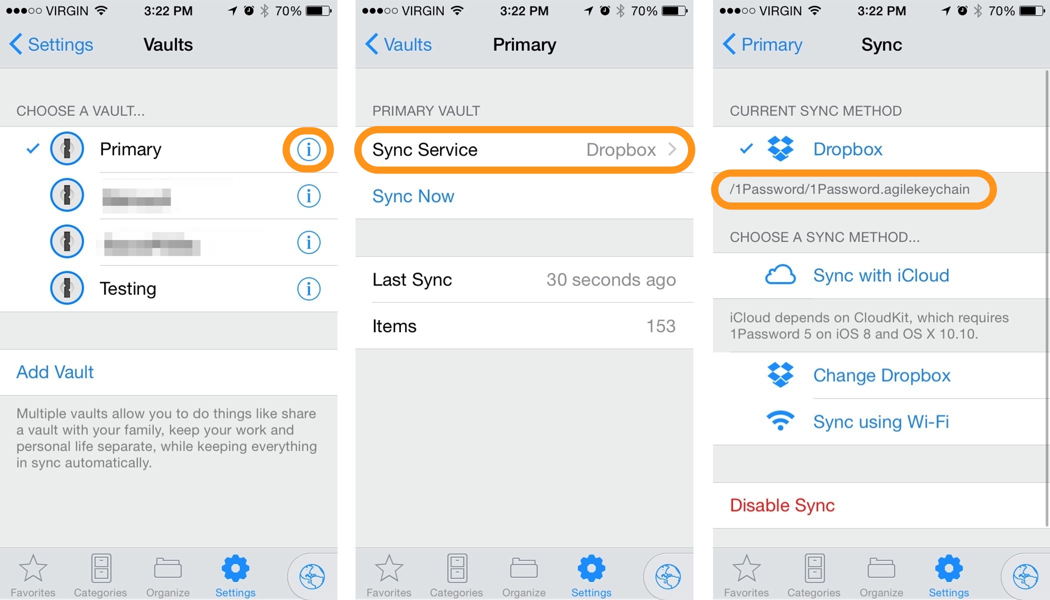
As a user of 1Password, the lack of "Sync" Button is frustrating when trying to use recently added passwords across devices.
"It just works" isn't always best - especially when dealing with cross-device data sync - I know it isn't magic, I'm not "fooled", I know it's actually data that needs to be transferred to the new device. Hiding that, not giving me the option to force sync and see the progress of it is a very frustrating experience when I can't see passwords (or any state) that I'm expecting to see.
I think the generalizable point here is that, at least for me, but I think this is for everyone, it should be considered an important part of the "UX" that users understand the "state" of an application. In particular, what data has been sent and received.
For example, this is imho one of the most important features of WhatsApp, the little checkmarks that tell you, in one tiny little graphic, whether your message has been sent, received, or viewed. This is just so important to the user experience. I feel that app developers that ignore that users need to know what the app is doing, what state it is in, are just ignorant of human psychology and how we interact with machines. We don't want "magic", we don't want to "trust", we want to be informed and to know what is happening. Doing this is a streamlined way, little unobtrusive checkmarks for example, is UX gold.
So much this! Some developers don't realise that informing the user of state provides invaluable information in correcting their mental model of the application.
"It just works" is great and imo arguably the ideal design in a lot of use cases. The problem here is that the code wasn't adequately tested. It "just works" in the circumstances that the app designers thought of when they were making it, and it "may or may not work if you're lucky" the rest of the time.
Same problem with LastPass and password/folder sharing. Luckily there is a refresh button for the chrome extension, but you have to click More Options -> Advanced to get it.
Also, even if you can demonstrate or prove that a refresh button offers no tangible benefit, it creates an illusion of control that improves the UI/UX.
> It's like the close door button in US elevators.
The close door button is retained for emergency manual operation, not as a placebo button (they are disabled in normal, non-emergency operation because of ADA minimum open time rules to accommodate wheelchair-bound passengers.)
> It's like the close door button in US elevators.
Some US elevators. The one at my office works fine, at least after the door has been open for a short time. I've done timing tests with a stopwatch to make sure I wasn't misjudging or misperceiving things. The door is open normally for N seconds and there is a threshold, T, such that if the button is pressed at time P, where P is in [T, N], the door starts closing immediately. I don't remember the details now, but T was around 2 or 3 seconds, and N was around 8 or so seconds.
There are a variety of reasons that many elevators do not work or appear to not work in the US.
• Some are programmed not to work during times that are normally high traffic to encourage fuller cars.
• Some have a delay. If the door was going to close in 5 seconds normally, and the close door button works but with a 3 second delay, it would only have an effect if you pushed it within the first 2 second after the door opened.
• Some are simply broken. A broken close door button does not put the elevator out of service so it can stay broken for a very long time.
• Some owners choose to have them disabled. Perhaps they have received complaints about too many obnoxious people closing the doors early. Perhaps they think that the law requires it (maybe local codes do in fact require it). Perhaps they think disabling it reduces wear on the doors (I've read somewhere that door problems are the most common cause of needing elevator repair).
I've seen quite a few articles that claim that the Americans with Disabilities Act (ADA) requires that close door buttons be disabled during normal operation.
I doubt this. None of the articles I've seen cited a specific section of the ADA, and I could not find any grepping through the text. Furthermore, the ADA was passed in 1990, but non-working close door buttons were widespread well before that. Here's a Straight Dope column on this from 1986, for example [1].
The most I found was something about there being a mandated minimum open time, during which the close door button would not be allowed to work.
I once worked in an older office where the 'open door' button worked as a 'close' button, as using it apparently canceled the 'hold door open' timer. It also had a traditional do-nothing 'close door' button.
> The most I found was something about there being a mandated minimum open time, during which the close door button would not be allowed to work.
Which still makes no sense: if a human being is pushing a close button, presumably he has a good reason for doing so.
I'm rather hopeful that the actual facts are that the ADA requires a minimum open time, and that a close button may shorten that time because it's an active human request.
There is one elevator from Otis in a business center which I visit often. It has "open door" and not working "close door" buttons. And, as I've accidentally learned from a janitor, to close the door you have to press current floor button! Who could've thought!
I wot not the attitude of others to such matters, but I find the presence of a close button that doesn’t appear to do anything unreasonably frustrating. (After an office move a couple of months back I encountered my first elevator in Australia with an close button that does little to nothing. Fortunately I work from home normally and only endure the elevator every couple of weeks.)
I know others have downvoted you, but I want to thank you for pointing that out to me. I had absolutely no idea the word "wit" could be used in that way. Apparently it appears in some biblical passage(s), as well as in a Robert F. Young sci-fi short story. I only found it defined here: [1]
That is an even dumber principle, and it is what leads to proliferation of products that are mostly useless toys that pretend to be tools. No amount of JS will make a person who never used 2D graphics programs a master of Photoshop. Only God Himself can make a pivot table that's usable by a newcomer without "having to read any documentation". The only way to realize the principle you described is to dumb down your product until bare minimum of functionality remains, and then hope your users somehow learned to use that minimum in the past.
Others have managed to touch on this topic in the thread, so I'll just say this: you don't expect people to be able to fully use a car without having to learn anything. You subject them to a training course. And this applies to pretty much any actual tool. You have to learn to use it effectively. "The only intuitive interface is the nipple, everything else is learned." You can embrace that and figure out how to efficiently teach your users, or you can forever be doomed to building toys that don't actually help anyone that much.
He's not saying that everyone should be able to use every program. But someone familiar with 2d graphics program in general should be able to learn how to use Photoshop without reading the manual.
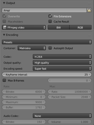
Consider a bad example: Blender. Even though I have used 3D graphics and CAD extensively I still always have to look things up in the Blender manual. Why? Because nearly every control is poorly labelled, there are no useful tooltips, and basically no hints in the UI at all. Take a look at this awful screenshot for example:
What does "File Extensions" do? What about "Placeholders"?
Why do none of the number inputs even have units?
Nobody is saying that users should have an intuitive understanding of what a B-frame is, but I shouldn't have to read the manual to find out whether the B-frame interval is specified in seconds or frames.
Blender is a funny program, because it can be used both as an example of bad UX - like what you describe - and good UX.
RE bad UX - I agree labels and tooltips are important. Even if I'm an experienced user, I do not remember everything, and in particular I would like to be always able to visually identify that number fields use the units that I think they use.
As for the good sides - Blender is the vim of 3D graphics. It allows you to be much more efficient - after you learn how to use it - compared to programs with simpler UI.
I generally summarize my point like this:
   productivity
     ^                                     /  tools you need to learn
     |                                    |
     |                                    /
     |                                   |
     |                                   /
     |                                  |
     |                                  /
     |                                 |
     |                                /+
     |                              /-
     |                           /--           toys with dumb UI
     |                        /--        /--------------------------------
     |      /---------------/------------
     |  /---         /------
     |--   /---------
     +----------------------------------------------------------------------->
                                                                 time
Probably not, I was shocked first time i heard but i've seen it a few times also. Most common complaint I hear is that everything is underlined in red as errors because you have a different code style or misspell things. Other common complaints are that the debugger buttons are non intuitive (both location and icons), hotkeys don't follow common conventions, or that it's hogging the computer resources. Although the latter is maybe not relevant in this discussion about UI-design.
> there are no useful tooltips, and basically no hints in the UI at all.
That's just blatantly false: https://i.imgur.com/MGrA4Ax.png Not only are there tooltips, the tooltips also document the python API.
> I shouldn't have to read the manual to find out whether the B-frame interval is specified in seconds or frames.
You mean Max B-Frames? Yes, you should know what B-Frames are and that's enough to understand what you can configure. If it said "Max Frames" would you ask yourself if it concerned frames or seconds?
Blender isn't an App that anyone should be able to use. It's a complex, specific tool with a lot of features. I've seen many hours of 3D software trainig for anything from Maya, 3DS, Zbrush to blender. Industry professionals usualy take a few courses and need time to adjust before switching software. Each tool has different workflows and only after ample training are you able to fully utilise its power. Blender is built to be very efficient while modelling, sculpting or animating with loads of shortcuts and modes to make these processes as fast as possible in the 3D viewport.
You're basically complainig that an airplane control panel is ugly and bad when you have no piloting training.
Bad? Not at all. UI designers try very hard to make them intuitive, and from what I hear are largely succeeding.
TBH, if I look at an aircraft cockpit (especially a modern one), I have little trouble orienting myself, or figuring out how to tell the plane to do what I want. However I can easily believe that a person not well acquainted with airplanes and their systems would be overwhelmed. However that's not bad UX, that's just exposing the airplane's complex systems.
I recently watched a few pilotseye.tv videos (the things people do for fun...), and observed a lot of very interesting details in the planes' UI that made a lot of sense, and underlined the attention to detail on the part of the UI designers.
> Blender isn't an App that anyone should be able to use.
See. This is the problem. It's just an excuse. I'm not saying it is possible to make Blender so intuitive that my mum could use it, but you shouldn't start from "this is a complex app so we don't need to make it user friendly".
Ooo I just thought of an even better example - Kicad vs DesignSpark PCB. Both complex software, but one is about a million times more easy to use.
> Only God Himself can make a pivot table that's usable by a newcomer without "having to read any documentation"
Then I guess god himself built the Excel pivot table UI, because I know I never read the documentation on pivot tables before diving in. I just picked up from somewhere that a problem I had might be solved with a pivot table, dug through the UI to find the ‘insert pivot table’ option, and followed the prompts, backtracking with ‘undo’ if things went wrong.
There is real power in interfaces where a user can, knowing that something is possible in the tool, figure out for themselves how to accomplish that goal. Yes, without having to read documentation or attend a training course.
You got me here. I wanted to quote something off GP's comment that it obscured what I really wanted to say - that is, using some advanced feature without learning. Learning through reading about it, or learning through experimenting with it. Both are valid ways, but you just can not make a powerful tool that does not require learning.
The best UIs I've used have two ways to do almost everything - the obvious way, and the fast way. You can almost always accommodate both sets of users.
Why is that? It used to be that there were help files and you pushed buttons until you figured out what they did. You had pages and pages of comfiguation options. You had manuals that explained things - without needing a browser. You had settings and advanced settings, hidden switches, and tweaks.
Now, you get a hamburger icon and there's not even an exit button.
Part of the joy of computing was figuring out what all those buttons and options did. VLC is one application that still has a decent settings selection and their advanced options is just about perfect. I don't even know what half those options are for - but I like it.
Please give me back my options to break stuff. I am not scared. Breaking stuff helps me learn. I don't even remember the last time I broke things bad enough to need a reformat. That's not for lack of trying, it's for lack of buttons. I'd like to kindly request you put those buttons back.
Seriously, discovering features and mashing buttons until you learn is one of the great joys of computing.
The result of computing leaving the hands of heavily-technical users and entering the world of the non-technical is that people are terrified of doing the wrong thing and breaking things.
Technical people inherently know that there's very little they can do that's irreversible, and that they'll be able to figure out how to reverse even the craziest of breakage.
Non-technical people do not assume breakage is irreversible, and even when they do, they do not assume that they'll be able to unbreak it themselves. Finding someone to help is a nuisance and can be embarrassing.
That isn't an argument for removing options or a "simpler" UI (which is usually a euphemism for "inflexible", "fewer features/capabilities"). Yes, non-technical people are often reluctant to experiment due to fears about breaking something. The solution to this problem is to have very clear boundaries around anything that actually does cause irreversible changes (or other "important" actions) while designing the rest of the UI in a way that emphasizes - explicitly, if necessary - that everything is ephemeral.
Having a very clear boundary between "safe for experimentation" and anything permanent/important is the most important part. People will learn to experiment if you explain that nothing will be saved until they press the visually distinct "Save Changes") button. When relevant, explain they can use the clearly marked "reload"/"reset" button to return to the original ("fixed") version, so they have a reason to feal safe experimenting.
"Magic"/"DWIM" interfaces and functionally overloaded UI features undermine confidence that experimenting is "safe", because they are hard to predict.
The problem is that for some significant amount of users, they don't have the mental model to differentiate between running stuff in an Administrator prompt and playing about with their Word settings - one of them being dangerous and one of them not.
We'd have to go right back to OS design principles in the first place to teach people that computers are not terrifying behemoths that are about to fall over at any given second, and then maybe that would follow through into our apps - but as it stands, they come with the default expectation that anything they do might result in needing to call IT.
Funnily enough, ChromeOS gets that more-or-less right. There's barely anything you can do to a ChromeOS machine that makes it unusable, and nearly everything is ephemeral. Then you have the always-revertible settings in Google's web apps, and people love it.
So hide the advanced options, like Firefox and its about:config. Even ask the user to solve some technical puzzle (hex math, perhaps) to prove they are worthy.
Maybe if they had to struggle, they'd learn? If we old people could do it, the next generation is smart enough to do it. Hell, they've got Google to help them.
It's not like I'm expecting a return of dip switches and multi-binder manuals. Just, maybe, stop designing for the lowest common denominator?
People aren't going to learn unless you give them a reason to. People aren't going to learn if they don't have to. Would you rather smarter users, or simplistic software that underperforms and offers only one output option?
I favor choice.
I do admit that it makes good financial choice to cater to the lowest common denominator, but even many of my beloved Linux apps are getting dumbed down. I haven't even had a kernel panic in years. Hell, I haven't even had to compile my own kernel in this whole decade. (I have, I just didn't need to.)
It's not about keeping it out of the hands of the less technical, it's about still keeping it educational for those of us who are. What kind of dystopia is it, when the preferences menu has but three options?
Instead of a stylus, maybe you should just give me a crayon!
Really, I think VLC has it right. Handbrake is pretty good. Gimp goes a bit overboard, but I can respect that. My VNC server? It's got like eight options, total. Torrent client? Maybe twice that many, spread over four panes. That's like putting four pieces of lettuce on four plates and telling me it's a salad!
Mobile apps? Some of them don't even have options! If there are no options, why use an app? Just use the web! Hell, they don't even have a close option, some of them. What if I want to close it and restart it at the default screen? Task manager or reboot, that's what. 'Snot like it has a discernable back button. No options to configure it, either.
I think people with mental handicaps should be allowed to use computers, just like everyone else. It doesn't mean you should design with them as your primary target audience.
I'm pretty sure it took more work to take the buttons out than it took to leave them in there. I can't even begin to count the number of updates that have removed options. What the hell was that? You worked harder to make the application do less. I don't even understand that mentality.
Sorry for the rant but this is a pet peeve. Imma start a Bring Back The Buttons campaign. It extends to other things, too. I noticed a friend's new television. Their remote had 3 buttons on it. It wasn't even broken, it came like that from the factory.
There's even a specific concept in UX research related to that whose name escapes me at the moment, but generally boils to "discoverable interface" that is also open and encouraging the user to explore. This way you aren't "blocked" when you first open the application - but you're encouraged to learn and become expert.
All of that is great for us, the people who got into computing way back when.
Then, computing became useful, and had to be used by people who don't like to twiddle with settings. It seems to be the case that those are in the vast majority. Moreover, there is a vocal minority of people that tweak settings, break something, and then start complaining / requiring support.
The end result is that our preferences are no longer the majority and thus are no longer catered to.
My toaster still has a slider to select how long I want to cook it. I wrote a long reply to the other person, I think I summed it up there. You can feel free to expand the thread and read it. It's one of my better rants, if I do say so myself.
Even Linux is impacted by this. I keep hearing complaints about flat design, I don't even know what that is. I just want my buttons back. New users don't actually have to push them. Just because a button exists doesn't mean Joe Sixpack has to push it.
Maybe if he pushes it enough times, people will stop fixing his computer and he will learn to fix it himself. Then, with time, he can learn to stop breaking it.
Not that long ago, I got some help to write some scripts to grab the entirety of the Ubuntu man pages and automatically convert them to PDF and provide an index for them.
When I posed my question, explaining where I was stuck and what my goal was, the first questions where, effectively, "Why would you want to do that? Nobody wants to do that!"
It's a horrible state of affairs.
I'm considering moving to GhostBSD. At least they still have buttons.
'My toaster still has a slider to select how long I want to cook it.'
And this is great, simple UI that means you can use it without a manual. If we we're to liken a lot of "configurable" software to the toaster it would:
* A resistance range setting that defined the max and min resistance ranges of the internal heating element, implicitly measured in ohms.
* A resistance setting to defines the current resistance from 0 - 100% where the percentage set gets it's temperature from the range defined with the resistance range UI element.
* A timer setter that allows you to set the time-to-cook value via a ISO 8601 formatted duration.
> And this is great, simple UI that means you can use it without a manual.
Of course it requires a manual. You think it doesn't, probably because you saw your parents use it, or saw it used on TV (or because you're a technical person and figured it out yourself from first principles). Even such simple things are learned, and for some users, need to be explained. Hence appliances include manuals.
Also: while you know how to use a toaster, if you find yourself in front of an appliance the type of which you've never seen before, you will naturally reach for its manual (maybe after first trying to figure it out yourself). You will not run away screaming, you'll learn to use it, and you will not think it is a weird thing. Similarly, nobody bats an eye at the prospect of having to learn how to drive, or use power tools. I think the single biggest sin UX is doing is promoting the expectation that using software is not something that requires learning. We're now training people into thinking they should become experts in 5 seconds, whereas in every other area of life there is an expectation of learning.
Indeed, so give me the option for that. I don't mind paying for software. Hell, I used to pay for my browser. Or, you know, stop dumbing it down in the first place.
When you design for the lowest common denominator, you get users that are the lowest common denominator.
I get it, it makes good financial sense. However, those of us with an IQ higher than room temperature are left out in the cold. You had those options in there - you took 'em out. Put 'em back.
Joe Sixpack will learn and improve. You'll get better and smarter users. You'll get users more confident and needing less support. Take an extra day and write good help documents, put the options back, and give ol' Joe a web form to query the FAQs.
Ol' Joe will figure it out. I did. Joe can figure it out too. We all did, back in the day.
If you don't give them incentive to learn, they're not going to learn. You're stuck with dumb users - forever. You don't want that, do you? Do you really want to have to keep telling Joe how to set up his email client? No? Well, give Joe incentive to learn how to set up his email client.
When Joe calls your helpdesk line, say, "Hey, Joe - did you read the manual?"
Give him a reason to mash those buttons until he becomes an expert button masher (also known as an admin). And, if you can't train Joe, you can use some pretty neat tools to lock his PC right down - and only let him do what you want him to do. If it's his cell phone, well - that's what he's got the restore option for. Ol' Joe will quickly learn to push buttons, fix his own problems, and actually understand what goes on inside that magic box - at least a little.
Seriously, we did this for decades. User friendly is good, but it's gone too far when there aren't even configuration options, a close button, a home button, or a help file.
DId y'all forget how to write help documents? There's some great examples out there. You can crib from those.
I'm not kidding about VLC pretty much having it perfect. Load up VLC and have a look in the options.
Open VLC > Click on Tools > Click on Preferences.
Once you're there, have a look around. That's pretty great, right? It's not too overwhelming, now is it? That's not the best part.
In the lower left, click on "All." It's right next to the Simple option - simple, like Ol' Joe. Click on that button and then take a peek at the options. It's a virtual cornucopia of button goodness. It has options for things they're probably just making up as they go along.
It's pretty much perfect. Even a plain text editor should have options like that. While not a plain text editor, LibraOffice is actually another example of a fine set of options. But, VLC gets it just about perfect.
Ol' Joe can still have the Simple options. Ol' Joe probably hasn't even got to touch them, as it comes with sensible defaults.
VLC could be the goal, not the Facebook app for Android.
> If you don't give them incentive to learn, they're not going to learn. You're stuck with dumb users - forever. You don't want that, do you?
Here's the problem though: many companies in our industry do want that, even if they don't admit it to themselves. That's how they make money.
A smart user will use their general-purpose computer and a suite of general-purpose software to solve their problems in a makeshift, but effective way. A smart user will not need to buy a service in a SaaS that's selling few textareas with a cloud sync. But a dumb user can be believed that "there's an app for that", and that things for which there is no app cannot be solved.
It pains me to think that I'm going to have to take up programming again. I don't like it. I'm not good at it. But, it's the only reliable way I have of frustrating myself to the point of learning on a computer.
What's wrong with an options menu and then an advanced options menu?
People are down voting my comments that suggest keeping options in place in applications - on Hacker News. I don't even know what to think anymore. I miss my options menus. I miss the vast amounts of configuration choices.
What I really miss is learning what all those options did. There is still plenty to learn, I miss that. I miss tweaking, configuring, and getting things just right. I miss the little things you could do to tie in a couple of apps and make them do things they weren't designed for. I miss the finding the undocumented settings that you only found when you hand edited config files.
They inspired me to learn more. They kept things fresh. They made each person's install unique (which I admit is generally a bad idea in a corporate setting).
When you design for the lowest common denominator, you get uninteresting, uninspiring, uncreative, inexpressive, bland consistency. We've gone from a multitude of choices to bland bowls of oatmeal.
If need be, put the options behind an 'advanced options' radio button and emulate VLC. I'm not kidding when I point to VLC as being close to ideal.
And no, I am not a curmudgeon. Computers and applications weren't better back in the day. In fact, they largely sucked. That's not because they had options, however. That's because they were slow and had access to so much less information. The options menu had nothing to do with it.
I don't want to bring back old computers. I just want my options menu back, and populated with optional goodness.
Do you use Windows? I haven't used it in years. However, there used to be a program called x-teq setup. It is now defunct, but that might have been the greatest Windows program ever made. It had a horrible interface, a UX was not even thought of, the UI was probably concocted while drunk, and it was an absolute security nightmare. But, you could tweak most any part of your OS with it.
It's that sort of mentality that makes me want my options back.
You have my upvotes on all those comments. I'm with you on this.
Thing is, lots of people on HN have internalized the "dumb UX FTW" principle - which is entirely understandable from the business point of view, where you care primarily about your sales, not about the value your users derive from your product - and by criticizing this point of view, you're implicitly criticizing their jobs or products. Hence the downvotes.
(In particular, a lot of developers despise options, because they increase "costs of support" - i.e. there are many more things that can break when you start mindlessly piling up new features.)
But criticize this trend we must, and loudly, because at large it is circular reasoning. Users want dumb software because they choose it, and they choose it because that's all that is available to choose from.
Computers are a tool that could give unprecedenced powers to individuals. Powers to learn and solve their individual problems themselves. And the software market is seriously, and increasingly, underserving individuals. It is understandable - companies prefer you to pay them instead of solving your problems yourself. But "what sells best right-fucking-now" is not the same as "what's the right thing to do".
If it is any indication, I'm the same KGIII that has been online since, well, before it was world wide. Never have I made a comment, or not made one, based on possible votes. At least not that I can recall, I used to drink and post. So, I may have, I just don't remember it.
So, I mean everything I say.
I have moderated my own posts to fit site guidelines, but I say what I have to say, bugger the votes.
So...
I agree, computers are tools to empower individuals in ways they've never been able to achieve in all of prior history, at lest on a mass scale.
To do so, they need to be able to get maximum usage from their devices. They need control of their data and their systems. Sure, they might make a few bucks writing blog posts, but the real power is in creation and, doing so requires skill and options.
This dumbing down of devices is a disincentive to learn. Dumb devices beget dumb users. Dumb users don't create, they consume. Sure, some exceptions exist, but this is generally true.
Dumb users are subservient to dumb devices.
So, along with my selfish goal of wanting to have more control over my devices, I guess there's an altruistic reason.
Maybe it really is time for a Bring Back The Buttons campaign? I could probably write a few essays on the subject.
From the 90s until about the mid 2000s, kids to me, there was a whole generation that actually understood computers, beyond just being able to open Office. They could put them together, understood ECC and RAM, built their own cooling systems, programmed what they needed, and devoured open source like it was a new religion.
Then... Well, then came the smartphone. I don't even regularly use my smartphone. I probably should. Maybe it will help me understand the next generation's viewpoints?
I don't know... We did pretty well for a while. People were even educating themselves. They created new and wonderful things.
I think I'll try formalizing this stuff into an essay and linking to it in a few days. Right now, it's rambling.
It is something I've pondered for a while. There's more to ponder and try to make sense of. This is meandering a bit too far off topic for the thread. Bring back our options and presences. Bring back our documentation. Encourage, no demand, people learn. You have to learn to use every other tool, a computer is no different. And yes, yes it is a tool. Even the network is a tool, a tool to facilitate exchanging information.
Man, I so hate the idea of having to write software. I really hate programming. I'll have to come up with a more practical example than VLC.
RE the votes, I don't understand now if you're writing in general or in response to my comment, but if it's the latter - all I meant is that I read what you wrote in the whole thread and I generally agree with it (hence you have my upvotes), and to provide a possible reason why those comments were so downvoted at some point today.
--
> Then... Well, then came the smartphone. I don't even regularly use my smartphone. I probably should. Maybe it will help me understand the next generation's viewpoints?
It didn't help me. Anyway, if you'll get a smartphone, you'll learn that:
- it generally solves most of your needs for unsophisticated communication with people
- it sucks when you try to do anything creative with it
- it has abysmal interoperability between applications - and beyond that, it goes out of its way to hide the filesystem from you, and even the clipboard barely works
Both of that is because it's bound by the features of lowest-common-denominator applications written by competing vendors.
--
> I don't know... We did pretty well for a while. People were even educating themselves. They created new and wonderful things.
Of course they did. Because if you tell people that a) they can make things they want to make with a computer, but b) they have to spend a little time learning and figuring it out (and c), here are some resources to get you started), people will figure it out. Some of the complexity just is essential, you can't remove it without losing the capabilities of the tool.
> I think I'll try formalizing this stuff into an essay and linking to it in a few days. Right now, it's rambling.
> Man, I so hate the idea of having to write software. I really hate programming. I'll have to come up with a more practical example than VLC.
Please do write it down and share it. And don't worry about writing software (unless you just want to have your dream tools made ASAP) - just provide a clean and detailed description of what you seek. There's plenty of people here who like writing code, and will happily experiment with new paths.
Oh, and VLC is a fine example. It's a popular and powerful piece of software.
Re "smartphones suck": With this mindset, I'm surprised that you can use iOS. Although Android is bound towards drool-proof interfaces as well, the pocket computer I have is quite versatile, after some prodding (and rooting). Not a phone-with-apps-on-top, this is a computer-that-also-can-do-voice-calls. (Full Linux distro alongside the phone UI? Check.)
TL;DR: newish Androids sucks far less than previous/other types, even though they're constrained by the form factor.
Dunno if i agree with that TLDR, as Google these days seems to take away way more than they add in.
That said, they have yet to take away unknown sources (and even seems to have refined it a bit with the latest version), so there is a small light at the end of the tunnel. But why oh why do they keep screwing with basic file management?!
> Then, computing became useful, and had to be used by people who don't like to twiddle with settings.
And then some people confused "twiddling with settings" with "learning to use a tool", and the completely stupid notion of "fully useful from first 5 seconds of encountering" software came into being.
An issue there is that often, making settings available is combined with having ill-conceived defaults. In these cases, "learning to use a tool" involves changing from the default configuration to a non-stupid config.
Then, stupid defaults were conflated with 'having settings at all' which made people not want any settings.
For mass market products, maybe. What about photoshop? music production software? what if your customers are developers and your product is a software library?
In many cases there is an inherent complexity to a product, and it warrants some learning curve. Removing the need for documentation often removes power and depth.
Funnily, now that many products are like this, the opposite trend is surfacing, and in some niches you have customers who love reading manuals. It becomes part of the user experience.
Ableton (music prod software) takes an approach to learnability that works well -- by default there's a dedicated UI element that shows documentation for whatever you're mousing over.
It doesn't remove the need to read docs, especially for people who are new to DAWs, but it does alleviate a lot of the intimidation factor and initial learning curve that can come with needing to find what you need to read in a manual for a complex piece of software.
I know Ableton Live very well, and yes it's a very good example of hard stuff done right. But I wouldn't include it in the list of "apps that are so user friendly that you don't need to read the docs".
I don't know anymore - is that some self fulling prophecy?
"the customer should be able to use the product fully once they have experimented, tried, failed, corrected, and learned by mistake the user interface that we have"
I think, but can not directly prove, that you're already talking about a very small minority there, single-digit percentage levels. Lots of people just muddle along, or ask the office grapevine, or just give up.
The easiest way to achieve that is simply to remove functionality until only the bare essentials are left. I'd argue this (the UI change, not identifying what can be removed) is always going to be simpler than making the existing UI understandable.
A solution which is often asked for by advanced users is a toggle between simple and advanced UI, but this has fundamental problems (The following is inspired by the VLC preferences UI). First, It will be triggered by accident by users who definitely don't want it (or by advanced users sharing the account). How do you ensure they can get back to the simple UI? By definition they are now in a mode which is harder to navigate for a normal user. Second, how do advanced users without extensive knowledge of the internals of the software (non-developers, essentially) locate the controls they were used to from the simple UI? The advanced UI will look fundamentally different from the simple one, because cramming all the advanced features in between the simple ones would just look weird and hacky. Things might even be named differently in the advanced UI because there are technical terms for them which will be more familiar to advanced users. And how do advanced users know if there is even a 1-to-1 mapping (a simple "Dolby Surround" boolean setting vs an advanced "Force Detection of Dolby Surround" boolean setting and "Stereo audio output mode" which can be set to "Dolby Surround")? Third, given finite resources one of the interfaces is going to have more effort applied to it than the other one. How do you ensure that they both stay usable when most users will only ever use one of them?
> The easiest way to achieve that is simply to remove functionality
The easiest way, yes. I am reminded again of the point made by Dave Smith, one of the Xerox Star human factors designers, at the ‘Final Demo’¹: “Star had many fewer commands than today's systems, and it didn't do it by having fewer functions — it just had fewer commands.”
PARC weren't trying to make things easy on themselves. Genericity is hard. Orthogonality is hard. Design is hard. (It's unfortunate that Steve Jobs either didn't understand what he saw, or didn't care, and popularized a Potemkin village imitation.)
You forgot one drawback to the advanced mode: users are bad at self-selecting into the proper group. Some will select it and get totally lost, while others who would benefit will avoid it. Also it ends up being twice as much UI to support.
But the example the author notes isn’t the worst. If killing the app refreshes, that’s okay.
The problem is a lot worse if the app syncs to disk.
All Apple apps have this issue. iCloud is nice when it works, but it’s infuriating when a photo or something doesn’t show up on your other device, and there is no way to force a sync.
Agreed. iCloud's antics keep forcing me to seriously consider android.
Their refusal to give you FS or cache access is similarly infuriating; I stopped using my old 16GB purely because I couldn't selectively control what was stored on the phone and iCloud photos was too dumb to control its cache. I would have gigabytes of old photos downloaded to my phone until it was so full that apps would regularly crash! I had to regularly toggle iCloud photo storage and basically just wait until my iPhone had locally cached enough of my library that it was full and broken again... And, of couree because Apple thinks their software "just works" or whatever, I couldn't just hit a "clear cache" button or manually rm files from the cache (still a hack, but one that takes all of two seconds).
At the moment, I'm keeping myself somewhat satisfied by just using adobe creative cloud for photos I care about, but it's not an ideal solution. And I'm annoyed that Apple basically forced me to buy a new phone a year or two earlier than I wanted to by crippling my old one with broken software.
> And I'm annoyed that Apple basically forced me to buy a new phone a year or two earlier than I wanted to by crippling my old one with broken software
Kill-to-refresh is marginally okay only if you just need to refresh the default state. It's very frustrating when you've already made 3-4 changes to the default view and are forced to re-apply all those changes after restart.
I've been running into a similar issue with the HandOff stuff (or whatever it's called). I'll have a chrome tab open on one computer, do the task-switching thing on the other computer which should open the same tab there. Instead I might get a tab I had open earlier, sometimes well over a minute earlier.
Obviously the best solution would be to make the syncing of this seamless, but I'd happily go for a system-wide sync button...
Lack of a refresh button is not the issue. The issue is that the app developer has never tested their app in real-world network scenarios. Switching between wifi, 3g, 4g, lte, and no network access. Inserting random packet loss, jitter, and latency. There are a lot of tools that can automate this now. You can stick a WAN simulator in front of your integration testing environment and insert all types of crazy network issues into your tests. If developers did this more often, these "sync" bugs would be fixed.
Sometimes you just can't reasonably test for everything. And sometimes it is not your fault. Operating systems have bugs too, and then there are bugs that are introduced by the presence of yet another application.
The rule of thumb, I believe, should be this: whenever you're dealing with a shared resource which you do not own - like with files on disk, or data on the other side of the network - your application state is just a cache for that data, and you need to offer a way to manually force a refresh of the cache.
The issue here is not bugs in the syncing software, the issue is that you are not presenting an accurate view to the user. Loosing internet connection from your mobile network is not a bug, it's something expected.
What you should do instead is to present to the user that you are in an unsynchronized state. I always add an internal watchdog for cloud sync and if time to last update goes above X seconds, you pop up a notification bar with a loading spinner that says "disconnected" and there you can add your refresh-button and a tooltip suggesting to turn on wifi.
When downloading things, refresh is a quick hack, for uploading things the situation is worse, there you should absolutely not pretend that things are done when they are not. Some times i need to know that a file was uploaded 100% before i disconnect the network. Again, the solution is not to add a manual refresh button, here you should always show the sync-progress.
I used to work at a shop that ran a 1.5 mbps dsl line, and a ~5 year old, cheap, slow computer. If their code worked on that, it would work on any of our customer's machines.
I wish devs would still test like that. Sure, your app works fine in downtown SF on the newest phone, but try using it in Nowherseville, TN, on a phone that is more than a couple years old. I bet a lot of user frustration comes from dealing with that.
macOS has a Network Link Conditioner preference pane that allows you to simulate all sorts of awful network scenarios. It's at the system level so anything using the networking should be affected.
Yes, the developer has never tested their app and if they would "just" make the difficult-to-implement code bullet proof, then there would be no need for a refresh button. facepalm (for the hard of thinking, I am sarcastically disagreeing)
My hope is that at some point the auto sync is smart enough so we don't need any refresh button.
For example: Instagram does auto sync of new posts, but it also has a refresh functionality. So I never know if it is up to date and I must refresh. When you know about a manual refresh functionality the auto update is totally useles. You're never sure if the app tries to stay up to date or does only occasionally sync to show some (not the latest) updates.
Another example is google mail, it does auto sync pretty well and I always see the mails when they arrive. But the refresh buttons makes me suspicious if it's really up to date (in my experience it always is).
Instagram and Facebook (at least on Android) is also a fine example of getting auto-refresh wrong. If I'm scrolling down the feed and stop for too long, or hop out of the app for a minute and then come back, often it'll refresh the feed and kick me back to the top. That's never what I want. I'd rather manual-only refresh to that.
GMail does a good job of being up to date, except when switching networks or resuming from sleep. It'll certainly eventually sync properly, but that can take minutes, and whacking the Refresh button fixes that in seconds.
I've also found that Refresh will surface very-new mail sooner than just waiting. Whacking Refresh while waiting for an email verification or password reset always makes it appear faster than just waiting.
I use the refresh button in Gmail every day. If I don't, some mails take up to 5 minutes to show up. Not so good when waiting for an automated mail (ex: password reset).
Refresh is not solely used to fetch latest data but also to reset the webapp, bringing it to clean state. Believe it or not our apps have a lot of undefined states.
You will need a refresh button as long as there are bugs in software - in particular, as long as there can be a bug in your UI code or your operating system's UI handling code.
I feel the difference between a programmer/power user and a regular user, and something that we need to start explaining to regular users, is that UI is not the true state of things. What you see is not what is really there. What you see is a representation, that is usually manipulated incrementally. A refresh is a request to rebuild the representation anew, from the true state of things.
It feels like the sign of times - the need for instant information. I like to be able to force refresh in Gmail, because sometimes I know I was just sent some notification / receipt / whatever. But normally it doesn't really matter... whether I find a new email I wasn't expecting immediately, or after an hour is irrelevant.
If you're confident enough of your auto-sync, you can always keep the manual refresh and just have it no-op. Eventually users realize that clicking refresh never actually brings in new content, and the content they expect is always there. Or maybe they don't, and think refresh is always super fast (you can't make it too fast). If you do this you'd better be certain your sync works though.
This problem would be solved if HTTP provided state synchronization rather than just transfer. Then we wouldn't need a reload button.
The invisible college built a solution called Statebus: https://stateb.us It's a backwards-compatible HTTP but with automatic synchronization. It eliminates these bugs.
That sounds a lot like the thinking the author was complaining about in the article. There is a lot going on underneath your protocol layer here, and much that can go wrong. How sure can you be that the system is in a synchronized state?
A lot of apps accept the pull down gesture (not sure how to call it) as a refresh, e.g. mail apps. I suppose that might not work so well when your app shows a map, like uber. Replacing a button by a gesture is ok.
It's only OK if you also describe somewhere that this gesture exists and what it does. Gestures are absolutely non-discoverable on their own. Occasionally, I try to show someone something on their Macbook, and I always have to experiment with the number of fingers on the touchpad, because nothing about the interface helps me remember the options. I guess it could be printed directly on the touchpad, but then that wouldn't be as slick.
I think the swipe-down-to-refresh UI pattern actually seems pretty discoverable. The newest things on a list are added to the top. How do you know if you're at the very top of a list?
I think this gesture eloquently addresses several issues at once. (1) The user is going to pull down on the main container to check for new items at the very top of the list, but (2) it may take a manual refresh to deliver these new items; refreshing the list when the user is attempting to pull the main container window beyond the top-most item allows the app to provide the newest content the moment the user is seeking it.
Yes, when you have a list sorted by recency, where the most recent entries are at the top, you can easily discover the refresh gesture by scrolling a little bit too far.
But when the gesture is used in different contexts, it is less likely to be discovered. For example most chat apps add new messages at the bottom, so the refresh gesture should be scrolling in the opposite direction. Additionally, I don't tend to scroll through my message history very often, so I'm unlikely to discover this. Fortunately, most chat apps tend to be quite good at loading new messages.
It gets worse when there's little reason to attempt scrolling past the boundaries. For example, it took me months to discover that Chrome on Android supports the gesture (before that, I opened the menu to refresh). That's because to scroll on a website, I just pull once and then let go. Inertial scrolling means that the motion will stop as soon as it hits the top of the page. Past that, there's a kind of resistance that needs to be overcome, which you won't do if you don't already know the gesture.
My point is, good interfaces shouldn't require the user to make accidental discoveries. There should be an obvious, labeled way to do it; if necessary, it can include a hint to use the less obvious but more convenient way next time.
Also, i have found that swipe to refresh on web browsers to be a mixed blessing. All too easy to trigger when all i want to do is to scroll to the top of the page.
A gester I'm familiar with only because it always activates when I don't want it.
"Scroll to top of screen" is now overloaded with "dump all user state".
The number of times this has occurred when I've been in the midst of changing that user state (say, editing in an on-page dialogue) is ... large. It is an infinity compared with the number of times I've wanted to pull-to-refresh (nil).
I recall when mobile browsers started adopting this, and how many times i would trigger it just because i wanted to make sure i was at the top of the page...
It struck me the other day that this is the future that the industry focus on AI is driving us towards - software that knows better than you do, whether you like it or not.
In much the same way that the capabilities and usage of today's technologies baffles people who didn't grow up with it, tomorrow all of us will be baffled by the number and magnitude of decisions that the average piece of software assumes its users will delegate to it, and the fact that no one will really be able to debug or diagnose exactly why it made the decisions it did. Zawinski's Law [1] will be modified to read "Every program attempts to expand until it can act as a personal assistant. Those programs which cannot so expand are replaced by ones which can."
I this this is a particularly insightful stance and it immediately reminded me of an application that already does this.
The thick-client MS Outlook will let you know when you have new mail, but there's also a "send/receive" button that forces a sync with the server and lets you know the result of that action.
I thought about outlook, too, but for the opposite reason: their web client overrides ctrl+r, making the way I force a refresh incongruous with the rest of the web.
that is another reason i am not much fond of "webapps".
Take Youtube for example.
If i scroll down to read some comments (yeah i know, i live dangerously for some reason that escapes me) and want to go quickly back up to the video, the natural reflex for me is to hit the home key.
But for some loony toons reason Google had decided to hijack the home key to mean "rewind video the 0 and start playing"!
This is only because apps are bad at sync. Quality varies; occasionally there's an app that gets it right. For example, I've used Google Docs and Google Sheets for ages now and never wanted or needed to refresh — the content is always in sync.
Google recently changed "Google Drive" to "Google Backup and Sync" and it's _terrible_
I can see some files on the web version of google drive that I uploaded last night, but on my other machine the Backup&Sync tool doesn't even bother downloading them.
It turns out that cache invalidation is a capital H Hard problem. Solutions that work fine on your LAN can easily go to shit on a slow and intermittent cell connection. Some developers spend a lot of time getting it right and it shows.
Even something as "simple" as deciding of a network is working or not can be wrong.
I have been fighting weak wifi+Windows10 lately.
I try to connect, and Windows will make every appearance of connecting fine, but actually assign itself a magic IP.
And the only way to get it to budge is to open a CLI and type ipconfig /renew, as there is no GUI way to force Windows to renew its IP lease. disconnecting and reconnecting, or toggling the wifi radio off and on will only refresh the magic IP:
I kill many apps on the hour just to refresh. Since I've basically reinvented the refresh button with an operating system feature, why don't all apps have them? And why doesn't everything have a home button, especially Facebook.
At least on Android, Facebook seems to have redefined the back button as home. Scroll down, hit back, and rather than exit the app i will be scrolled back to the top and the feed "refreshed" (more like randomized).
Yes, please! It doesn't have to be a visible button, the scroll hard past the top of the list gesture is fine. Just show a spinner until you actually received a server response. I hate opening a weather app just to see the weather from last time I opened it. Even the most perfect sync code will not work when my internet connection is broken. I'd rather find out so I can fix it than look at old data.
Btw, why does the web Gmail refresh button not actually load new emails unless I press it twice?
A lot of web UIs only show a refresh button if something goes wrong. I think this makes a lot of sense, as it is really just a placebo if the app already knows that the data is up to date (for example, if it has an active websocket connection for maintaining state).
Of course, it helps that the browsers all have builtin refresh buttons too.
Yes, this infuriates me about my city's (Moscow) bikeshare app. It would show you completely outdated state until you restart it with no way to refresh. Later they introduced electrobike option, and I discovered that if you switch to electrobike map and back to normal bike app, it refreshes! Later I found that Citymapper is available in Moscow, and its bike map is much superior so I don't have to suffer the official app anymore.
Like they say "There are only two hard things in Computer Science: cache invalidation and naming things." ;) Apps without `refresh` claim to be ones which managed to solve caching problem properly (they usually didn't anyway)
Indeed. Often they don't even realize they're in the caching business. And yet, showing the state of anything for which the canonical representation doesn't live in your process' memory is caching state.
Agree, though I must say the app suite that has come closest to making it "just work" with no sync button is Trello. It even knows when it might be out of sync and then offers you a refresh button.
Surely refresh is just kill for web-apps? The app's state is discarded, the code is reloaded and it re-requests the data. I don't see the differentiation Tim is implying.
One requires the push of a convenient button already within the workflow of the app; the other requires knowing how to force close an app, or at any rate losing your flow.
Yeah, but the sync button doesn't always work either. For example, my email client has a sync button but I have to go to the web app to really see what's going on.
Usually, you can just force a resync instead. Refresh button is needed for the situations when your application doesn't know its state is wrong, but the user does - which does happen whenever your app is displaying the state of a shared resource it doesn't own, like files on disk.
I'm not sure git is the example I would want to hold up of a service that always synchronizes flawlessly and effortlessly.
Maybe I'm alone, but I've more than once gotten my local copy in a state that seems to require me to blow it away and re-clone it to get it working again. Sometimes it seems to get hung up at a particular point in time and I can't get it to pull recent changes, even when I've tried to tell it to pull from the head.
But IMO this tracks back to the MPA vs. SPA problem.
Do we actually need to be using a SPA/JS framework (Angular, React, etc) and what do we get in return which outweighs the wildly agreed increased development effort of SPAs?
I think the author is referring to mainly "wrapped" SPA web apps that sit inside native apps with a "web view" rendering the SPA (like the browser would).
It's not just wrapped apps tho, many native apps have some kind of hybrid where you're using a library directly (React Native?.. dives for cover) which but a whole framework of abstractions on top of the native interfaces. With so many "layers" and all these things being new and vastly more complex than MPA web apps, the statistical likelihood of goofing things up is just very high.
Where are the days of old (what? 10 years?) where we got to the edge of MPAs (we didn't even call them MPAs then) and optimised the crap out of them making them fast, and simple and quick and a pleasant user experience? I think we come up with all sorts of poorly justified reasons to go to SPA/JS frameworks these days and the users are the ones who end up paying the price.
> But IMO this tracks back to the MPA vs. SPA problem.
It doesn't. You can have refresh buttons in SPAs that refresh correctly parts of their stores. You can have MPAs that incorrectly (or don't even try) invalidate local storage cache. You can have backends with bad cache invalidation. You can have SPAs that are also MPAs (nextjs+react, nuxtjs+vuejs, univeral angular, etc..).
Fact of life is, once your "page" needs more than a non-trivial amount of "GUI", solutions like react are far more maintainable, easier to develop, more portable, faster, and most importantly, build better user interfaces.
No need to blame SPAs using the 2012 concept of SPAs when the cause is clearly a rookie coder or a bad UX decision from upper management.
There's nothing about an SPA that inherently prevents you from having a button that force-refreshes the internal state from the server. This is what happens when you kill the app and re-open it -- it gets it's state from somewhere.
Man, leave it to HN to turn an article that has _nothing_ to do with a specific technology (notice how the app the author makes an example of isn't even a web app?) into an excuse to soapbox about modern web development.
It's not HN-specific thing. It's that in the new generation of developers, people sometimes miss that there are things that are not Web, and the Web is not be-all end-all of programming.
You don't have to show a refresh button all the time. If the timestamp of the most recent data is more than Xs, and you hash or build a merkle tree of all the data, then you can opportunistically tell the user that the app's view is out of date and automatically refresh.
It's the solution that works. Random storage - hash it. Log data - merkle tree. You don't even have to do proper one, because log of state hashes is fine too.
A merkle tree could be used for verifying a tree of data (e.g. a JSON state object) that is updated in pieces.
The root hash would be sent as part of each update, to validate that you have the right state. If it's different, a hard update isn't necessarily required - you can find missing items in log time.
In addition, for large states (e.g. say all cars in a region/partition for Uber), you can use merkle trees to partition and validate that the client has one area right, without downloading all the data.
There are many other approaches, but I think a merkle tree isn't a bad method for the use case of client state validation in the use cases I described.
What are your thoughts? How would you architect it?
Upon searching for a manual sync option (that would have to be a trivial addition) I came upon this issue[1]:
"No, adding an action for this would be a hack. The whole point of SparkleShare is to sync stuff automatically.... Just because something is easy to do doesn't mean it should be added."
I haven't touched Sparkleshare since.
[1] https://github.com/hbons/SparkleShare/issues/794